
A Style-Based Approach To Market Meteorology
Where is the stock market going? Up Down? Sideways? We devote considerable time and resources to seeking answers despite the reality that few among us, if any, can give consistently reliable answers to such questions. Perhaps it may be more productive to accept the role of equities as a core investment asset class and ask, instead, what kinds of stocks may be preferable given readily observable market weather conditions.

Re-thinking Age-Old Questions
On October 12th, I posted an article suggesting it was time for conservative investors, who had been left in the dust by the growth-momentum market leaders since late 2016, to anticipate a shift toward a more respectable view of risk control. Was that an accurate “forecast?”
I wouldn’t be at all surprised if it were the case that many, at least subconsciously, read between the lines to discern whether I was giving a bullish or bearish forecast, or that others took umbrage at what seemed to them to be an effort to chicken out of taking an actual position with regard to the market’s future direction. It’s easy for anyone to read into such a post whatever suits one’s wishes.
The harder thing to swallow, however, may the possibility that I really meant exactly what I said: “[T]here’s a big difference between saying ‘sell stocks’ versus saying ‘hold stocks and even buy more, but consider pulling back a bit on the degree of risk you take.’ I’m not saying the former. I am proposing the latter.” No hidden messages. No subtle hints. Just straightforward message to stay with stocks but switch to those that rate higher in such areas as risk reduction, quality and so forth.
Was I right to suggest such a course?
Well, had you simply sold everything instead of reconfiguring to a lower-risk profile, you’d probably be ahead of the game right now since the market continued to slip. But that’s not really the answer. The market is like a book that keeps going on and on and on with no final chapter in sight. (Game of Thrones? Did that ever end? I lost track.) Just because one who wished I said “Sell” would see that post as having been wrong, that doesn’t mean it will look wrong a year or two down the road. See, e.g., the many who sold into the 2008 crash (and others before it) but failed to get back in, if at all, until long after the market passed its pre-crash high. It’s a lot easier to dream about getting out and in at the right times than it is to actually do it. And actually, as we’ll see below, the advice to trim risk was, at least so far, prescient.
There is, of course, a passive alternative: Just buy an index that represents the whole market and cease and desist from thinking about it. Assuming you can pull that off while pretending that your active choice of which among many available indexes to track was somehow passive (even the old standby, the S&P 500 is, whether one wants to admit it or not, an active decision to invest in large-mega-cap generally high-quality U.S. equities), that may not be the most prudent course of action. Notwithstanding the efforts of those who make their fortunes by selling books trying to convince readers that the market can’t be comprehended, the reality is that there is much that can be seen, even by ordinary mortals looking at readily-observable observable here-and-now circumstances, and it hardly seems prudent to ignore obvious risks in favor of blind allegiance to promotional or marketing mandates: As we learn from Kurt Vonnegut’s dystopian 1950 short story Harrison Bergeron (part of his Welcome to the Monkey House collection), a human brain is a terrible thing to waste. (It’s a really good story and I heartily recommend it).

Those who view equities as a core investment asset class are not likely to go from 100% invested to zero invested and back and forth again and again. The usual course of action is to adjust exposure according to one’s sense of the market’s temperature. (Even the folks who go on TV and speak in bearish terms are not likely to sell all stocks, but are more likely to adjust the weight of their equity exposure (viz., say, fixed income) and/or reallocate from some kinds of equities to others (e.g., sector rotation or style rotation)
Market Meteorology
Taking the market’s temperature, measuring its atmospheric condition, etc. is not at all complicated. We can glean a lot of information simply by studying various logically-related pairs of style-specific ETFs, one representing a high level of exposure to a specific style and the other representing the stylistic opposite.
Here are the pairs (I suppose one could refer to them as factors) I’m going to look at:
I start with popular standbys about which pretty much everyone wants to know.
- Large-cap versus Small-cap
- Value versus Growth
Then, I move onto pairings that get more to the heart of my interest in risk
- Momentum versus Low Volatility
Finally, I look at two pairings that might serve as proxies for good versus weak economic growth
- Consumer Discretionary (more cyclical) versus Consumer Staples (less cyclical)
- Dividend Yield (presumes lesser future growth) versus Dividend Growth (presumes stronger growth)
For each pairing, we’ll look at comparative price charts created on Portfolio123, in which one ETF is tracked as an investment and the other as a benchmark. We’ll do this on a long-term and recent basis, in order to put the current situation in perspective. (Note: Not all of these ETFs were in existence for the full length of time. In these cases, Portfolio123 computed pro forma historical prices based on data relating to the indexes those ETFs were designed to track. Click here for more details.)
We’ll also compare Chaikin Analytics ETF ratings for each and drill down into the components of each rank. This will allow us to compare the technical and fundamental characteristics of the securities held in the respective ETF portfolios, and provide a valuable grass-roots view of how the market is responding to each style. (Click here for more on the Chaikin ETF ranks and the comparative tables.)
LARGE-CAP VERSUS SMALL CAP
Price Performance Since Jan. 1999, Large-Cap (blue) vs. Small-Cap (red)
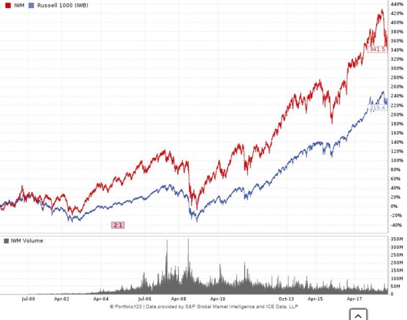
Price Performance 1 Month, Large-Cap (blue) vs. Small-Cap (red)

Portfolio Comparison (Large- vs. Small-Cap)
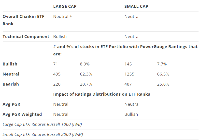
What we see in the long-term price chart is consistent with what academicians such as Eugene Fama and Kenneth French refer to as a “small cap effect,” a perennial tendency of the part of smaller issues to outperform larger-cap stocks. I don’t buy into that notion and instead, see small-cap as more likely to outperform during times when investors are optimistic and more tolerant of risk. (Smaller issues, by virtue of less diverse business profiles and subject to greater burdens from fixed costs, tend to have more volatile earnings streams, a trait that is cherished during boom times but feared when things turn sluggish).
The period covered by the long-term chart was dominated by good times. We had some recessions, but we came roaring back so, for the much of the time, risky companies with volatile earnings streams were prized for the upside potential they offered, and given good times, in many cases achieved.
However, the most recent month, along with the Portfolio Comparison table, suggests large-cap now holds a modest lead; a very very modest lead, but a lead nonetheless. Is this something about which we should be concerned? If this turns out to be the only red flag we see, I’d say no. Id’ say to treat it as an aberration. But instead of locking in on that conclusion, let’s continue.
VALUE VERSUS GROWTH
Price Performance Since Jan. 1999, Value (blue) vs. Growth (red)

Price Performance 1 Month, Value (blue) vs. Growth (red)

To this point, it seems easy to say Value beats Growth and move along to something else. But look again — squint — at the long-term chart. There is something to be said for the long-term superiority of Value, but might Growth have been stronger than usual for a hefty chunk of the recent past? It does seem as if the angle of the red line’s ascent might be steeper than that of the blue since 2008. Let’s check a closeup of the last two years.
Price Performance 2 Years, Value (blue) vs. Growth (red)

Yes, there it is. We see that Growth has, of late, been uncharacteristically hot relative to value. Others say it in terms of value being out of favor. It looks, however, as if Growth’s superiority-phase has started to unravel.
Portfolio Comparison (Growth vs. Value)
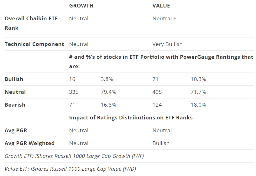
Value’s comeback is also evident in the portfolio comparisons. The Value ETF is ranked modestly higher than Growth (Neutral + versus Neutral). We see this strength reflects modestly better ratings for portfolio positions, especially when we factor portfolio weightings into the analysis and much more Technical strength. The latter is driven by the investment community, attitudes; reaction to news that is out there and expectations for the future.
This isn’t enough to allow us to say the market now hates Growth. But it does seem to have gone back to a tendency to be less trusting of growth stories.
MOMENTUM VERSUS LOW VOLATILITY
Price Performance Since Jan. 1999, Minimum Volatility (blue) vs. Momentum (red)

Price Performance 1 Month, Minimum Volatility (blue) vs. Momentum (red)

Portfolio Comparison (Momentum vs. Low Volatility)
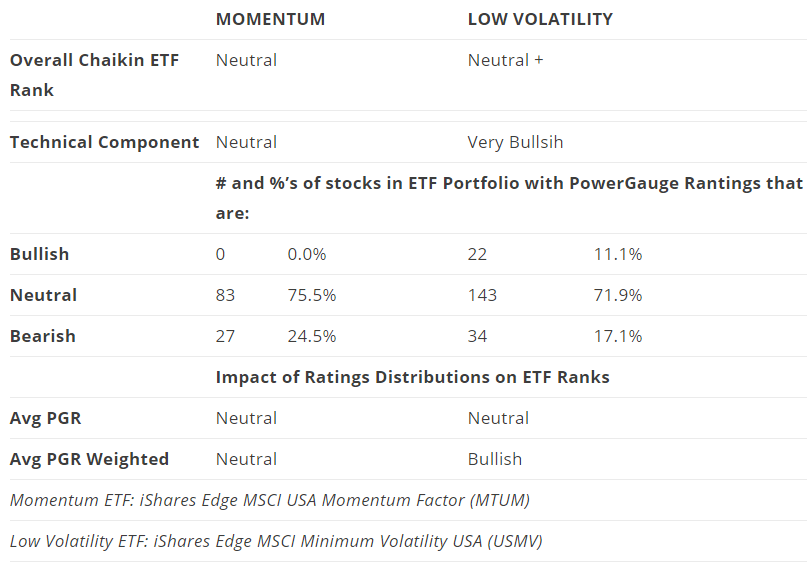
The situation here is straightforward. Normally, Momentum and Low Volatility have moved together more or less neck and neck with each taking turns in the leadership position. But there were three occasions when Momentum pulled significantly ahead; in and around the turn-of-the-century dot-com boom; leading up to 2008 and after 2016. The first two Momentum pull-aways proved very short-lived, however, and wound up vigorously correcting. The same thing is happening right now — we’re seeing a harsh correction that’s been nullifying an especially brisk Momentum surge. Much of this can be seen anecdotally, in the FANG-stock experience.
The Portfolio Composition Table uncovers some of the underlying elements of the correction. The grass-roots advantage for Low Volatility is significant, with 11.1% of that ETF’s portfolio having Bullish Power Gauge ratings versus none for the Momentum ETF. We also see that stronger LowVol ratings were skewed toward larger portfolio holdings. Stand-alone Technical ratings give LowVol a noteworthy advantage.
Yet through it all, the Overall ETF ranks are not far apart. Something, obviously, is neutralizing the Technical Rank and preventing it from producing a substantially higher Overall rank. That suggests that within the rank-distribution tallies, stock-specific numeric Power Gauge scores may be skewing higher in the Momentum model. (In other words, for example, Momentum stocks may have higher numeric scores within the Neutral category and LowVol stocks may rate lower within that same Neutral range.
Don’t fret if you don’t follow the details of the preceding paragraph. Suffice it to say that in non-technical matters (by the way, Technical is also a component of Power Gauge), there are probably “better” companies in the Momentum portfolio.
The upshot here is that the higher risk group of companies still seems to be fine for the most part. The problem — and we’ve seen this sort of thing before — is that too many of them got too far ahead of rational investment considerations. (Again, see, e.g., the FANG group.) That suggests the correction we’re seeing is actually a healthy thing, not a precursor of stock-market doom.
CONSUMER STAPLES VERSUS CONSUMER DURABLES
Price Performance Since Jan. 1999, Consumer Staples (blue) vs. Discretionary (red)

Price Performance 1 Month, Consumer Staples (blue) vs. Discretionary (red)

Portfolio Comparison (Consumer Discretionary vs. Staples)
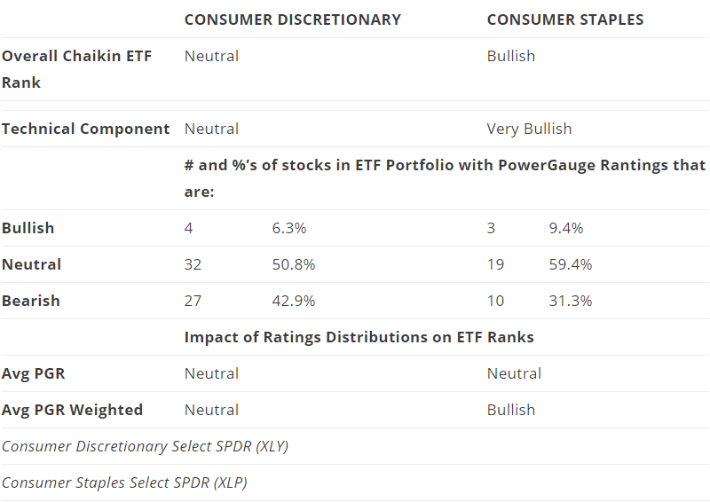
This comparison looks a lot like the one we saw with Momentum and LowVol, except that Consumer Discretionary (the more cyclical sector) enjoyed greater long-term relative strength. That’s to be expected in times of strong economic growth, which was the case for most of the sample period. But here again, as with Momentum (and there may well be overlap in the portfolios), the stocks may have gotten a bit ahead of themselves (note the acceleration visible in the long-term chart just before the last peak) relative to their less-cyclical Staples cousins. As with the Momentum situation, the Portfolio Composition table suggests much of the ongoing correction is Technical in nature. And again, this correction we’re experiencing is unpleasant, irritating, and downright painful, but probably healthy.
One difference is in the distribution of Power Gauge ratings within the ETFs. Ratings for holdings in both portfolios, especially Discretionary, are more bottom-heavy than what we saw with Momentum and Low Vol. There may be a message here that while business conditions are generally O.K., Mr. Market may be tapping the brakes lightly with regard to expectations, something that may reflect Trade War uncertainty (many things purchased by consumers use materials that may be subjected to tariffs, which are not to be paid by China but by U.S. companies likely to pass them on in whole or in part to customers) and higher interest rates although to a tiny extent (Housing, the most rate-sensitive area, is not part of either Consumer sector — but furniture etc. is vulnerable).
DIVIDEND YIELD VERSUS DIVIDEND GROWTH
Price Performance Since Jan. 1999, Dividend Yield (blue) vs. Dividend Growth (red)

Price Performance 2 Years, Dividend Yield (blue) vs. Dividend Growth (red)

Price Performance 1 Month, Dividend Yield (blue) vs. Dividend Growth (red)

Portfolio Comparison (Dividend Yield vs. Growth)
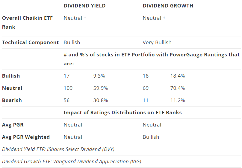
Although the two equity-income ETFs moved pretty much together in the past month, we see that over the long term, the Dividend Growth ETF has outperformed. Note that on Portfolio123, the source of the price charts, prices are adjusted to include the impact of dividends, so they really show “total return.” Hence one cannot assume the lesser price gains from the yield-oriented fund were made worthwhile by the superior yield.
The question is whether the observed superiority of Dividend Growth, also reflected today in the ETF Rank comparisons (the Overall Ranks are identical, at Neutral+, but when we drill down to look at the rank components, it seems reasonable to conclude that it would not take much change in one or more components to give Dividend Growth and edge (whether through an increase in its overall rank or a softening of the rank for the Yield fund).
A potential explanation would relate to expectations of continuing economic strength (which could logically be expected to spark better profit growth and, hence, better dividend growth). But other comparisons discussed above suggest a bit more caution on the part of Mr. Market. It may well be the case that the level of investor optimism faces a lower hurdle when it comes to choosing between Dividend Growth versus Yield than we encounter elsewhere, such as with Growth or Momentum.
Putting It All Together
The constellation of signals from this set of benchmark ETF comparisons points to a change in tone from what we have in the recent past seen in the market. Actually, however, we knew that just by watching the market — the change in tone was too obvious (and painful) to require much if any, analysis.
Less obvious is the nature of the change. We can see from the foregoing that we are not entering into a “new normal.” What we’re actually doing is moving away from an aberrant exceptional period back toward business as usual.
Business, as usual, is not always pretty. It does, at times, include recessions. But assuming the Trade War doesn’t escalate too far, I’m not seeing the sort of excesses in the system that tend to send the economy over the edge. I’m not alarmed by rising wages or even interest rates (from the incredibly low trough). Higher wages puts money into the hands of consumers and consumers still are the ones who primarily drive GDP. Might inflation rise? Sure. But there’s no law that says we need zero. Even the direst of today’s inflation forecasts are far below what anyone would have dared dream of back when back when former President Ford proposed that we all wear WIN (Whip Inflation Now!) buttons.
More than recessions, business, as usual, includes a lot of articles forecasting recession (wrong though they may be, they attract lots of clicks and viewership, hence ad revenue for news organizations). Ditto for other nasty headlines ranging from newsworthy (e.g., housing starts don’t always rise, new unemployment claims rise in a such-and-such month) to fanciful (use your imagination). So don’t look for emotional comfort. That’s never going to happen.
The message I’m getting from the foregoing is that the loudest and perhaps most inebriated attendees at the Wall Street party are leaving and it looks like the hosts are preventing them from stumbling their way back inside.

But among the more sensible folks who remain, while they can’t laugh anymore at beer guzzlers (yes, FANG et. al., you know who you are) throwing up on the rugs (nor will they enjoy the sort of tax-cut-pumped earnings comparisons they’d been seeing), they are likely to be able to calm down, enjoy good company and good conversation.
I’m sticking with what I said on October 12th: Stay in stocks but cut back on risk. (Or tell the D.J. to stop playing House tracks and instead, lower the volume and play some Vivaldi.)
Disclosure: None.


