
A Perspective On Secular Bull And Bear Markets - Thursday, July 2
Was the March 2009 low the end of a secular bear market and the beginning of a secular bull? Are we in the beginning stages of another secular bear?
Let's examine the past to broaden our understanding of the range of historical trends in market performance. An obvious feature of this inflation-adjusted series is the pattern of long-term alternations between uptrends and downtrends. Market historians call these "secular" bull and bear markets from the Latin word saeculum "long period of time" (in contrast to aeternus "eternal" — the type of bull market we fantasize about).
We've added the recent major downturn as a potential new secular bear and the February S&P 500 market top. Time will tell if this is in fact a secular bull, but note that the market is still at very high levels.

The keyword on the chart above is secular. The implicit rule we're following is that blue shows secular trends that lead to new all-time real highs. Periods in between are secular bear markets, regardless of their cyclical rallies. For example, the rally from 1932 to 1937, despite its strength, remains a cycle in a secular bear market. At its peak in 1937, the index was 29% below the real all-time high of 1929. For a scholarly study of secular bear markets, which highlights the same key turning points, see Russell Napier's Anatomy of the Bear: Lessons from Wall Street's Four Great Bottoms.
An alternate view of secular trends is offered by Ed Easterling of Crestmont Research. See his fascinating study Understanding Secular Stock Market Cycles, which makes a persuasive case that we remain in a bear market that began in 2000. The underlying principle, in Easterling's view, is the price/earnings ratio, which remains lofty. Ed maintains that even with the lofty market highs, this has been the best cyclical bull inside of a secular bear.
If we study the data underlying the chart, we can extract a number of interesting facts about these secular patterns (note that the table below includes the 1932-1937 rally):
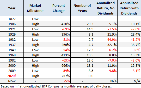
Since that first trough in 1877 to the March 2009 low:
- Secular bull gains totaled 2075% for an average of 415%.
- Secular bear losses totaled -329% for an average of -65%.
- Secular bull years total 80 versus 52 for the bears, a 60:40 ratio.
This last bullet probably comes as a surprise to many people. The finance industry and media have conditioned us to view every dip as a buying opportunity. If we realize that bear markets have accounted for about 40% of the highlighted time frame, we can better understand the two massive selloffs of the 21st century.
Add a Regression Trend Line
Let's review the same chart, this time with a regression trend line through the data.
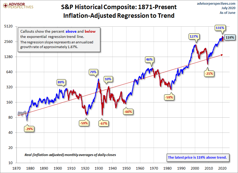
This line is a "best fit" that essentially divides the monthly values so that the total distance of the data points above the line equals the total distance below.
The chart below creates a channel for the S&P Composite. The two dotted lines have the same slope as the regression, as calculated in Excel, with the top of the channel based on the peak of the Tech Bubble and the low is based on the 1932 trough.

Historically, regression to trend often means overshooting to the other side. The latest monthly average of daily closes is 119% above trend, which is why we hesitate to call this a new secular bear.
Note that in the charts above, we've color-coded the rally since the 2009 low in blue, implying the start of a secular bull. We did so because, in December of 2011, the real price achieved a new all-time high. But based on the underlying market valuation, one can make a strong case that the secular bear market hasn't ended. For a persuasive argument along those lines, see Ed Easterling's Are We There Yet? Secular Stock Market Cycle Status (PDF format) and/or contact Bob Bronson of Bronson Capital Markets Research.
For a more optimistic view, see Chris Puplava's assertion in The Secular Bear Market in Stocks Is Over. Chris's commentary includes some interesting demographic analysis based on the ratio of the higher-earning, bigger spending age 35-49 cohort to less financially empowered age 20-34 cohort. Unfortunately, this ratio is being savagely trumped by a far more powerful demographic shift: The ratio of the elderly (65 and over) to the peak earning cohort (age 45-54). The next chart, based on Census Bureau historical data and mid-year population forecasts to 2060, illustrates this rather amazing shift.
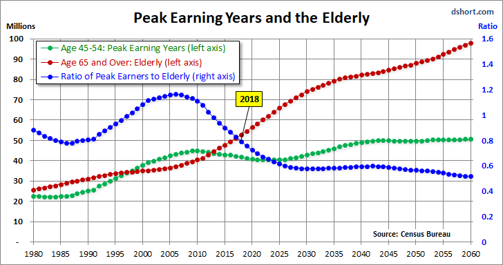
In the chart above, the elderly cohort (red series) is dramatically increasing in numbers. The ratio of the two, the blue line in the chart, peaked in 2007 and began its long rollover in 2008, coincident with the beginning of the last recession. We have many years to go before this ratio approximately levels out around 2030.
Even more disturbing is the elderly dependency ratio, the label given by demographers to the ratio of the 65 and older population to the productive workforce, which for developed economies is usually identified as ages 20-64. The next chart illustrates the elderly dependency ratio with Census Bureau forecasts to 2060. Note that in this chart we've followed the general practice in demographic research of multiplying the percent by 100 (e.g., the estimated mid-year 2016 elderly dependency ratio is 25.7% x 100 = 25.7).
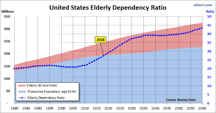
As the chart painfully illustrates, the elderly dependency ratio is in the early stages of a relentless rise that doesn't hit an interim peak until around 2036, over eighteen years from now.
Notes: This commentary focuses on price rather than total return. For a perspective on Total Returns across this timeline, see our periodically updated Total Return Roller Coaster.
For readers unfamiliar with the S&P Composite Index (a splice of historical data different from the S&P Composite 1500), see this article for an explanation.
The S&P 500 closing high in 2000 was on March 24th. But the peak for monthly averages of daily closes was in August of 2000. Similarly, the closing high for the current cycle was on February 19, 2020, while the peak for monthly averages of daily closes was in February 2020.


