
A Closer Look At Today's ADP Employment Report - Wednesday, Jan. 30
In this morning's ADP employment report we got the January estimate of 213K new nonfarm private employment jobs from ADP, a decrease over December's revised 263K. The popular spin on this indicator is as a preview of the monthly jobs report from the Bureau of Labor Statistics. But the ADP report includes a wealth of information that's worth exploring in more detail.
Here is a snapshot of the monthly change in the ADP headline number since the company's earliest published data in April 2002. This is quite a volatile series, so we've plotted the monthly data points as dots along with a six-month moving average, which gives us a clearer sense of the trend.

As we see in the chart above, the trend peaked 20 months before the last recession and went negative around the time that the NBER subsequently declared as the recession start. At present, the six-month moving average has been hovering in a relatively narrow range around 200K new jobs since around the middle of 2011.
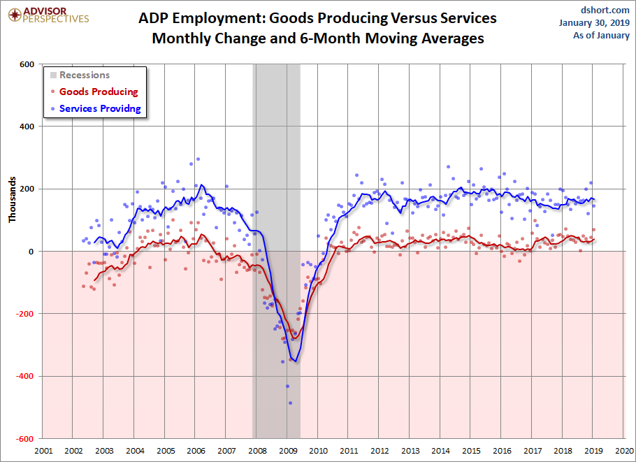
ADP also gives us a breakdown of Total Nonfarm Private Employment into two categories: Goods Producing and Services. Here is the same chart style illustrating the two. The US is predominantly a services economy, so it comes as no surprise that Services employment has shown stronger jobs growth. The trend in Goods Producing jobs went negative over a year before the last recession. Interestingly, the Goods Producing jobs saw an uptick in late 2016 that has continued.
For a sense of the relative size of Services over Goods Producing employment, the next chart shows the percentage of Services Jobs across the entire series. The latest data point is just fractionally below the record high.
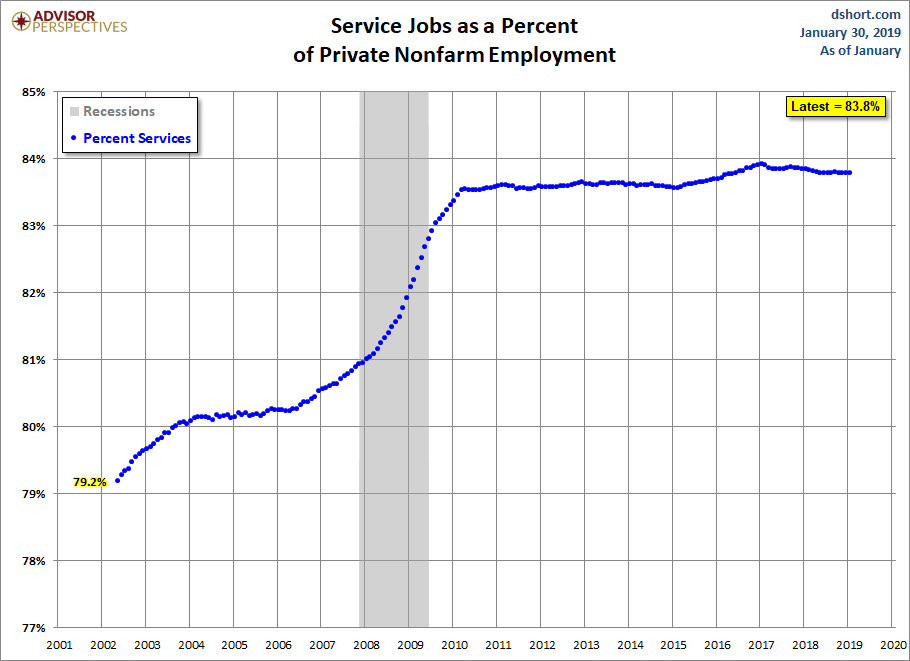
There are a number of factors behind this trend. In addition to our increasing dependence of Services, Goods Production employment continues to be impacted by automation and offshoring. The percentage in the chart above began decreasing in early 2015 with no true bounceback since.
For a better sense of the components of the two Goods Producing and Service Providing cohorts, here is a snapshot of the five select industries tracked by ADP. The two things to note here are the relative sizes of the industries and the relative trends. Note that Construction and Manufacturing are Production industries whereas the other three are Service Providing.

Another view of the relative trends of the five select industries is an overlay of the year-over-year comparison.

For a longer-term perspective on the Goods Producing and Service Providing employment, see our monthly analysis, Secular Trends in Employment: Goods Producing Versus Services Providing, which is based on data from the Department of Labor's monthly jobs report reaching back to 1939.


