
9 Charts On Quantitative Tightening
Quantitative tightening has been running at full speed for almost 5 months now (and for a total period of 17 months since commencing in October 2017), and with QT finally coming front of mind for investors I thought it would be a good idea to update some of the charts from my previous "8 Charts on Quantitative Tightening" article (as well as a couple of new charts and indicators).
It's also very timely to revisit this topic as the Fed has begun to get distinctly cold feet on rate hikes and QT (quantitative tightening, aka "balance sheet normalization" or "balance sheet runoff"), and speculation is growing that QT1 may get put on ice as the Fed approaches its apparent deemed 'neutral balance sheet level' (my term - borrowing from the neutral Fed funds interest rate level concept), or as Fed Chair Powell mentioned, the "normal balance sheet".
Indeed, as Powell also noted: "The Committee is now well along in our discussions of a plan to conclude balance sheet runoff later this year. Once balance sheet runoff ends, we may, if appropriate, hold the size of the balance sheet constant for a time to allow reserves to very gradually decline to the desired level as other liabilities, such as currency, increase. We expect to announce further details of this plan reasonably soon."
In addition to this, the Fed has broadly communicated and acknowledged that the balance sheet will remain an important tool of monetary policy (albeit with a back seat to the Fed funds rate). Hence while we may be near the end of QT1, it's not out of the question that we wont someday encounter a QT2. For now though, here's some QT charts to think about...
The key takeaways on the state of quantitative tightening (or QT) are:
-QT is running at a total maximum monthly pace of US$50B and so far the Fed has reduced its total assets by almost US$500B and holdings of treasuries by almost $300B.
-The Fed is approaching what it deems the "normal balance sheet" level where it will cease QT.
-Market impacts of QT have arguably been wide-reaching, adverse, and still in progress.
-QT had previously been a neglected/forgotten issue, but this changed very quickly.
-Global central bank balance sheet movements have arguably had a significant impact on global growth and asset markets, and remain front of mind as the global growth slowdown continues.
-(and therefore) A global policy pivot may be on the cards.
1. US Fed Balance Sheet Normalization Plan: The US Federal Reserve is steadily progressing with its "balance sheet normalization plans", and is now running QT at a maximum monthly pace of US$50B (which compares to the peak pace of Quantitative Easing, or QE, of $85B during QE3). The chart below shows the actual and projected paths (*all going to plan).

2. Quantitative Tightening Tracker: The next chart shows the cumulative amount of quantitative tightening undertaken since its commencement in October 2017. Total Fed assets have declined by almost US$500B and holdings of treasuries have fallen by almost $300B. Whether you want to talk the flow ($50B per month) or the stock, the numbers are truly getting meaningful now.

3. Fed Balance Sheet % GDP: And here's another angle on it, this chart shows the Fed balance sheet or total assets vs US GDP. Expressed as a percentage of GDP the figure is going to decline as GDP rises, but you can see the marked acceleration of decline when QT commenced late 2017. The red dashed line shows the latest reading (19.1% vs the peak 25.6% of GDP), which is the lowest reading since Q1 2013, and on this particular lens you could say that QE3 has been completely unwound now.

4. Google Search Trends - Quantitative Tightening: I mentioned last year that people had been underestimating the potential impact of QT and had all but forgotten that it was progressing at a steady pace in the background... but shortly after being ratcheted up to the maximum pace of $50B/month in November 2018, a 20% correction in the S&P 500 helped focus attention squarely and intently on this issue as evidenced in the spike in Google search interest.

5. Fed QT vs the S&P 500: This next chart shows how the S&P 500 has traded as the Fed began "balance sheet normalization" - if you think balance sheet normalization is not tightening then this chart should prompt some contemplation and reflection. Basically, if quantitative easing is a tool for easing financial conditions and supporting the economy then it stands to reason that quantitative tightening should operate in the opposite direction.

6. US Treasuries vs Quantitative Tightening: The bond market likewise had a reaction to the commencement of quantitative tightening, but apparently was quicker to react. While there are many more other factors (e.g. growth and inflation trends and outlook), you could make the case that the move in bond yields since December amounts to an effective pricing-in of a Fed pause on balance sheet normalization. And with chart 3 (balance sheet vs GDP) showing significant unwind, maybe they are on to something!

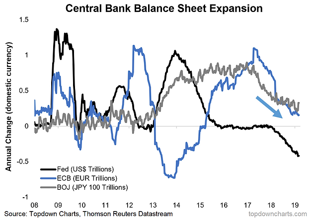
7. Big 3 QE Balance Sheets: Moving on from the Fed to the rest of the world, the ECB and BOJ had been steadily progressing with their official and stealth taper plans respectively. But in both respects there has been a shift to the dovish side as the global growth outlook has dimmed. It's too soon to call for the ECB to restart QE but it has announced further TLTROs, and the BOJ retains a flexible approach meaning it could ramp up purchases at any time.
8. Global Shadow Policy Rates: And after all, it's probably only logical to expect global growth and at least global markets to experience some indigestion as the composite monetary policy rate for developed markets has gone up 90bps at a headline/nominal basis, and more notably; +200bps when you substitute in shadow policy rates (i.e. monetary policy interest rates which have been adjusted for the impact of quantitative easing). But one thing the shadow composite policy rate shows is that there may be something to my "global policy pivot" theory, as it has already declined 37bps since peaking in November. Watch this space.

9. Global Equities vs Global Central Bank Balance Sheets: Final chart is a new tactical allocation indicator I developed for global equities based on the expansion/contraction of G3 central bank balance sheets (Fed/ECB/BOJ). This chart makes it clear how the monetary thrust in 2016 helped drive the new bull market, and the subsequent shrinking in 2017/18 was a major contributor to the global equity market correction. This chart is going to be useful in the coming months to help determine whether global monetary policy will remain a headwind to global risk assets, or whether a policy pivot will drive a new 'extend and pretend' bull market.

For more and deeper insights on the global markets, good charts, and actionable investment ideas you may want to more


