
1Q16 Sector Ratings For ETFs & Mutual Funds
At the beginning of the first quarter of 2016, only the Consumer Staples sector earns an Attractive-or-better rating. Our sector ratings are based on the aggregation of our fund ratings for every ETF and mutual fund in each sector. See last quarter’s Sector Ratings here.
Investors looking for sector funds that hold quality stocks should look no further than the Consumer Staples or Information Technology sectors. These sectors house the most Attractive-or-better rated funds with the most assets. Figures 4 through 7 provide more details. The primary driver behind an Attractive fund rating is good portfolio management, or good stock picking, with low total annual costs.
Attractive-or-better ratings do not always correlate with Attractive-or-better total annual costs. This fact underscores that (1) cheap funds can dupe investors and (2) investors should invest only in funds with good stocks and low fees.
See Figures 4 through 13 for a detailed breakdown of ratings distributions by sector. See our ETF & mutual fund screener for rankings, ratings and reports on 7000+ mutual funds and 400+ ETFs. Our fund rating methodology is detailed here.
All of our reports on the best & worst ETFs and mutual funds in every sector are available here.
Figure 1: Ratings For All Sectors
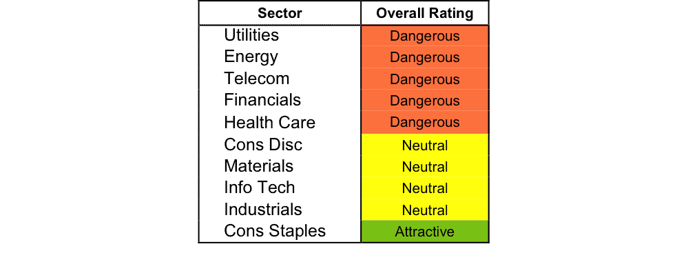
Source: New Constructs, LLC and company filings
To earn an Attractive-or-better Predictive Rating, an ETF or mutual fund must have high-quality holdings and low costs. Only the top 30% of all ETFs and mutual funds earn our Attractive or better ratings.
State Street Select Sector SPDR Trust: Consumer Staples (XLP) is the top rated Consumer Staples fund. It gets our Very Attractive rating by allocating over 37% of its value to Attractive-or-better-rated stocks.
Proctor & Gamble (PG: $78/share) is one of our favorite stocks held by XLP and earns our Attractive rating. Over the past decade, Proctor & Gamble, one of the largest consumer goods companies in the world, has grown after-tax profit (NOPAT) by 6% compounded annually over the past decade. Since 2008, PG has maintained a double-digit return on invested capital (ROIC) and currently earns a 12% ROIC. In spite of declining revenues, Proctor & Gamble has generated a cumulative $64 billion in free cash flow over the past five years alone. Best of all, PG shares remain undervalued. At its current price of $78/share, PG has a price to economic book value (PEBV) ratio of 1.1. This ratio means the market expects Proctor & Gamble to grow NOPAT by only 10% over its remaining corporate life. However, if the company can grow NOPAT by just 3% compounded annually for the next decade, shares are worth $91/share today – a 17% upside.
ICON Utilities Fund (ICTVX) is the worst Utilities fund. It gets our Very Dangerous rating by allocating over 66% of its value to Dangerous-or-worse-rated stocks. Making matters worse, it charges investors annual costs of 4.72%.
American Electric Power (AEP: $58/share) is one of our least favorite stocks held by ICTVX and earns our Dangerous rating. AEP’s capital-intensive business has destroyed shareholder value for many years. In fact, American Electric Power’s invested capital has expanded from $37 billion in 2004 to $61 billion on a trailing twelve-month basis while its economic earnings have been negative in every year of our model, which dates back to 1998. The company currently earns a bottom quintile ROIC of only 4%. Despite the poor economics of this business, AEP’s valuation is already baking in significant profit growth. To justify its current price of $58/share, AEP must grow NOPAT by 8% compounded annually for the next 12 years. This expectation seems highly unlikely given AEP’s long history of destroying shareholder value.
Figure 2 shows the distribution of our Predictive Ratings for all sector ETFs and mutual funds.
Figure 2: Distribution of ETFs & Mutual Funds (Assets and Count) by Predictive Rating
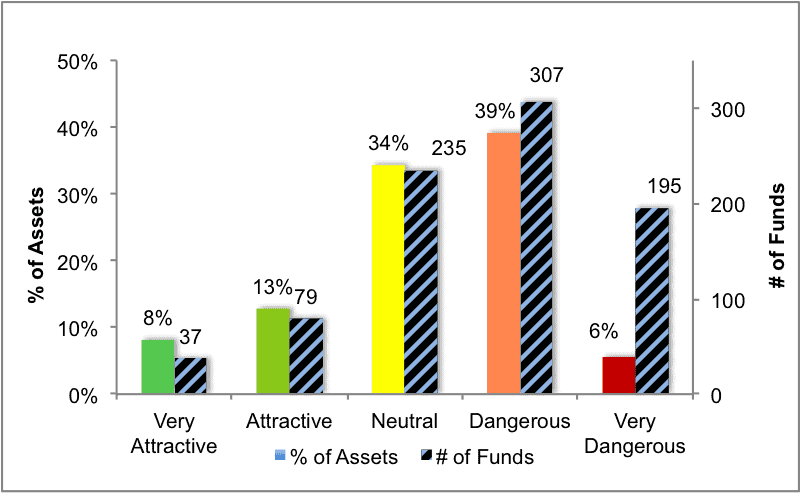
Source: New Constructs, LLC and company filings
Figure 3 offers additional details on the quality of the sector funds. Note that the average total annual cost of Very Dangerous funds is almost 10 times that of Very Attractive funds.
Figure 3: Predictive Rating Distribution Stats
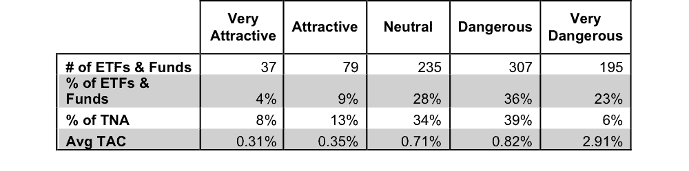
* Avg TAC = Weighted Average Total Annual Costs
Source: New Constructs, LLC and company filings
This table shows that only the best of the best funds get our Very Attractive Rating: they must hold good stocks AND have low costs. Investors deserve to have the best of both and we are here to give it to them.
Ratings by Sector
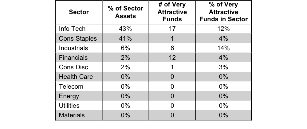
Figure 4 presents a mapping of Very Attractive funds by sector. The chart shows the number of Very Attractive funds in each sector and the percentage of assets in each sector allocated to funds that are rated Very Attractive.
Figure 4: Very Attractive ETFs & Mutual Funds by Sector
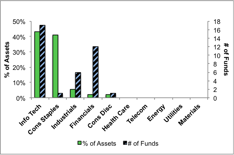
Source: New Constructs, LLC and company filings
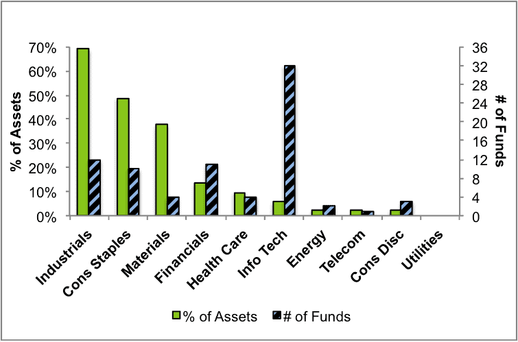
Figure 5 presents the data charted in Figure 4.
Figure 5: Very Attractive ETFs & Mutual Funds by Sector
Source: New Constructs, LLC and company filings
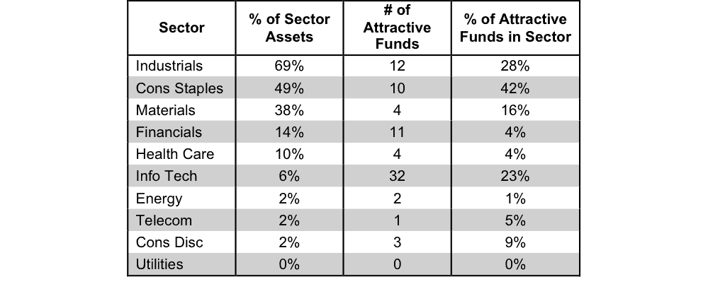
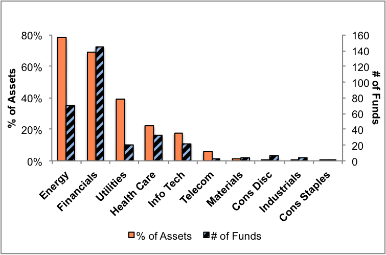
Figure 6 presents a mapping of Attractive funds by sector. The chart shows the number of Attractive funds in each sector and the percentage of assets allocated to Attractive-rated funds in each sector.
Figure 6: Attractive ETFs & Mutual Funds by Sector
Source: New Constructs, LLC and company filings
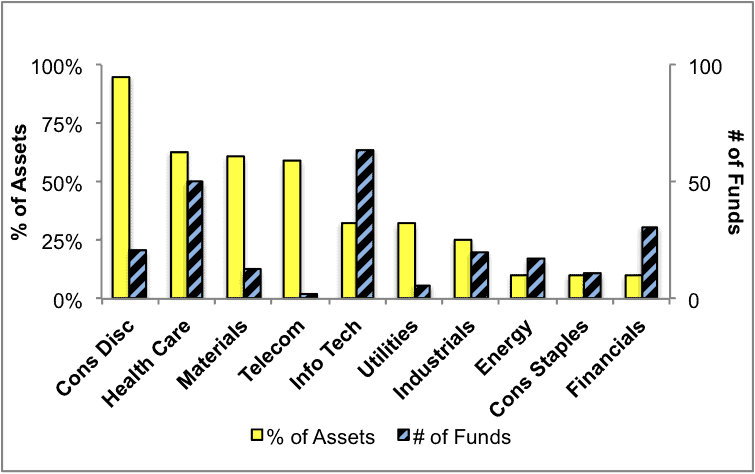
Figure 7 presents the data charted in Figure 6.
Figure 7: Attractive ETFs & Mutual Funds by Sector
Source: New Constructs, LLC and company filings
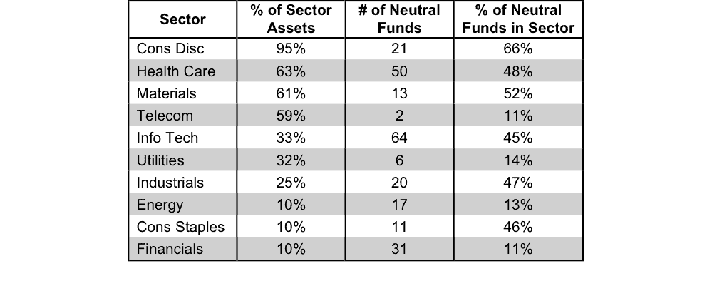
Figure 8 presents a mapping of Neutral funds by sector. The chart shows the number of Neutral funds in each sector and the percentage of assets allocated to Neutral-rated funds in each sector.
Figure 8: Neutral ETFs & Mutual Funds by Sector
Source: New Constructs, LLC and company filings
Figure 9 presents the data charted in Figure 8.
Figure 9: Neutral ETFs & Mutual Funds by Sector
Source: New Constructs, LLC and company filings
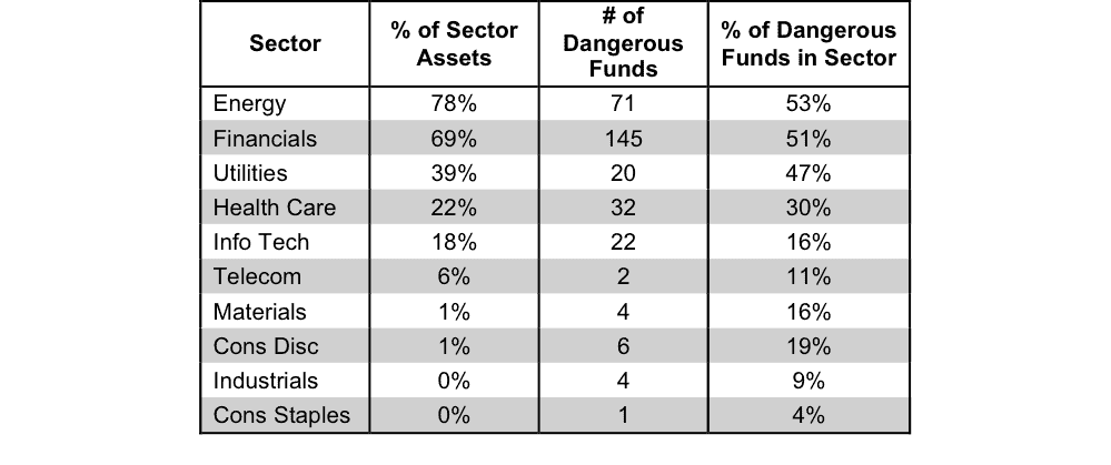
Figure 10 presents a mapping of Dangerous funds by fund sector. The chart shows the number of Dangerous funds in each sector and the percentage of assets allocated to Dangerous-rated funds in each sector.
The landscape of sector ETFs and mutual funds is littered with Dangerous funds. Investors in the Energy sector have put over 78% of their assets in Dangerous-rated funds.
Figure 10: Dangerous ETFs & Mutual Funds by Sector
Source: New Constructs, LLC and company filings
Figure 11 presents the data charted in Figure 10.
Figure 11: Dangerous ETFs & Mutual Funds by Sector
Source: New Constructs, LLC and company filings
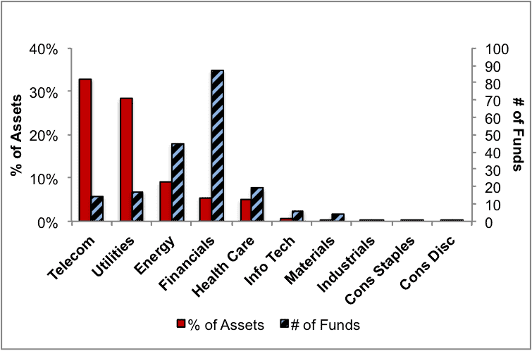
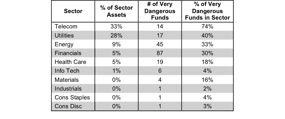
Figure 12 presents a mapping of Very Dangerous funds by fund sector. The chart shows the number of Very Dangerous funds in each sector and the percentage of assets in each sector allocated to funds that are rated Very Dangerous.
Figure 12: Very Dangerous ETFs & Mutual Funds by Sector
Source: New Constructs, LLC and company filings
Figure 13 presents the data charted in Figure 12.
Figure 13: Very Dangerous ETFs & Mutual Funds by Sector
Source: New Constructs, LLC and company filings
Disclosure: New Constructs staff receive no compensation to write about any specific stock, sector, or ...


