
Where Do We Go From Here?
The State of the Market
Long-time readers know that I'm a fan of historical market cycles. As the saying goes, history doesn't repeat exactly, but it often rhymes. And over the years, I've found this tends to the case in the stock market, more often than not.
To be clear, I am not suggesting that stocks follow historical patterns on a daily, weekly, or even monthly basis. Nor am I suggesting that one can look at history to figure out what is going to happen next in the stock market.
However, what I have learned about historical patterns is when the market is "in sync" with its cycles, a projection of where the market is headed - from a general trend perspective - can be a good tool. As in scary good. But at other times, well, not so much!
The bottom line for me is that the historical patterns can be useful in many ways. So much so that I incorporate the market's historical cycle projections over the next week, month, and three-months into my daily work.
To review, I follow a cycle composite created by Ned Davis Research Group. The composite is basically a mashup of the 1-year seasonal, the 4-year Presidential, and the 10-year decennial cycles going back to 1928.
So, without further ado, let's look at the cycle and its components and see what they tell us...
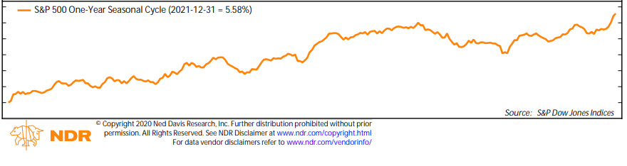
First up is the 1-year seasonal cycle for 2021. Remember, we are looking at these charts from a general directional standpoint, not on an absolute return basis.
Below is the seasonal cycle for the S&P 500 for all calendar years going back to early 1928.
(Click on image to enlarge)
* Source: Ned Davis Research
This chart alone makes a pretty good argument for investing in stocks. In short, history shows the stock market tends to rise during the vast majority of calendar years.
In looking at the historical trends, the S&P typically starts the year off in fine fashion, with some occasional pauses. Then there is a larger pause - or correction - around May as the market "catches its breath". Usually, the rally then continues until the "fall swoon." And after that, "year-end" rallies tend to ensue.
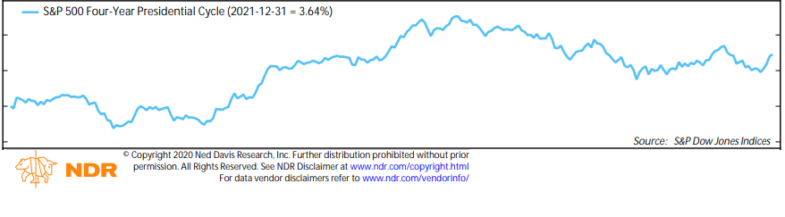
The next important cycle to review is the Presidential cycle. This is "a thing" because Presidents tend to follow a similar pattern in terms of when/how stuff gets done during their terms. This year is the first year of the Presidential cycle, where new Presidents want to keep the economy going. This is especially true this year.
(Click on image to enlarge)
* Source: Ned Davis Research
But eventually, the hope of new policies, which causes stocks to rise, tends to wear off in the first year of the Presidential cycle and stocks give back some of the hope-oriented gains.
One of my main big-picture concerns about the current market is stocks are "pulling forward" the expected gains in economic and earnings growth on the hope that we can return to normalcy in the coming quarters. More on this in a bit. But first, let's continue with the cycle work.
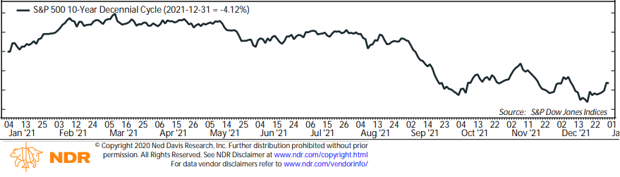
Next up is the 10-year decennial cycle. I.E. What happens to the stock market in years that end in 0, 1, 2, 3, etc. So, since 2021 ends in 1, we need to think back to 2011, 2001, 1991, 1981, and so on.
(Click on image to enlarge)
* Source: Ned Davis Research
Unfortunately, the stock market has had some tough times in calendar years ending in 1. 2011 was certainly challenging as the European Banking crisis was raging. In 2001, the tech bubble was bursting. And in 1991, I believe the economy was flirting with recession after the first Gulf War. As such, this pattern isn't exactly encouraging.
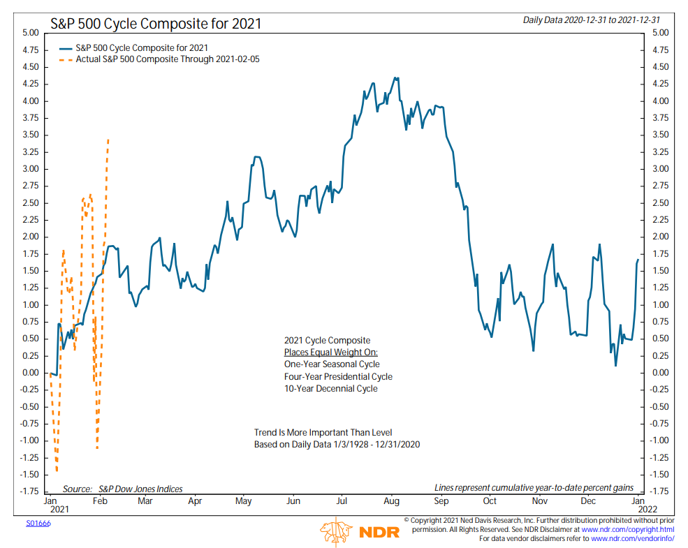
But again, history doesn't repeat and this is why I like the cycle composite concept as it blends multiple historical cycles together. Below is the mashup of the three historical cycles. The blue line is the cycle composite's projection and the orange dashed line is the actual movement of the S&P 500.
(Click on image to enlarge)
* Source: Ned Davis Research
If you blur your eyes and focus only on where the S&P closed Friday versus the projection, you may conclude that the market is largely "in sync" with history. However, it's been a volatile year and the path to this point has deviated quite a bit from the historical cycles.
My take is that the market is not really "in sync" with the cycle projection at this point. But I've also learned over the years that stocks tend to find their way back to their historical cycles at some point during the year. Therefore, I believe looking at the general trends of the cycle projections has merit.
So, although the cycle suggests that the ride is going to be bumpy, the general trend is projected to be higher into late summer. And then the cycles suggest a healthy correction will occur. For me, THIS is the primary takeaway - that we should expect a stiff correction at some point this year.
Looking at the macro picture, this certainly makes sense. Stocks are moving on the dueling stimuli being provided by the Fed and Washington. The key here is that historically, when money flows into the system, the economy, and in turn, stocks, tend to benefit.
However, my worry - which is a back-of-my-mind type of worry at this stage - is that stocks are "pulling forward" more growth than the economy can deliver. Remember, the current rally is based on the hope that the economy will recover fully, and that pent up demand will create a boom. To be sure, this makes a TON of sense and I too am on board with the concept.
But... With valuations stretched and everybody on the planet able to recite the bull case, I fear that Wall Street might overdo it to the upside (that never happens, right!), which could certainly set the stage for some sort of corrective phase.
My personal plan is to continue to stay seated on the bull train and enjoy the ride - buying the dips along the way. Yet at the same time, I am keeping my eye on where the exits are located - just in case things get out of hand.
Now let's turn to the state of my favorite big-picture market models...
The Big-Picture Market Models
There are no obvious changes to report on the Primary Cycle board this week. However, I will note that the historical return of the S&P 500 given the current readings of the models has improved to 17.04% from 12.7%. This is largely due to an uptick in our Intermediate-Term Market Model, which measures the percentage of sub-industries that are "technically healthy." As I've been saying for some time, the state of the Primary Cycle Models suggests that we stay seated on the bull train.
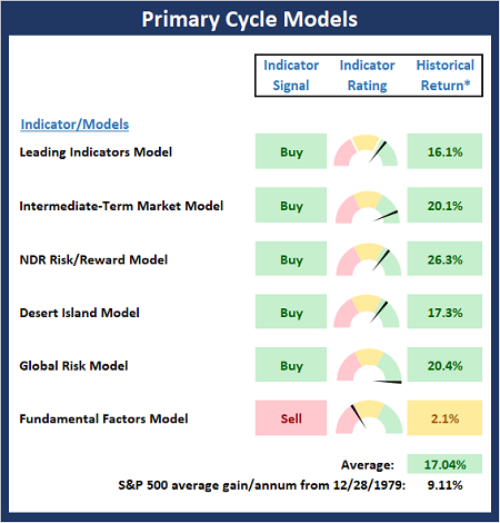
* Source: Ned Davis Research (NDR) as of the date of publication. Historical returns are hypothetical average annual performances calculated by NDR.
Fundamental Factor Models
There are no changes to the Fundamental board again this week. Although using Fundamental indicators/models for timing/trading purposes is never a good idea, my take from the Fundamental board is that risk environment is elevated.
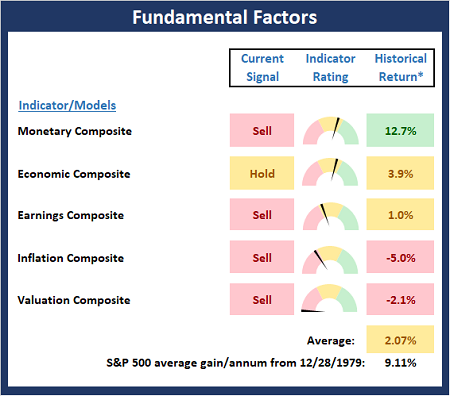
* Source: Ned Davis Research (NDR) as of the date of publication. Historical returns are hypothetical average annual performances calculated by NDR.
"Primary" Cycle History
I have found that checking in on state of the cycles and the weekly/monthly charts helps to keep the big-picture in perspective.
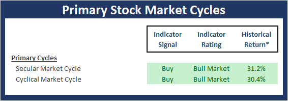
* Source: Ned Davis Research (NDR) as of the date of publication. Historical returns are hypothetical average annual performances calculated by NDR.
The Secular Market Cycle
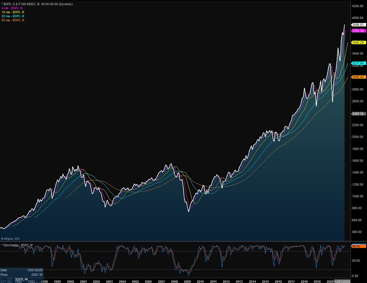
Below is a monthly chart of the S&P 500 Index illustrating the current cycle, which we estimate began on March 9, 2009.
S&P 500 - Monthly
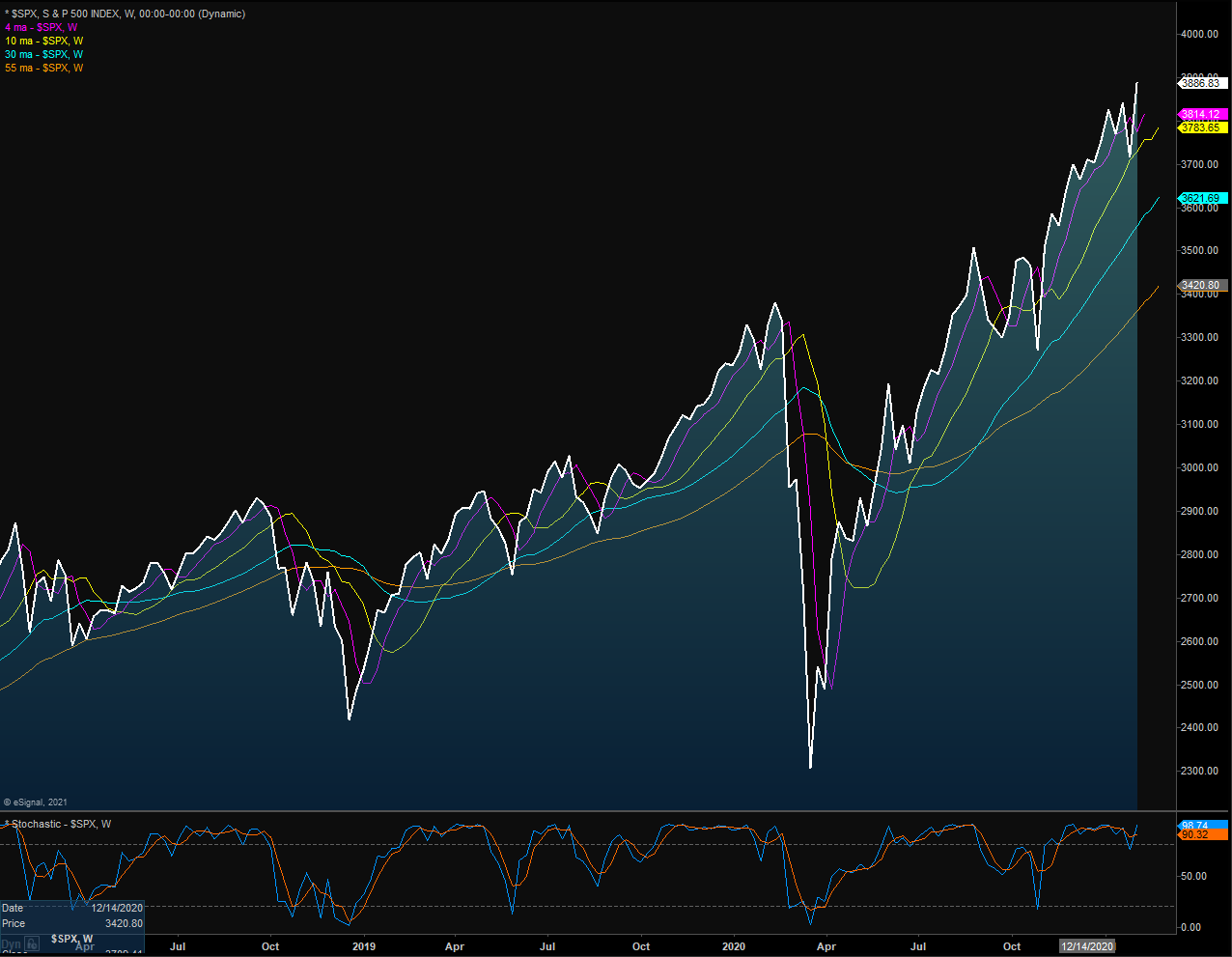
The Cyclical Market Cycle
Below is a weekly chart of the S&P 500 illustrating the current cycle, which we estimate began on March 24, 2020.
S&P 500 - Weekly
(Click on image to enlarge)
The opinions and forecasts expressed herein are those of Mr. David Moenning and may not actually come to pass. Mr. Moenning's opinions and viewpoints regarding the future of the markets should ...
more

