
Weekly Market Outlook – The Bears Are Testing The Waters (For Good Reason)
We warned you a week ago that the weight of the recent gains was starting to wear down the buying and buyers. We saw the impact of that reality last week, in the form of a 1.5% pullback from the S&P 500. It's possible that's all the break and breather the rally needed. Realistically speaking though, given how overbought stocks are, last week's lull may be a glimpse of more profit-taking to come.
That's not necessarily an omen of a new bear market. There's room for more selling that won't break the bigger-picture bullishness. There's a ton of technical support for miles below where the indices currently rest. Still, there's enough room for a "reset" that it could rattle bullish positions that had seemed relatively well-defended.
We'll take a detailed look at the budding breakdown below. First, let's recap last week's big economic news and preview what's in the cards for this week.
Economic Data Analysis
Last week was a big one in terms of economic news, as measured by the amount of data, but more importantly, as measured by the importance of the data.
Inflation data was part of the mix, and it was mostly encouraging. We expected a little of it, and we only got a little of it. It's healthy, but not overwhelming --particularly considering the amount of cheap money that's currently in circulation.
The annualized consumer inflation rate now stands at 1.4%, or 1.6% when not counting food and energy costs. Both are below the Fed's target level of 2.0%. Producers (factories, assembly plants, etc.) are also seeing tame inflation.
Consumer, Producer Inflation Charts
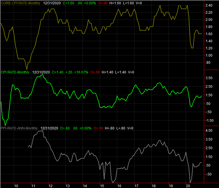
Source: Bureau of Labor Statistics, TradeStation
Of course, inflation may be tame largely because consumer demand is decidedly down.
Keep things in perspective. We're in an unprecedented time, and November's retail spending was oddly high. Moreover, economist were largely expected December's retail consumption to be lower, partly because of the logistical hurdles of making purchases, and partly because the pandemic has claimed jobs.
Still, we don't like to see retail sales (not counting automobile sales) fall 1.4% from November's adjusted level. They were still up about 1% year-over-year for last month, but that's not the kind of growth we've been accustomed to seeing in spite of the crimped environment.
Retail Spending Charts
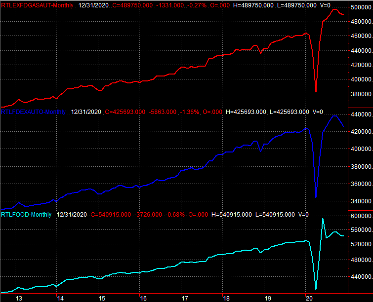
Source: Census Bureau, TradeStation
Nevertheless, the nation's factories, packagers, assemblers, and producers were busy last month, and busier than expected; things were just cheaper for them to build and deliver. The utilization rate of the country's industrial capacity improved to 74.5%, which is the highest reading since February, right before the pandemic materialized within the U.S. Industrial productivity improved to its highest levels since February.
Capacity Utilization and Industrial Productivity Charts

Source: Federal Reserve, TradeStation
These are strong indications that the economy is getting back on track, even if it's dented and dinged. Everything else is on the grid.
Economic Report Calendar
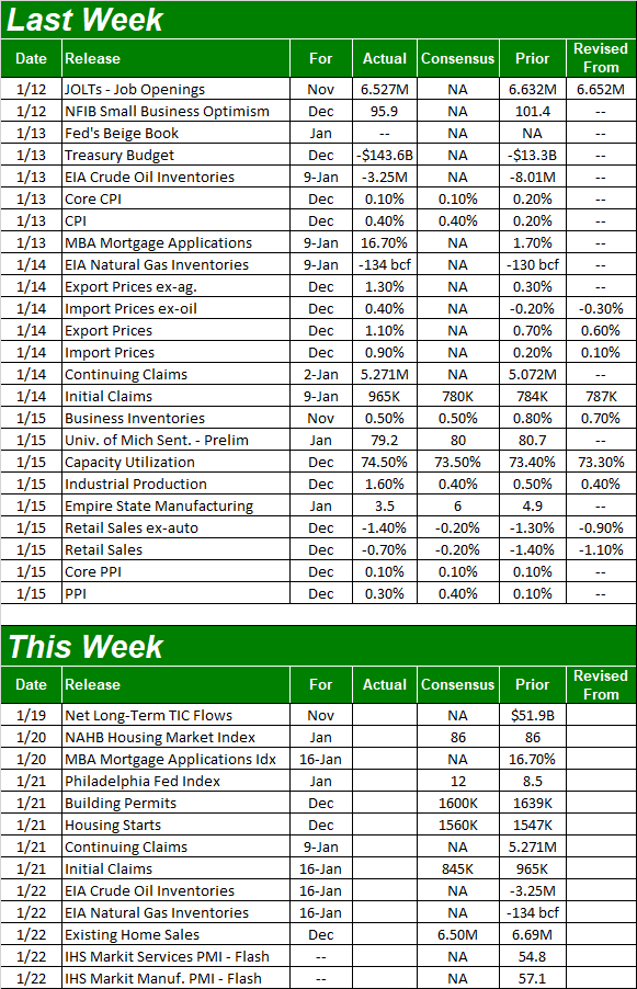
Source: Briefing.com
This holiday-shortened week won't give us as much time to work through as much data, but it is going to be a big one for real estate. On Thursday, Jan. 21, look for last month's housing starts and building permits, followed by Friday's look at sales of existing homes.
Starts and permits are expected to fall from November's numbers, but keep things in perspective. Both surged to multi-year highs a couple of months ago, and even if they come in as expected, that's still quite strong.
Housing Starts and Building Permits Charts

Source: Census Bureau, TradeStation
Ditto for home sales. We have to chart to show you here, as we'll add the NAR's information about existing home sales to the Census Bureau's tally on new home sales next week. They're both telling the same basic story, though. That is, the real estate market is a pretty bright spot in a less-than-stellar environment.
Stock Market Index Analysis
We'll start this week out with a close-up look at a daily chart of the S&P 500. Most of the last week's loss was suffered on Friday, though the setup for that pullback was in place before last week's trading began. The index is (well, was) up 18% from its late-October low, reaching a record high on Friday from two weeks ago.
People were going to start taking profits even with the increasing certainty behind the country's political landscape. They finally did, even with the promise of more stimulus checks on the horizon.
S&P 500 Daily Chart, with VIX and Volume
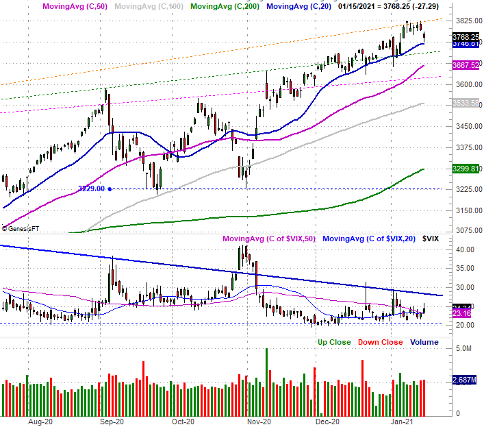
Source: TradeNavigator
Of course, even with the stumble, the S&P 500 didn't break below the very first of its most likely technical support levels. That's the 20-day moving average line (blue) at 3747. Friday's selloff stopped -- and reversed slightly -- right there.
That doesn't necessarily mean the selling has stopped. It's only paused. Even then, there's plenty of support below the 20-day moving average line. Also note the VIX. It's testing the waters of higher highs, though it's not yet above its critical technical ceiling currently around 29. More on that in a moment.
The NASDAQ Composite looks about the same. It took a dive on Friday, but it's still holding above its 20-day moving average line (blue) at 12,901. Also like the S&P 500's volatility index, the NASDAQ's volatility index (VXN) dished out an upward headfake on Friday, but clearly hasn't started a new or decisive uptrend. The potential for that move and a corresponding, substantial pullback from the composite itself, however, is clearly there.
NASDAQ Daily Chart, with VXN and MACD
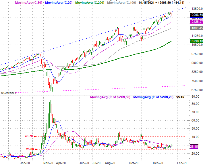
Source: TradeNavigator
As was the case with the S&P 500, the potential for a pullback is clearly in place. It's not underway though.
That potential selloff, however, is even greater than the charts might suggest. That clue is being served up by a comparative look at which types of stocks are losing the most ground, and which stocks are increasingly struggling.
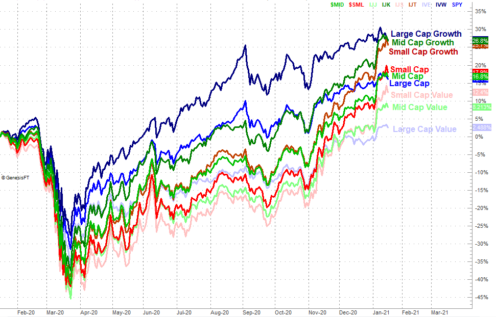
Large-caps are the weakest sister right now, and large-cap growth names are the especially weak siblings. The performance-comparison chart below puts things in perspective, plotting the day-to-day returns for each major market grouping.
Style and Market Cap Performances since Mar. 23
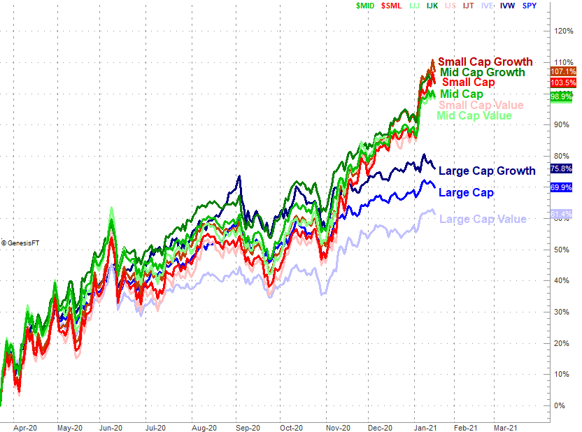
Source: TradeNavigator
Here's the relative performance of the same groups for the past twelve months. Large-cap growth was crushing it for months, and held up better than small-caps during the February/March rout. But, that leadership has clearly deteriorated of late -- to the benefit of small- and mid-caps.
Style and Market Cap Performances since Jan. 15, 2020
Source: TradeNavigator
If the market wholly crashes, there won't be any place to hide. Small-caps and large-caps will both tumble. But, it's not great when the group that's been leading the charge suddenly stops doing so. It's a hint that there's a bigger change in the undertow that acts as a prelude to a more significant change in direction.
Now take a step back and look at the long-term weekly chart of the S&P 500. It's from this vantage point we can see just how wild the last ten months have been. The market's overbought by a mile, and vulnerable to the selloff that's been suggested by the way large-cap growth names are starting to lag.
S&P 500 Weekly Chart, with VIX and Volume
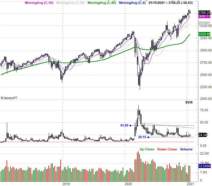
Source: TradeNavigator
None of it means anything, however, until the VXN and the VIX really start to climb and push past their technical ceilings. This week's marching orders are simply to wait and see how this shakes out.


