
Weekly Market Outlook – Stuck In The Middle With You
Five straight days of losses for the S&P 500 certainly forces traders to rethink how strong this market really is. Yet, even as Friday's action was winding down, the bulls were testing the waters again, with the market never really slipping into too much trouble
On the other hand, even with Friday's intraday reversal effort, stocks were able to move to the proverbial wrong side of the fence. All the major indices are now back below their pivotal 200-day moving average lines. Only time will tell if they've got what it takes to crawl back above those lines. The good news is, it shouldn't take very long to get an answer to that question.
We'll take a detailed look at those charts below, as always, following a close look at last week's economic numbers and previewing this week's. There were, and are, some doozies.
Economic Data Analysis
A pretty busy week last week, as the federal government wraps up the catch-up it had to do with the numbers that weren't reported during the shutdown. The highlight, of course, was Friday's jobs report for February, but there was a lot of other noteworthy stuff crammed in before that... most of it pretty good.
The party started in earnest on Tuesday, with the ISM Services Index report to follow up on the previous week's ISM Manufacturing Index report. The pros were calling for a slight increase, but the actual figure was even better than expected.
ISM Index Charts

Source: Thomson Reuters
The manufacturing data from the ISM was down in February, though both figures are still above the critical 50 level.
We're still waiting on some of the last data delayed by the Federal Government shutdown, but last week we got a look at December's new home sales. Although existing home sales didn't snap out of their funk for the month, sales of new homes in December improved for a second month in a row, to a pace of 621,000. Inventory appears to be abating as well.
New, Existing Home Sales Charts
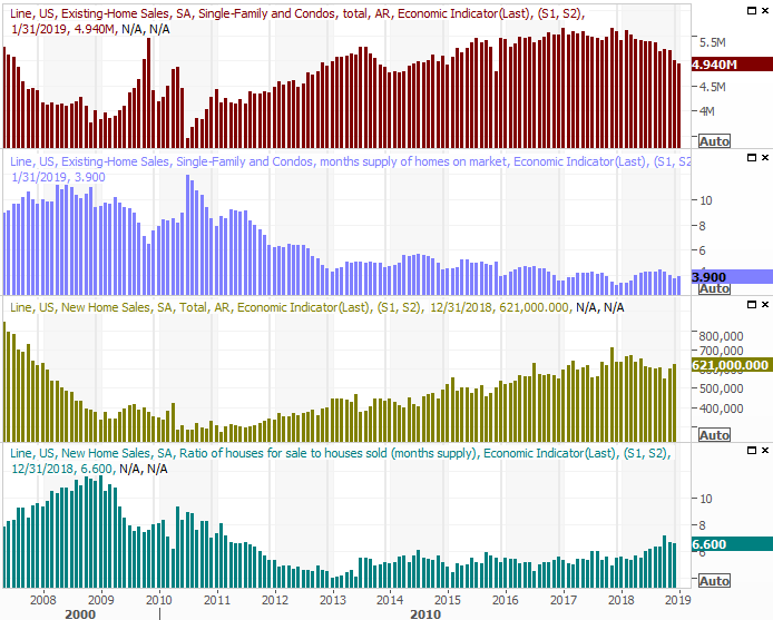
Source: Thomson Reuters
That being said, from the data we've been able to glean thus far, new home demand may well be perking up now. January's construction permits and housing starts were up, with starts surging higher. It may be the advent of a revival out of a funk that somehow permits never fell into.
Housing Starts and Building Permits Charts

Source: Thomson Reuters
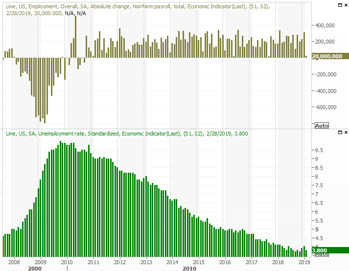
The big Kahuna was February's jobs report on Friday, which if nothing else was strange and should be taken with a grain of salt.
Last month, the economy only added 20,000 new jobs, falling well short of estimates of around 180,000. But, there's little doubt that the shutdown was the key driver of that slowdown. Even then though, January's payroll growth figure was revised upward, from 304,000 to 311,000... both of which were incredible numbers, suggesting that workers displaced by the shutdown had no trouble finding a new position.
Payroll Growth and Unemployment Rate Charts
Source: Thomson Reuters
The headline data, however, actually meant very little. It's the detailed data that tells so much more about the true state of the employment picture. We hashed out those details at the website, which you can review here:
On balance though, it gave the overall February jobs report an A-, knowing the tepid payroll growth figure was misleading.
Everything else is on the grid.
Economic Calendar

Source: Briefing.com
This week is going to be even busier, and harder hitting.
Monday's retail sales reports for January are going to be scrutinized thanks to an alarmingly poor December report that may have been inaccurate. Economists are looking for another lull. If they get it, some observers will peg it as the beginning of a recession. If instead retail spending unexpectedly improves for January, the bulls will use it as evidence that December's stumble was little more than a math error. Either way, prepare for fireworks.
Retail Sales Charts

Source: Thomson Reuters
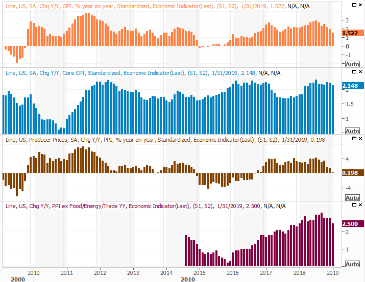
On Tuesday and Wednesday, brace for consumer and producer inflation data, respectively. It's been tamed, but almost dangerously so; a little inflation is actually a healthy sign of economic strength. Economists are looking for a repeat of January's tepid growth.
Inflation Charts
Source: Thomson Reuters
All eyes will be on this data, as it will shed some light as to what the Fed is likely to do with interest rates in the foreseeable future.
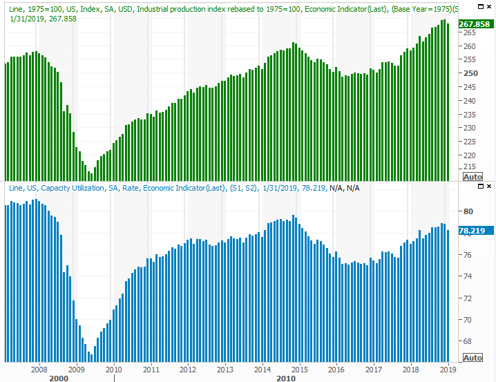
Finally, keep an eye out for Friday's capacity utilization and industrial productivity reports. Both took a hit in January - again, thanks to the shutdown - so it will be noteworthy to see if they've recovered. Most economists think they did.
Capacity Utilization, Industrial Production Charts
Source: Thomson Reuters
Don't overlook the industrial output and capacity utilization data. It's one of the few data nuggets with a near-perfect correlation with corporate earnings and the long-term direction of the market.
Stock Market Index Analysis
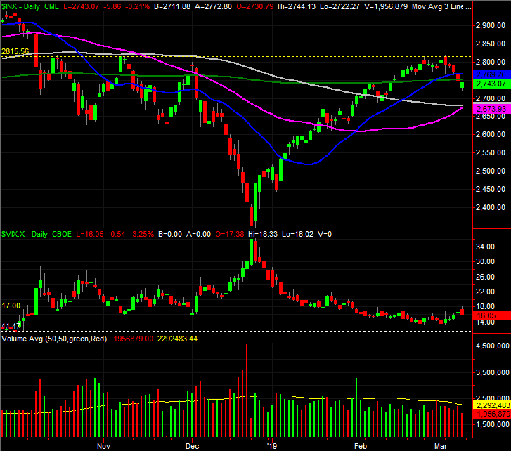
In retrospect, the 2815 area is a real problem for the S&P 500. The index topped out there in October and November, and then failed to move above that line with last week's effort. End result? The index is now back below a couple of key moving average lines, including the key 200-day moving average line (green).
S&P 500 Daily Chart, with Volume
Source: TradeStation
But Friday ended on a high note? Yes, it did, which on the surface may be encouraging. There's a lot of psychology going on right now though, and it's actually a double-edged sword.
A bad start and even worse finish on Friday could have been considered a capitulation of sorts... particularly if it was a high-volume affair. Instead we got a bad start and an intraday bounceback, and saw it unfurl on low volume. It may have been nothing more than a respite from a selling effort that will get going in earnest again this week. Traders haven't yet suffered that spike in fear that tends to accompany a good, long-lasting bottom.
Same basic story for the NASDAQ Composite - the cross above the 200-day moving average line last month was impressive, but as soon as the October/November highs were met, the effort faded.
NASDAQ Composite Daily Chart, with Volume
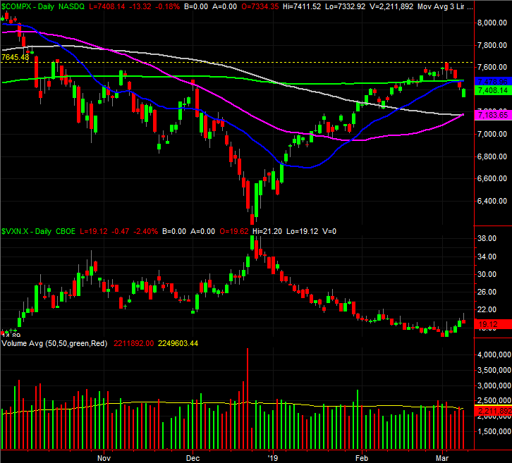
Source: TradeStation
Both indices are now in a proverbial no-man's land, below the 20-day and 200-day moving averages, but above the 50-day (purple) and 100-day (gray) moving average lines. The market could easily bounce around between that floor and ceiling for a while, never making any net progress. The real action will be outside of those boundaries.
Still, despite Friday's intraday rebound, the tide is bearish.
Zoom out to the weekly chart of the S&P 500 for a moment. Last week's 2.1% tumble is survivable, but the past two major setbacks from October and even as far back as February of last year got started with big jolts. The recent mindset has been once it starts to rain, traders tend to make it pour.
S&P 500 Weekly Chart, with Volume
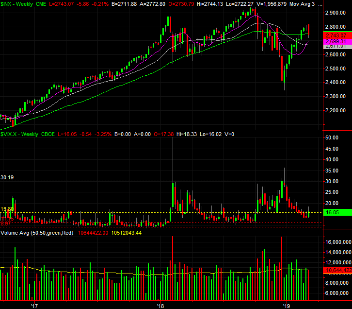
Source: TradeStation
You can also see on the weekly chart the VIX is miles away from a peak level that tends to coincide with market bottoms.
It's a conundrum. Though there are decent bullish and bearish arguments to be made, the big driving force right now is sentiment, which is ultimately driven by politics. The right news on the right day can send stocks soaring, while the wrong news on the wrong day could prove devastating. We could use conventional interpretation of charts to glean some sort of picture about what's in store, but it would be of little value.They're even of less value as long as the index is trapped between all of its key moving averages.
What we're really watching right now is the VIX, and volume, as the simple look at the indices can be somewhat deceptive.
If the VIX pushes above the ceiling at 18.0 and the S&P 500 moves to lower lows, that's trouble... though bear in mind the convergence of the 50-day and 100-day moving average lines at 2674 could turn into at least temporary support.
And, if the market starts to lose ground on rising volume - something we've somewhat seen, but not seen in earnest - that too is trouble. On the flipside, if bullish volume starts to flow again (something we've definitely NOT seen of late) and the S&P 500 can push its way back above the 20-day and 200-day moving average lines, that's a buy signal too. The NYSE's up-volume and down-volume data on the bottom portion of the chart below illustrates how and why it was only a matter of time before the rug got pulled out from underneath the market last week.
S&P 500 Daily Chart with NYSE Up, Down Volume
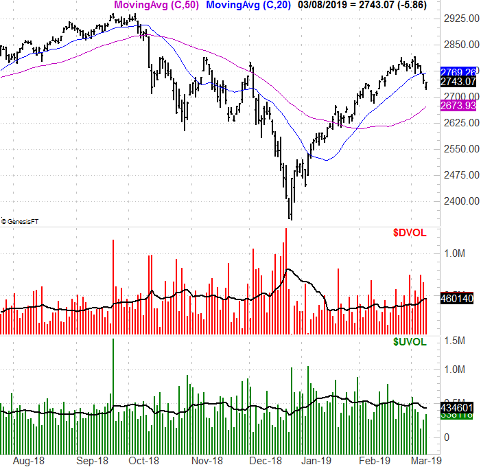
Source: TradeNavigator
The hardest part is the waiting, for one side or the other to flinch. But, waiting is the smart-money move here.


