
Weekly Market Outlook – Good, But Not Great
Following through on the previous week's bullishness, the bulls came back from the Fourth of July weekend still in a buying mood. They were tested to be sure, and for a while the market was even in the red for the week. When push came to shove though, it was the bulls doing most of the shoving.
There are still a couple of problems with the move, however. While the market finished the week on a high note, participation in that gain was tepid. The S&P 500 index also failed to close above highs hit early in the week. The buyers will need to prove a little more of their mettle if they're going to get other buyers off the sidelines and into the game.
We'll take a detailed look at the matter below. First, however, let's run down last week's big economic news and preview what's in store for this week.
Economic Data Analysis
A rather light week last week, though what little news we got was more encouraging than not.
Among the good news was last month's ISM Services Index figure. Like the manufacturing version of the index, the services measure jumped in a big way, and by far more than expected. Economists were only calling for a move up to 49.0, but it actually popped to 57.1. That's well above the make-or-break 50 level that defines "good" or "bad."
ISM Index Charts

Source: Institute of Supply Management, TradeStation
We also got an early look at the inflation landscape on Friday, with June's producer inflation numbers. Surprisingly, input prices fell rather than grew as expected.
PPI Inflation Rate Charts
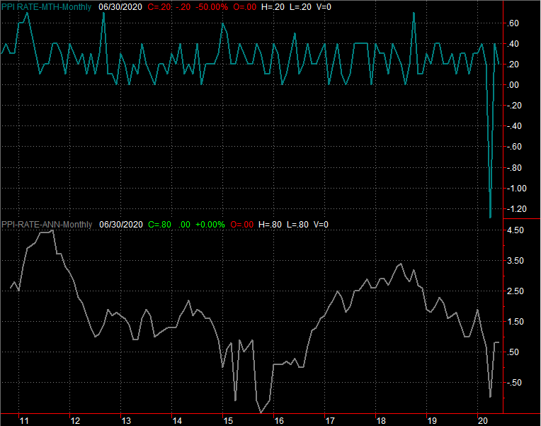
Source: Bureau of Labor Statistics, TradeStation
It remains to be seen if this is a reflection of tepid demand or just a hint of volatility. But, it seems more like the latter. This week's look at consumer inflation will help flesh out this picture.
The only other item of interest from last week (and we've not charted it) is May's JOLTS, or job openings, report. Not surprisingly, openings of 5.4 million not only suggests the economy is ready to get back to full speed, it was much better than the 5.0 million the pros were modeling. Just keep in mind that figure was for May, and not June, and much has happened in the meantime.
Everything else is on the grid.
Economic Calendar
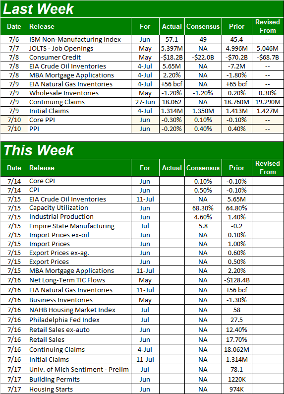
Source: Briefing.com
As was noted, we'll get a look at consumer inflation this week. Like producers' input prices, economists are calling for a modest increase in costs after May's surprisingly modest uptick. Either way, while annualized inflation rates fell sharply since March, it could have been worse.
CPI Inflation Rate Charts
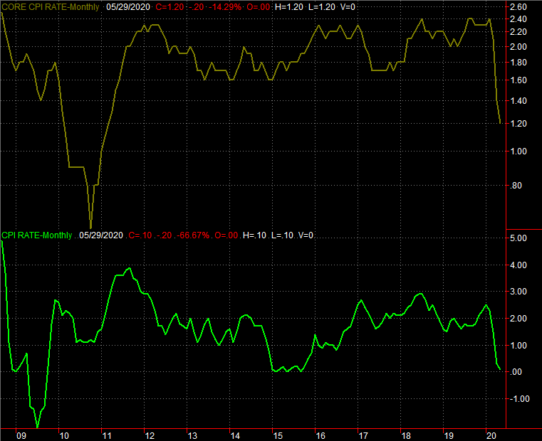
Source: Bureau of Labor Statistics, TradeStation
Odds are good analysts have overestimated last month's CPI rate like they did the annualized PPI rate.
On Wednesday we'll get last month's capacity utilization and industrial productivity. This may be the most important data nugget of the week, and the month for that matter — this measure most closely coincides with corporate earnings. The pros are calling for huge increases of both measures, gauging the massive return to work of millions of people. A shortfall could lead to a knee-jerk selling reaction.
Industrial Production and Capacity Utilization Charts

Source: Federal Reserve, TradeStation
Also look for retail sales figures for June on Thursday, and look for another big gain. Economist outlooks aren't available as of right now, but could be posted before the actual data is reported.
Retail Sales Charts
Source: Federal Reserve, TradeStation
Finally, the week will wrap up with a look at last month's building permits and housing starts. Both bounced back a little in May, but didn't even come close to recovering to pre-pandemic levels. It's unlikely to have happened in June either, just because even the consumers still qualified to buy a house are facing logistical impasses.
Housing Starts, Building Permits Charts

Source: Federal Reserve, TradeStation
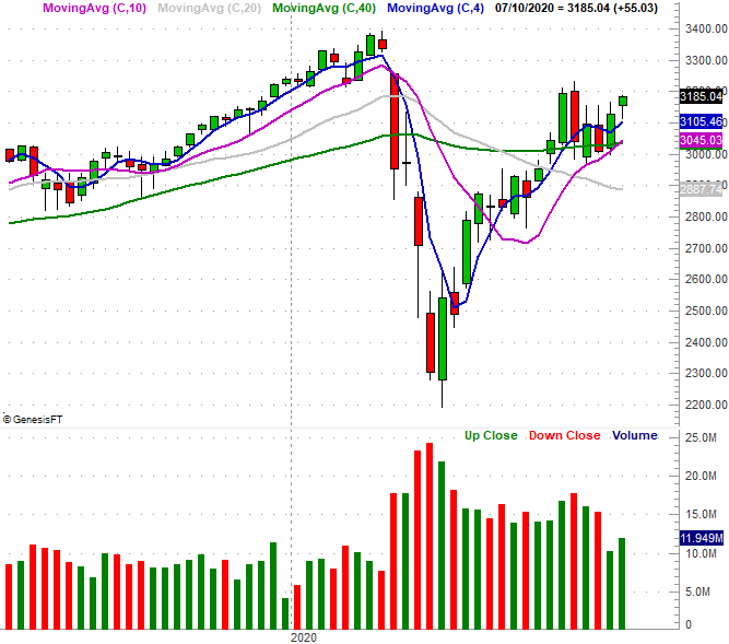
Stock Market Index Analysis
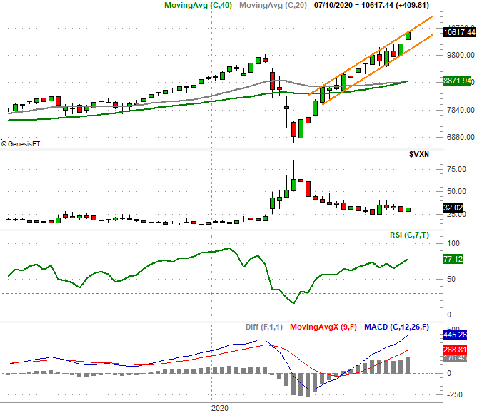
Is the coronavirus thing even happening? The Nasdaq's chart would suggest not, hitting another record high last week. The composite is up 60% from its March low, and while the selloff before that low was incredibly steep, that's still an amazing (and unprecedented) run at a time when stocks should be at least struggling to move higher. Unlike other indices or exchanges, the volume behind the gains logged the last couple of days last week was bullish.
NASDAQ Composite Daily Chart, with Up and Down Volume
Source: TradeNavigator
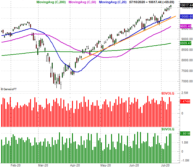
Zooming out to a weekly version of the Nasdaq chart puts this idea in perspective, though this vantage point also shows us that with last week's bullish move, the composite is now back at the upper boundary of a trading range marked by all the highs and lows since April (marked in orange). Not only is the Nasdaq overbought by the RSI indicator, the lead MACD line (blue) is higher than it's been for the composite in several years. This is something unusual, and the fundamental analysts would struggle to justify the market's present valuation.
Nasdaq Composite Weekly Chart, with VXN, RSI and MACD
Source: TradeNavigator
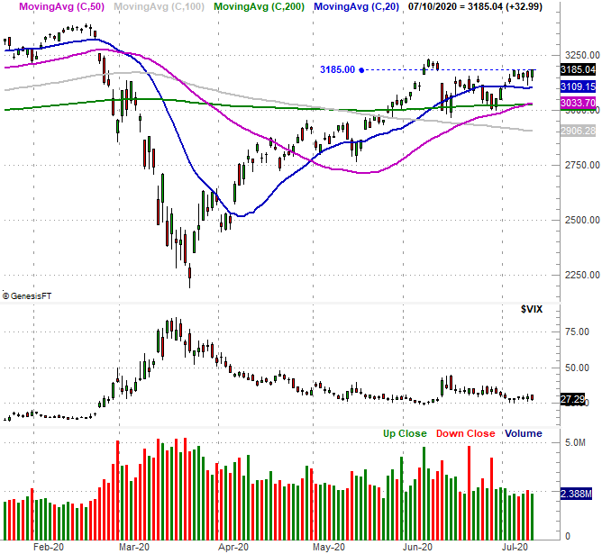
Things aren't nearly as impressive for the S&P 500 somehow… and that's a problem. As the weekly chart of the S&P 500 illustrates, not only did the large cap index fail to reclaim its February peak level, it even failed to surpass the highs hit back in June. (However, to its credit, we do like the way the S&P 500 used its 50-day moving average line – plotted in purple – as a push-off point for the current bullish effort. Notice there's also very limited volume with last week's advance.)
S&P 500 Weekly Chart, with Volume
Source: TradeNavigator
Zooming into a daily chart of the S&P 500 shows us even greater detail about last week's tepid move…after a solid start, the index couldn't actually make any more net forward progress. An objective assessment of the chart would lead on to conclude that in the bigger picture, the market's rally is running out of steam.
S&P 500 Daily Chart, with VIX and Volume
Source: TradeNavigator
Things look even less bullish the further away you move from the Nasdaq's riskier and tech-centric names and closer to more the biggest of the big, old-school blue chips. Namely, the Dow Jones Industrial Average essentially broke even last week, and remains below its 200-day moving average line (green) that's kept the index at bay since mid-June (highlighted). Notice the Dow's volume hasn't been decidedly bullish either.
Dow Jones Industrial Average Daily Chart, with Volume

Source: TradeNavigator
We've seen this dynamic take shape in another way of late. In the sector rotation analysis we posted at the website this past weekend, we confirmed that technology stocks (and pretty much only technology stocks) are performing very well. Most other sectors are underperforming the broad market. (Go here to see that analysis.) That's certainly fun for the traders in those tech names, but an advance that's going to last needs broader participation. That's on top of the fact that the Nasdaq appears to be at the upper end of its plausible range right now.


