
Weekly Market Outlook – Even Bad News Is Good News
What a week! Even when things finally looked a little dangerous mid-day on Friday, August 7, the bulls mustered some gumption to claw their way back to a small gain for the day. Friday's small win on top of the bigger gains logged earlier in the week carried stocks to meaningfully higher highs, and past some technical resistance. It seems flimsy and artificial, but we can't deny progress continues to be made. We also can't fight the tape.
We'll dissect the move below, as always. First, let's review the economic numbers that were posted last week and preview what's in store this week. The jobs report for July, of course, was the big one.
Economic Data Analysis
Cutting straight to the chase, the U.S. "only" added 1.76 million jobs last month, versus expectations of 2.0 million. That was enough to drive the unemployment rate down from 11.1% to 10.2%, but 10.2% is still pretty high; except it isn't, given the circumstances. Hourly pay rose higher too, underscoring the obscured strength of the jobs market.
Payroll Growth, Unemployment Rate Charts
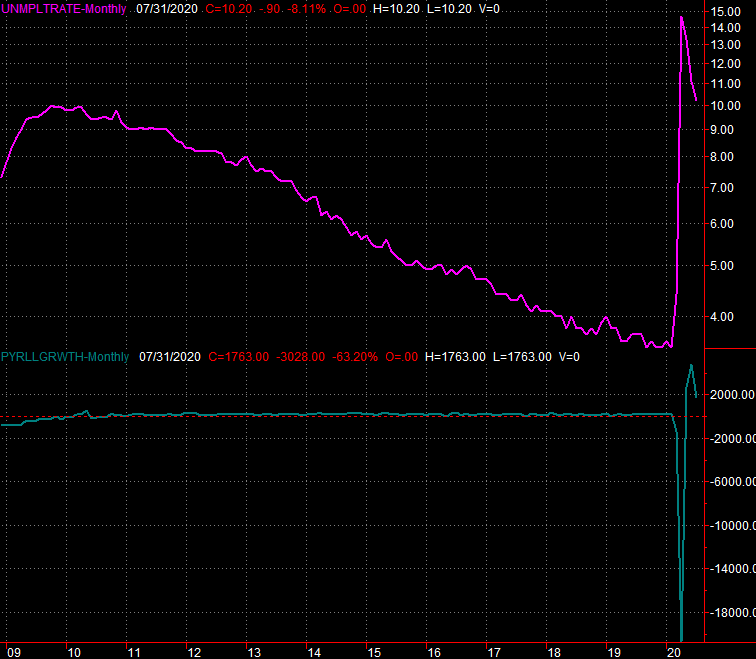
Source: Department of Labor, TradeStation
In the same vein, service and manufacturing activity remained rather firm for July, with those recently re-employed people not only making and doing more stuff, but consuming and using more goods and services. The ISM Manufacturing Index held above the 50 level, and even improved to 54.2 (blowing away expectations of only 53.4).
The ISM Services Index was even more impressive, rising from June's 57.1 to 58.1 this time around, not sliding back to the consensus of 55.2. This is great news that underscores just how busy workers who are back on the job actually are.
ISM Index Charts
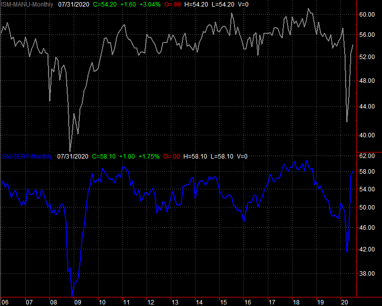
Source: Institute of Supply Management, TradeStation
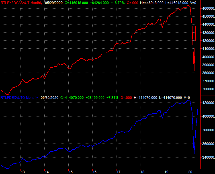
Finally, it's only indirectly related, but auto sales continue to improve. July's annualized pace of car sales in the U.S. rolled in at 14.9 million vehicles. That's still below the typical 16 million-17 million unit pace generally seen before the COVID-19 pandemic took hold. But, again, consider the circumstances. It's difficult to get to a dealership, and it's been abnormally difficult for dealers to secure inventory.
Auto Sales Charts
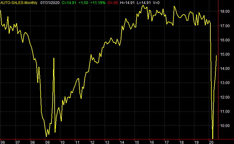
Source: Bureau of Economic Analysis, TradeStation
Everything else is on the grid.
Economic Calendar

Source: Briefing.com
This week is loaded.
The party starts early with a look at producer and consumer inflation rates. You'll recall things have remained relatively tame in the inflation front, but with the swell of people flowing back to jobs and the subsequent demand for goods that may or may not be there, consumers are feeling a little bit of pricing pressure.
Consumer, Producer Inflation Rate (Annualized) Charts
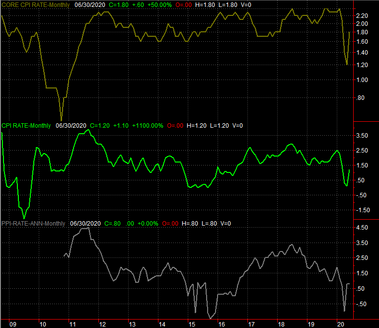
Source: Bureau of Labor Statistics, TradeStation
On Friday, August 14, we'll hear about last month's retail sales; in a sense reflecting not just potential inflationary pressure, but how confident people are feeling again now that things are moving sort of back to normal.
The previous month's pace of more than 7% growth isn't sustainable, as it was a comparison to a time when lockdowns were in place. But, the expected 1.4% increase (and 1.8% increase including automobile purchases) from June's spending levels is still very healthy.
Retail Sales Charts
Source: Census Bureau, TradeStation
Finally, the most important data nugget in the lineup this week is also the one most likely to be overlooked: the Federal Reserve's capacity utilization and industrial production number. Given the ISM data and the jobs numbers, economists are calling for another strong improvement on both fronts. Not getting those increases could be cause for concern, though failing to do so seems very unlikely here.
Industrial Production and Capacity Utilization Charts
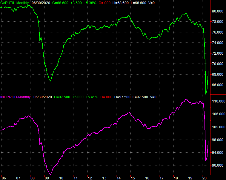
Source: Federal Reserve, TradeStation
This data is noteworthy simply because it coincides so closely with actual earnings results, moving higher with profits, and moving lower when profits fall.
Stock Market Index Analysis
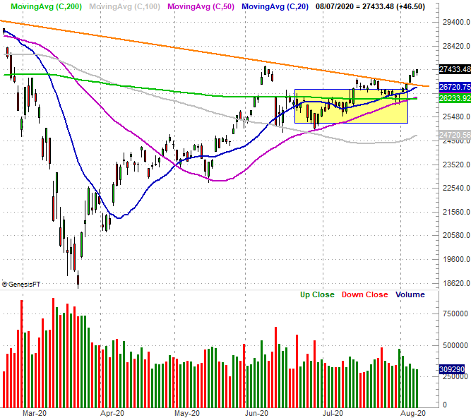
A week ago, we were concerned about the fact that stocks were not only failing to move higher, but were putting pressure on some key technical support levels. A little more weakness could have pushed them over the edge, so to speak. That worry was well-abated last week.
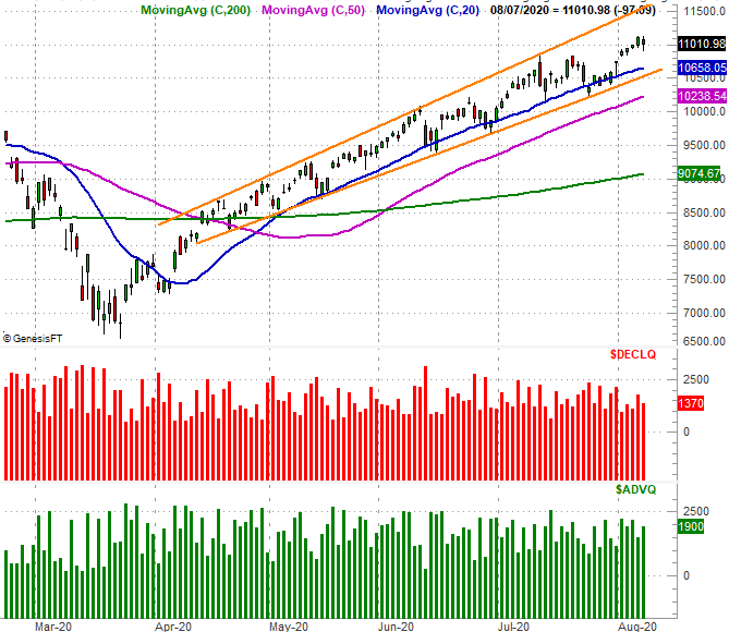
Nowhere is this more evident than with the Dow Jones Industrial Average. A week ago it was testing its 50-day (purple) and 200-day (green) moving average lines as support, and continued to be guided lower by a falling resistance line (orange) that connects all the key highs going back to February's.
Last week, the Dow not only logged a higher high above that falling resistance line, it did so by pushing up and off the 50-day and 200-day moving averages. On that note, the 50-day moving average crossed above the 200-day moving average line last week - a so-called "golden cross" that negates the "death cross" that sent people into a panic in March.
Dow Jones Industrial Average Daily Chart, with Volume
Source: TradeNavigator
Curiously, the Dow Jones Average was last week's big winner, logging a 3.8% gain versus the Nasdaq's 2.5% advance and the S&P 500's 2.45% score. That's not a huge surprise, as the Dow had been lagging for some time as traders chose riskier, more aggressive, tech-centric names over blue chips. But, now with the NASDAQ arguably too overbought and the S&P 500 in a similar situation, traders are starting to see the Dow's names as the better opportunity.
In fact, the NASDAQ did something last week that the other two indices didn't do - it closed below its high. In fact, it logged a loss on Friday, while the other two indices didn't.
The composite is still above its key rising support lines, but now up 66% from its March low and deep into record high territory, investors are starting to think a little more cautiously on this front. That's problematic, as the NASDAQ leads the market up and down. If the NASDAQ Composite starts to weaken, that may not necessarily mean that money will continue to flow into the Dow Jones Industrial Average.
NASDAQ Composite Daily Chart, with Advancers/Decliners
Source: TradeNavigator
Perhaps the chart that will hold the market's ultimate fate in its hands, however, is the S&P 500 (at least for right now). It's knocking on the door of February's peak near 3397. In that it's the most evenly-distributed and most accurate representation of the overall market, everyone needs to watch what happens from here closely.
That's because this is where the bears will have their best shot at turning the tide. For some the 3397 level is a trigger, and for others it's a target. Whatever it is, it's at the very least a mental battleground. The bulls may seem like they have enough momentum to punch through, but notice that the volume behind this advance has been lackluster.
S&P 500 Daily Chart, with VIX and Volume
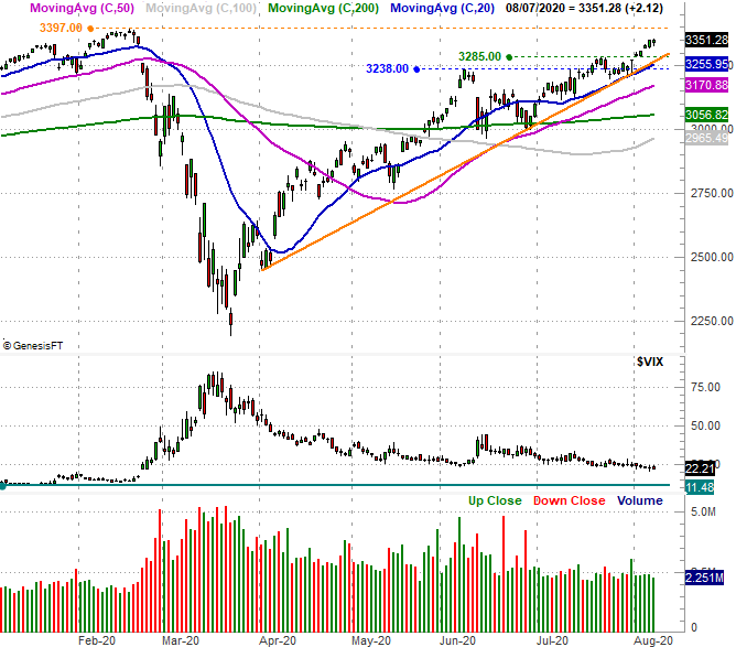
Source: TradeNavigator
On the flipside, also notice the VIX isn't yet testing a more absolute floor around 11.5. Traders are at least somewhat cautious - in a healthy way - about this multi-month advance.
Bottom line? Stocks remain in limbo. Most are overbought, but fear of missing out is keeping investors buying rather than selling. The second quarter's earnings season hasn't been as bad as first expected, vindicating a big piece of that optimism. An economic recovery could indeed be quick, providing fuel for more upside.
Remaining in limbo works for the Dow and Dow-like names, and against the NASDAQ and its big tech stocks. All the indices are still vulnerable. Like last week, the key is watching what happens when the indices start to test well-established support levels. The smart-money move for right now may simply be doing nothing.


