
The Six Most Powerful Charts On Wall Street
THIS IS WHAT A MAJOR TREND REVERSAL LOOKS LIKE
The three periods shown below produced an average peak-to-trough loss of over 50%. Thus, it is prudent to understand some of the common characteristics found in all three cases. We can then look for similar characteristics in the present day. Imagine if you were a few years away from retirement when the 1973-1974 bear market hit. The S&P 500 dropped 48.2% causing many sleepless nights.
(Click on image to enlarge)
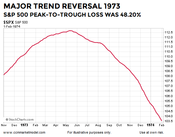
The chart above shows the S&P 500’s 200-day moving average during the earlier stages of the 1973-1974 bear market that came to an end on October 3, 1974. The chart seems fairly simple but contains a ton of valuable information about a major shift in investor expectations regarding future economic and market outcomes.
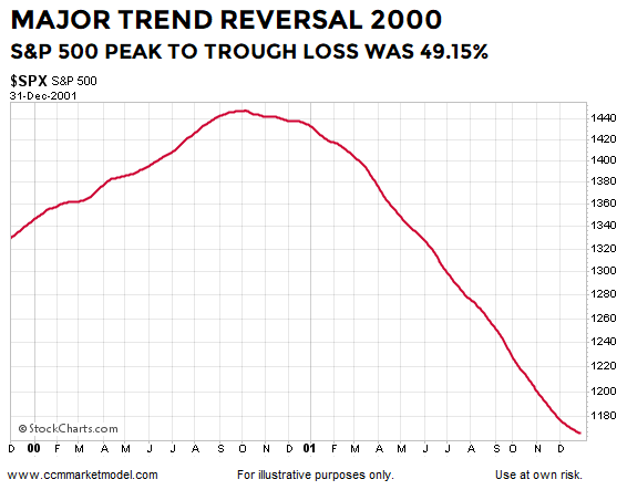
While the combination of fundamental factors, including valuations, interest rates, inflation, economic issues, and geopolitical events are significantly different in all three major bear markets, there are also important and consistent lessons for investors. On the left side of the 1999-2001 chart below, the net aggregate opinion of all market participants regarding all subjects on all timeframes was bullish. Consequently, the bias was for the market to move higher based on positive expectations about future economic and market outcomes. In the early stages of the bear market, more and more market participants begin to respect the problems of the day, resulting in a major and sustained shift in the net aggregate opinion of all market participants regarding all subjects on all timeframes. Consequently, the odds shift to favoring a series of lower lows rather than a series of higher highs.
(Click on image to enlarge)
These examples provide a fact-based response to a common objection to historical studies:
“But today is significantly different from the periods shown in numerous ways.”
“Today is different” is always true. No two periods in human history have the exact same combination of fundamental, geopolitical, economic, psychological, and technical factors. The three painful bearish periods shown here (1973-1974, 2000-2002, and 2007-2009) are all unique in significant ways, but the process of a major shift in the net aggregate opinion of all market participants looks very similar in all three cases. Stated more simply, the whys differ in each case, but the major trend reversals are very similar.
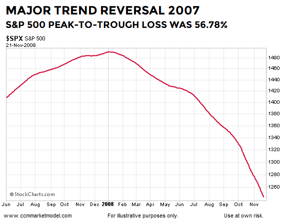
The early stages of the financial crisis bear market occurred in a significantly different fundamental environment relative to the oil embargo 1970s and dot-com-hyped early 2000s, but the process of a major shift in market sentiment is similar in many important ways. There is nothing magical about the 200-day moving average; this is an exercise in pattern recognition. Chart patterns reflect patterns of human thought. People think and behave in similar ways near a major market peak because human greed and fear are constants. The same is true for all patterns in the stock market (bullish, neutral, and bearish).
(Click on image to enlarge)
HOW DOES THE SAME CHART LOOK TODAY?
If we look at the question above, it can be rephrased in this manner:
“Are we seeing a similar bearish shift in the net aggregate opinion of all market participants regarding all relevant subjects on all timeframes?”
The answer is no. The present day chart also represents a discernible pattern in human behavior. From a traditional charting perspective, the 2019 chart below appears to be a continuation pattern. The trend on the left side of the chart below is bullish. We are all familiar with the expression the market needs to consolidate its gains, which is exactly what took place in the center of the chart below. Given what we know today, we have a bullish trend, a period of consolidation, and what appears to be a resumption of the bullish trend.
(Click on image to enlarge)
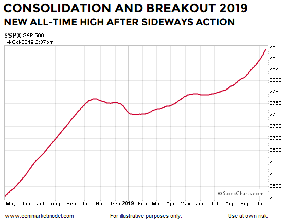
Does the chart above look anything like the 1973-1974, 1999-2001, or 2007-2008 major-bear-market-reversal charts above? The answer is no, which means, as of this writing, the net aggregate opinion favors higher highs in the coming months relative to lower lows. The previous sentence contains a probabilistic statement based on the facts we have in hand today. If the facts change in a material manner, we must reassess the probabilities.
PATTERNS REFLECT COMMON HUMAN BEHAVIOR
The 200-day is useful here because we have a discernible pattern, just as there were discernible patterns in the three major bear market cases. In a continuation-pattern scenario, the net aggregate opinion over time is adversely impacted by a set of concerning issues (think Fed policy errors and the trade war in 2018). These issues cause the net aggregate opinion to shift in a similar manner to what transpired near the major S&P 500 peaks in 1973, 2000, and 2007. The difference in the continuation-pattern case is the concerning issues are addressed in some manner (Fed shifted in early January 2019 and trade has been trending in the right direction).
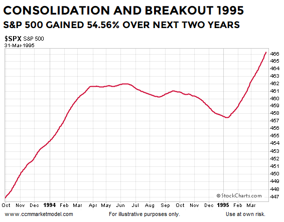
Thus, in the continuation-pattern cases, the net aggregate opinion shifts back to a bullish bias allowing the prior bullish trend to continue, which is exactly what happened in the 1994-1995 case shown below. The combination of factors is unique in each case, but the net outcome is the same. After consolidating and breaking out, the S&P 500 resumed its bullish trend and gained 54.56% over the next two years from the date shown on the chart below.
(Click on image to enlarge)
A similar shift in fundamental perceptions and human expectations occurred in the 2011-2012 continuation-pattern case. Once again, the combination of fundamental issues were different in the 1994-1995 and 2011-2012 cases, but the net interpretation and subsequent behavior by market participants was very similar. The results were similar as well; from the date shown in the chart below, the S&P 500 gained 39.97% over the next two years.
(Click on image to enlarge)

INSTITUTIONS AND FUNDAMENTALS
It would bolster the bullish thesis above if (a) present day fundamentals supported ongoing expansion over an imminent recession, and (b) if institutions were still open to bullish economic and market outcomes. This week’s CCM stock market video looks at fundamentals and technicals which support the “avoid a recession” case and the “institutions have not given up on this market” case. After viewing the facts presented in the video, you can draw your own conclusions.
EXECUTIVE SUMMARY
Keeping in mind chart patterns enable us to monitor shifts in the net aggregate opinion of all market participants regarding all subjects on all timeframes, does the pattern in 2019 look more like the major-topping patterns or more like the continuation patterns?
(Click on image to enlarge)

Since there is no question 2019 looks more like the 1993-1995 and 2011-2012, it might be helpful to know what happened next in the two continuation-pattern cases. As the table shows below, the S&P 500 did continue the bullish trend and posted very impressive gains over the next five years.

ANALYSIS SPEAKS TO ODDS
Logic can be used to minimize the odds of repeating common investing missteps. The weight of the evidence says we should remain open to better than expected stock market outcomes while respecting the odds are based on the information we have in hand today. When the next major bear market arrives, the concepts outlined above will still be helpful; the message will simply shift from “sit tight with growth-oriented investments” to “take action to reduce risk to our hard-earned principal”. We will continue to take it day by day, while remaining open to all outcomes from wildly bullish to wildly bearish.
This week’s stock market video will most likely expand on the concepts covered above. Recent studies involving the market action near the 200-day and Fibonacci retracements align with the continuation-pattern thesis above.
WHAT ABOUT SMALL SAMPLE SIZES?
We cannot control sample sizes. There have only been three 40%-plus declines in the S&P 500 since 1950 (1973-74, 2000-2002, and 2007-2009), which represents a very small sample size. Are we supposed to totally ignore these major declines because of the small sample size? According to Reuters, the S&P 500 was officially launched on March 4, 1957, meaning any S&P 500 study deals with a very limited historical data set. It is what it is.

When we study rare events, we acknowledge the sample size and try to learn anything that can add value in the present day. There are countless economic and market studies that are based on small sample sizes. Typically, the small sample size argument is only raised when the results run counter to someone’s personal opinion. When results agree with someone’s personal view, the small sample size is suddenly not a problem. If you believe a study or data set is irrelevant, there is an easy solution - ignore it.


