
The Biggest Downside Risk To Markets
Investing across the cycle requires a firm grasp of the fundamentals, and perhaps nothing is more fundamental than the flow of money and credit.
Indeed, the current economic shock facing the world can be boiled down to a simple one-liner: we are currently in the middle of a liquidity crisis, and the biggest downside risk is that it transitions from a liquidity crisis to a solvency crisis.
As the charts and analysis below show, disruptions in the flow of money and credit can trigger and signal a self-reinforcing downdraft to markets.
That said, I remain constructive on the medium-term outlook for risk assets... but that view rests on a few key underlying assumptions - and requires close monitoring of a number of key indicators.
The following charts and commentary addresses the dynamics at play, what to watch for, and the resultant implications for the risk/return outlook across corporate credit and equities.
1. Lending Standards vs Policy Rates: This is quite a powerful chart - in a way it shows the disconnect between monetary policy easing versus banks tightening up lending standards. In other words, benchmark interest rates may be lower, but it's harder to actually get a loan. In fairness, it is completely understandable that banks would take this stance given the impairment of credit quality, servicing ability, and balance sheets as a direct result of the economic shutdown shock of the pandemic. But it highlights or leads into a couple of other themes and trends worth noting...
(Click on image to enlarge)

What to watch for: In my view, the pandemic is essentially a liquidity crisis in that the vital interlinked system and chain of cash flows has been disrupted for a large part of the economy. The biggest risk is that a more prolonged shutdown turns the liquidity crisis into a solvency crisis (i.e. the shortfalls go from income statement to balance sheet).
2. Credit Managers Index: Studying bank lending surveys often yields actionable insights for longer-term investing, but one drawback is the frequency (e.g. the ECB and Fed only conduct quarterly surveys). But we can supplement those with the US Credit Managers Index -- think of it as the PMI for credit. The CMI tracks a set of "favorable" and "unfavorable" factors, and the chart below shows the index for unfavorable factors. Interestingly enough, prior to the pandemic, it turns out that credit managers were seeing the lowest levels of credit stress in years, of course, that has clearly crashed now, and there is widespread stress. But this highlights my parting thought above: for now, we are dealing with a liquidity crisis, and whether that turns into a solvency crisis will depend on a combination of: a. Policy Response (fiscal and monetary); b. The Duration of the Economic Shutdown; and c. Firms' ability to Adapt and Evolve (where possible).
(Click on image to enlarge)

What to watch for: Within the surveys, I am keeping an eye on a few particular indicators which have proven useful as leading indicators to deeper financial stress in the past. As of the April data, there is obviously deterioration, but not outright capitulation as yet.
3. Lending Standards vs Credit Spreads: For a number of good reasons, credit spreads and lending standards tend to be fairly highly correlated (mostly coincident, but sometimes one leads the other). The main reason is credit spreads can basically be thought of as a real-time assessment of the current level of credit quality (of course the market can/does get it wrong from time to time aka presents opportunities to investors). But probably the main takeaway for this chart is how my global credit spread composite indicator is basically confirming the tightening up of credit.
(Click on image to enlarge)
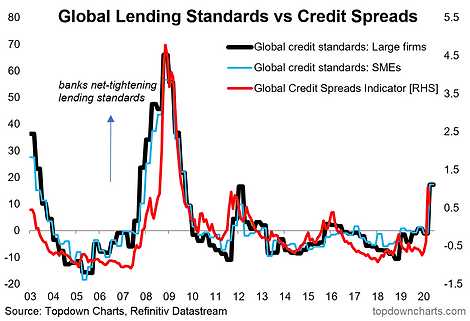
What to watch for: The path of credit spreads will be the first tell as to whether central bank policies designed to free up the flow of credit are gaining any traction.
4. Lending Standards vs High Yield Credit: Taking a US-specific version of the chart above, this next chart shows the net change in credit standards for large and medium firms from the Fed's quarterly Senior Loan Officer Opinion Survey on Bank Lending Practices, overlayed against US High Yield (aka junk bond) credit spreads. There is a notable disconnect between the two series; in other words, it looks like on first glance the banks have tightened up more than credit markets (but then again, the Fed is about to step into the market both in a primary and secondary market capacity with the CCFs - albeit primarily focused on investment-grade issuers).
(Click on image to enlarge)

What to watch for: Historically, there are only a handful of examples of these divergences e.g. LTCM collapse in 1998 (as a result of the Asian financial crisis and subsequent Russian debt crisis), and then the early 2000's recession, and subsequently in the lead up to the financial crisis in 2008. Basically: a shock, a recession, and a recession/global financial crisis. I would say the current situation is best described as a shock. Again, the thing to really watch for is any compelling evidence that it ends up as something greater than a one-off shock.
5. Lending Standards and the Stock Market: This chart compares the same lending standards indicator from the previous chart against the S&P500. The point of this chart is to highlight the interplay between credit/lending conditions and the market. Intuitively, they are interlinked as the stock market tends to lead the economy, and large swings in the stock market (and the related news) can hold significant sway on sentiment -- and after all, it is people answering the surveys. The main point though is how deteriorating credit conditions can reinforce downward spirals in the economy and financial markets (hence why it could be considered a "bear market warning indicator").
(Click on image to enlarge)

What to watch for: Again, the sample size is small, but it's fairly clear on the chart how a trend of deteriorating credit conditions can signal the start of a bear market (whether as a cause or a symptom, or both). But we again have to continue to think about and monitor whether this is a one-off shock vs a deeper and longer downturn, my view is it ends up as a one-off shock [because if managed well, the pandemic should be inherently temporary - and provided there is no widespread material lasting damage, when the global economy reopens it will have enormous stimulus tailwinds]. So the thing to watch for really is evidence against that base case.
Final Thoughts and Bottom Line
Bottom line: the biggest risk to markets is that the liquidity crisis turns into a solvency crisis, and a key channel/symptom/trigger of that will be the flow of money and credit.
As outlined, while the ultimate duration of the economic shutdown (i.e. the pandemic) is anyone's guess, the policy (fiscal + monetary >> it needs to be both) response is something we can observe with greater certainty and is a vital circuit breaker in preventing the otherwise natural transition from a liquidity crisis to insolvency crisis. The global policy response has been massive and coordinated across countries and policy tools. Therefore the downside risk has been reduced (*for now*). But investors need to keep a close eye on the evolving dynamics discussed above in the inter-play of credit flows, market sentiment, and economic realities. The charts and indicators above provide a sound starting point in understanding these dynamics and in identifying evidence to incorporate in the evolving investment conclusion on the risk/return outlook.


