
Take A Step Back
Investors currently seem perturbed by two trends. Firstly, they are watching the crash in oil prices with part glee, part amazement, if not outright horror, depending on how much skin they have in the game. The second is that almost everyone seems skeptical about the sustainability, I even dare say “fairness”, of the rally in equities. I have little insight into the oil market, but something or someone is about to break. Demand isn’t coming back until the start of Q3, at the earliest, and while I get the supply-side dynamics of a broken OPEC oligopoly, I struggle to see that this Last Man Standing™ price war serves the purpose of any of the interlocutors.
In any case, I’ll stick to the tape for this one, watching the price like everyone else. It’ll be a blast! On equities, it’s important to step back a bit and accept that Q1 was an outlier. The MSCI World fell 8.5% on the month in February, and then went on to crater nearly 14% in March, a denouement which includes a 32% round-trip from the highs in Mid-February to the lows in March. That’s record-busting pain, and no matter what type of bear market we’re in—and I do think we’re in just that—a rebound was coming, eventually. As I type, the MSCI World is up nearly 7% on the month in April, which doesn’t seem outlandish to me.
THE MARKET MATH LOOKS SO-SO
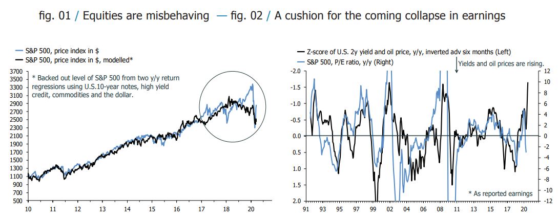
The fortunes of global equities are best analysed, at least initially, through the lens of the U.S. My first chart show shows the implied value of the S&P 500 based on an arbitrage-pricing-theory framework. My model backs out a value for the U.S. index based on a regression, in y/y terms, with the other major asset classes as explanatory variables.
re-estimated the model last week to include the recent swoon in markets, and it currently suggests the S&P 500 is overvalued by some 15%. On its own, this number doesn’t mean much. The model is best understood as an error-correction mechanism, with extremes in under- and overvaluation indications of a turning point. From that perspective, more pain is ahead. The chart shows that the implied value of the S&P 500 has been trending down since the beginning of 2019, even as the index shot higher to nearly 3500 before the Covid-19 panic. The S&P 500 was briefly “undervalued” last month, but based on the usual pace of mean-reversion in the error terms, new lows beckon.
The catch is that the model’s accuracy appears to be dwindling. I haven’t tested this empirically, but I am almost certain that I could find a structural break in the data around 2017. Why exactly equities became un-tethered from other major assets at that point is a topic for a different time, but it’s fair to say that the amplitude of the model’s error terms is now much wider than before. Looking beyond my home-cooked models, the big debate among investors is how far and fast earnings are now falling, and whether this isn’t the next shoe to drop for markets. It will be, almost by definition, but how much will the multiple be able to absorb? My second chart below suggests that it could be quite a bit, a metaphor for the safety net that global policymakers have strung out underneath markets. Remember that because earnings are about to crash, the trailing P/E ratio will rocket in the next six months; that’s normal in recessions. The chart below shows that it has a lot of room to do so, even with a constant or even slightly rising price, in theory at least.
(Click on image to enlarge)
LOOK UNDER THE HOOD
As interesting and important as the tug-of-war between prices and earnings, the real story takes place under the hood. This cycle overwhelmingly has been characterized by the outperformance of growth—effectively large tech—relative to value—most notably energy and financials—associated closely with a flattening yield curve.
To me, it is difficult to talk about a regime change or an end-of-cycle unless these two trends shift. So, will they? At first glance, it sounds like a decent bet. Markets currently face self-imposed recession, which could, in time, do as much damage on the supply side as on the demand side, and policymakers have responded in kind with stimulus to the tune of 20-to-25% of global GDP.
If this doesn’t wake the bond vigilantes, nothing will, but that central banks have one last trick up their sleeve; yield curve control. If that is deployed, I reckon the current regime can continue, with real assets going to the moon too. If they don’t, get ready for a big shift!
HOW RISKY ARE EMs?
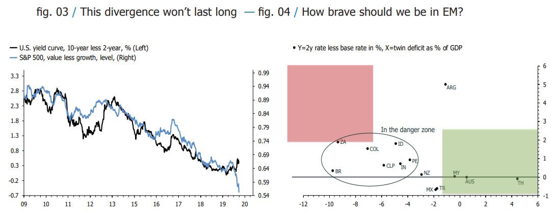
Finally, I want to have a look at EMs. Just as with the other themes discussed, there appear to be two competing narratives. One is that EMs will get shot to pieces as the global economy grinds to a halt, with the counterpoint that a $2T, and counting, Fed balance sheet expansion and swap lines will provide a floor. As per usual, market pricing will reveal the truth somewhere in between, and I am inclined to look on the bright side.
For starters, the rates curve in the chart below has flattened significantly since I last updated this model. In other words, dramatic Fed rate cuts and liquidity injections have provided cover for EM central banks to support their economies too. They’re not out of the woods yet, especially in Latin America, but with stock markets there down around 50% on the year, a lot is in the price already. Elsewhere, the model below also suggests that investors buy the Aussie against the Kiwi, but now I am getting over my skis. It’s probably time to take a step back.
(Click on image to enlarge)
Disclosure: None


