Netflix Chartapalooza
We’ve entered the action-packed phase of the cycle, and one of the more exciting announcements will be from Netflix (NFLX). Here are some of the cool ways that one can view Netflix as we approach this event.
(Click on image to enlarge)

Earnings reaction graph, showing the diminishing gains and losses in recent years.
(Click on image to enlarge)
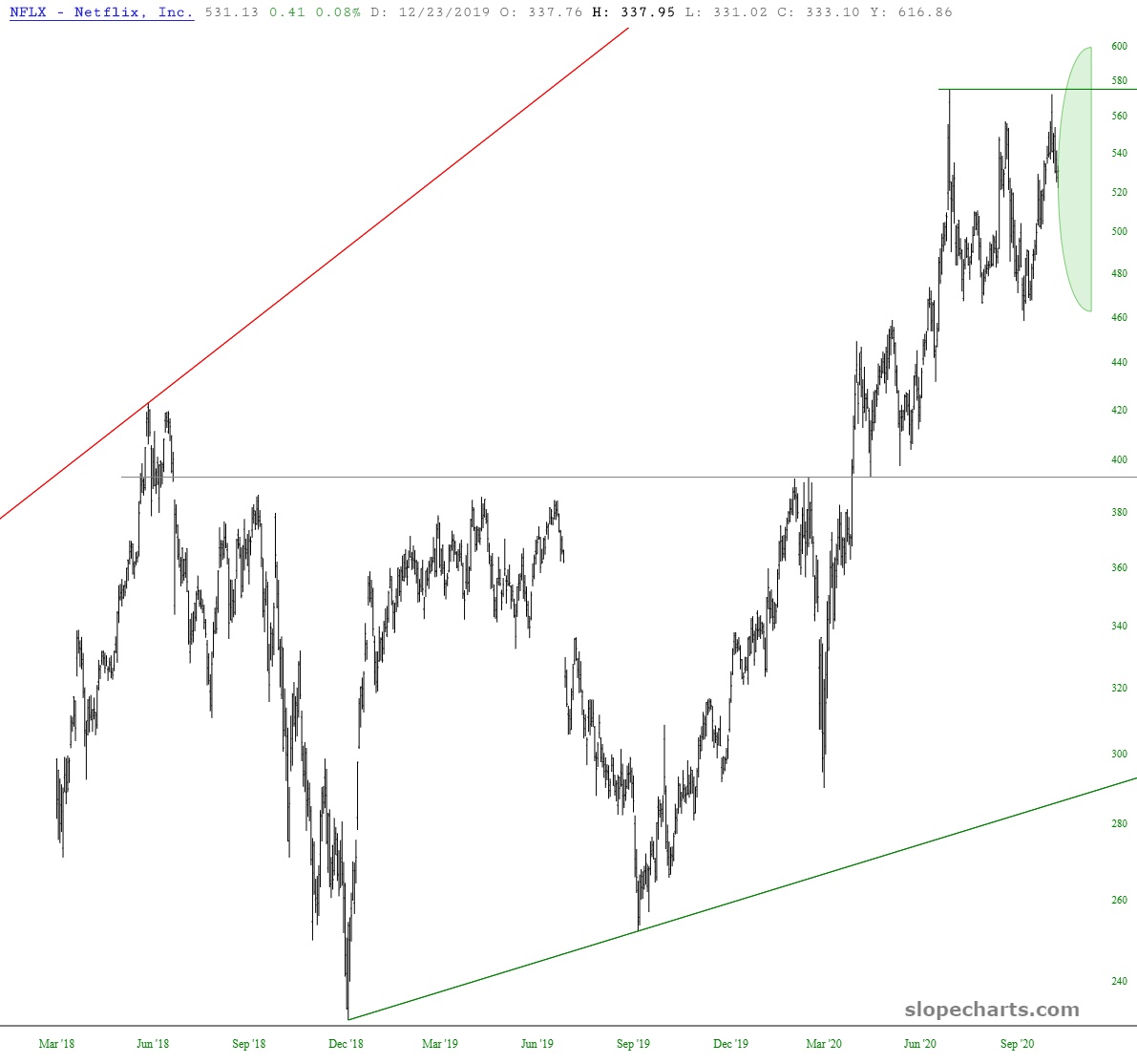
Price cone, illustrating the assumed range of outcomes.
(Click on image to enlarge)
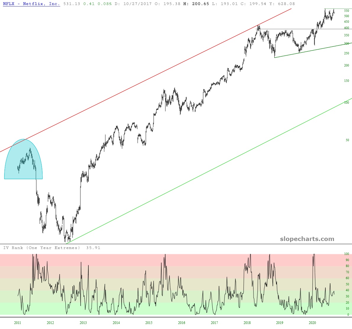
Implied Volatility Rank, showing NFLX relatively low right now.
(Click on image to enlarge)
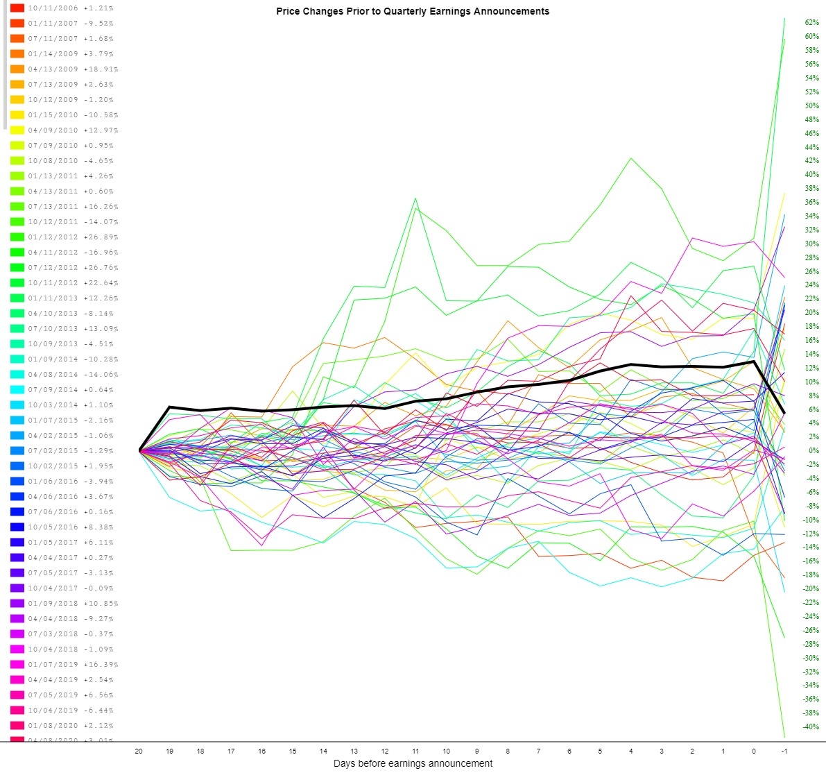
Price change graph, showing on average a drop the day after announcements.
(Click on image to enlarge)
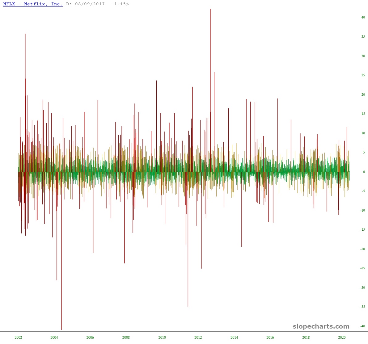
The Seismograph, illustrating volatility changes over its history.
(Click on image to enlarge)
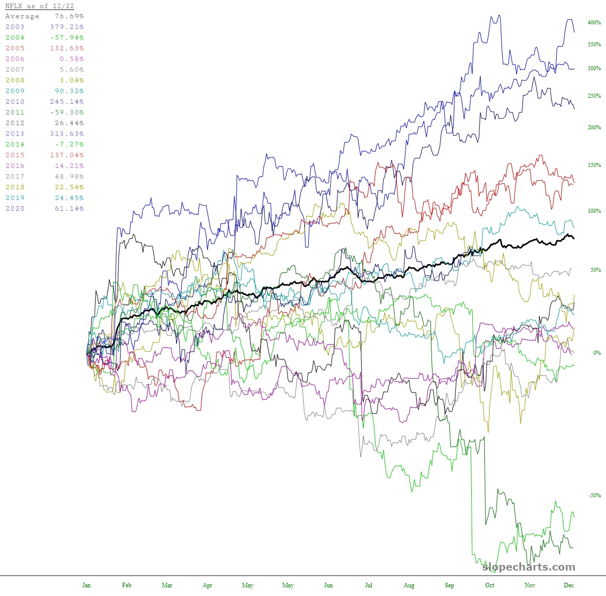
Time perspective analysis, which illustrates the non-seasonal nature of prices
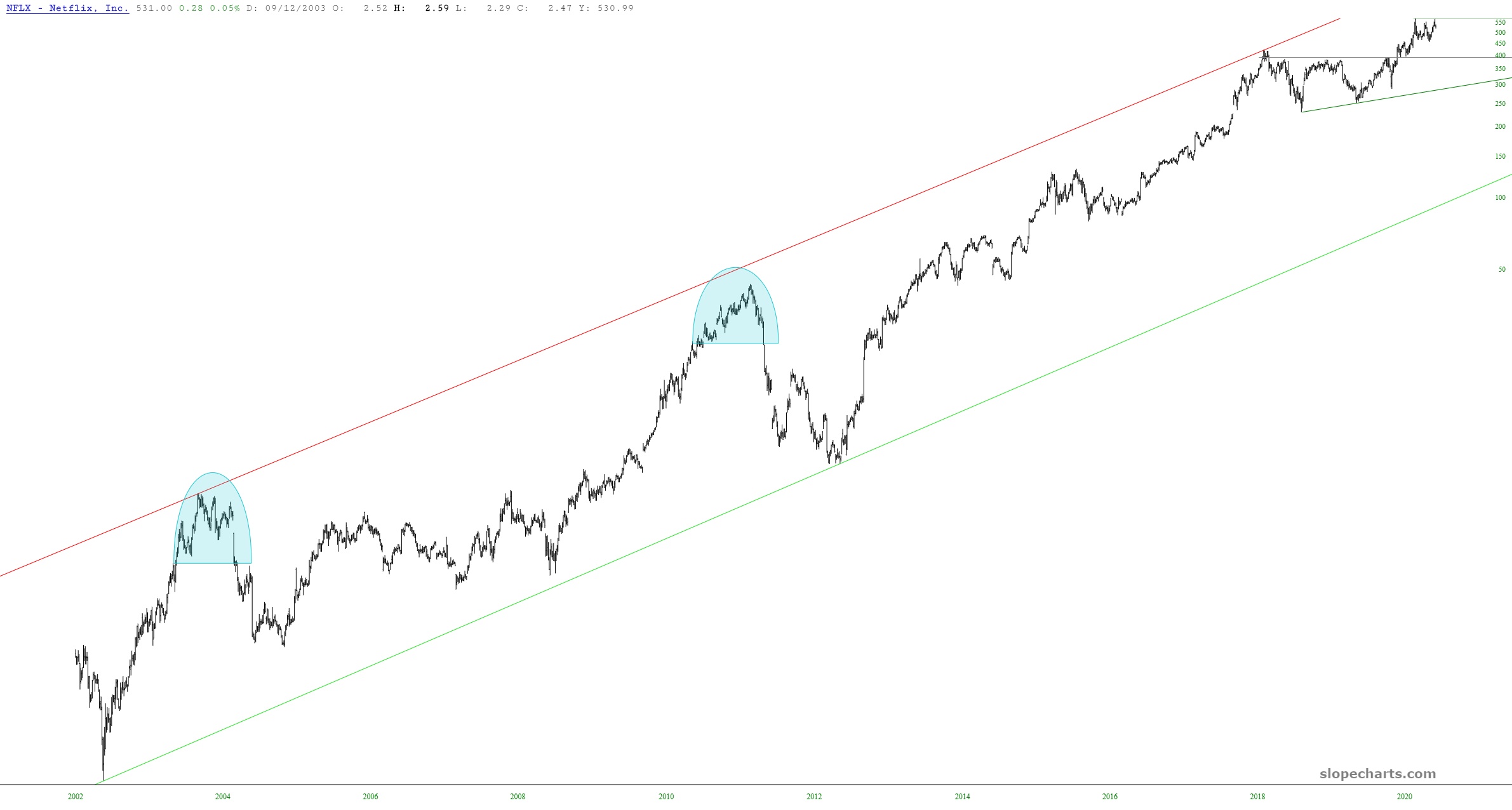
Most simply, here is the entire NFLX chart, bounded by its lifetime price channel. Since its bottom, the chart is up 1500-fold, meaning if you had just invested a billion dollars at the bottom, you would have $1.5 trillion now.
(Click on image to enlarge)