
Is There Any Upside From Here?
With the S&P 500 closing, Friday up 35.9% from the March 23 low, the key questions in my mind are simple. First, how high is too high? And is there any upside from here?
The reason I ask these question is because it appears there is a ginormous chasm between the stock market's recovery and that of the economy. Yes, the economy is turning the corner. But as we discussed last week, the hill the economy must climb in order to return to where things stood in January is long and steep. In fact, Fed Chair Jay Powell lamented last week that recovery could take years. As such, a "quick fix" doesn't look to be in the cards.
Now compare this to the S&P 500, which sits just 10.2% from its all-time high. Or the Nasdaq 100 Index that closed Friday up 10.66% on the year. See what I mean?
Logic would seem to dictate that one of these two views is wrong. Either the economy is going to recover very quickly, which would justify current stock prices. Or stock prices have gone too far when considering the amount of time it will take the economy to recover.
However, it is important to keep in mind that the stock market has its own kind of logic. And oftentimes it isn't exactly, well, logical.
The Narrative
The current narrative is that Ms. Market is looking ahead. Moving on, if you will, beyond the current economic and earnings debacle, which was self-inflicted, and ahead to what things will look like in 2021.
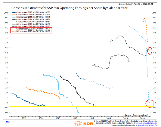
The chart below makes this point pretty well. This is a graph of the consensus estimates for S&P 500 operating earnings for each calendar year going back to 2014 and forward to 2021.
(Click on image to enlarge)
Source: Ned Davis Research Group
As you can see, in most calendar years, analyst estimates start out a bit on the high side and then are reduced over time. Except for 2018 and 2020, that is. Of course, 2018 estimates had to be revised upward as the year went on due to the tax cuts. And then we all know that 2020 is going to be rough. Just look at that dashed teal line!
As analysts began to look at 2020, the estimated operating earnings for the S&P 500 was north of $185. And as of June 4th, it stands at 109.71 - a drop of about 41%. Ouch.
And if the stock market were "logical" it might be trading in line with where the earnings were in 2014, 2016, or 2017 - which I've highlighted with a yellow box. To review, the S&P closed 2014 at around 2058, 2016 at about 2284, and 2017 around 2700. So, with earnings for 2020 down at these levels, wouldn't it be logical for the S&P to be trading somewhere around where those years ended? After all, the earnings are expected to be about the same.
How The Game Is Being Played
But hang on, that's not how the game is being played. No, since we stopped the economy on purpose, the market is looking past the "artificial" decline in earnings and ahead to 2121's earnings. And analysts currently expect the S&P to earn $161.80 next year.
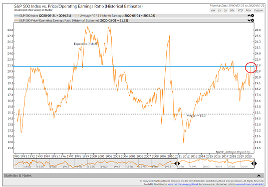
So, if we take $161.80 and multiply it by 22 (the current Operating Earnings P/E and the multiple range seen in mid-2016 through most of 2018), we get 3560. Which is 17.05% higher than where the S&P closed on Friday. Thus, it would appear that there might be some serious upside still available!
Assuming the S&P 500 companies earn $161.80, of course. And that investors are willing to pay 22 times those earnings. Remember, sometimes they pay a lot more. And other times a LOT less.
To make this point, I offer the chart below - the S&P's Price-to-Operating Earnings Ratio going back to 1990ish.
(Click on image to enlarge)
Source: Ned Davis Research Group
As you can see, putting a 22 multiple on earnings isn't exactly conservative. Sure, 22 isn't as high as the heady times seen in the late '90s or as the market bottomed from the Great Financial Crisis in 2009. But it ain't cheap either. Especially when there might be some question as to whether those earnings actually show up.
So again, I ask, how high is too high?
My Take
Here's my take on the situation. If the economy is going to recover faster than expected, a 22 multiple is probably about right. And the joyride to the upside can surely continue as traders discount better days ahead.
But... If the economy doesn't recover like a racehorse and instead acts more like a plow horse (hat tip to Brian Wesbury at First Trust for the horse analogy), there might be some "discussion" about the appropriate level of earnings as well as the proper multiple to put on those earnings.
And to clarify, that "discussion" involves a little something called "price discovery," which in this case will likely include some downside testing.
The bottom line is this is going to be interesting. Stay tuned!
Weekly Market Model Review
Each week we do a disciplined, deep dive into our key market indicators and models. The overall goal of this exercise is to (a) remove emotion from the investment process, (b) stay "in tune" with the primary market cycles, and (c) remain cognizant of the risk/reward environment.
The Major Market Models
We start with six of our favorite long-term market models. These models are designed to help determine the "state" of the overall market.
Once again, there are two changes to report on the Primary Cycle board this week. First, the Leading Indicators Model improved from neutral to positive. Next, NDR's Risk/Reward model flipped to positive. In addition, my "Desert Island " model looks like it will flash a long-term buy signal as well this week. So, with three buy signals and three neutral signals, I'll continue to rate the board (and the overall market picture) as moderately positive. While I remain concerned about the chasm between the stock market's recovery and the economy's, I cannot argue with the indicators.

* Source: Ned Davis Research (NDR) as of the date of publication. Historical returns are hypothetical average annual performances calculated by NDR. Past performances do not guarantee future results or profitability - NOT INDIVIDUAL INVESTMENT ADVICE.
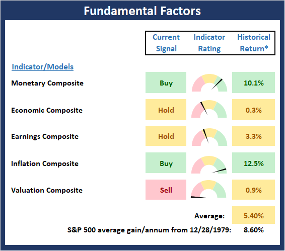
The State of the Fundamental Backdrop
Next, we review the market's fundamental factors in the areas of interest rates, the economy, inflation, and valuations.
There are no changes to the Fundamental Factors board this week. As I have stated previously, I believe both the Economic and Earnings Composite models remain artificially high due to the fact that many of the component indicators update either monthly or quarterly and have not had time to reflect the sudden halt to economic activity caused by the coronavirus. However, based on the market's reaction to the Fed's support, we might want to give the Monetary Model double - or even triple weight here.
* Source: Ned Davis Research (NDR) as of the date of publication. Historical returns are hypothetical average annual performances calculated by NDR. Past performances do not guarantee future results or profitability - NOT INDIVIDUAL INVESTMENT ADVICE.
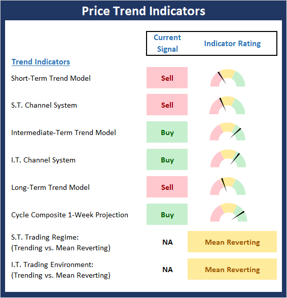
The State of the Trend
After looking at the big-picture models and the fundamental backdrop, I like to look at the state of the trend. This board of indicators is designed to tell us about the overall technical health of the current trend.
After the recent joyride to the upside, (as in the best run over a 50-day period in history), a pullback/pause/correction shouldn't come as a surprise. And since Thursday's rout was one of the largest in stock market history on a percentage basis, it is natural to see the shorter-term indicators on the price trend board turn red. The key here is if the bulls will be able to "break on through to the other side" (hat tip to The Doors) and continue to move higher after a period of consolidation or if the bears will be able to do some additional downside price exploration. I'll be watching the key technical levels for clues this week.
* Source: Ned Davis Research (NDR) as of the date of publication. Historical returns are hypothetical average annual performances calculated by NDR. Past performances do not guarantee future results or profitability - NOT INDIVIDUAL INVESTMENT ADVICE.
The State of Internal Momentum
Next, we analyze the "oomph" behind the current trend via our group of market momentum indicators/models.
While the Momentum Board gave up a little ground last week, the preponderance of green on the board remains positive. As such, the plan is to give the bulls the benefit of any doubt here.
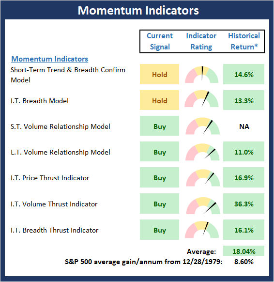
* Source: Ned Davis Research (NDR) as of the date of publication. Historical returns are hypothetical average annual performances calculated by NDR. Past performances do not guarantee future results or profitability - NOT INDIVIDUAL INVESTMENT ADVICE.
Early Warning Signals
Once we have identified the current environment, the state of the trend, and the degree of momentum behind the move, we then review the potential for a counter-trend move to begin. This batch of indicators is designed to suggest when the table is set for the trend to "go the other way."
The Early Warning board did a pretty good job of warning us that a pause was due. At this stage, the board is beginning to suggest that the bulls may regain control of the ball. However, I for one would like to see the bears consolidate in a sideways fashion for a spell here.
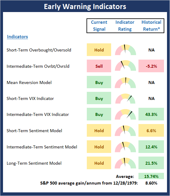
* Source: Ned Davis Research (NDR) as of the date of publication. Historical returns are hypothetical average annual performances calculated by NDR. Past performances do not guarantee future results or profitability - NOT INDIVIDUAL INVESTMENT ADVICE.
Disclosure: At the time of publication, Mr. Moenning held long positions in the following securities mentioned: none - Note that positions may change at any time.
The opinions and forecasts ...
more

