
Extreme Extremes
If you look at the Fundamentals Data Panel in SlopeCharts, you can find some real treasures. Below, for example, is a chart of the quantity of stocks above their own 200-day moving average. The chart is, naturally, rather cyclic, and I’ve drawn two horizontals at the 8% and 92% marks. I’ve also taken the time and trouble to tint the zones above and below these levels.
(Click on image to enlarge)
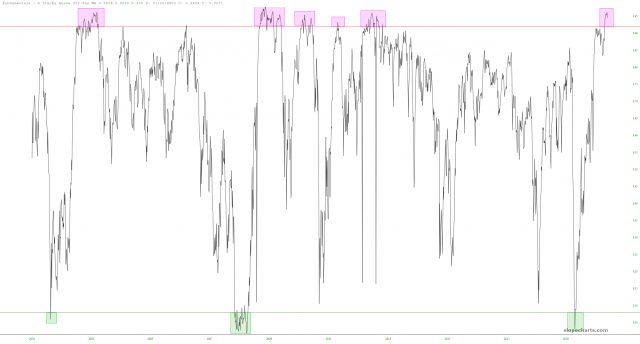
Let’s just all agree stocks are really high and, if the entirety of human history is any guide, they will eventually fall, and probably sooner than people want or expect.
(Click on image to enlarge)
How did you like this article? Let us know so we can better customize your reading experience.

Comments
Leave a comment to automatically be entered into
our contest to win a free Echo Show.

