
An Interest(ing) Development

The State of the Market
Midway through February, things were looking good as all-time record highs were recorded by the major indices and the YTD gain for the S&P 500 was approaching +5%. But then it happened. On 16-Feb all heck broke loose in the bond market as the yield on the 10-year Treasury Note surged above its recent trading range and embarked on a what can only be described as a joyride to the upside.
Normally, when prices on a chart move up quickly, it's a good thing. However, when the move occurs in bond yields, it's the opposite and many analysts call such a move a "tantrum" - as in the market pitching a hissy fit. In this case, the temper tantrum in rates is being attributed to the combination of more aid/stimulus (which in turn, will create massive increases in the supply of bonds the government will have to sell), economic data that has largely surprised to the upside, and of course, the long-awaited uptick - albeit modest - on the inflation front.
Despite Fed Chair Powell making it abundantly clear during his bi-annual testimony on the state of the economy and monetary policy that the Federal Reserve has no intention whatsoever of raising rates anytime soon, bond traders had other ideas. In the span of 8 trading days, the yield on the 10-year leaped from 1.2% to 1.61% - a move of about 35%.
Higher, But Not High
Granted, yields pulled back a bit on Friday and closed at levels last seen a year ago - which at the time, were all-time lows. So, from a big-picture standpoint, yields returning from their COVID-induced record lows to the prior all-time low means rates remain quite low by historic standards. Perhaps the best description of the big-picture situation here is rates are "higher but not high."
It can also be argued that the increase in rates back to more "normal" levels shouldn't be surprising given the expectations that the economy is should return to some form of normalcy in the coming months. But in Ms. Market's game, it's the big surprises that get traders' attention, and the spike in rates certainly qualifies as such.
Trades Press Pause
In response to rapidly rising yields, traders pressed the pause button on the steady march upward in stocks of all colors, shapes, and sizes. It appears that a collective rethink about the return to normalcy party was in order as traders began fretting about the corresponding consequences.
As in, do we REALLY want to continue to pay up for growth stocks that may not grow quite as fast with rates on the rise? The short answer last week was, "uh, no." And this, dear readers, is the stuff that "corrections" are made of (and driven by).
A glance at the action in the major market averages over the past couple of weeks tells the story. From the recent highs, the S&P 500 has pulled back -3.14% as of Friday's close. The Russell 2000 (using IWM as a proxy), which is where all the small-cap companies expected to benefit greatly from the anticipated economic boom, is off -1.83%. And the Dow Jones Industrial Average, which contains some of the value darlings such as Caterpillar (CAT) and Chevron (CVX), is off -3.22% (all of which occurred Thursday and Friday). All in all, not too bad, right?
However, the real action is happening away from the broad market indices. It's the COVID winners - I.E. mega-cap tech which enjoyed huge gains last year - that have been experienced the brunt of the intense selling. For example, the Nasdaq 100 Index is down more than double the S&P (-6.51%) and the ARK Innovations ETF (ARKK), which is a poster child for high-flying names such as Tesla (TSLA), Roku (ROKU), Teladoc (TDOC), and Square (SQ) has plunged -16.75% since 12-Feb. Yikes.
Why The Dive?
Why the dive in what had been the market's star players, you ask? It's a little something called discounted cash flow analysis - and a rotation into cyclicals, of course. According to Investopedia, "Discounted cash flow (DCF) is a valuation method used to estimate the value of an investment based on its expected future cash flows. DCF analysis attempts to figure out the value of an investment today, based on projections of how much money it will generate in the future."
One of the key components to DCF is the discount rate employed in your formula. Cutting to the chase and using layman's terms, higher interest rates means future cash flows are worth less.
To be sure, the vast majority of investors have never even heard of DCF, let alone employ such analysis in their decision to invest in Tesla. But the big boys at Wall Street firms do. And when a market or a group of stocks has outperformed everything by a mile - becoming richly valued in the process - just about anything can be used to justify some selling/profit-taking.
Is this the end of the mega-cap COVID Winners trade? Frankly, I'm not sure. But it does make some sense to me that the high-fliers deserve to rest for a spell, at the very least.
The Bottom Line
From my seat, it appears that stocks have entered some sort of pullback, correction, or sloppy phase. Where the indices go in the near-term, of course, is anybody's guess. So far at least, the pullback in the major indices falls into the "garden variety" pullback category - you know, the type of thing that tends to occur several times a year, with or without a good reason. It's just the way the game is played.
I for one will be watching closely to see if the selling picks up steam in the near term. And since I recently created some dry powder in my more discretionarily managed portfolios, my plan is to continue to put money to work into weakness - something I started doing late last week.
Here's wishing you a great week! Now let's turn to our expanded weekly model update...
Weekly Model Review
Each week we do a deep dive into our key market indicators and models. The overall goal of this exercise is to (a) remove emotion from the investment process, (b) stay "in tune" with the primary market cycles, and (c) remain cognizant of the risk/reward environment.
The Big-Picture Market Models
We start with six of our favorite long-term market models. These models are designed to help determine the "state" of the overall market.
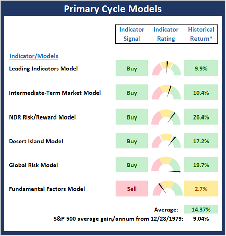
* Source: Ned Davis Research (NDR) as of the date of publication. Historical returns are hypothetical average annual performances calculated by NDR.
The Fundamental Backdrop
Next, we review the market's fundamental factors including interest rates, the economy, earnings, inflation, and valuations.
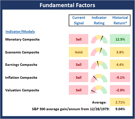
* Source: Ned Davis Research (NDR) as of the date of publication. Historical returns are hypothetical average annual performances calculated by NDR.
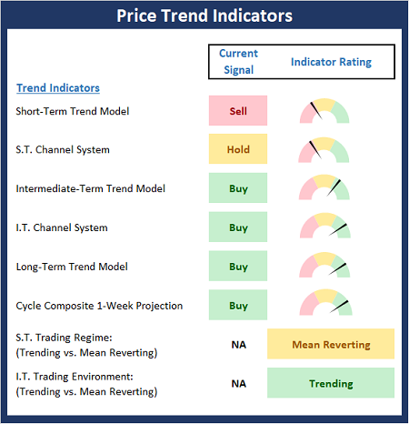
The State of the Trend
After reviewing the big-picture models and the fundamental backdrop, I like to look at the state of the current trend. This board of indicators is designed to tell us about the overall technical health of the market's trend.
The State of Internal Momentum
Next, we analyze the momentum indicators/models to determine if there is any "oomph" behind the current move.
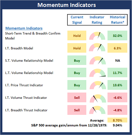
* Source: Ned Davis Research (NDR) as of the date of publication. Historical returns are hypothetical average annual performances calculated by NDR.
Early Warning Signals
Finally, we look at our early warning indicators to guage the potential for counter-trend moves. This batch of indicators is designed to suggest when the table is set for the trend to "go the other way."
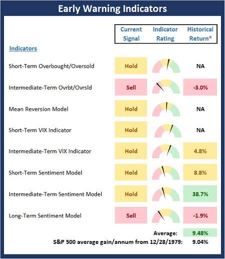
* Source: Ned Davis Research (NDR) as of the date of publication. Historical returns are hypothetical average annual performances calculated by NDR.
The opinions and forecasts expressed herein are those of Mr. David Moenning and may not actually come to pass. Mr. Moenning's opinions and viewpoints regarding the future of the markets should ...
more

