
A Chart That Makes Me Say, Wow!

While almost everyone is still talking about Friday's jobs report and whether or not inflation is here to stay, I'd like to use my pixels to talk about something else on this cold and rainy/snowy Monday morning in Colorado. You see, when doing my review of news, charts, and models, over the weekend, one thing really jumped out at me. Something that made me say, wow, that's interesting!
Although the chart of Consensus Estimates for S&P 500 earnings is near the end of the 70+ chart pack I review each Saturday morning, it definitely made me sit up and take notice. And while 2021's expected EPS has been trending higher for some time, the recent surge is impressive - and tells a story (well, to me, anyway).
By now, everybody knows that earnings have been coming in stronger-than-expected during the current quarterly parade of corporate results. To be sure, this has been a pleasant surprise. And I see the improving earnings picture as being one of the primary factors responsible for the move to all-time highs in the stock market.
So, let's get to it. The chart below illustrates the consensus of analysts' GAAP (Generally Accepted Accounting Principles) earnings estimates for the S&P 500 for each calendar year, plotted over time. For me, this chart really says it all.
(Click on image to enlarge)
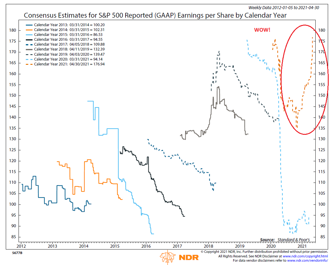
Source: Ned Davis Research
Don't look now fans, but the consensus estimate for GAAP EPS has surged to a new all-time high. Yep, that's right, analysts are projecting GAAP earnings of $176.94 for 2021. Which is up from the approximately $135 estimate seen near the end of last year. And if my calculator is functioning properly, that's an increase of more than 31% over a period of six months or so. I'll say it again, wow!
While I can certainly be accused of oversimplifying the matter here, if earnings estimates are at all-time highs, it shouldn't be too surprising to see the price of the S&P 500 index at all-time highs as well.
I'm going to go one step further here and opine that this chart also suggests there could be more upside ahead. Sure, stocks have been discounting the improving earnings picture for some time. However, one could argue that the expected earnings have been rising faster than prices themselves. And maybe, just maybe, there could be some catch-up down the road.
Yes, I know full well that the multiple game is key here. As in, what multiple of earnings are investors willing to pay? Especially given the already lofty valuations. But again, if earnings are rising this fast, then it follows that valuations are likely to come down meaningfully over time. Which, of course, is a good thing.
As long as the projected earnings materialize, that is. And it is worth noting that, as the chart shows, analysts have a tendency to overestimate earnings. This is illustrated by the downwardly sloping line of most years' calendar year earnings estimates. In fact, of the eight prior years shown on the chart, EPS finished the year higher than where they began the year only once - in 2018 (in response to the tax cuts). The rest of the time, analysts spent most of the year taking their estimates down in order to catch up with a reality that wasn't as rosy as initially projected.
But of course, this year is different. We have the virus receding and the economy re-opening. We have the Fed keeping its foot on the gas - and pledging not to let up any time soon. And we have Washington handing out/spending money at an eye-popping rate. As such, there is reason to believe that the upbeat mood about the economy and earnings just might stick around a while. We shall see.
Here's hoping you have a great week. Now let's turn to our weekly model update...
The Big-Picture Market Models
We start with six of our favorite long-term market models. These models are designed to help determine the "state" of the overall market.
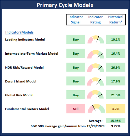
* Source: Ned Davis Research (NDR) as of the date of publication. Historical returns are hypothetical average annual performances calculated by NDR.
The Fundamental Backdrop
Next, we review the market's fundamental factors including interest rates, the economy, earnings, inflation, and valuations.
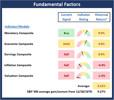
* Source: Ned Davis Research (NDR) as of the date of publication. Historical returns are hypothetical average annual performances calculated by NDR.
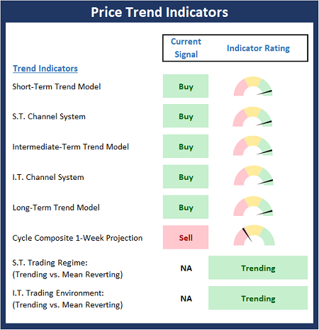
The State of the Trend
After reviewing the big-picture models and the fundamental backdrop, I like to look at the state of the current trend. This board of indicators is designed to tell us about the overall technical health of the market's trend.
The State of Internal Momentum
Next, we analyze the momentum indicators/models to determine if there is any "oomph" behind the current move.
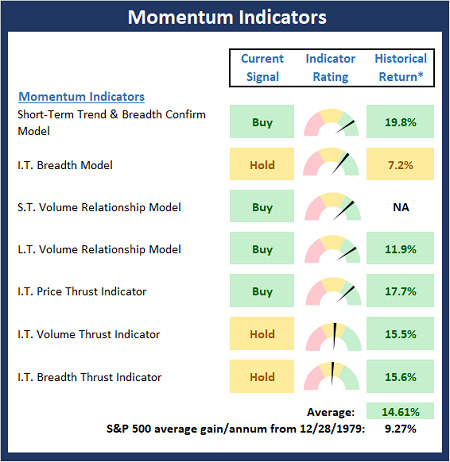
* Source: Ned Davis Research (NDR) as of the date of publication. Historical returns are hypothetical average annual performances calculated by NDR.
Early Warning Signals
Finally, we look at our early warning indicators to gauge the potential for counter-trend moves. This batch of indicators is designed to suggest when the table is set for the trend to "go the other way."
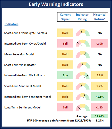
* Source: Ned Davis Research (NDR) as of the date of publication. Historical returns are hypothetical average annual performances calculated by NDR.
The opinions and forecasts expressed herein are those of Mr. David Moenning and may not actually come to pass. Mr. Moenning's opinions and viewpoints regarding the future of the markets should ...
more

