
Some Positive Gold Market Charts
A good place to start is at the seasonal tendencies for gold. There are seasons when gold drops in price, simply due to a lack of interest on the part of investors, and there are times when there is a seasonal tendency for investors to flock into the gold market.
(Click on image to enlarge)
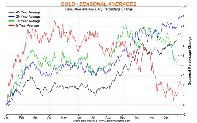
This chart courtesy goldchartsrus.com shows January is historically the best month for owning gold and gold products, such as mining stocks. The Christmas rally usually lasts into February before producing a seasonal top.
(Click on image to enlarge)
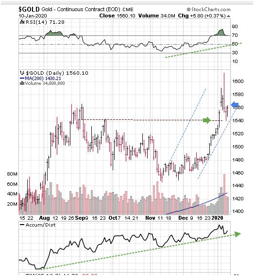
All other charts in this essay are courtesy Stockcharts.com. Featured is the daily bar chart for gold. Price is rising inside the blue channel. The supporting indicators are positive. The horizontal green arrow points to a level of previous resistance that appears to be ready to offer support. A close above the blue arrow will confirm that a new uptrend is getting underway.
(Click on image to enlarge)
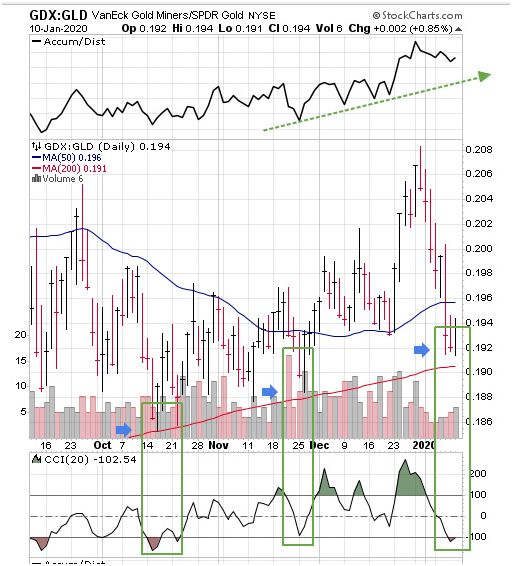
Featured is a chart that compares gold mining stocks (GDX), to gold bullion (GLD).In a gold bull market, we expect GDX to outperform GLD (as now). Quite often, when price touches the rising 200DMA (red line), while the CCI (Commodity Channel Index), drops to -100, (bottom of the chart), we are presented with a buying opportunity – see the blue arrows. Our subscribers benefit from this type of in-depth analysis. Notice also that the moving averages are in positive alignment, and rising!
(Click on image to enlarge)
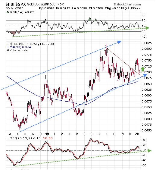
Featured is a chart that compares the mining stocks of the HUI index to the S&P500 index. While investors have been mesmerized by the constant rising of the S&P and DOW, it turns out that mining stocks have done even better, as can be seen clearly by the action inside the blue channel. The supporting indicators at top and bottom are positive, along with the rising 200-day moving average (solid blue line). The vertical green arrow hints at the start of another rally. Got Gold?
(Click on image to enlarge)
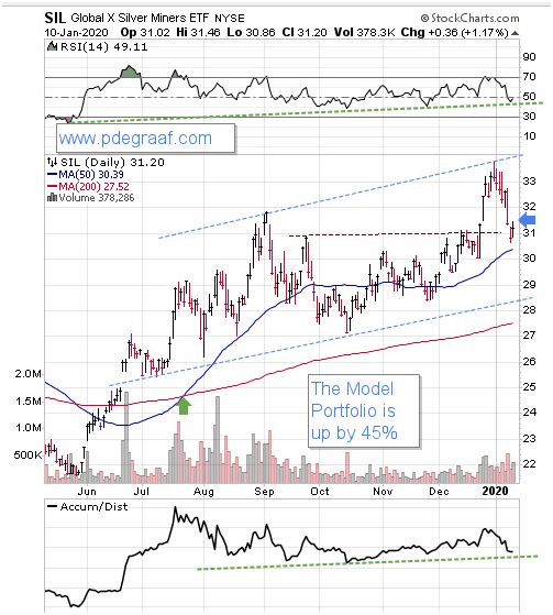
Featured is SIL the silver producers ETF. Price has been advancing since breaking out in June, above the moving averages. The green arrow points to a 'bull cross'.A close above the blue arrow will indicate that a new rally is about to get underway. Silver and silver producers are expected to benefit from a California law that mandates all new homes and any renovated homes, must have solar panels incorporated into the roof, as of Jan 1st this year. It is expected that other states will follow along. Solar panels will require a lot of silver, and because used solar panels are not easily recycled, most of them will end up in landfill in years to come – including the silver that was used in the manufacturing process.
(Click on image to enlarge)
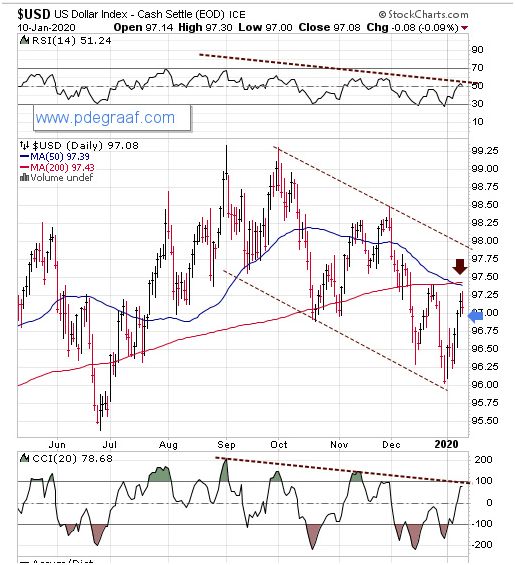
Featured is the US dollar index. Price is declining inside the brown channel. The supporting indicators are negative. The brown arrow points to a 'bear cross'.A close below the blue arrow will send price looking for support at the bottom of the channel. A declining dollar will be of benefit to gold and silver.
Disclaimer: Investing involves risk taking. Please do your own due diligence. Peter Degraaf is NOT responsible for your trading decisions.
Peter Degraaf is a stocks and commodities investor with ...
more


I would think the tensions with Iran would be enough to keep gold high.