
Perspective On The Employment Release
Some observations: (1) The blockbuster number (943 K vs 870K fm Bloomberg) has to be kept in perspective, as NFP employment is far below trend, (2) high contact intensive services employment was recovering quickly through the reference period before the delta variant surge, (3) both average nominal wages and aggregate hours continued to rise, and (4) average real wages likely stabilized in July, at about 1.5% above 2016-19 trend.
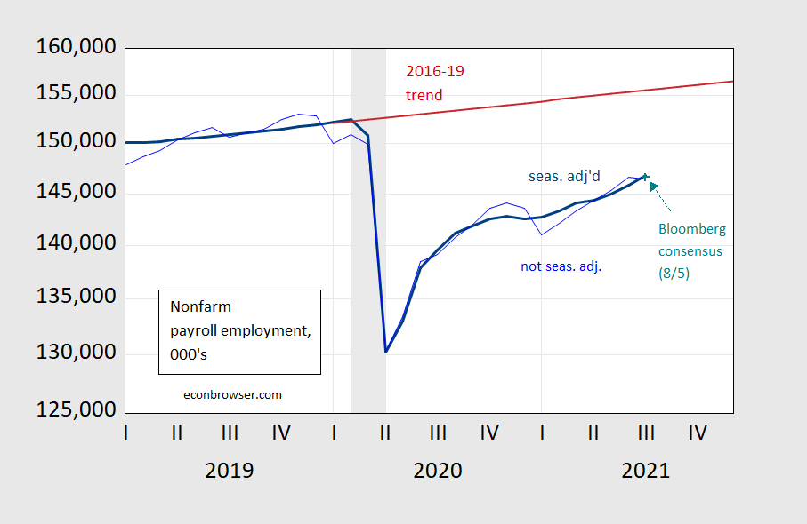
Figure 1: Nonfarm payroll employment, seasonally adjusted (bold blue), seasonally unadjusted (light blue), Bloomberg consensus of 8/5 (teal +), 2016-19 stochastic trend (red), all in 000’s. NBER defined recession dates shaded gray. Source: BLS, Bloomberg, NBER and author’s calculations.
Despite the large number, employment in the big picture does not look much above expected (from the Bloomberg consensus) and remains 5.7 million shy of peak (3.8% in log terms). Employment is 5.8% below the 2016-19 trend. Note that the seasonally adjusted and not seasonally adjusted series agree on the levels of employment, as do the 12-month percentage changes.
The sectoral distribution of growth is also remarkable. Manufacturing continues to grow as it has, after a couple of hiccups, but accommodation and food services have really staged a comeback – at least through the 2nd week of July (the reference period).
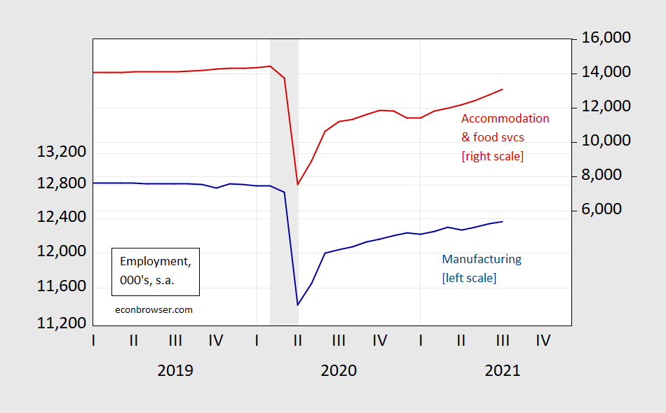
Figure 2: Manufacturing employment, (dark blue), accommodation and food services (red), all seasonally adjusted, in 000’s. NBER defined recession dates shaded gray. Source: BLS, Bloomberg, NBER and author’s calculations.
Nonetheless, accommodation and food services employment remains 9.7% (1.3 million) below peak, while manufacturing employment is only 3.4% below (433 thousand). And this is before the impact of the delta variant was being felt in terms of risk averse behavior in high contact activities, occurring toward the end of July.
Aggregate weekly hours continued its climb, and hence too did (composition unadjusted) average hourly earnings.
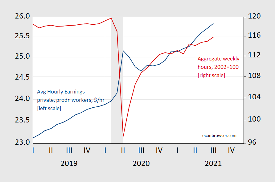
Figure 3: Average hourly earnings, $/hr (blue, left log scale), aggregate weekly hours index, 2002=100 (red), both seasonally adjusted. NBER defined recession dates shaded gray. Source: BLS, NBER.
With rapid see-saws in inflation taking place, it’s important to think about real earnings (it would be better to look at earnings by categories or by income deciles, but I haven’t had a chance to do that). Figure 4 shows real average hourly earnings, calculated using the CPI-all (and the Philadelphia Fed’s nowcast for July).

Figure 4: Real average hourly earnings in total private sector, 2019$/hr, seasonally adjusted (blue), real earnings based on Philadelphia Fed nowcast (teal +), and 2016-19 stochastic trend (red), both on log scale. NBER defined recession dates shaded gray. Source: BLS, Philadelphia Fed, NBER, and author’s calculations.
Real average hourly earnings have come down substantially — of course not adjusted for composition. They now seem to be relatively flat going from June to July. If the July nowcast proves accurate, then real average hourly earnings are only about 1.5% above the 2016-19 trend.
As noted in this post, reported CPI probably understated inflation in 2020, and overstated inflation in 2021. If that is the case, then the fall in real average earnings since 2020M04 is probably smaller, and the deviation relative to trend in July 2021 larger.
Disclosure: None.


