
Nasdaq 100 To S&P 500 Ratio
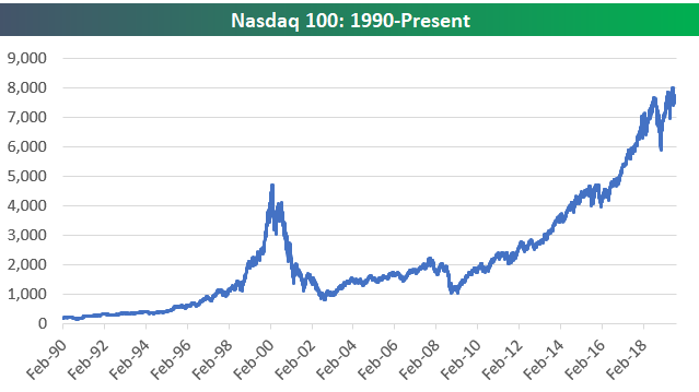
Below is a chart of the Nasdaq 100 going back to 1990. While it took 15+ years for the index to make a new all-time closing high following its March 2000 peak, the index is currently 65% above those March 2000 highs.
(Click on image to enlarge)
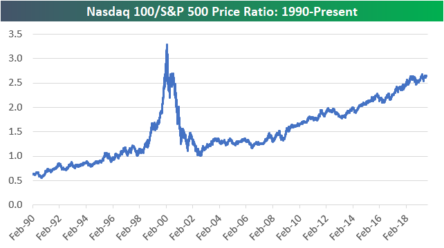
Below is a ratio chart of the Nasdaq 100’s price versus the S&P 500’s price since 1990. The ratio started well below 1 in early 1990 but quickly overtook the S&P in price by the mid-90s. As you can see, the ratio spiked dramatically above 3 during the peak of the Dot Com bubble in late 1999. The Nasdaq 100 then gave up much of that outperformance versus the S&P 500 over a 2-3 year period where the ratio got all the way back down to 1, but since then it has been steadily trending higher to its current level of 2.65. While it went through a bubble and a burst over a 5-year period, the Nasdaq has been outperforming the S&P 500 for a long time now.
(Click on image to enlarge)
Start a two-week free trial to one of Bespoke’s premium equity market research services.
Disclaimer: Read ...
more

