
My Favorite Charts Of 2019
We recently published the 2019 End of Year Special Edition of the Weekly Macro Themes report - a summary of some of our best, worst, and most notable charts of 2019 (and the ones to watch in 2020).
Already on the blog we've covered the "Charts That Worked" and the "Charts That Didn't Work" last year. In this post I take you through some of my favorite charts of 2019.
These charts are mostly ones I simply enjoyed coming up with (some of my favourite moments are designing a new chart/indicator which brings a completely new perspective or insight). Certainly, a lot of these will be worth watching in the months and years ahead.
Format note: each chart has a comment on the chart, the date when it first appeared, and a quote from the original report which it appeared in.
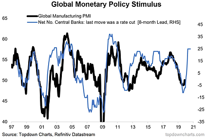
1. One that quickly became (in)famous (especially given the prevailing sentiment at the time). It shows the global policy pivot portending a PMI pop. Time will tell whether it will be one for section A (good calls) or B (bad calls) in next year’s End of Year Special edition!
(30 Aug 2019) “the net number of central banks in rate cut mode against the global manufacturing PMI: it seems to operate with about an 8-month lead; not a perfect track record but pretty good, and it’s pointing to a decent rebound later this year/early next year.”
2. This was one of the new sets of indicators I built this year, and one of the first insights it helped generate was presenting a harbinger that the Fed needed to pivot back to rate cuts given the collapse in inflation expectations.
(29 Mar 2019) “Looking at the all-indicators composite inflation expectations indicator, it seems to line up fairly well with the direction of the Fed funds rate (YoY change), thus the easing in inflation expectations arguably justifies a more dovish stance.”

3. The Global Monetary Policy Pivot: this chart remains one of my favourites, and was a feature in last year’s End of Year report as it helped pick up on the mass migration of central banks to tightening – which as it turns out in hindsight was probably a mistake.
(1 Mar 2019) “As promised, the global monetary policy map chart is going to be a regular feature this year. Predictably, after 9 months of exclusive hikes and no cuts by the 37 central banks we track, February brought a return of the cuts, and a fair dealing of dovish declarations - hinting that this could just be the start of a wider pivot in policy”

4. Another monetary policy chart, this one tracks the weighted average policy rate for DM central banks, but uses “shadow rates” (which factor in the impact of QE). The shadow composite tells a bit more than the headline rates.
(31 May 2019) “looking at the developed markets composite policy rate with shadow rates subbed in the weighted average policy rate has fallen [170] bps from the previous high (this followed 200 bps of effective tightening by DM banks). Interestingly, it declined by 155 bps in the wake of the 2015/16 corrections - which you could argue helped pave the way for the echo bull market of 2016/17. Further easing and follow-through on the policy pivot will be helpful for risk assets,”

5. This one was useful both initially in terms of helping confirm the bottom in global equities, but also subsequently in showing how institutional investors basically sold the bottom, sold the rebound, and remained underweight. It’s one of the reasons why I remarked that a lot of investors were offside to my 2020 global economic rebound thesis (which I developed later in the year, but before the October breakout).
(1 Feb 2019) “As you can see with the chart, the global (investor confidence) index dropped to a record low which indicates massive de-risking”

6. Another relatively new addition to the stable of charts, a tracker of leveraged ETF trading volumes, this one yields quite interesting tactical (contrarian) insights at extremes e.g. around the Dec/Jan market lows, and subsequent rebound. As you might guess it’s shot up again recently…
(25 Jan 2019) “On trading action, we can see the ratio of levered long vs short ETF value-traded (basically a gauge of demand for leveraged long relative to leveraged short product) plunged to multi-year lows around the market bottom (in contrast to a record high in Jan 2018 …if only I had this chart back then!)”

For more and deeper insights on the global markets, good charts, and actionable investment ideas you may want to more


These charts are definitely worthwhile. Thanks for sharing.