
Income Inequality For Households: A Long Biased History Of Gini Ratio. 2021 Revision
The Census Bureau measures incomes and reports the estimates. One of the main questions is income inequality – personal and households. We published a post in 2012 on the bias in the household Gini ratio. Here we revise the previous study with new data.
In 2012, our first point was that the Gini ratio for personal incomes reported by the Census Bureau from the very same data set (CPS ASEC conducted every March) does not change much since 1994. The upper panel in Figure 1 reproduces the Gini ratio from the previous post, which varies from 0.494 to 0.512 – a relatively narrow window. In the lower panel, the dataset is extended to 2019 and the rise from 0.494 in 2007 to 0.524 in 2013 is a challenge for an economic explanation. This is a catastrophic and unexpected change in inequality. The years after the Great Recession (say, after 2010 with G=0.503) were not characterized by some outstanding economic processes or events. These were the years of President Obama.
In another post on January 17, 2001, we reported an unprecedented fall in the share of “compensation of employees” in the total personal income (PI) as reported by the Bureau of Economic Analysis. Figure 2 presents the corresponding curve, which demonstrates the accelerated decrease from 0.660 in 2006Q3 to 0.614 in 2016Q3. The 0.046 drop in the share of income from jobs reported by BEA is synchronized with the personal Gini rise by 0.03. The trough in 2020 related to the COVID-19 pandemic may be an interesting economic experiment for income distribution. Personal income in 2020 does not change much (even increase in Q2 and Q3 against pre-crisis expectations) despite the drop in compensation of employees. The question is where we will find the government social benefits to persons (+2.5 trillion in Q2 and +1 trillion in Q3 compared to the previous year). My current guess – stock market.
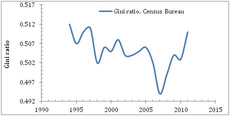
Figure 1. Personal incomes: Upper panel: Gini ratio evolution between 1994 and 2010 as presented in this post. Lower panel. Gini ratio evolution between 1994 and 2019. Between 2007 and 2013 the Gini ratio raised from 0.494 to 0.524, i.e. by 0.03.

Figure 2. Ratio of compensation of employees and Personal Income (BEA. Table 2.1. Personal Income and Its Disposition). Quarterly data. The fall 0.655 in the third quarter of 2006 to 0.614 in 2016Q3.
The upper panel in Figure 3 is borrowed from the previous post and shows the history of Gini ratio for households between 1967 and 2010. (The lower panel extends the period to 2019). We normalized the ratio to its maximum value (0.477 in 2011) in order to show that this inequality measure had risen by 20% since 1967. This dramatic increase was interpreted as harm for the US. In my view, this is just a misunderstanding of the income measurement procedures. Unlike personal incomes, the household income data are collected for entities that can evolve in size in all directions. There are two limit cases: 1) all households may have just one person and then the household Gini is fully equivalent to the personal Gini, which is higher as we can learn from Figure 1; 2) all people represent one household and then the Gini is 0 because there is no inequality for 1 object. For a given personal income distribution, any other combination of people gathering in households should give the Gini between 0 and the personal Gini. Reconfiguring the households’ sizes and personal content for the same population one may change the Gini for the household incomes without changing personal incomes. Therefore, the split of the population into households defines the Gini for a given population and time point. The distribution of the increasing number of people among households, i.e. the distribution of household sizes, and the personal income distribution are changing in time, and the household Gini is evolving in sync with these changes. The Census Bureau’s approach is straightforward – they measure the distribution of the household incomes and calculate the Gini ratio. This ratio is incompatible with the previous years since the distribution of household sizes is changing. Moreover, it is changing in the direction of the split of bigger households into smaller pieces, eventually into the single-person-households. Hence, the household income distribution approaches the personal income distribution and this must be accompanied by an artificial increase in the Gini ratio. This increase is reported as a big problem of American households. This is a definitional problem, however, and has no relevance to real changes in income distribution illustrated in the lower panel in Figure 1.
The Census Bureau does not explicitly report the distribution of household sizes (in persons) and one has to make an own estimate, which is easy, however. Figure 4 presents (old and new) the total household population (different from the civil population or residential population) and the number of households reported by the CB. Figure 5 depicts (old and new) the evolution of the average household size since 1967. Actually, it was quite spectacular: from 3.2 in 1967 to 2.49 in 2011. Between 2010 and 2019, the mean household size hovered around the 2.5 level. This constant mean size could be interpreted as the constant household size distribution between 2000 and 2019.
Does it matter for the household income inequality? As we discussed above, the Gini ratio depends on the size distribution of objects if these are not indivisible persons. Intuitively, more low-income (e.g. one person) households result in a higher Gini ratio. The fall in average size indicates that one gets more and more small households over time and … the Gini ratio increases accordingly. The link between the average household size and the Gini ratio is not linear (as we discussed before, many household size distributions have the same average size) but Figure 6 shows the (old and new) product of the normalized Gini curve for households (see Figure 3) and the curve in Figure 5. This product is an approximation of the constant 1967 household size distribution as if all people in every year after 1967 were distributed in the same household size structure as in 1967. This product compensates the size distribution change but does not compensate the income change in the households, i.e. we do not compensate the process of income gain or loss in the households with time, and we do know that the income distribution for a given household size has been changing with time (see these posts). In Figure 6, we see a corrected (and likely closer to reality) Gini history. This corrected normalized Gini is not fully compensated for the household size changeover time but tells a different story.
The original Gini ratio for households corrected to the change in the household size distribution is depicted in Figure 7. In 2019, the level is the same as in 1967 – 0.397. The positive shift from 1992 (0.358) to 1993 (0.378) is completely artificial. In 1993, there was a revision to income definition and all-time series were subject to dramatic changes. Therefore, the current level is below that in 1967 if to use the 1967 household income definition.
Overall, the Gini ratio for households has not been changing as the CB estimate says because these estimates do not take into account the change in the household size distribution.
As we wrote in 2012, this is a methodological error. The same logic must be applied to family income distribution. Another sufferer is the mean income. Since the size of households has been decreasing the number of households has been growing faster than the total household population. The mean household income must also be corrected for the changing size.
Figure 8 shows the actual evolution of the mean income. There was a period of constant mean income between 1996 and 2013 with no significant change in the average household size. Since 2014, the mean income curve has been demonstrating tangible growth.


Figure 3. The evolution of normalized Gini ratio for households. Old and new versions


Figure 4. The evolution of the total household population and the number of households (both in thousands)


Figure 5. The evolution of average household size.


Figure 6. Corrected normalized (see Figure 3) Gini ratio.

Figure 7. Gini ratio corrected to the change in household size distribution. In 2019, the level is the same as in 1967 – 0.397. The positive shift in 1992 (0.358) to 1993 (0.378) is completely artificial. Therefore, the current level is below that in 1967.


Figure 8. The growth of normalized (household) mean income and that corrected for the fall in the household average size.
Disclosure: None.


