How Many ‘Shortage’ Anecdotes Equal Data?
There is a growing list of categories of prices which are seeing abnormal price pressures. At least, they are abnormal by the standards of the last quarter-century! A couple of months ago, in “The Risk of Confusing Inflation Frames,” I wrote about some of the effects we might soon be seeing, and of the risk that some of the known-but-temporary effects will obfuscate more serious underlying issues.
In April, we will get the CPI for March; this will be the first CPI release to have ridiculously easy comparisons against the year-ago month. March 2020 was -0.2% on core CPI, and I suspect the consensus estimate for March 2021 will be something like +0.2%; this implies the y/y core inflation number will jump from 1.3% to around 1.7%, depending on rounding. But as I said, that disguises some of the important underlying pressures that may also start to appear with this number. There is an old saying that the plural of “anecdote” isn’t “data,” but eventually there must be a crossover point where the preponderance of independent anecdotes begins to approach the informational value of data, right? Well, here is a short list of some recent anecdotes and reports of shortages.
There has become an acute shortage of semiconductor chips, which has impacted automobile production (and will that increase prices for what is available?). There is a shortage of shipping containers, causing widespread increases in freight costs affecting a wide variety of goods. Packaging materials, which are also a part of the price of a great many goods, are also shooting higher in price. Worker shortages at various skill levels were reported in the most-recent Beige Book. There is a shortage of Uber and Lyft drivers.
There are other effects that have shown up but I misapprehended the significance of them at the time. Apparel prices have risen at an annualized 9% pace over the last four months. I’d attributed that to shipping, but there is more to it than that. In January US Customs issued a Withhold/Release Order (WRO) on cotton and tomato products coming from the Xinjiang region of China, where forced labor is employed; the order calls for the stoppage of freight with any amount of cotton (or tomatoes, but there is not much tomato in apparel) that originates from that region – even if it is only the thread on the hem. While this and the other effects on apparel are probably temporary, we don’t really know how temporary.
Importantly, we should add to these shortages a growing shortage of housing. The inventory of homes available for sale just hit an all-time low (the National Association of Realtors started keeping track in 1982).
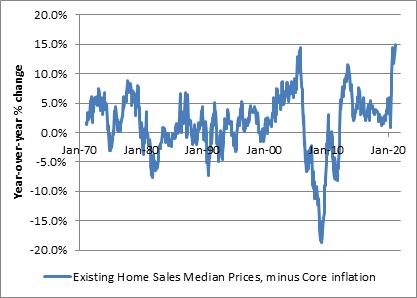
And, as a result, the increase in the median sales price of existing homes just reached an all-time high spread over core CPI (home price increases sometimes have been higher, though it is unusual. For example, in May 1979 the year-over-year increase in the median home price was 16.9%. But core inflation was 9.4% at the time, so the real increase in home prices was only 7.5%).
I have written elsewhere about the fact that there is large divergence right now between what the BLS indicates the effective inflation in the cost of housing is, and what a measurement of asking rents suggest it should be. The significant chart is reproduced below – and the short story is that the divergence dates to the imposition of the COVID-related eviction moratorium. This has decreased the amount of rent that landlords actually expect to receive on average, which lowers effective rents even though every other measure of the true (free market) cost of shelter would be, is ratcheting higher at rates seldom if ever seen before.
Now, this moratorium was due to expire at the end of March, but the CDC just extended it until June (which may be one reason that TIPS breakevens have hit some minor resistance). That’s a little unfortunate since it means that the moratorium will expire right about the time that the CPI is enjoying favorable comparisons versus 2020. The understating of rent and owners’-equivalent rent inflation, since those are a huge portion of the consumption basket, has an outsized effect on CPI. I want to be fair here to the BLS: in an important sense, the CPI data on rents is not wrong because in fact if a tenant pays less because of the moratorium, then that tenant’s cost of living really did go down. Even though in a free market without such a moratorium his cost of living would have been higher, that’s not the question the BLS is trying to answer. The cost of living is lower in such a case. Of course, that’s temporary, and so when the moratorium is lifted we can expect the BLS will also faithfully report the catch-up. Which means that in the summer, when we would have expected y/y CPI to start to decline again as it faces more difficult comparisons to 2020…it may not, because rents will start to catch up. That’s going to toast the marshmallows of a lot of investors.
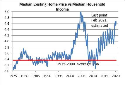
Now, there’s one more facet of the cost-of-shelter question and that’s whether home prices have risen too far, too fast and so it’s home prices and asking rents that will have to decline, rather than effective rents re-accelerating. This is a reasonable question. It is true that the ratio of home prices relative to incomes is getting back to levels that in the late 2000s indicated a bubble was getting ready to pop (see chart). For many, many years median home prices relative to median incomes was fairly stable at around 3.4x. Some increase makes sense since homes have been getting bigger, but it does give the appearance of being overextended.
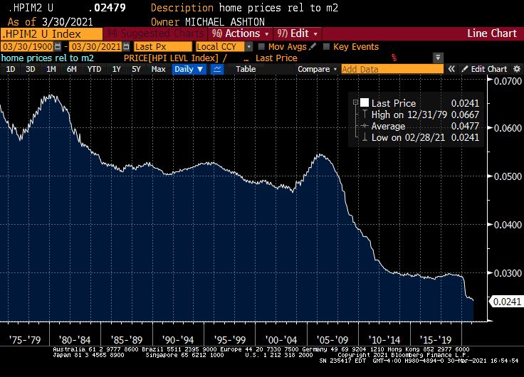
However, last week in Money Illusion and Boiling Frogs I argued that the nominal value of certain real assets might be usefully compared to the level of the money supply as a way of assessing their real value. Comparing the equity market to M2 made the former look less frothy, and the argument is that maybe equity investors aren’t suffering from “money illusion” in the same way that consumers might be (so far). But the same cannot be said for the housing market. The chart below (Source: Bloomberg) divides the home price index (from the FHFA) by M2. While home prices relative to incomes look high, home prices relative to the stock of money look quite low. It is interesting how the QE of the early 2010s shows up as a one-time shift in this ratio, followed by a period of stability, isn’t it? It suggests that maybe home prices didn’t fully adjust to the new money-stock reality after the bubble’s burst in 2008 and the subsequent QE. And maybe such a one-time shift happens again now.
But it might also be the case that the current rapid escalation of home prices is the market’s attempt to get the real value of the housing stock to reflect the rapidly increasing value of the money stock. If that’s the case, then it also suggests that median wages probably will eventually follow. The last people to respond to money illusion generally are the people selling their labor.
I don’t know if this is the ‘right’ answer, and my purpose in these articles isn’t to give the ‘right’ answer. I just want to ask the right questions…and I feel like these are the right questions.


