
Growth Rate Of The GDP Per Capita Revisited: Cross Country Comparison
We have presented a large number of the real GDPpc country histories between 1960 and 2018 as reported in the Maddison Project Database. The range of initial conditions, GDPpc(1960), and the total growth, GDPpc(2018)/GDPpc(1960), creates an impression of chaotic behavior and may compromise our understanding of actual growth processes in various countries. In this section, we present a general framework allowing consistent analysis of the MPD data and assessment of relative economic performance for a given country. The principal GDPpc inertial growth equation is the following:
g(t) = dlnG(t)/dt = A/G(t)
Instead of integrating this equation between 1960 and 2018 and finding the total growth GDPpc(1960)/GDPpc(2018), we directly calculate this ratio. Figure 1 shows several theoretical curves of total GDPpc growth in 58 years, GDPpc(58)/GDPpc(0), for four different annual GDPpc increments, A. For example, the curve with A=$300 gives the total growth by a factor of 2, when the initial GDPpc(0)=$17200, and the total growth of 4 for GDPpc(0) =$5800. Because of the GDPpc level difference in 1960, the total growth, and thus the annual GDPpc growth, of rich countries is lower than in poor countries with the same annual GDPpc increment. A good example of the denominator effect of the growth rate is given in 2020. A 50% drop of real GDP followed by 50% growth in the next period does not return the economy to the initial level. Actually, simple calculations show that the new level is only 75% of the initial one because the 50% growth from the 50% level is 0.5+0.5/2 = 0.75. Hence, one should not pay attention to only the relative growth rate, but to compare the GDPpc level and the (average) annual increment.
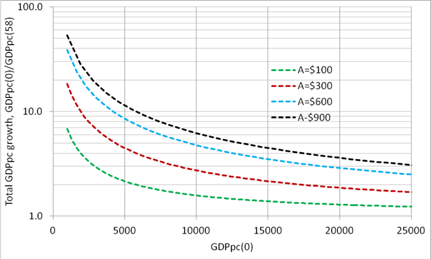
Figure 1. Total growth as a function of initial GDPpc value, GDPpc(0), and the annual increment, A.
In Figure 2, we merged the theoretical GDPpc growth curves for the 58-year period between 1960 and 2018 presented in Figure 1, and the estimates of the total GDPpc growth for the same period obtained from the MPD. Now the interpretation of economic performance is straightforward. In 1960, the USA had the largest GDPpc=$18057 (actually, the MPD gives $52299 in 1960 for Qatar, but we ignore this value) and the total GDPpc growth by a factor of 3.04. The latter value seems to be low compared to fast-growing economies like China and Malaysia (MYS). However, China and Malaysia grow from a very low level and their GDPpc annual increment is around $300 when the USA has ~$600 per year increase. Therefore, China and Malaysia grew at a slower rate when the USA, i.e. in the long run they never catch the GDPpc level in the USA. The annual increment in China and many other countries had a break to higher values in the 1990s, but they are still below $600 per year.

Figure 2. Theoretical curves of the total GDPpc growth between 1960 and 2018, and the estimates for various countries. Country tags are borrowed from the MPD and correspond to international abbreviations.
Many West European countries, Japan, Canada, and Australia are all close but below the A=$600 line. Their performance since 1960 was overall stationery with a few recession falls. Norway has lower total growth than Ireland, but taking into account the initial GDPpc, one can say that Norway had faster economic growth in terms of annual increment. The UK, France, and Italy were rather the relative losers among the most developed countries, likely because of the non-equivalent exchange with Germany (DEU) within the EU. New Zealand performed not well since 1960 despite a very high start level in 1960. Switzerland outperformed all developed economies except exotic cases of Ireland and Norway. At this point, it is important for the underperforming developed economies to understand that their lag behind the best performers will be increasing in the future. The causes of different growth rates observed within the EU might be internal and external.
Latin American countries actually reside between A=$100 and A=$300. These are poor performers, except Puerto Rico, which is an obvious outlier. Chile is the closest to A=$300 line. Therefore, the only difference between Latin American countries shown in Figure 2 is the start GDPpc level.
East European countries are close to A=$300 line, but the break in the 1990s demonstrates that their growth rate can be higher in the long run. Russia has all chances to move close to A=$600 line in the future judging by the GDPpc history since 2000. Despite the incredible growth period, China is still in the club of not excellent performers with good chances to move to A=$500 level, i.e. join the bunch of developed courtiers. India is just in the beginning of growth history and the linear growth in the annual GDPpc increment opens bright perspectives.
Disclosure: None.


