
World Markets Weekend Update: Year-End Rally Followed By Profit Taking
The past week straddled the boundary between 2013 and 2014 and was variously interrupted by holidays. But the dominant pattern was profit taking in the opening days of 2014. Japan's QE-juiced Nikkei was the only index with a gain for the week, up 0.69%, but that gain was logged on Monday, Tokyo Exchange close for the rest of the week. The other seven index all posted losses for the week, ranging from the fractional 0.30% slip for Germany's DAXK to the Hang Seng's 1.83% selloff.
The Shanghai Composite remains the only index on the watch list in bear territory -- the traditional designation for a 20% decline from an interim high. See the table inset (lower right) in the chart below. The index is down 39.99% from its interim high of August 2009. At the other end, the Nikkei 225 posted a new interim high, followed by the S&P 500, which is down 0.92% from its all-time high at year's end.
Here is snapshot of the 2013 performances, with Japan's Nikkei as the big attention-grabber.

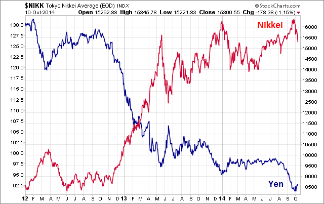
The amazing rally in the Nikkei is attributable to its unprecedented monetary policy, as the behavior of the Yen readily confirms in this two-year overlay.
 Here is a table highlighting the 2013 index performance, sorted from high to low, along with the 2013 interim highs for the eight indexes. The Shanghai Composite is the only index that finished the year in the red, where it spent most of the year.
A Closer Look at the Last Four Weeks
The tables below provide a concise overview of performance comparisons over the past four weeks for these eight major indexes. I've also included the average for each week so that we can evaluate the performance of a specific index relative to the overall mean and better understand weekly volatility. The colors for each index name help us visualize the comparative performance over time.

The chart below illustrates the comparative performance of World Markets since March 9, 2009. The start date is arbitrary: The S&P 500, CAC 40 and BSE SENSEX hit their lows on March 9th, the Nikkei 225 on March 10th, the DAX on March 6th, the FTSE on March 3rd, the Shanghai Composite on November 4, 2008, and the Hang Seng even earlier on October 27, 2008. However, by aligning on the same day and measuring the percent change, we get a better sense of the relative performance than if we align the lows.

A Longer Look Back
Here is the same chart starting from the turn of 21st century. The relative over-performance of the emerging markets (Shanghai, Mumbai SENSEX and Hang Seng) up to their 2007 peaks is evident, and the SENSEX remains by far the top performer. The Shanghai, in contrast, formed a perfect Eiffel Tower from late 2006 to late 2009.

Check back next week for a new update.
© Copyright 2013, Advisor Perspectives, Inc. All rights reserved.


