
Market Notes: Stock Market Breadth Indications And Allocation Opinion
The investment media is swirling with anxious prognostications about whether a recession and a Bear market in stocks are near. We received several calls and emails about that. Here is our opinion.
We are in a late stage of this market, perhaps in the 11th hour. The US stock market is historically expensive with significant valuation mean reversion risk. Earnings growth and margins are at high levels which also have significant mean reversion risk, with growing consensus that mean reversion of growth and profitability is not far away. However, few signs of an impending Bear market in stocks are present. Interest rates are still at low levels with the mean reversion process underway.
For investors who have substantially completed the asset accumulation stage of life, and are in or near the withdrawal stage, risk taking in stocks or bonds higher than long-term personal investment policy target levels is not prudent at this time. Maintaining equity exposure at or somewhat below the long-term target level is appropriate. Minimizing interest rate exposure in bonds is appropriate. Temporarily holding well above average near-cash reserves is appropriate.
For those planning tactical exits from stocks based on trend following, consider that more money has been made exiting stocks after a peak than before a peak. Stock markets can go on long past where skeptics expect them to fall. Predicting the peak is far less exact than recognizing the decline.
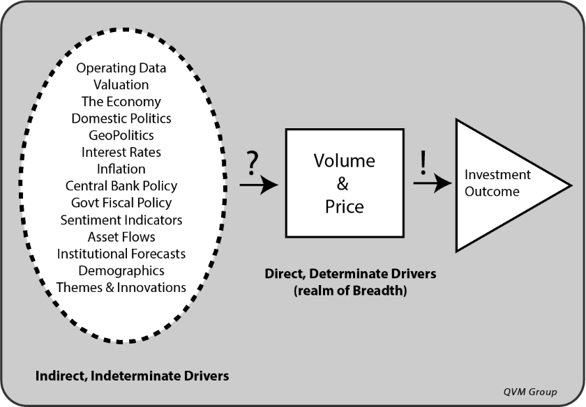
Breadth indicators suggest on balance that stocks are not ready to toss in the towel on the Bull. This is not based on company operating fundamentals, valuation, macro-economic factors, geopolitical factors, sentiment, asset flows, central bank monetary policy or government fiscal policy – all of which are important, but that in the end are all expressed in and through price and volume, which we are addressing with selected breadth indicators here.
Breadth measures how widely or narrowly market direction is shared among index constituents.
The Breadth Principle:
Breadth is important to monitor, because as more and more constituents move in the same direction as the parent index, the stronger the parent index trend direction, whether up or down. As more and more constituents fail to move in the same direction or move in the opposite direction of the parent index, the closer the parent index is to a trend direction reversal.
Behavioral Investing Risk:
We all tend to create a narrative based on what we think is important. Investors are swamped with information and biased to select the information that confirms their beliefs. How to filter and reduce information to effective action is a critical question. There is no “theory of everything”.
We tend to see what we want to see. But just because we are not looking for something, does not mean it’s not there.
Breadth helps narrow the information search. There are reasonable theories about breadth and forward market behavior.
Breadth is more quantitative and less prone (although not completely so) to show us only what we want to see than attempts to digest all available information. The market digests that information in the aggregate, but individuals cannot. In the end, all information reduces to price and volume behavior as final direct information. Breadth studies price and volume and assumes most of what it known has been factored into price and volume by the market.
Breadth measures the alignment between the price and volume behavior of constituents of an index and the index itself. Two important theories of breadth are:
-
Divergences in alignment suggest forces building to cause index trend reversal
-
Extreme divergences suggest trend reversal is near.
Net Breadth Evaluation:
The various breadth indicators render a net positive signal for continued Bull conditions. However, the strength of the net positive indicators is not high.
Intermediate-Term Trends:
The tips of the 200-day trend lines for major domestic and international indexes are tilted upward, and their prices are above their trend lines.
Short-Term Technical Condition:
Short-term technical ratings for US large-cap stocks from BarChart.com are “Hold”. The US mid-cap and small-cap indexes are rated weak “Buy” as are Europe and Japan; but the Emerging Markets index short-term technicals are weak “Sell”.
Long/Flat Fund Tactical Allocation ETFs:
Two ETFs (PTLC and LFEQ) are run with algorithms to be 100% long the S&P 500 or 100% long T-Bills, with some intermediate levels based on trend following.
PTLC is currently 100% S&P 500. LFEQ moved to 80% S&P 500 / 20% T-Bills as of last week.
PTLC uses a simple disclosed method. LEFQ uses a vaguely disclosed Ned Davis Research system.
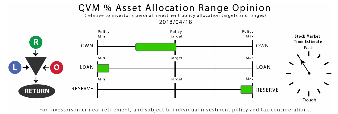
Equity Risk Allocation Relative to Investment Policy Target Levels and Min/Max Range:
For an aggressive investor with either a long time horizon before entering the withdrawal stage of life, or an investor comfortable pursuing a tactical long/flat strategy, a full equity risk asset allocation would probably still be appropriate. However, the event risk in this market is high, and should be carefully considered before making above investment policy target allocations.
For investors with a short time horizon before the withdrawal stage, or who are in the withdrawal stage, the current positive breadth indications do not override the need to preserve capital by minimizing maximum drawdowns. The maximum equity risk exposure should be the investment policy target level, and probably somewhat less.
Summary of Selected Breadth Indicators:
The preponderance of breadth indicators suggests the stock market is still in an upward trend.
Positive Indicators:
-
% stocks with tips of 200-day trend line in upward direction
-
% stocks with price above 200-day trend line
-
% stocks with Money Flow index above 50 (0-100 scale)
-
Consumer cyclical stocks return vs consumer staples stocks return
-
S&P 500 high Beta stocks return vs S&P 500 low volatility stocks return
-
Low quality bonds return vs high quality bonds return
-
Cumulative advancing vs declining prices
-
Cumulative advancing vs declining volumes
Neutral or Mixed Indicators:
-
% stocks with positive MACD (moving average convergence/divergence)
-
Transportation stocks return vs industrial stocks return
-
Cumulative new highs as % total new highs and new lows
-
% of S&P 1500 stocks in Correction, Bear or Severe Bear
Negative Indicators:
-
S&P 1500 net buying pressure vs S&P 500 price direction
Trendline Tip Direction, Price Position, MACD and Money Flow Index:
More than 50% of US large-cap and small-cap stocks have 200-day trend line tips pointing upward. US mid-cap stocks 200-day average tips are just under 50%. Europe, Japan United Kingdom and Core Asia (Korea, Taiwan, Hong Kong and China) have downward pointing tips to their 200-day averages.
More than 50% of US stocks have their price above their 200-day trend line, as do Europe and United Kingdom, but Japan and Core Asia do not (Japan is hovering around 50%).
More than 50% of US large-cap stocks, as well as Core Asia stocks, have negative MACD indicators (MACD stands for moving average convergence/ divergence). MACD is a popular short-term trend indicator that deserves watching because it is so widely followed by others. US mid-cap and small-cap, and Europe and United Kingdom stocks have positive MACD indicators.
A large majority US and International stocks (except Core Asia) have positive money flow (levels above 50 on a 0-100 scale). China also has a positive money flow rating, but only for 54% of stocks, unlike 70% to 80% for the other sets of index constituents.

Percent of S&P 1500 Constituents in Correction, Bear or Severe Bear:
For the first three quarters of 2017, the percentage of S&P 1500 stocks in some level of trouble (10% Correction or worse, 20% Bear or worse, or 30% Severe Bear or worse) was increasing into territory characteristic of the prelude to the 2015 Correction in the S&P 500. Then the S&P 500 just took off as tax cut legislation was expected, and the percentage of stocks in trouble decreased, but remained at elevated levels.
Approximately 56% of S&P 1500 stocks are in a 10% Correction or worse, versus a median since 2014 of 46% and a high of 77% in early 2016. This Correction has not created as much broad-based damage among S&P 1500 stocks as the back-to-back recessions of 2015 and 2016. The troubled stocks are at about the level of the first Correction in 2015, but below the further damage caused by the follow-on Correction in 2016
This a probably a neutral indication relative to being in Correction, not indicating worse to come, but something to be closely watched. It must improve as the price improves, or it would become a warning sign.


Buying/Selling Pressure (Supply and Demand):
We measure Net Buying pressure by multiplying the price change for each of the S&P 1500 stocks by the volume for each stock, then summing those multiplication products for rising stocks and falling stocks as an indication of the money flowing through the stocks. We then take the ratio of the total money flowing through the rising stocks to the total amount of money flowing through all the stocks.
A ratio higher than 50% is Net Buying. A ratio lower than 50% is Net Selling. Averages of 6-months and 12-months seem to be most meaningful. Averages of shorter periods are too volatile to interpret.
Net Buying among the S&P 1500 stocks has been declining for about 15 months while the S&P 500 index was charging ahead. This showed dwindling support for the Bull run. During this Correction, Net Buying was extinguished, and pressure became Net Selling.
This is a strong negative that gives clear warning as it did before the 2015 Correction. If it does not soon move back to Net Buying, that would raise serious red flags.


Advancing and Declining Prices and Volume, and the Ratio of New Highs to Total New Highs and Lows:
The direction of cumulative of advancing prices less declining prices among index constituents should confirm the direction of the parent index for the index trend direction to be strong. Divergence suggests the index trend is weak. Similarly, the direction of cumulative advancing and declining volume should confirm the direction of the parent index. And, cumulative new highs to total new highs and lows should confirm the parent index.
For the S&P 500 large-caps, the price advance/decline line (red) is doing better than the index (black) – a strong positive. The volume advance/decline line (purple) is also stronger than the index – a positive but not as strong as the price advance/decline. The ratio of new highs to total new highs and new lows (gold) has remained flat during this Correction, making it a modest positive rating, by not declining.
For the S&P 400 mid-caps, the data is the same as for the S&P 500 large-caps.
For the S&P 600 small-caps, the price advance/decline line and volume advance/decline line are hugging the index price creating a neutral rating. The ratio of new highs to total new highs and new lows has remained flat during the current Correction and is also a modest positive, by not declining.

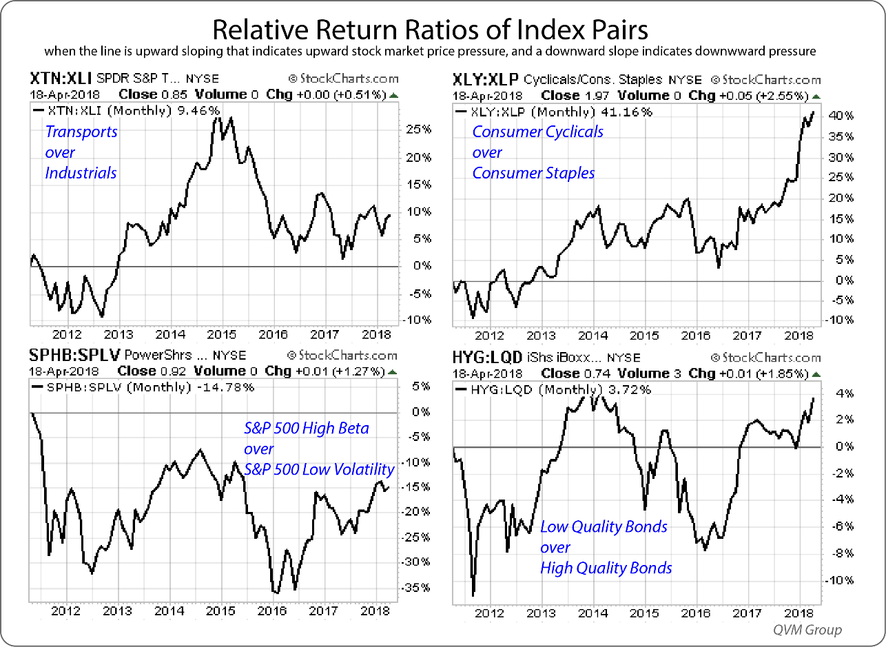
Relative Return Ratios of Opposing Index Pairs:
These four charts divide the return of one index by the return of another.
Transports tend to rise when industrial production rises. The ratio of the transports ETF to the industrials ETF has been moving sideways for a couple of years. This is a neutral indication.
Consumer cyclicals are stronger in fat times versus lean times. Consumer staples tend to be OK in both fat and lean times. The significant outperformance of the cyclicals ETF vs the staples ETF is a strong positive.
High Beta stocks (stocks that move up more and down more per unit of movement of their index) tend to outperform low volatility stocks in strong markets and underperform in weak markets. The high Beta ETF has been outperforming the low volatility ETF for a couple of years, but not by as much as the prior several years, having taken a steep relative performance dive in 2015. This is a positive indication.
Low-quality bonds do better than high quality bonds in good times and worse in bad times. The low-quality bonds ETF has been outperforming the high-quality bonds ETF this year, underperformed in 2017, outperformed in 2016, underperformed from 2014-2016. This is a more volatile indicator but is currently positive.
Refer to the 2018-04-16 Client Letter “What Types of Bonds Are Attractive in a Rising Rate Environment” for perspective on our allocation range ...
more


Impressive!