
If The Bear Lurks, High P/E Stocks Are The Dreaded "Phone Ringers"
A Value investing article recently went quasi-viral. Titled “Quants Show They’re Still Human With 3,168 Versions of Value,” it pointed to the price-to-earnings (P/E) ratio as the best performing value factor (figure 1).
Figure 1: Annualized Returns, Assorted Value Factors, Feb. 1988–Feb. 2017
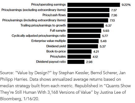
For definitions of terms in the chart, please visit our glossary.
But even the best performing value factor was no contest for a market that has avoided value stocks like the plague. Figure 2 is my favorite chart right now.
Figure 2: 10-Year Rolling Annualized Outperformance, Low P/E vs. High P/E Stocks
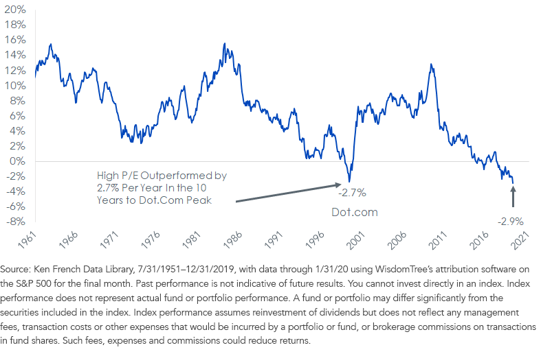
Face it: The amount by which high P/E stocks have outperformed low P/E stocks in the last 10 years exceeds the amount observed at the apex of the dot-com bubble.
I mean, seriously. Are our memories this bad? The dot.com bubble wasn’t even that long ago.
This is remarkable. The 10 years after that blowup—the period ending February 2010—witnessed the quintile of stocks with the lowest P/E beating the quintile with the highest P/E by nearly 13% per year.
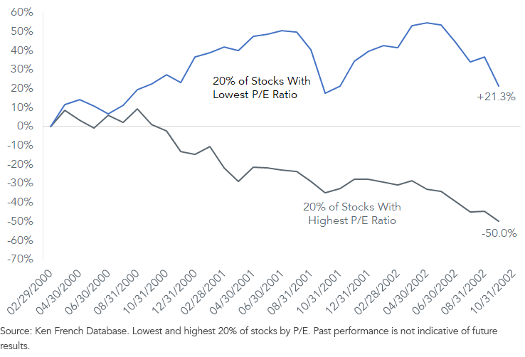
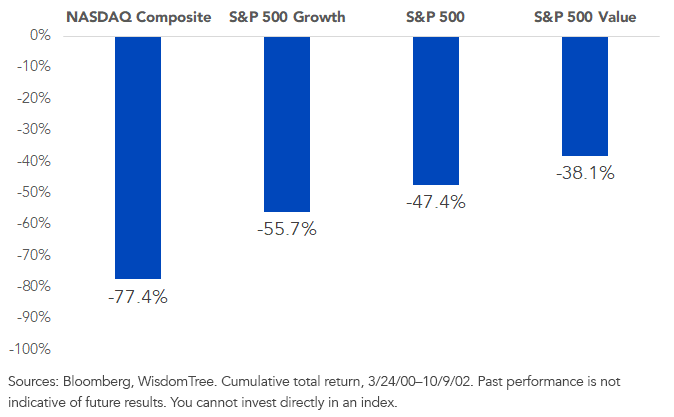
That's because not everything fell in that bear markets (figure 3).
Figure 3: Cumulative Return, 2/29/00–9/30/02
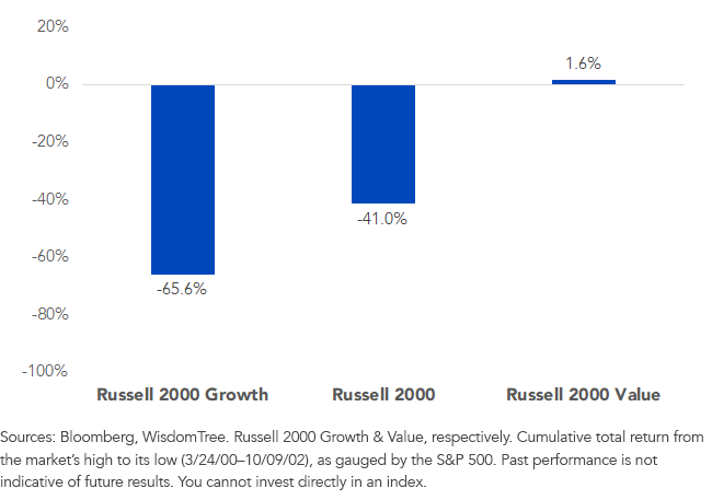
Here’s another interesting fact from the 2000–2002 crash: In the small-cap sector, the Russell 2000 Growth Index lost two-thirds of its value in that bear market, yet the Russell 2000 Value Index of cheaper stocks went up (figure 4).
Figure 4: Cumulative Return, 2000–2002 Bear Market
The double whammy for money managers is when you get:
- A bear market in your largest holding (U.S. large caps), and
- Your stuff goes down harder than the market
Because the crash was so deep, figure 5 is the dreaded “phone ringing off the hook” chart.
Your whole day is spent trying to convince clients not to dump you for some “smarter” money manager.
The nastiest “phone ringers?” Look at the left side of figure 5.
Figure 5: Cumulative Return, 2000–2002 Bear Market
Last year we slashed the fee to 8 basis points (bps) on the WisdomTree U.S. LargeCap Fund (EPS), our P/E-focused ETF that seeks to track the price and yield performance before fees and expenses of the WisdomTree U.S. LargeCap Index. It’s “beta-lite,” so we put it right there with the expense ratios of the three biggest ETFs that seek to track the S&P 500.
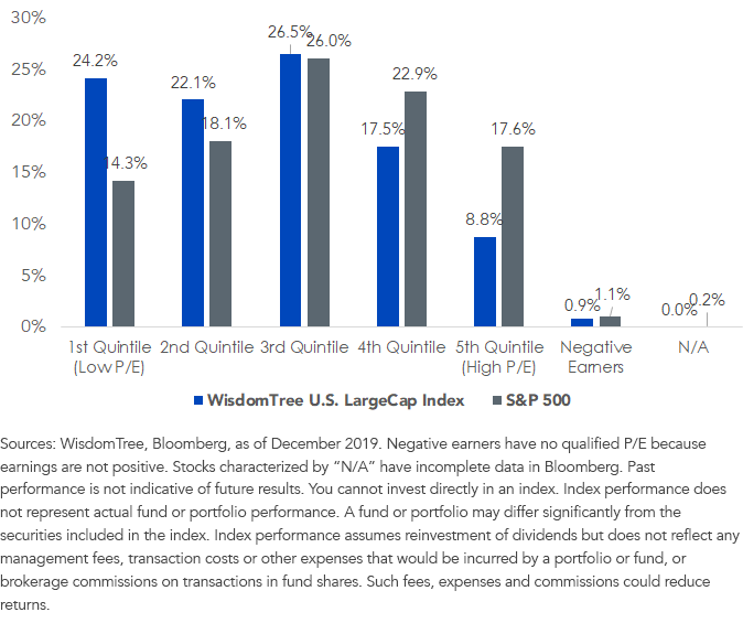
If the gray groups on the right in figure 6 get hurt in the next bear market, our stocks at 8 bps are a way to avoid many of them. It’s about cutting down on the dreaded phone ringers.
Figure 6: Underlying Index P/E Composition
Disclosure:
Disclaimer: Investors should carefully consider the investment objectives, risks, charges and expenses of the Funds before investing. U.S. investors only: To obtain ...
more

