
Filtering For ETFs That Outperformed Blended FANMAG Stocks
Summary
- Relative momentum filtering can sometimes identify overlooked niche securities lost in the enthusiasm for the giant winners.
- Other than precious metals securities, healthcare/life science and internet related securities tend to come out on top.
- Short-term relative momentum needs to be cross checked with trend and multi-year total return to find signs of persistence.

In a market populated mostly with mediocre opportunities and led by a small number of high performers, we use extensive filtering to attempt to identify lesser-known or lesser-followed securities that also stand out from the crowd.
Every week we review every ETF, every other security on the New York Stock Exchange and NASDAQ, and every mutual fund through a simple, short-term, two-factor relative performance filter supplemented by some trend and technical data.
The basic filter asks whether the security has price performance superior to Treasury Bills over one month, three months, six months, and 12 months. For those that have done better than essentially cash, we ask have they done better on a price performance basis than our risk asset benchmark over one month, three months, six months, and 12 months.
Normally for equity securities, we use SPY (Standard & Poor's 500) as the risk benchmark, and for debt securities, we use BND (US Aggregate Bonds).
We further ask whether the 200-day moving average now is higher than it was a month ago, whether the one-year linear regression slope of the 200-day moving average is positive or negative, and whether the price is above or below the 200-day moving average (expressed as Z-values, which are simply the number of standard deviations above or below trend line). We also ask if the 50-day moving average is above the 200-day moving average, and whether the price is above or below the 50-day moving average, and also how far the prices from its one-year high and where it is in the range from the one-year high to the one-year low.
Additionally, we measure the percentage size of the maximum drawdown from the highest price anytime during the past 12 months.
Lastly, we measure the three-month average Dollars traded per minute to get a sense of liquidity and the three-year total return to potentially weed out overnight wonders that have basically been dogs.
The result shows us what's working and what's not that also trades in reasonable Dollar volume. This approach sometimes identifies some narrowly focused high performers that might be considered for the Tactical Opportunity sleeve of some portfolios.
This week, partly just for fun, and partly because we did it for one client who is a total FANMAG fan, we used the average attributes of an equally weighted portfolio of the six FANMAG stocks (Facebook (NASDAQ:FB), Amazon (NASDAQ:AMZN), Netflix (NASDAQ:NFLX), Microsoft (NASDAQ:MSFT), Apple (NASDAQ:AAPL), and Alphabet (NASDAQ:GOOG) (NASDAQ:GOOGL)) weighted equally as the risk benchmark.
That massively reduced the number of ETFs with superior performance. This article is about those that did relatively well with a few examples of those who did relatively badly.
The most stringent criteria we could use to get any names from the filter was to have done better than cash, outperformed FANMAG over three months and one month (but failing to outperform over six months and one year), to have the 200-day moving average tip pointing up, the 12-month slope of the 200-day moving average being flat or positive, and the price of the security being above the 200-day moving average, and importantly that the maximum drawdown anytime during the past 12 months was less severe than the drawdown of the hypothetical equal weighted FANMAG portfolio.
Six ETFs made it through those criteria. As shown in Figure 1, they are:
- Invesco DWA Healthcare Momentum (NASDAQ:PTH)
- ProShares Online Retail (NYSEARCA:ONLN)
- The Emerging Markets Internet & E-commerce (NYSEARCA:EMQQ)
- Invesco NASDAQ Internet (NASDAQ:PNQI)
- Communication Services Select Sector SPDR (NYSEARCA:XLC)
- Renaissance International IPO (NYSEARCA:IPOS)
The first five have low to high average Dollar trading volume. The last, IPOS, has almost none. Perhaps one problem with the IPOS strategy from a marketing perspective is that positions are eliminated after a fixed period; they do not ride the winners long-term. Some take longer than the elimination period to blossom.
FIGURE 1:
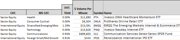
Figure 2 shows the trend direction and price position information. A value over 1.00 for the column labeled "200-day Av" means the current value is higher than it was a month ago. A slope value greater than zero means the slope of the 200-day moving average over one year is positive. A 200-day Z value that is positive means the price is above the 200-day average, and the value shows the number of standard deviations the price is above that average.
XLC with a Z value of 0.73 is less than one standard deviation from its average which is within a normal kind of distance from the average that should not be of concern. PTH with a Z value of 2.96 is almost 3 standard deviations above its moving average, which suggests extra care in evaluating whether or not it is too overbought.
FIGURE 2:
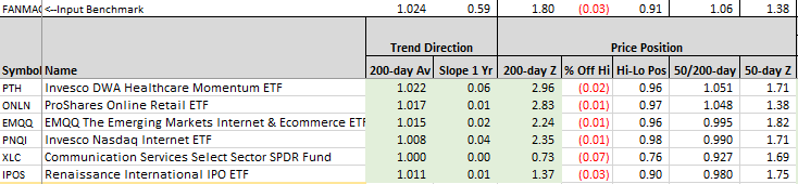
Figure 3 shows the relative price return versus the risk-free benchmark (BIL) and versus the risk benchmark, in this case the equal weighted FANMAG group.
The FANMAG values are the actual price returns for that risk benchmark.
The values for the ETFs are the price return of each security for each period of time minus the price return of the benchmark over the same periods. Figure 3 also shows the percentage magnitude of the largest intra-year price decline of the FANMAG risk benchmark (30.18%) and the actual maximum price decline of each security.
You can see that each of these six ETFs outperformed cash and outperformed the risk benchmark for one month and three months, but didn't come very close over six months and one year. They also experienced a lower maximum intra-year decline than the risk asset.
FIGURE 3:
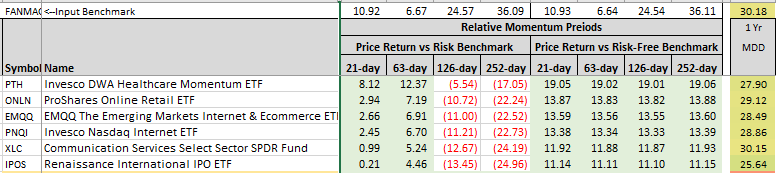
Figure 4 represents the risk asset relative performance and the maximum declines, supplemented by the actual three-year total return of the hypothetical risk asset and each security. Only the Invesco product came close to the risk asset over three years. XLC may have done but does not have sufficient history to be certain.
FIGURE 4:
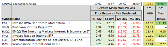
Figure 5 presents three-year weekly charts for the six ETFs in Figure 4, showing their dividend adjusted price in black and the dividend adjusted price of SPY in dashed red.
PTH looks interesting, and to a lesser degree, PNQI looks interesting recently. The others, not so much.
FIGURE 5:
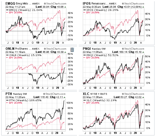
Figure 6 shows an expanded group of 10 that did well versus cash and outperformed the risk asset group over one month and three months and did reasonably well by annualized three-year total return, but with the exception of ARK Generation Internet (NYSEARCA:ARKW) and ARK Innovation (NYSEARCA:ARKK) - both actively managed - none outperformed the risk group on a total return basis over three years. And they did that with significantly higher maximum drawdown intra-year (41% to 43% versus 30% for the risk group).
Only one ETF had a lower maximum drawdown, Invesco DWA Healthcare Momentum.
ARKG came close on total return over three years with a 29.63% total return versus 29.99% for the FANMAG benchmark and had a maximum drawdown not too much larger than the benchmark at 35% versus 30%.
COVID juiced the short-term which may fade as the final winner in COVID therapies and vaccine becomes known, but COVID may have juiced the FANMAG returns too.
FIGURE 6:
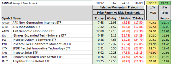
Figure 7 presents the charts for the expanded group of 10 ETFs from Figure 6 which collectively look more interesting than the six in the first group chosen because of their maximum drawdown intra-year.
FIGURE 7:
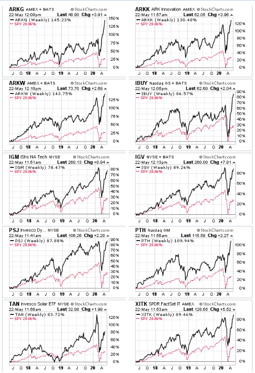
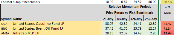
Figure 8 is a sampling of funds that outperformed the FANMAG risk benchmark over one month and three months, six months, as well as 12 months, but they did so experiencing 73% to 86% intra-year declines. Probably most people would have bailed out before declines of that size and never have realized the superior relative return.
FIGURE 8:
I have a personal position in my Tactical Opportunity sleeve in PTH and ARKG.
Disclosure: QVM has positions in some of the securities identified in this article as of the publication date. We certify that except as cited herein, this is our work product. We received no ...
more

