
Trends In The Distribution Of Weath Are Even Scarier Than Trends In Income

“We have an economy in this country that is not working for working people,” says Sen. Kamala Harris, a Democratic candidate for President. It is a common refrain. As the following chart shows, when adjusted for inflation, average hourly earnings of ordinary U.S. workers have grown just 15 percent over the past 30 years. Weekly earnings of full-time employees have grown even less, just 10 percent.

Meanwhile, the pay of top earners has soared. According to a study from the Economic Policy Institute, in 1989, the pay of corporate CEOs was 59 times as high as that of production workers. By 2016, it had risen to 270 times higher than workers’ pay.
No wonder a lot of Americans are feeling left behind by a booming economy. But wages are not the whole story. Would you believe, there are other data that make the “left behind” narrative look even worse?
It’s not the wages, it’s the wealth
The trend that is even scarier than that of wages is the trend in wealth. “Wealth,” in this sense, means net worth, that is, total assets minus total debts. It’s not what you own that matters, but the difference between what you own and what you owe.
Here are the astonishing data on the net worth of American households since 1990, broken down by income percentiles. The chart is based on the latest data from the Federal Reserve. The total net worth of the super-rich — the top 1 percent of households — is more than three times higher than it was in 1990. The wealth of the merely rich — those in the 90th to 99th percentiles — is two and a half times higher. That of the upper-middle class — the 50th to 89th percentiles — has almost doubled. Meanwhile, the net worth of the poor and working-class households who make up the bottom half of the distribution has actually fallen by 20 percent, when adjusted for inflation.
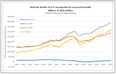
Now we see why so many people are feeling left behind. Their hourly and weekly pay, as shown in the first chart, has kept ahead of inflation, even if just barely. But their net worth has gone down.
How has this happened?
It’s not the assets, it’s the debt
We get a clearer picture of what is going on if we chart the relationship of assets to liabilities in a different way. The previous chart showed the difference between assets and liabilities — net worth. The next one shows the ratio of liabilities to assets, a concept known in the financial world as leverage.

What we see is that households in the bottom half of the income distribution are far more leveraged than those in the top half. The bottom half own just 6 percent of all assets, but they owe a whopping 37 percent of all debt. As a result, their financial situation is very fragile. Any setback — loss of a job, a major illness, a tornado — can wipe out their thin sliver of net worth. For some near the bottom of the bottom half, it doesn’t even take a tornado. The need for a major car repair can trigger a wipeout.
We are not talking about just a theoretical possibility. For the better part of three years, from early 2010 to late 2012, the entire lower half of the income distribution had liabilities that exceeded their assets.
Note that the extreme indebtedness of the working class is a relatively recent phenomenon. During the 1990s, the debts of the bottom 50 percent stayed steady at around 60 percent of assets. The big change came in the 2000s, when rising home prices encouraged banks to lower lending standards. Subprime loans allowed people to take out mortgages with small down payments or none at all, and sometimes even without proof of a steady income. Between 2000 and 2008, total mortgage debt of the bottom half increased by more than a factor of three, while the value of their homes less than doubled.
More recently, during the recovery from the Great Recession, banks have been a little more prudent in their mortgage lending. Today, mortgage debt of the bottom 50 percent is only 80 percent of what it was in 2008, while the total value of their homes has risen by about 10 percent. However, their total indebtedness has not fallen by nearly as much as their mortgage debt, due to a 50 percent increase in consumer credit, mostly credit card debt and auto loans. Because of the growth of consumer credit, which played a relatively small role in the 2000s, the ratio of debt to assets for the lower 50 remains far above levels of the 1990s.
The bottom line
Democratic candidates are right when they say that despite moderate inflation and record low unemployment, the economy is not really working for working people. Sluggish wage growth is part of the story, but wages have begun to look a little bit better in the last four or five years. The more serious source of ongoing financial stress has been the inability of the working class to shake off the burden of debt.
The bottom line… There is still a long way to go before the bottom 50 percent regain the ground they lost in the early part of the century.


