
Drawdown Analysis Is Also Valuable For Economic Indicators
Calculating the history of drawdown (DD) for assets is common in the investment community, but the risk metric also provides useful information for analyzing economic data. In particular, monitoring peak-to-trough declines can offer relatively reliable estimates for turning points and estimating the probability that a decline is set to end or that a new downturn has started.
In contrast with DDs in financial markets, economic DDs tend to be smoother and suffer less noise. More importantly, the start of a rebound following a trough is often more persistent vs. comparable results in the stock market.
Some of this is a function of data frequency. Many key economic indicators are published monthly vs. the tick-by-tick numbers available for stocks, bonds and other financial assets. But even accounting for this difference shows that some economic data sets have a habit of tenacious recoveries after reaching a bottom, and vice versa following a peak. That’s a valuable feature for developing real-time estimates of trend changes in the business cycle.
As an example, consider DD for US private payrolls. Most of the declines exhibit a recurring feature: once a drawdown’s depth eases following a decline, the recovery persists. As a result, the first DD data point that posts a lesser shade of red is a reasonably reliable first estimate that the decline has hit bottom and a recovery has started for the indicator.
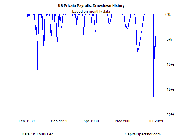
For private payrolls, the previous trough was April 2020. In that month, private payrolls posted a 16.5% drawdown, followed by a slightly lesser 13.9% drawdown in May. Once the May data was available (in early June), there was a case for estimating that a recovery in payrolls had started.
That’s obvious now, but in the depths of the pandemic such thinking was a radical thought. But studying the history of DD for economic indicators suggests that these turning points are valuable real time estimates of major shifts in economic trends.
The caveat is that the chart above is based on revised data. In real time, releases of economic numbers are first approximations that may or may not be reliable and so additional confirmation is required in second- and third-month updates following an apparent trough.
In the example above from 2020, once a second month of rebound was confirmed (via the release of June data), the case strengthened that the slide in payrolls was over. Note that the June employment report was published in early July. Having solid econometric support for thinking that the worst for the labor market had passed at that point was still timely, given the generally pessimistic views that prevailed at that point.
Another useful feature of economic DD data is that there are relatively few false warnings vs. financial markets. When DD for payrolls goes negative, it tends to stay negative until a trough is reached and a rebound starts. Something similar applies to other econ data sets. It’s not 100%, but this aspect is far more common vs. the relatively chaotic start-stop DD trends that predominate in financial markets.
As a result, there’s opportunity for estimating the start of potentially severe DDs in economic data early on, which can provide warnings of economic trouble ahead of the usual suspects.
In future posts, I’ll formalize how to run DD analytics for multiple indicators and combine the signals as an alternative metric for monitoring business cycle risk.
Disclosures: None.


