
COVID-19 Mortality Rates And What It Means
If you have been following my previous articles about COVID-19 you will be interested to know there is another possible reason for the improved corona performance: According to The Wall Street Journal, "Covid-19 patients who received transfusions of blood plasma rich with antibodies from recovered patients, reduced their mortality rate by about 50%."
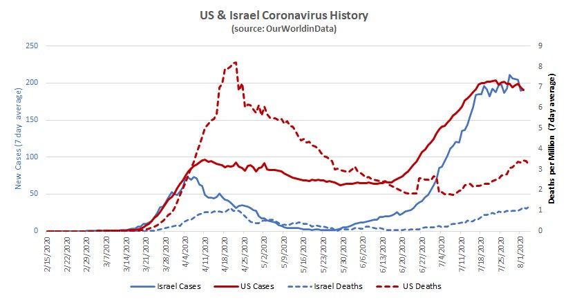
It is possible the US death curve is following the positive test curve but much later and at much less magnitude than the first time around. The test curve isn't very reliable (simple volume of testing will pick up more asymptomatic tests), so it should be taken with a grain of salt. (That little US hump around June 26th is prior deaths being added in).
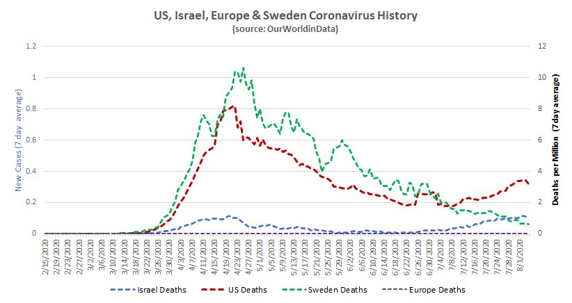
Sweden continues to fall, supporting the concept of community immunity (as they never locked down) combining with better treatment and/or a weakened virus.
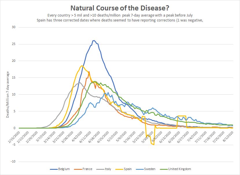
I charted the hardest hit countries that peaked prior to July. These had a 7-day average that peaked above 10/million and have more than 5 million in population. The trends are very similar to Sweden's (which got hit hard). This doesn't really tell us much because the *other* five countries could have a drop due to restrictions. Nonetheless, it is interesting that the paths are so similar.
The weird Spanish values are due to three single-day data points (including one that was negative) that seemed to be correcting for earlier numbers.
The US may be like multiple countries - with the northeast getting lots of infections in 'round one' and then other places following. But because those other places have the benefit of the northeast's example/practice they aren't suffering anywhere near the same death rates. This suggests the northeastern experience won't be repeated and we shouldn't react like it will.
All of the worst death rates in the US are 'round one' states: NJ (1,780 deaths/million), NY (1,680), MA (1,250), CT (1,240) etc....
'Round two' states are much further down the list: AZ (520), GA (260), Florida (330), Texas (240), California (240).
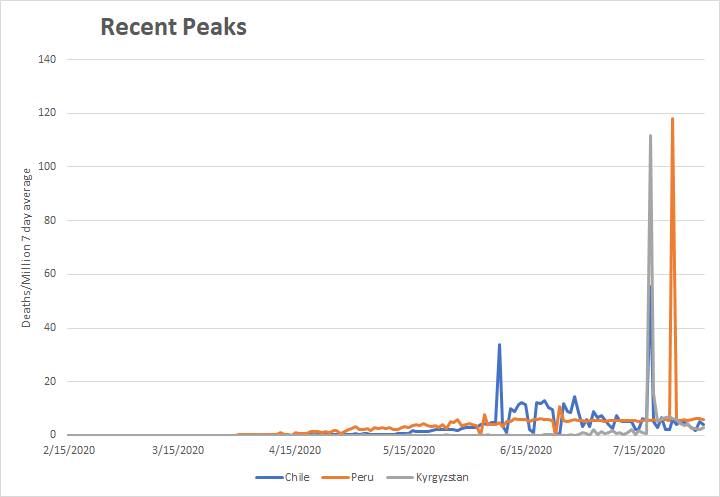
According to the data, Chile, Peru and Kyrgystan all peaked in July. All three seem to have peaked then due to data fixing. You can see that in this chart - prior deaths were added in.
That said, all of these countries peaked later than the big 6. Despite this, their overall death rates are in the same range. This could be because:
1) They lack the resources of the big 6 (to take advantage of what has been learned),
2) Because the drops among the big 6 are due to some sort of community immunity and these countries haven't achieved that
3) Because of more effective lockdown measures in the big six (except with Sweden)
4) Or because they have a different strain of the virus than 'round 2' in the rest of the world.
5) Some other reason I don't yet follow...


These graphs are very interesting. It almost looks like there is an inversion going on where countries that locked down, had few deaths, and then those numbers started to climb, while countries that didn't, like Sweden, had a very high death toll, but now have few deaths. So which is better?
According to chart #2, it looks like Sweden had the right call. All 3 countries had high infection rates, but while the others are going up, only Sweden is now going down. Makes me think we all stayed home and destroyed our economy for nothing.
Sweden's overall death rate is very high. I have that chart here: talkmarkets.com/.../covid-19-and-the-limits-of-modeling-science
Things might be better now for them, but they aren't overall. That said, it may well be time for us to follow in their path because the virus might be less dangerous now.
Wow, you are right. That chart paints a completely different picture. Didn't realize Sweden's deaths were even higher than the US's.
Doesn't make sense unless their talking about per capita. Almost 6,00 people died in Sweden. Almost 160,000 died in the US.
It is all per capita.
Has Sweden's economy really recovered though? And even with herd immunity, they haven't completely knocked out the virus. And even if they manage to, with such a short immunity period (about 2 months), they won't be able to keep it out unless they completely shut down their borders.
They won't completely knock it out, but their performance is improving. The virus is killing something like 0.64 people/million in Sweden today. That is about 234 people/million/year. That is similar to a very bad flu season.
That said, they are part of the world economy. They make their money on iron, steel, machinery, trucks etc... and all of that got killed irrespective of what they did. If others follow something like their path *now* then we could all recover a lot more of our economy.
As an aside, one reason their death rate was so high was because they apparently didn't treat those over 70 and let the virus rampage in nursing homes. Earlier serological testing suggested a 5% death rate vs total infections vs. 1.4% in NY and 0.14% in Israel. So they got hit harder than necessary not just due to the virus spreading, but due to treatment.
That's horrible. Why didn't they bother treating those over 70? Were their hospitals overwhelmed.
Could be cultural, I don't know. The WSJ wrote on that as well. Here is a relevant quote:
"About 90% of nursing-home residents who succumbed to Covid-19 in Sweden were never admitted to a hospital, according to official estimates."
www.wsj.com/.../coronavirus-is-taking-a-high-toll-on-swedens-elderly-families-blame-the-government-11592479430
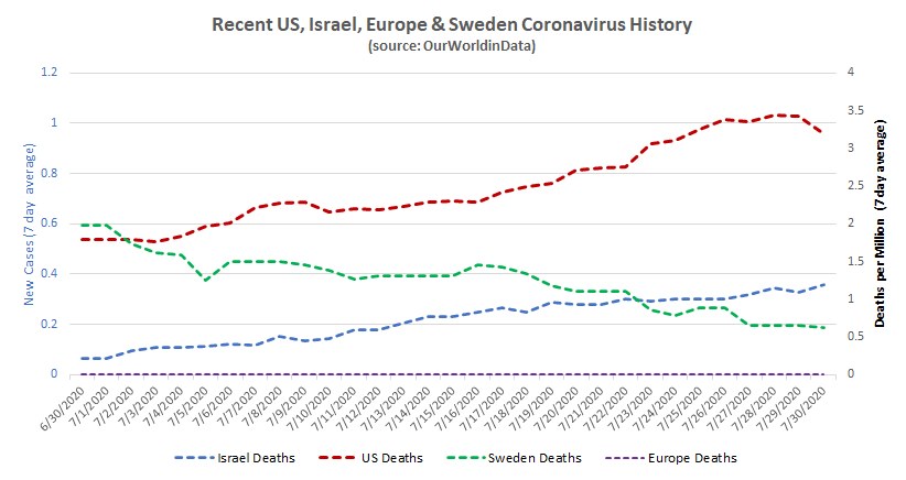
I don't really know. I live in Israel which locked down and had very few deaths. Sweden had quite a few. Sweden is interesting *not* because they chose the right path, but because they have declining deaths *despite not locking down.*
This would suggest that while individuals don't acquire longer-term immunity, communities still can. The mechanism could be repeated exposure 'reupping' individual immunities.
If death rates are falling for other reasons - better treatment, a less virulent virus, isolating the elderly etc... - then perhaps the best option is to encourage community spread among the young and healthy and get the economy back on track. For wealthy people economic problems are annoying - for those who are not wealthy they can be devastating. For the billions who live hand-to-mouth, they can be straight up deadly.
My argument is that it is a moral imperative to take the lives of the world's poor into account when we decide to shut down an economy - and if we can possibly limit deaths within rich nations while opening up (and I think we can) then we should.
Interesting data, but I don't understand the point of this article. What point are you trying to make?
It is related to earlier articles in which I argue for relaxing most economically impactful restrictions while maintaining things like mask wearing. See here: talkmarkets.com/.../changing-the-way-we-fight-covid-19
I find some of these charts confusing. If due to things like "data fixing" the graphs are radically skewed, how helpful are they really? The gigantic spikes in the deaths for Peru and Kyrgyzstan are eye grabbing at first, but then are explained away by fixing the data to include previous deaths. But why weren't they included in the first place?
And how can Spain's deaths be negative? From corrections? Why not just re-plot the charts with the correct data. I think that would be far more telling since the data would be accurate.
It is confusing. I *could* try to unkink it, but I don't know enough to do it reliably. Obviously death reporting varies. The US, for example, added a whole bunch of prior deaths between June 26th and July 2nd (that weird hump in the US curve). Rather than smooth things and have my data biases questioned I just used what is publically accessible with some explanation.
Peru, Kyrgyzstan, Chile all suffer from reporting systems that are having a harder time keeping up. Reassessing causes of death afterwards can also impact it. In other places, the data is totally untrustworthy or lacking. We are pretty sure a lot of people are dying in Sub-Saharan Africa but we have no idea how many.
The news from the Wall Street Journal article you linked to is the best news I've heard on COVID-19 since all this started. A reduction of 50% mortality rate is huge. Unfortunately I couldn't read the entire article due to it requiring a subscription. How long until this solution can be rolled out nation wide?
They've already used it on 50,000 people and they are continuing to collect plasma. I think Mayo is spearheading it. Dexomethazone also helped a lot with more critical patients and there have been papers on that as well.
Very glad to hear this. Too many have already died. Hopefully other countries can benefit from this as well. The world needs to pool it's resources and information to fight this disease together.