
10 Charts To Watch In 2019 (Half-Time Update)
Well, it's already H2 now, and what a year it's been so far! Following on from the original "10 Charts to Watch in 2019" and the Q1 update here's a half-time update on the 10 charts to watch in 2019. The key purpose of this article is to update the charts and see what's changed, where I've been wrong, and what to watch for in the second half of the year and beyond...
In the original article, I shared what I thought would be the 10 most important charts to watch for multi-asset investors in the year ahead.
My original overarching thoughts/themes on the outlook were:
"Overall, the theme of “transitions” I think captures a lot of the major moving parts: a transition for central banks from suppressors to sources of volatility, rotation across assets and markets, and a transition stage in the business/market cycle. Risk is clearly elevated, but as the charts show; so too is opportunity."
As for what's changed at a high level on the outlook from here, the big thing is globally central banks are clearly trying to pivot back towards being suppressors of volatility. We're certainly seeing signs of rotation across assets and markets and so far a lot of ranging. And with the global economic slowdown, we are most certainly in a transition stage, but it is unclear whether this is a transition to a major global recession or that it ends up being a passing growth scare and subsequent re-acceleration. I remain in the latter camp... for now.
With that all said, let's get into the charts!
[Note: I have included the original comments from back at the start of the year, so you can quickly compare what I'm thinking now vs what I said back then]
1. Deflation Risk: Following a fairly decent run of performance in H1 (MSCI ACWI Ex-US up over 11%, S&P500 up about 20%), the proportion of world equity markets in "deflation" has dropped from over 80% to now less than 50%. Basically, stocks are pricing in more benign economic conditions now. So far there is some hope that the current global slowdown follows the 1995, 1999, or 2011 playbook. But the fact that over a third of countries we track are seeing contracting industrial production and forward earnings growth goes to show that there is or at least has been a genuine slowdown.
"Deflation Risk: as I write, over 80% of world equity markets are in “deflation” (price negative YoY%), the risk here is that we see the black and blue lines turn up (proportion of countries seeing forward earnings and industrial production contracting on an annual basis), and if they do it will probably leave us all feeling a little black and blue, because when it comes to economic deflation, what we’re really talking about is the risk of a global economic recession. Keep this chart front of mind and top of your radar this year."
(Click on image to enlarge)

2. Manufacturing PMIs - EM vs DM: The manufacturing PMIs also reflect this, but I find this chart really interesting in that EM [Emerging Markets] has really just been plodding along, chopping in a tight range, while DM [Developed Markets] has basically fallen from grace (fallen from hype?). At present we are in a rare condition where the EM PMIs are higher than the DM PMIs. It's worth keeping this economic divergence in front of mind.
"Manufacturing PMIs: down with DM, up with EM? It’s early days, but we’ve been seeing some stabilization in EM economic data (and softening across DM). Given the growing size and influence of EM economies this could be a key chart in determining how the previous chart plays out."
(Click on image to enlarge)

3. EM vs DM Equities Relative Performance: One key reason to keep that economic divergence between EM & DM front of mind, is this chart. EM vs DM relative performance has at least for the last few decades followed a long cycle of under/out-performance. Along with cheap valuations and some economic divergence (and perhaps most importantly, a very tired looking US$), I think we could be on the cusp of a potentially decade long period of outperformance by EM.
"EM vs DM – Equities: this one also ties in closely with the previous chart, because this emergent economic divergence is among the many factors (including valuation) which I think will help EM equities comfortably outperform vs DM in coming years."
(Click on image to enlarge)

4. Global Cyclicals vs Defensives: On a shorter term basis, global cyclicals vs defensives have been something I've been intently focused on as they've provided a heads up on some of the major moves of the past couple of years in global equities. The standout in this chart to me again is EM. EM cyclicals vs defensives rolled over first in late 2017 and then were also the first to bottom in late 2018. That nascent uptrend there is probably the main thing keeping me constructive on risk assets on a tactical basis, and I think is as good as anything when it comes to a tactical risk management indicator (i.e. if that uptrend breaks down, then forget about it!).
"Global cyclicals vs defensives – a key theme in 2018 with rotation well underway. But the key one here (EM again!) is the red line and the nascent rebound: watch closely for follow-through. Since initially publishing this chart in the end of year report we've actually started to see the other regions begin to turn up too (...just like how EM rolled over first)."
(Click on image to enlarge)

5. Global Monetary Policy Trends: The global monetary policy pivot is well underway now, this chart shows it quite dramatically with EM making a sharp about-face from a majority in tightening mode, to now a majority in easing mode. I quipped that monetary policy was in the process of going from suppressor to source of volatility, and so we come to perhaps the biggest question for the rest of the year and beyond: will (can?) central banks and monetary policy go back to becoming a suppressor of volatility?
"More and more global central banks are shifting into tightening mode. My guess is we’ll see more of the same here and more of monetary policy being a source (vs suppressor) of volatility."
(Click on image to enlarge)

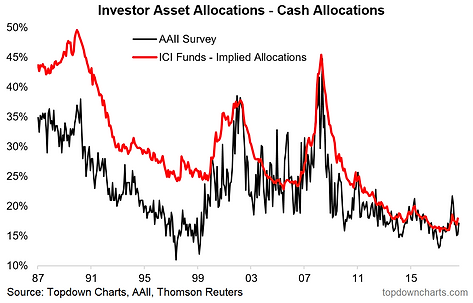
6. Cash Allocations: With the Fed likely to cut interest rates soon, cash (from a yield perspective) is still trash (but not from a capital preservation function perspective!!). Cash allocations are clearly up from the lows, and perhaps this is the start of a cycle of rising cash allocations, but then again, if central banks faced with the risk of recession renew their 'war on cash' efforts, it could be back to cycle/record lows here.
"One impact of monetary policy tightening is that cash becomes incrementally more attractive (as an income generating asset) beyond its core role of capital preservation. Look for cash allocations to rise from record lows (as indeed, they have already started to do so)."
(Click on image to enlarge)
7. US High Yield Credit: Now that the Fed has basically told us they are pivoting from tightening to easing (already they tapered quantitative tightening and are set to cut rates in the near term), it only leaves more question marks here. We are indeed in the final innings for credit/cycle, but the big question for credit really is just as simple as this: "can the Fed help avoid a recession?" If the answer is yes, then credit does well because basically credit only really gets taken out when a recession drives up defaults.
"Higher cash rates may cause issues for those who opted to push risk for income: US high yield credit is in the final innings; anticipate wider spreads ahead."
(Click on image to enlarge)

8. Global Equity Valuations: Interestingly enough, on global equity valuations, the median forward PE is still trading below the long term average. It is worth noting the spread between the upper quartile (more expensive) and lower quartile (cheaper), which goes to highlight how relative value across countries and regions is definitely there to be found. Anyway, the key here is that global equity valuations are not at rock bottom, but in a general sense are on the cheap side.
"In the wake of the global equity market correction it’s becoming easier and easier to find a bargain. Valuations have already reset to some of the previous major market lows. While global equities could get cheaper yet, the probability is increasingly in favor of long term investors at these levels."
(Click on image to enlarge)

9. Commodities: I am increasingly intrigued by the action in commodities.My indicators continue to show cheap "valuations" for commodities as an asset class (in the aggregate sense), and still relatively light positioning. It's true that cheap valuations can get cheaper and traders can get shorter, but when these conditions show up, probability favors the bulls in the medium term. Tactically, the US dollar looks to be rolling over, and EM/China are in easing mode. The main question mark is global growth...
"Beset by numerous headwinds and cross-currents last year, commodities ended 2018 looking un-loved and undervalued. As with the previous chart, there’s always room to go lower, but as long as the global economy avoids recession and if China/EM do ultimately stabilize and improve the case for commodities starts to look very good. And it’s often that you see commodities tend to do well later in the cycle. As the window starts to close for US dollar strength, that could be the final element to fall into place for commodities (and EM)."
(Click on image to enlarge)

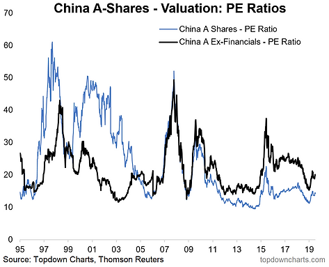
10. China A-shares: At the turn of the year Chinese equities were trading at rock bottom valuations, and subsequently rallied over 20% (as I like to say: valuations often have a habit of speaking for themselves - especially at extremes). At this point, valuations are more on the neutral side (sitting around long term average for China A-shares ex-financials). So it's no longer a value play as such, but rather some kind of bet on policy and politics (i.e. that they implement more stimulus and/or that we see a resolution to the trade war -- both are scenarios in their extremes which would likely drive material upside here).
"Last but not least is China again (our China stimulus chart was number 10 last year, and it remains very important), this time China A-shares in particular. A lot went wrong for China last year, and in my mind that simply sets the stage for things to go at least less wrong, if not right for China this year. Trump has helped make China A-share valuations great again (cheap again). All that’s required now is a catalyst and I can see multiple candidates."
(Click on image to enlarge)
For more and deeper insights on the global markets, good charts, and actionable investment ideas you may want to more


