
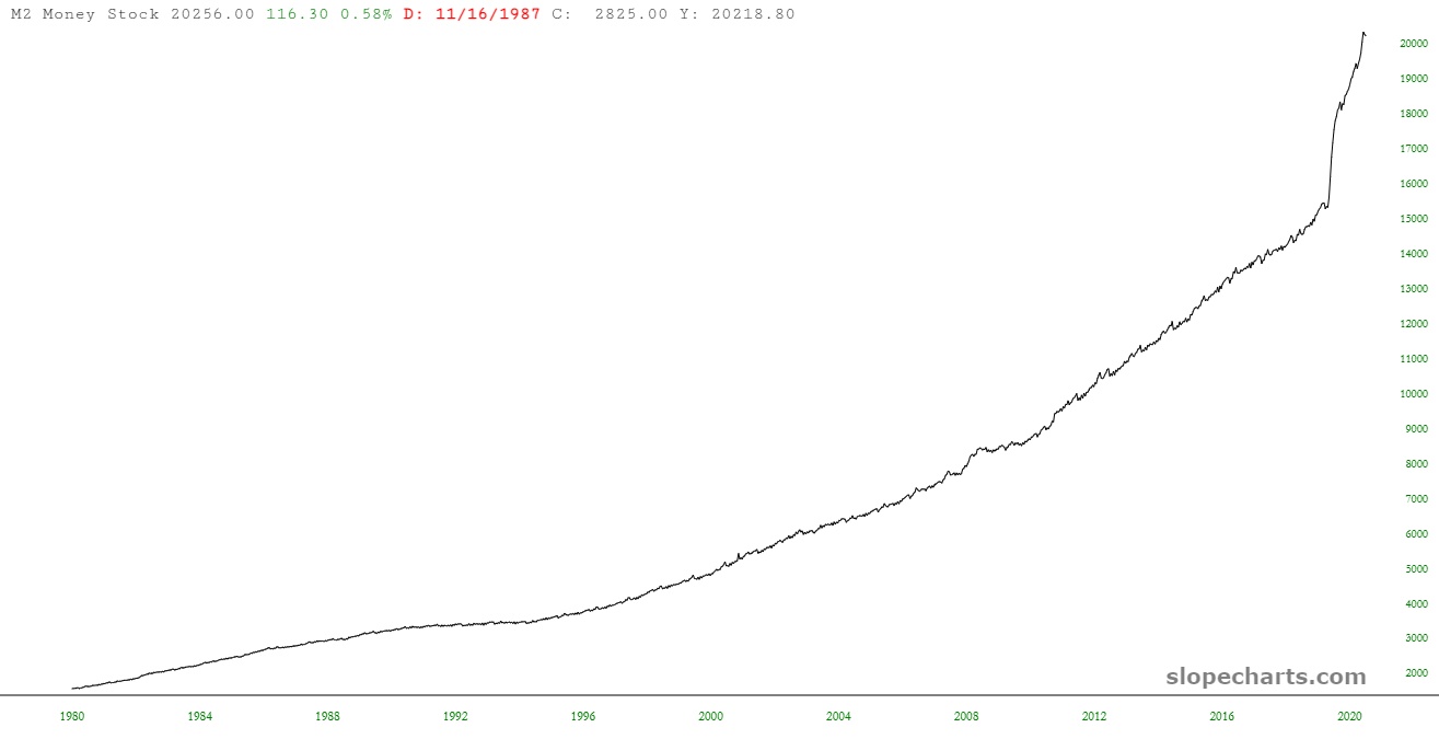
Weekly Money Supply
I don’t get to mess around with SlopeCharts‘ economic database as much as I would like to. However, I was monkeying around with it briefly when I stumbled upon a data set I didn’t know was there: weekly money supply data!
The symbol is FR:WM2NS and the chart looks like this:
(Click on image to enlarge)
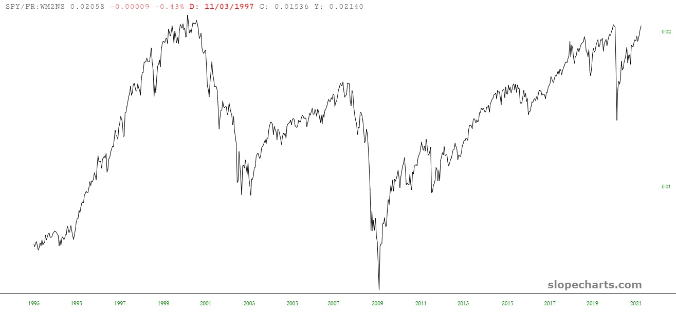
Naturally, I started looking at ratio charts. Here is the SPY, which shows clearly – – surprise!! – that stocks are, in real terms, as insanely overvalued as they were back in 2000.
(Click on image to enlarge)
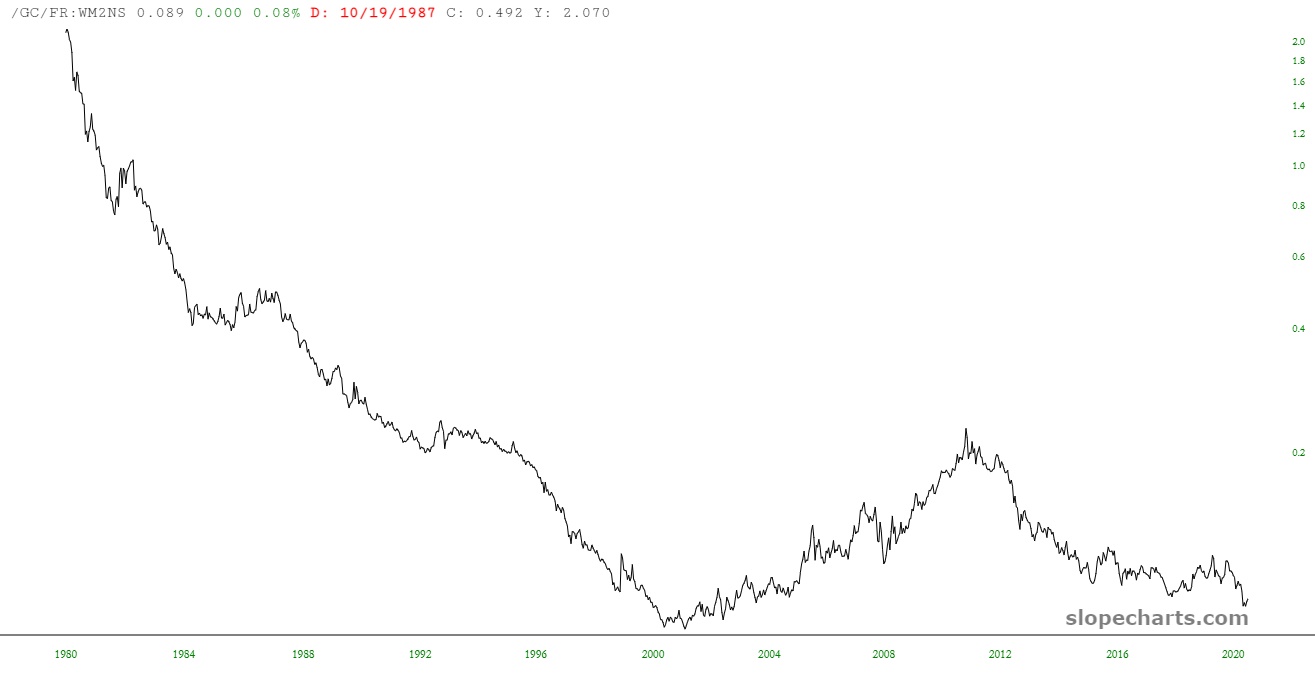
And here is the ratio chart of the long-term continuous futures contract of gold. Looks pretty cheap, would you say?
(Click on image to enlarge)
Anyway. This is my idea of fun. I’m serious.
Disclaimer: This is not meant to be a recommendation to buy or to sell securities nor an offer to buy or sell securities. Before selling or buying any stock or other investment you should consult ...
more

