
These Two Charts Virtually Scream “Buy Silver”
The Amount of Dollars in Existence
Silver is currently trading around $14.84 an ounce. This is around 30% of its 1980 all-time high of $50. However, this is an incomplete representation of what silver is really trading at, relative to US dollars.
When you look at the silver price, relative to US currency (the amount of actual US dollars) in existence, then it is at its lowest value it has ever been (see chart below).
Also, it is ridiculous that one ounce of silver cost $50 in 1980 when there was about 132 billion dollars in existence, whereas today it is only $14.84 at a time when there is 3 304 billion dollars in existence (note that I have used rounded numbers which created some distortion).
The US monetary base basically reflects the total amount of US currency issued. Originally, the monetary base is supposed to be backed by gold available at the Treasury or Federal Reserve to redeem the said currency issued by the Federal Reserve. This is not the case anymore, therefore, the amount of dollars have grown exponentially over the years.
Below, is a long-term chart of the silver price relative to the US monetary base (in billions of dollars)
(Click on image to enlarge)
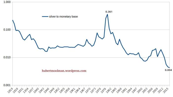
Note that the ratio, or price of silver, in terms of US dollars in existence, is indeed at its all-time 100-year low.
In 1980, the all-time high was 0.361, whereas the ratio is currently at around 0.004. The US monetary base is currently around 3 304 billion dollars (or 3.304 trillion). Therefore, if silver was today at its 1980 value, relative to the monetary base, it would be around $1 193 (3304*0.361).
So, in terms of US dollars in existence, silver is trading at 1.24% (14.84/1193) of its 1980 high – it is the bargain of the century.
Silver Long-Term Channeling
(Click on image to enlarge)

On the chart, the first phase of the silver bull market was from 1993 to the end of 2001, and the second phase is potentially from 2001 to the end of 2015.
It appears that there is a similarity between the two phases. I have drawn some lines and marked some patterns to show how the two phases are interwoven and could be similar.
The first phase is marked 1 to 3, in black, and the second 1 to 3, in blue. Both of the phases appear to occur within a broadening channel, from which they both broke down (out of the channel), after point 2.
Outside of the channel, there was a triangle-type consolidation. The first phase managed to get back inside the broadening channel after breaking out of the triangle-type consolidation. If the current pattern follows, then we could have a big rally, after breaking out of the triangle consolidation.
Based on this comparison, buying silver now is like buying silver back in 2003 when it was under $5 per ounce.
For more on this and this kind of fractal analysis, you are welcome to subscribe to my premium service. I have also ...
more

