
Silver Chartbook – Overbought And Oversold
Learning to master the markets is like drinking from a fire hose. This does not change, no matter at what stage of the game you are. The vastness of possibilities and the challenges of psychology are endless. Therefore the only way of maneuvering through a landscape this broad is condensing systematically and focusing on principles. One question we get asked a lot is:” How can one identify overbought and oversold zones within the market?” Consequently, we would like to give a brief simplified answer to this topic. Let us demystify this expansive field of market interpretation. Overbought and oversold.
From a price perspective:
- You can see on a candlestick representation if prices are overbought or oversold for directional markets.
- You can see on a market profile chart representation, if markets are oversold or overbought for sideways trading markets.
From an indicator perspective:
- For directional markets you need to use indicators for these measurements.
- For sideways markets you need to use oscillators to measure oversold and overbought zones.
Google the typical settings of oscillators and indicators and the way on how to read them. (=which values are the ones indicating the overbought and oversold regions). Be aware that radical setting changes on either oscillators or indicators can change their typical behavior. This means one can transform an indicator into an oscillator by radical setting changes.
There isn’t that much difference within the various tools that are commonly available. However, the difference is on how experienced you are interpreting these derivatives of the price. Above all, choose only very few of these tools. Use them consistently over time to learn their behavior. Certainly there is less of a holy grail in an individual tool or its settings. It is but rather the screen time using the tool and truly get to known it on a deeper level.
Weekly chart, silver/US Dollar 12/05/2019, “using indicators and oscillators for entry and exit timing” :
(Click on image to enlarge)
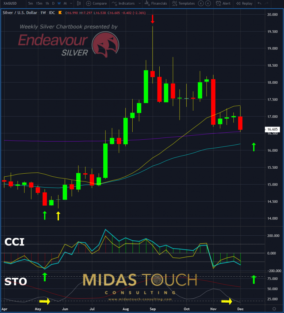
Silver in US Dollar, weekly chart as of December 6th, 2019
Overbought and oversold
The weekly chart above uses candlestick as a directional measurement tool in its price chart. It also plots a CCI oscillator and a Stochastic indicator.
In mid of May 2019, we posted a silver long entry live in our telegram channel. Supported by an oversold CCI signal (left green up arrows). Two weeks later an oversold Stochastic signal confirmed that decision. (yellow arrows to the left of the chart).
At the beginning of September 2019, we posted an exit signal. Supported by a reversal candlestick pattern indicating overbought conditions in the price chart (red downward arrow).
To the right of the chart, you can identify an oversold condition in the Stochastic again. Consequently, a possible early indication for a soon to come low-risk long entry point.
Overbought and oversold, silver/US Dollar 12/05/2019, monthly chart, “higher time frame confirmation”:
(Click on image to enlarge)
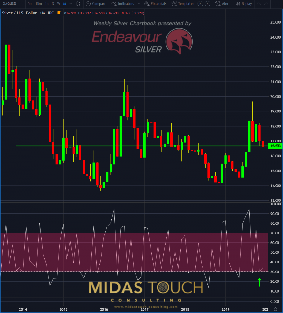
Silver in US Dollar, monthly chart as of December 6th, 2019
In the monthly chart above the green arrow signals a near overbought reading on the RSI oscillator. A confirming signal of a possible upcoming turning point.
Overbought and oversold
The dilemma is obviously the identification of directional or sideways markets. Therefore a minimum use of one oscillator and one indicator is required. Likewise, the price chart should have one representation for directional markets and one for sideways markets.
Disclosure: None.


