

Image Source: Unsplash
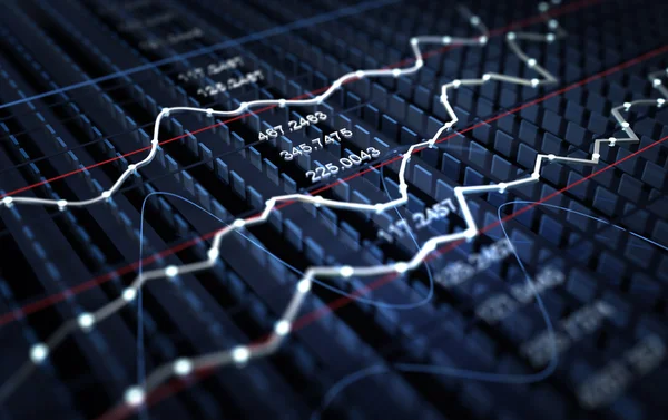
A walk-through of ratio charts highlighting a strong bullish trend for precious metals versus equities, weakening breadth in major indexes, extreme valuations in M2-adjusted terms, and standout strength in gold, silver, and palladium as equities look increasingly vulnerable.
Video Length: 00:08:20
More By This Author:
DeFi Still PlungingLong-Termers
At Any Rate...


Comments
Log in or sign up to join the conversation.