
Market Update For Late November
This week opened with the Dow Jones closing at a new all-time high on Monday; it then lost headway closing the week -0.57% from Monday’s close.
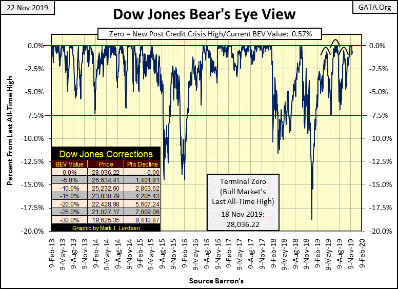
Next is the Dow Jones in daily bars. Since October 1st; this week’s performance was one of the Dow Jones' weakest, but still a good way above where it was in the first days of October.

In the table below, Row #8 shows how the Dow Jones performed for the week, which wasn’t bad. After the past two weeks where it made eight new BEV Zeros in the chart above, it’s only reasonable expecting a little R&R for the bulls.
The key thing I was looking for at the end of the week wasn’t how the stock market closed, but how much additional Treasury Debt the Federal Reserve “monetized” in its fourth round of quantitative easing. The answer to that question was $4.62 billion. And as seen in the chart below; since the end of September (or first few days of October?) the Federal Reserve hasn’t seen a week where it sold more T-debt than it had purchased. This was quite a change from when it was liquidating its portfolio of Treasury debt during its Quantitative Tightening from January 2018 to just last month.
The impact of this new round of QE, along with the Federal Reserve’s recent and massive support of the overnight repo market, has been a rejuvenation of the bulls running around Wall Street. This new “monetary policy” has dramatically changed the plot in the chart below since early October, and we should anticipate additional increases in the FOMC’s portfolio of US Treasury debt in the months and maybe years to come. Quantitative Tightening? Looks to me that is something now best seen in the market’s rear-view mirror.

I haven’t covered the Dow Jones’ 200 count (Red Plot below) since August.The 200 count is the number of days of extreme-market volatility, days the Dow Jones has moved (+/-) 2% or more from a previous day’s closing price in a running 200 day sample.
These Dow Jones 2% days are rare-market events, unless the Dow Jones is in a market decline where they pile up in the 200 count, as seen during the deflation of the NASDAQ High-Tech and sub-prime mortgage market bubbles below.
The 200 count increased to 17 in late August, creating the appearance of a problematic autumn for 2019, but since late August the 200 count has decreased to a 5 at the end of this week, which is expected for a market now making regular new all-time highs.

Below are the seventeen days of extreme market volatility the Dow Jones’ 200 count had in August. The first twelve of these extreme days began last November when the Dow Jones was seeing an 18% market correction, all of which have since passed out of the count, leaving only five increasingly stale 2% days at the end of this week.

Until the Dow Jones once again begins seeing regular days of extreme-market volatility, as it did last November when it was in an 18% correction, I’m going to assume the path of least resistance for the stock market is up. There will be days and weeks where the Dow Jones is down, but this is a market whose valuations are being inflated by the Federal Reserve, and so I’m assuming the stock market is going up for the foreseeable future.
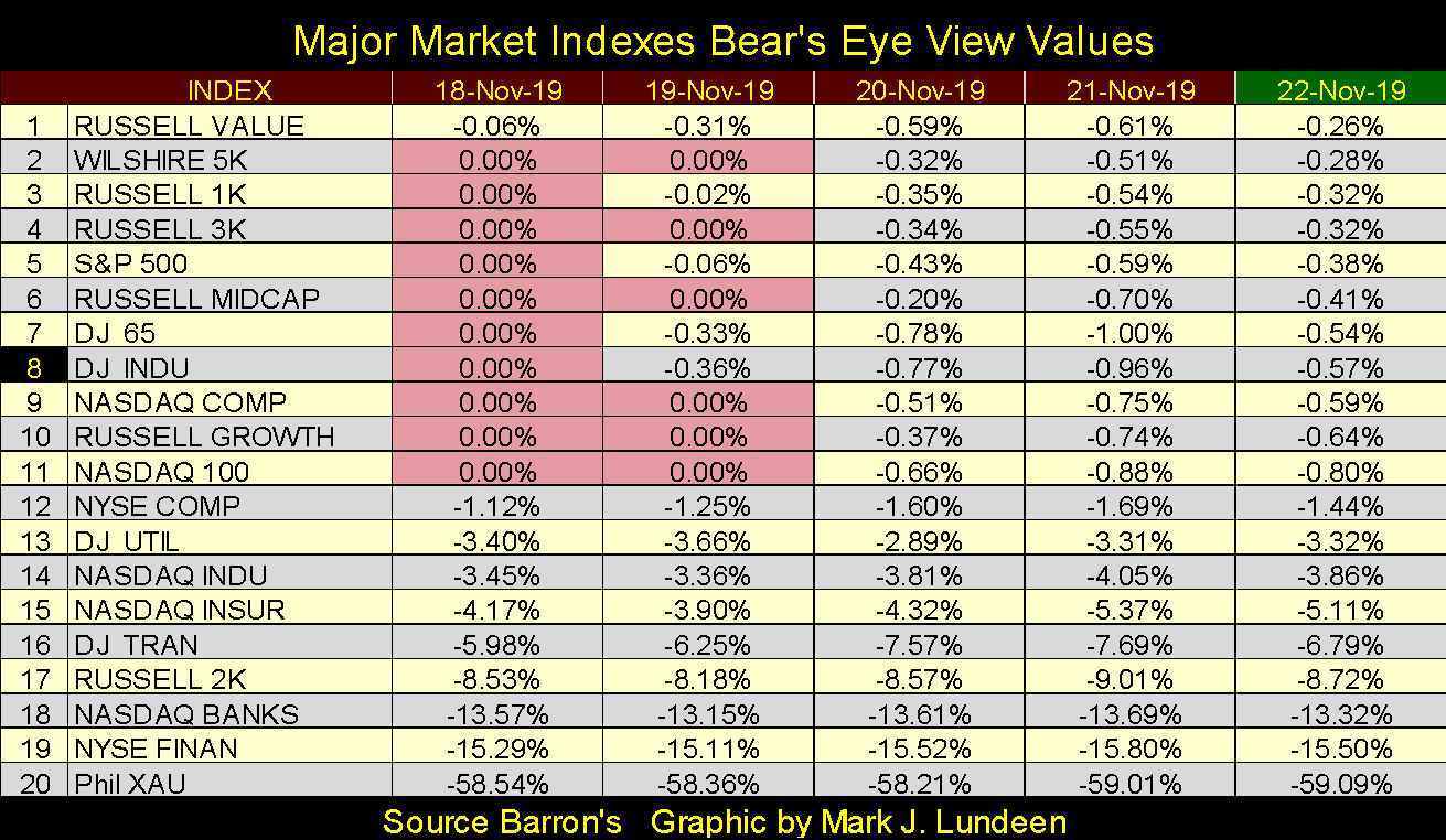
That doesn’t mean there aren’t problems in the market; oh there are. One that stands out in my data files is the NYSE Financial Index. This index was ground zero during the 2007-09 sub-prime mortgage meltdown, and unlike most of the stock market, these financial companies have yet to recover to their pre-crisis highs seen in the summer of 2007.
That the FOMC has increased its activities in the Overnight Repo Market tells us these financial companies are once again having problems. Seeing auto dealers offer 0% financing for 60 months with no down payment isn’t a sign of stability in finance. Rather it’s a sign the Federal Reserve is desperate to find areas of the economy willing to take on even more debt to stimulate the economy.
The last time such preposterous loan offers were seen was during the sub-prime mortgage market before 2008. Keep that in mind. So in late November 2019 I’m bullish, but I’m ready to change my opinion on a moment’s notice.
Anyway, back to the NYSE Finance Index; there’s an excellent reason why they haven’t recovered; almost eleven years after their March 2009 -80% bottom seen above, these companies remain damaged goods from the sub-prime mortgage debacle.
The link below goes to the movie “The Big Short” which provides an excellent view of the 2002-2007 sub-prime mortgage bubble market, and subsequent market meltdown that almost took down the global financial system.
Instead of allowing Mr. Bear to purge the financial system of the toxic financial products from this era, they’re still polluting the Federal Reserve’s balance sheet, as well as in Wall Street’s and very likely your pension fund and insurance company’s balance sheets too.
“Economic Policy” for the past decade has only made it worse, reflating the bubble in housing, the stock and bond markets all at the same time. If you haven’t seen The Big Short, or saw it years ago, this would be a good time to review it. Respectable market opinion from 2002 to 2007 couldn’t see the problems in the housing market, until they could no longer ignore them as their world crumbled.
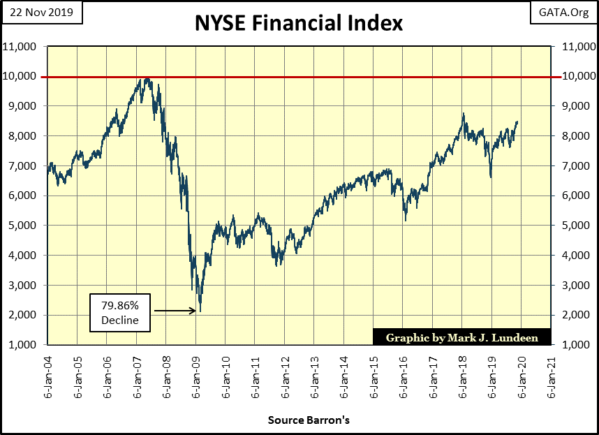
Gold is holding on; keeping near its BEV -22.5% line below. To my eyes this appears to be a normal correction in a continuing advance in the price of gold.
But looks can be deceiving. The big banks, the same as were in the movie The Big Short, continue shorting the gold market, flooding the COMEX Exchange (Red Plot below) with promises to deliver gold they neither have, or could ever obtain in a deliberate effort to suppress the price of gold.
Since late August they have stopped gold’s advance (Blue Plot below), and are now piling on tons of phantom gold to cause a collapse in the price of gold. But so far they have failed to do so.
Typically what happens is this; both plots in the chart below begin to collapse, which indicates that the big banks are profitably closing their short contracts at the expense of the longs.
But one of these days we’ll see a collapse in the Red Plot (COMEX Open Interest) as gold’s blue price plot rises with enthusiasm. That would indicate the big banks are losing billions of dollars as the longs in the gold market (the bulls) are cleaning up.
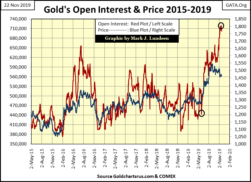
Is that going to happen this time? Maybe, but I’m not counting on it. One thing missing to make this possible is the lack of market distress in the financial markets, the kind of market distress last seen during the sub-prime mortgage market crisis.
Years ago a massive liquidation of COMEX Open Interest such as we see pending above could have caused the price of gold to collapse to something below $1250 in the chart above, stripping away all of gold’s gains since last May. Can the bears do that again? I’m anticipating they are going to give it a good try as this expansion in open interest once again contracts, but the world has changed greatly in the past decade.
I’m not a market trader in any sense of the term. I take a position and hold on for dear life. For example since the dollar was decoupled from its Bretton Woods $35 gold peg in 1971, the expansion in the global supply of dollars has been enormous, leaving the valuation in gold and silver far behind. One day this anomaly is going to correct and I want to be there when it does. I can’t complain about how I’ve done so far, as I’ve been in the gold and silver market since the late 1990's, and have done good. But better things are ahead of us, especially for the miners of gold and silver. So I’m staying put.
If you’re someone who likes to trade the market, to buy low and sell high a few times a year, there is little I have to offer you to help you do this. But even if you can profitably do so, and have done so for years, history has proven that most people who attempt to do this fail. Though I know there are people who have done so, and will continue to do so, and more power to them. So my market commentary is geared to my investing style; of discovering undervalued situations in the market, and wait for them to develop profitably.
Anyway, when Mr. Bear once again begins clawing back valuations in the stock, bond and real estate markets as he did from 2007-09, I’m expecting the profits for anyone with a single box of Silver Eagles of 500 coins will exceed those of many active traders who have traded in and out of the precious metals markets.
Moving on to gold’s step sum chart below, the bear box that began in September continues. I haven’t placed a box around this bear box as it’s only a few months old; still one can see the market reality of declining gold prices (Blue Plot) as market sentiment (Red Step Sum Plot) continues to rise.
I’m hoping this bear box fails, that the bulls are ultimately proven correct by seeing the price of gold reverse upwards. But that isn’t how these bear boxes typically workout; where the price plot continues declining until it breaks the incorrect positive market sentiment, causing the step sum plot to recouple with the price plot on the way down.
The Bear Box from August 2011 to May 2014 is an excellent example of what to expect, but hopefully lasting for only a few months, not years.

The bulls for the stock market are having it their way. Last December’s 18% market correction happened within a bear box, but the bears failed to collapse the bulls positive market sentiment; so the box failed.
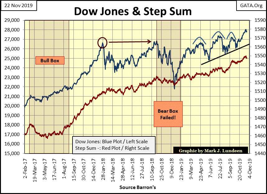
The bulls then ignored a bearish head and shoulders chart formation that spanned from April to September before they took the Dow Jones to eight new all-time highs (BEV Zeros) for the 744th to the 752nd time (Dow Jones BEV Freq Distribution Table Below) since August 12, 1982 when the current stock market advance actually began with the Dow Jones bouncing off a bottom of 776.92.

This advance in the Dow Jones has been going on now for thirty-eight years and 27,260 points. Yes this advance is only inflation, but who cares? Certainty not the bulls! So, after all this it’s hard faulting the bulls for being optimistic. The only words of comfort I can offer bears in the stock market, people waiting for a tsunami of flight capital to reignite the bull market in gold and silver is: This Too Shall Pass.
Next are the step sum tables for gold and the Dow Jones. Both see their step sums advancing, but the price of gold is under pressure while the Dow Jones is less than 1% below its last all-time high, or the 752nd new all-time high since August 1982.
Maybe the most bearish factor for the stock market is that a hardcore bear (such as myself) is beginning to understand how the stock market could continue rising for a considerable time to come.


