
Is This The Greatest Stock Market Rally Of All-Time?
The elements of good trading are: (1) cutting losses, (2) cutting losses, and (3) cutting losses. If you can follow these three rules, you may have a chance. ~ Ed Seykota
Good morning!
In this week’s Dirty Dozen [CHART PACK] we look at signs suggesting oil is going to move lower in the short-term but much higher in the long-term. We then look at the ridiculous moves going on in the big tech names and compare them to past speculative bubbles before diving into a recent IB report exploring structural systematic pessimism, what it means, and what could be causing it. And finally, we end by checking out a lithium play with strong secular tailwinds, plus more…
Let’s dive in.
***click charts to enlarge***
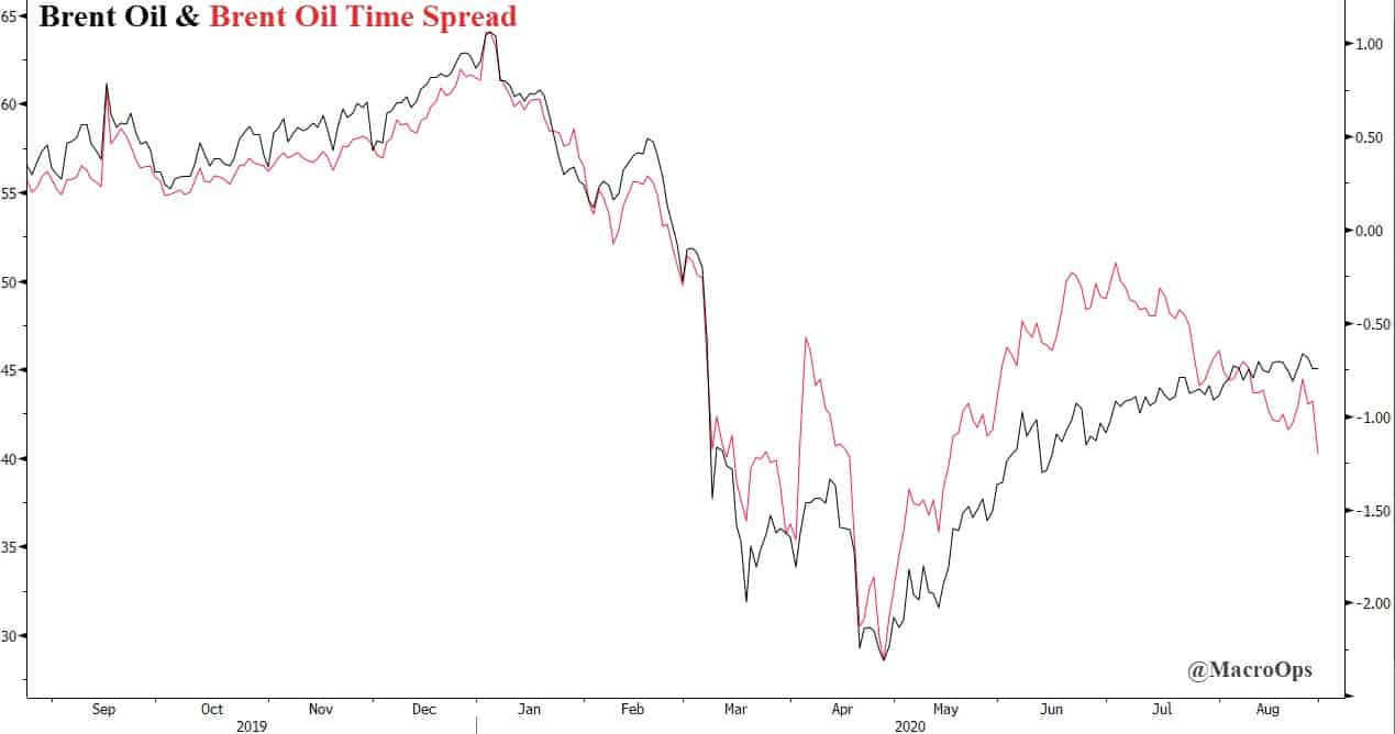
- Last Wednesday, I shared this chart on the twitters and wrote “Brent oil time spread suggesting we may see a breakdown lower from its compressed range. A bounce in the $DXY would help fuel this move. Need a setup and breakout confirmation from the tape now.” The next day we got the setup and then Friday gave us the confirmation. Expect crude to move lower in the short-term. Longer-term, crude is setting up for a monster bull cycle. The Capital Cycle all but guarantees it.
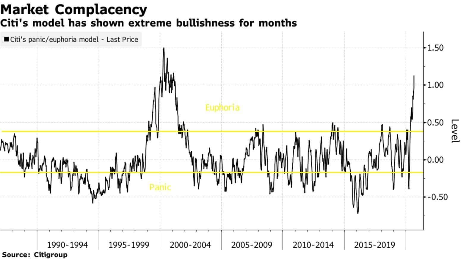
- This chart from Citi’s Proprietary positioning/sentiment model shows the market is giving its best effort to imitate 99’ (h/t to @tihobrkan).
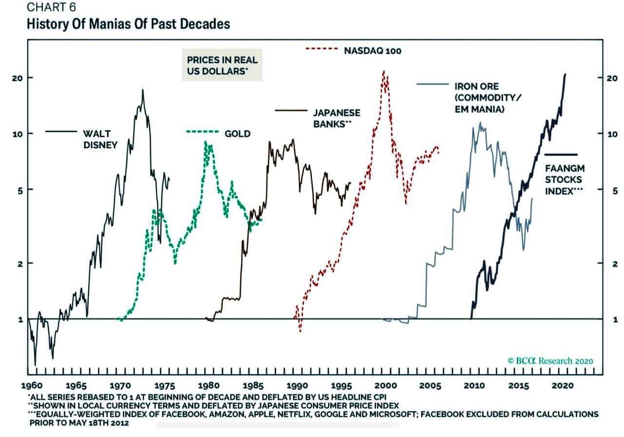
- This great chart from BCA Research shows just how silly the run in big tech stocks has gotten. It’s now at 99’-00’ Nasdaq 100 peak insanity levels. Jesse Stine talks about this craziness in his latest public letter which you can find here.
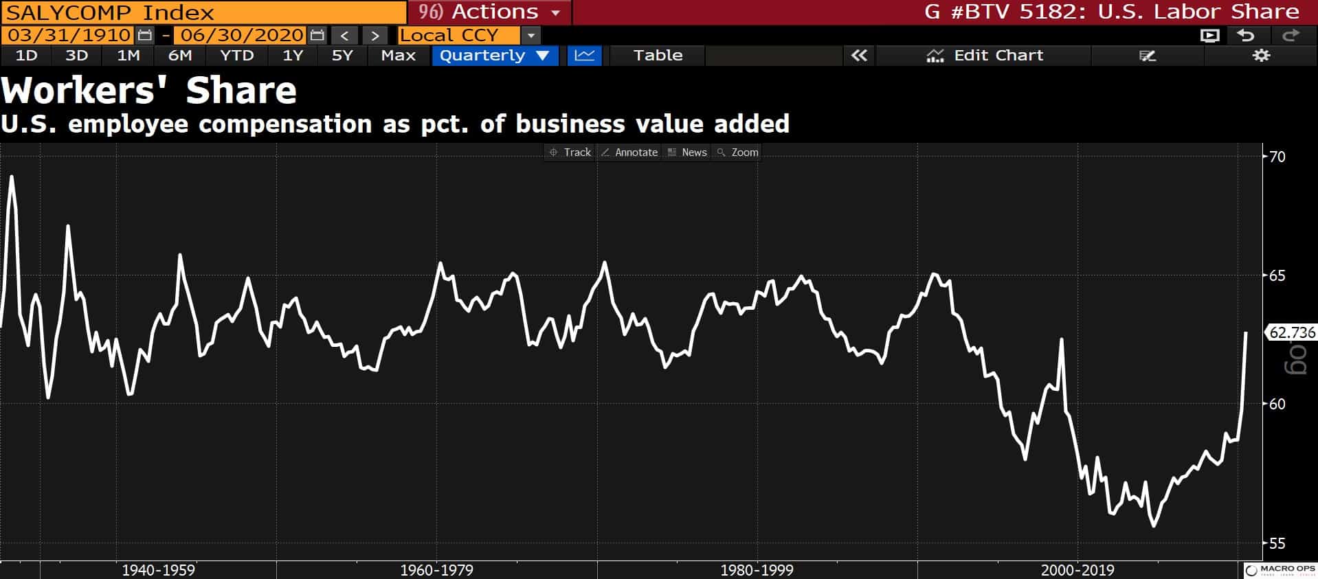
- So this is interesting… Employee compensation as a % of US business value-added is hockey sticking higher after being in a secular decline for the last 15+ years. I need to look into how this data is put together to see if there’s anything creating noise here but this could be a very important trend (shoot me an email if you have any insights!).
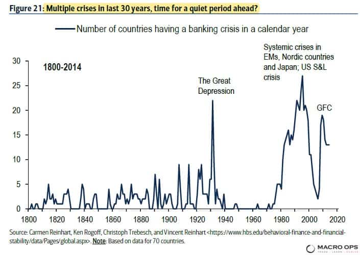
- BofA published a great report last week outlining the systemic pessimism that’s pervading nearly all aspects of our society. Below are a few of my favorite charts from the report. This one is great. It shows over 200-years of global banking crises. Why the rise over the last 40-years? The answer is leverage. And that leverage is the result of the long-term debt cycle and financialization of the global economy.
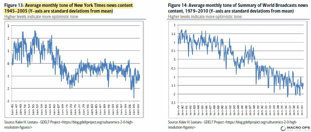
- Check these out. The charts show the average monthly “tone” of NYT news content from 1945-2005 (left) and the tone of Summary of World Broadcasts news content from 1979-2010 (right). The y-axis is standard deviations from mean. This is quantitative proof that the media is peddling doom and gloom. The fact that the tone is more bearish now than it was at the depth of WW2 tells you everything you need to know.
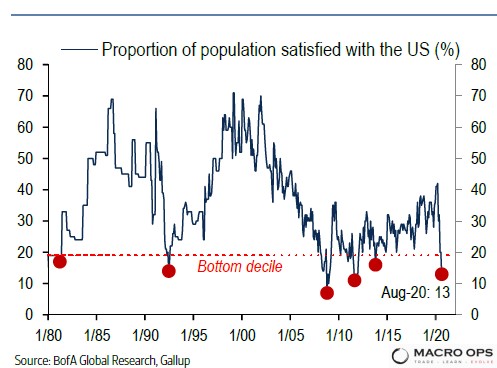
- There’s a bit of a chicken or egg component to this pessimism. With the proportion of the US population satisfied with the US near all-time lows, is the news just feeding us citizens what we want? Confirming our biases? Or is it forming and shaping those biases? Or, is it a feedback loop of sorts? I don’t know but I do love this quote from economist AC Pigou that’s included in the report. Pigou writes “The dying error of optimism gives birth to an error of pessimism. This new error is born, not an infant, but a giant.” Welcome to the Fourth Turning…
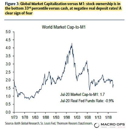
- BofA writes in the report that “Equity markets are a low 1.7x the global narrow money supply (in the lowest tertile), cumulative equity fund inflows since 2008 have been USD 425bn, while bond funds have received USD2tn, the percentage of Americans who own equities has fallen from 63% to 55% since 2004… Not exactly a ringing endorsement of optimism, or risk-seeking behavior.” There’s a demographic component to this (growing wave of retiring baby boomers structurally have lower risk preferences i.e., prefer bonds over equities). But with negative real yields, you have to imagine its shifting those preferences much further out the risk curve.
- BofA’s latest Flow Show report has some good nuggets. For example, since the March lockdowns began, central banks have “bought $1.4bn of financial assets every hour” and the “market cap of Nasdaq 100 [has gone] up $1.6bn every hour.”
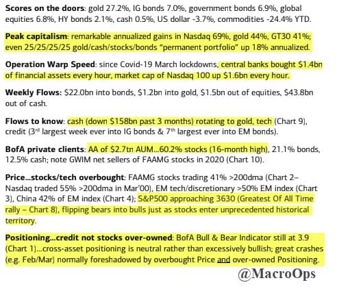
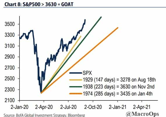
- According to BofA, the SPX is now within spitting distance of becoming the “Greatest Rally of All-Time”. It needs to cross the 3,630 level to make it official.
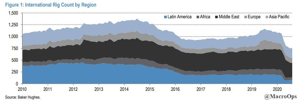
- Going back to my first chart on oil and comment on the bullish CAPEX dynamics. This chart of International Rig Counts from JPM shows supply capacity is trending to unsustainable levels.
- With monetary policy tapped out across the developed world, fiscal is going to become a larger part of the economic equation. And government spending on “green” energy is going to be a big part of that. One of the companies we’ve been bullish on for a while now is lithium miner Albemarle (ALB). Lithium battery capacity is expected to reach 2,450 GWh by 2029. If we get anywhere near that range, it’s going to require roughly 2mn metric tons of LCE. That’s well over 5x current demand. Lithium mines take 4-years on average to come online before they can actually deliver supply to market. Currently, there’s little demand for funding for any large projects in the space. The lithium market is headed for a supply crunch. ALB stock looks like it’s starting to sniff this out. The chart is weekly.

Disclaimer: All statements are solely opinions and are for educational purposes only.


