
Gold Vs. Stocks: Ratios Do Not Imply Correlation
There is considerable extensive research and lots of articles written about gold vs. stocks. Sometimes, that is done in order to support or justify the argument that stocks are a better, long-term investment than gold. And the results seem to indicate that.
Except that gold is not an investment.
Gold is real money and a 'store of value'. Its fundamentals have nothing to do with the fundamentals for stocks or any other investments. When gold is analyzed as an investment, it gets compared to other investments. And then the analysts start looking for correlations.
Some say that an 'investment' in gold is correlated inversely to stocks. But there have been periods of time when both stocks and gold went up or down simultaneously.
And, classifying gold as an alternative investment, or a safehaven asset, confuses people and creates unrealistic expectations. At least when comparing apples to oranges, we know that both of them are fruits.
Some of those who consider gold and stocks to be inversely correlated investments follow the Dow to Gold ratio. The ratio is calculated by comparing the U.S. dollar price per ounce of gold to the Dow Jones Industrial Average in such fashion as to determine hypothetically how many ounces of gold are needed to 'buy' the Dow.
For example, gold is currently priced at $1297.00 per ounce and the Dow Jones Industrial Average closed today (6/7/18) at 25,241. When we divide 25,241 by 1297.00 we get the number 19.46. What this means is that - theoretically - it costs 19.46 ounces of gold to buy the Dow. Not a realistically practical application of numbers, yet, some people are convinced that the two are inversely correlated when plotted on a chart with adequate time periods. Not true, but we are provided with some talking points. Let's take a look:
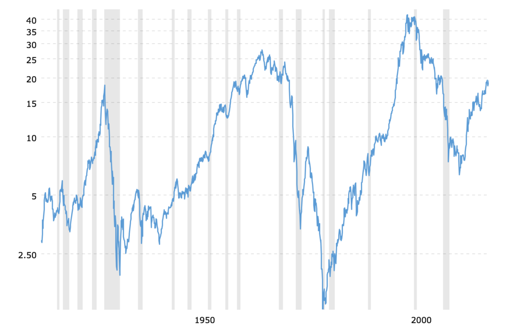
The three successively higher peaks in the ratio coincided with highs in the stock market. And the low points following the January 1980 peak and the August 2011 peak coincided with highs in gold.
Thus, it would appear that the driving force behind moves higher in the ratio is a higher stock market; and that moves lower in the ratio are primarily the result of a significantly higher gold price. Seems reasonable, but...
The move lower from September 1929 to June 1933 was almost entirely due to lower stock prices - not higher gold prices. This calls attention to the fact that the ratio depicts the relative price differential between the two items. It does not imply a correlation.
In order for correlation to exist, there must be fundamentals that directly connect the two items being compared. For example, there is a possible correlation between localized, bad weather and crop failures. But how do you predict the timing and extent, or the effects, to a degree that can be profitable?
And there certainly is a correlation between the price of labor and materials vs. the finished cost of building a new home. But there is no correlation between the price of labor and materials vs. the number of new housing starts.
We can find patterns and rhythm that might appear to be correlation (or inverse correlation) by plotting the price differential of any two items but it still does not imply correlation.
That being said, there are some positive things we can learn from this chart. But for that to happen, we need to change our perspective.
Here is another chart. This one is a one hundred-year history of the 'ratio' of the U.S. dollar to the Dow Jones Industrial Average.
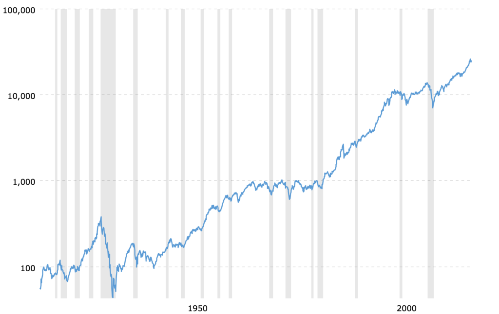
Our first chart depicted the ratio of the Dow to gold and we learned that it costs 19.46 ounces of gold to buy the Dow at today's prices. Our second chart, plots the ratio of the Dow to the U.S. dollar and we see that, at today's prices it takes 25,241 U.S. dollars to buy the Dow.
When we look at the chart just above, we might be tempted to assume that the stock market (as represented by the Dow) is a one way ticket to riches. But is it?
In February 1915, the Dow stood at 55. A simple calculation tells us that the Dow at 25,241 is up 45,800 percent - in dollar terms. Quite impressive. Unfortunately, the U.S. dollar, as a result of inflation, has lost nearly all (more than ninety-eight percent) of its value over that century-long period.
We know that stocks have been a good long-term investment. But, a chart of stock prices - such as that above - is somewhat misleading. In order to get a clearer picture of actual stock performance, we need to account for inflation.
Accounting for the results of inflation is somewhat problematic. We know that it costs more today for the things we purchase and consume (goods and services) than, say, ten years ago; or twenty, etc. But how do we compare today's cost of living to the cost of living eighty years ago when conditions were nothing like they are today? Industrial and technological advances have radically altered every aspect of our lives such that it is very difficult to account for the effects of inflation accurately. There are too many variables and it involves subjective judgement. When you consider the fact that familiar gauges such as the CPI are manipulated and unreliable, it seems like an almost impossible task.
What we need is a single barometer that reflects the actual deterioration of our money/U.S. dollar. It needs to have a recognized value (not the same thing as its price) that remains stable (a store of value) over time and cannot be 'tinkered with' by politicians and central bankers. And it must be market-oriented.
Gold is the perfect barometer. It is original money. Its price is inversely correlated to the value of the U.S. dollar. Changes in the gold price are a direct reflection of changes in the U.S. dollar.
Something else: gold is cash in its original meaning and form. What we refer to as cash today are paper 'notes' which have no intrinsic value. They were originally issued as a sort of receipt which represented a specific physical amount of gold coin held in a warehouse or depository.
Now lets look at the Dow to Gold ratio chart again. With our new perspective using ounces of gold rather than dollars as our measure of value, we find that the Dow Jones Industrial Average over the past century is up 580 percent; not the previously mentioned 45,800 percent. That is quite a difference. And it shows just how badly distorted our view of financial history can be because of the effects of inflation.
But we are not limited to just stocks. Similar comparisons will work just as well with anything else, such as the cost of a loaf of bread or a gallon of gas.
There are, of course, inflation-adjusted charts and analyses. And they are often quite helpful, if for no reason other than to give us a better perspective. But nothing could be simpler and more reliable - as well as more accurate - than using gold instead of dollars as our measure of value.
Disclosure: None.


Correlation does not prove causation, and so even if there was a valid correlation it would not prove anything. The article certainly points this out very clearly. The whole system is complex enough that a simple theory will usually be incorrect.