
Gold Market Update - Sunday, February 23
If you are wondering why gold is starting to accelerate away to the upside, you need to look no farther than the following amazing chart forwarded to me by reader Larry Fike, which Larry has kindly given me permission to reproduce in this update…
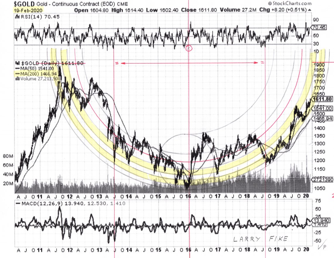
Click on chart to popup a larger, clearer version.
Chart courtesy of Larry Fike
The chart speaks for itself and requires little additional comment by me, save to say that it is astounding how precisely the hemispherical Bowl pattern captures the action in gold since as far back as 2011, and secondly to draw your attention to the way the right side of the Bowl boundary is now approaching the vertical which suggests that gold will blow through the resistance at the 2011 highs surprisingly quickly. Fundamentally, this is no longer surprising since we have a fiat system that is headed for a hyperinflationary meltdown, a process catalyzed by the virus pandemic and its grave economic consequences. It would seem that the US hybrid war on China is a resounding success, as far as its protagonists are concerned, but it will lead to the direst of consequences for most of us, especially those who are unprepared. Another article has just appeared that is very much worth reading is Will Covid-19 Lead To A Gold Standard?
Compared to Larry’s chart above my 10-year chart showing a Saucer pattern looks basic. Still, we used it for a long time and it worked very well as a predictive tool…
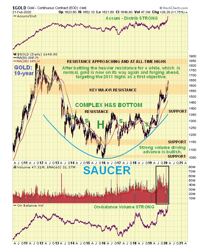
Even though gold’s progress in the recent past has been measured and modest it has actually done well – it took its time because it was chewing its way through the considerable resistance arising from the 2011 – 2013 top area. It still is and will be until it gets to the 2011 highs in the $1850 area. However, as mentioned above the now near-vertical ascent on the right side of the Bowl on Larry’s chart means that gold is likely to be propelled to new highs with alacrity.
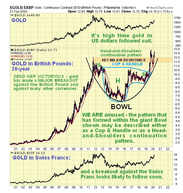
It is very important at this time not to get too hung up on gold’s performance against the dollar, which can be misleading and lead to missed opportunity. For the fact is that gold has been romping ahead against most currencies, making new highs in many of them. A fine example is shown below of the new highs established by gold against the British Pound. Of special interest on this chart is the way the price action of recent years has been perfectly captured by the Bowl pattern shown, within which is an embedded Cup & Handle continuation pattern and a Head-and-Shoulders continuation pattern, which illustrates how these patterns are often hybrid.
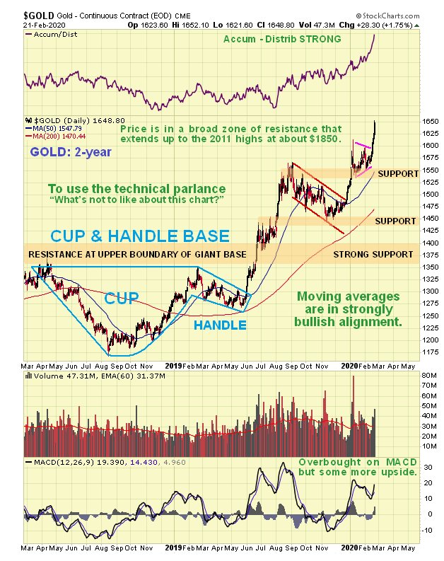
The 2-year chart for gold in dollars is interesting as it reveals that the latter part of the giant Saucer base took the form of a fine Cup & Handle pattern, and once the price broke out of it and then above the strong resistance forming the upper boundary of the Saucer, gold was on its way. Everything about this chart is bullish, with no sign of weakness.
On gold’s 6-month chart we can that gold’s sharp rally of recent days was triggered by a breakout from a fine bull Pennant, which gives a measured target for this move in the $1720 area, although it could pause to consolidate before it gets there as it is getting overbought.
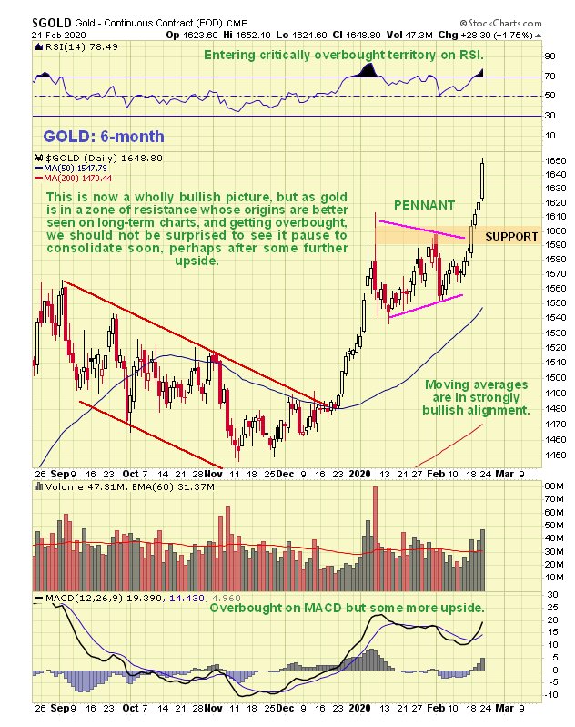
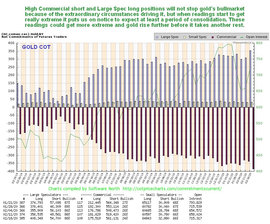
Although gold’s latest COT may be initially concerning on account of the high Commercial short and large Spec long readings, we should keep in mind that in the environment that we are entering readings are likely to stay high, and may get even higher. The main value of this chart is that when it shows really extreme readings it means that the risk of correction/consolidation is high, and it is approaching that state now, which is hardly surprising given the sharp rally of the past week or so.
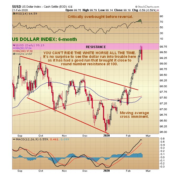
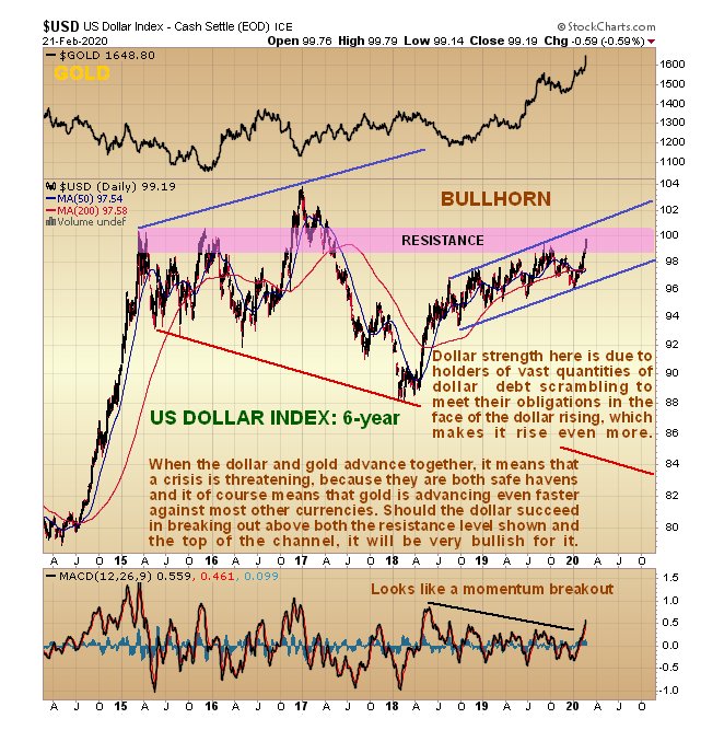
One of the most noteworthy developments this month is the way that both the dollar and gold have been advancing in tandem – normally they go in opposite directions. The reason for this is that they are both safe havens, and increasingly in demand at a time of crisis. However, on Friday gold got an additional boost from the dollar doing a sudden about-face at resistance, after rising more or less non-stop all month up to now. The reason that it reversed on Friday is simple – it was arriving at “round number” resistance at 100 on the index, a level which turned it back twice in 2015, as we can see on the 6-year chart for the dollar index below. However, this 100 level may not stop it for long, especially as the dollar appears to have made a momentum (MACD) breakout. A big reason for the dollar’s rise, despite the Fed’s valiant attempts to stop it by means of profligate QE, is that as the global crisis deepens, many holders of dollar-denominated debt are scrambling to cover these debts before the dollar soars even more, which of course creates more demand for dollar and a self-fulfilling prophecy, but as we have seen already, the dollar’s advance won’t stop gold.
Finally, what about gold stocks? Given what gold has already accomplished they still haven’t done much, which is partly due to investors having been brainwashed and conditioned to ignore them and instead chase rainbows via the FAANGS and Tech stocks etc., but to say that this is about to change would be a mighty understatement.
You may recall the public article posted about a week ago entitled GOOD CHEER FOR PM SECTOR INVESTORS - the completing CUP & HANDLE CONTINUATION PATTERN IN GDX. The Bowl and Cup & Handle patterns shown on the 7-month chart for GDX in that article worked like a charm, calling precisely the sharp rally of the past week by the sector, as we can see on the latest 7-month chart for GDX below…
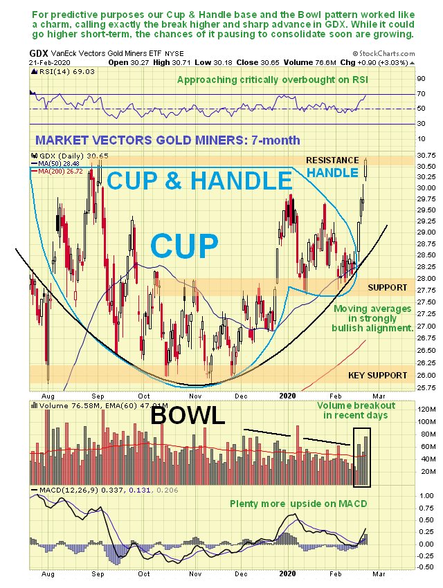
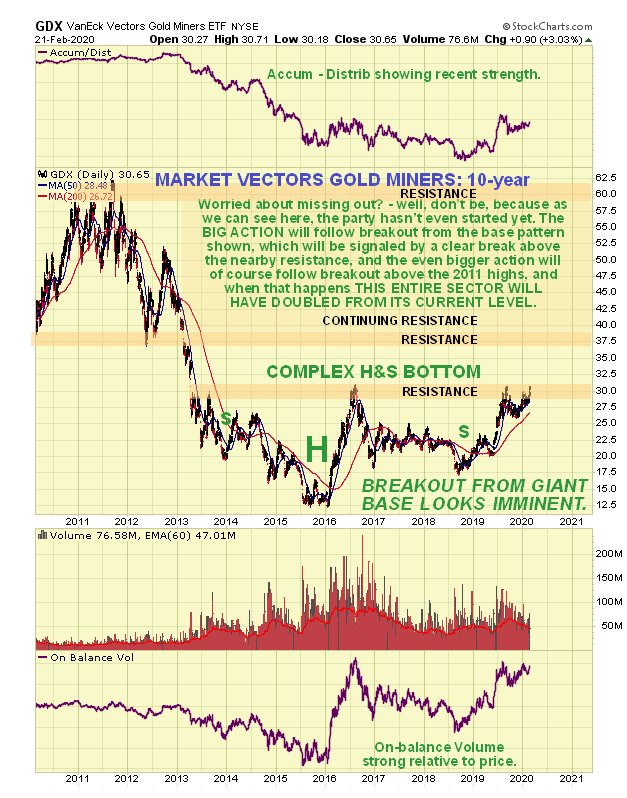
So what now? – think it’s gone too far, too fast? Certainly not – the 10-year chart for GDX shows that it hasn’t even broken out of its giant base pattern yet, so this thing is just getting started. Once GDX breaks above the upper boundary of the pattern, which is at about $31, i.e. a shade above where it is now, gold and silver stocks are going to soar, so if you haven’t boarded the train, you’d better get your act together PDQ.
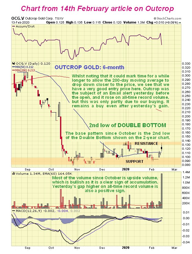
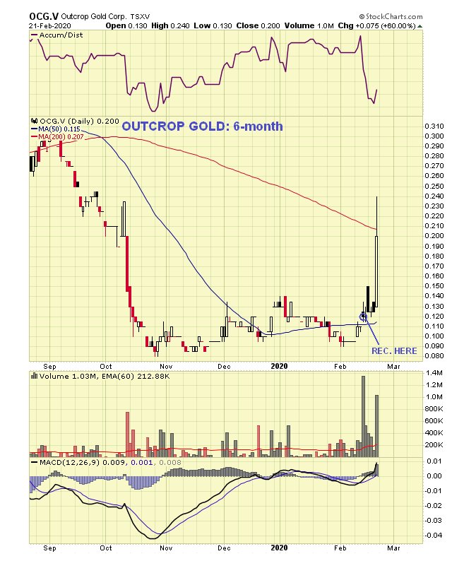
It always makes me laugh when I get mails from people after featuring a cheap gold or silver stock on the site protesting “I can’t buy that, it’s too cheap!” “Suit yourself” I say, “but I’d rather buy something for 10 cents and sell it at 50 cents than buy it at $1.00 and sell it $1.50.” Here’s an example, a gold stock we bought at 12 cents just 8 days ago, and which gained 60% on Friday to 20 cents, and it’s just warming up – and we do look at more pricey PM stocks on the site anyway…
Outcrop Gold – chart when featured on the site on the 14th…
Outcrop Gold – chart for last Friday’s close…
Of course, they don’t all do this well, but there is a whole clutch of gold and silver stocks looking set to take off strongly higher when GDX finally breaks out of its giant base which, as set out above, looks set to happen soon.


