
Eleven Reasons Why I Am Super Bullish On Gold And Silver
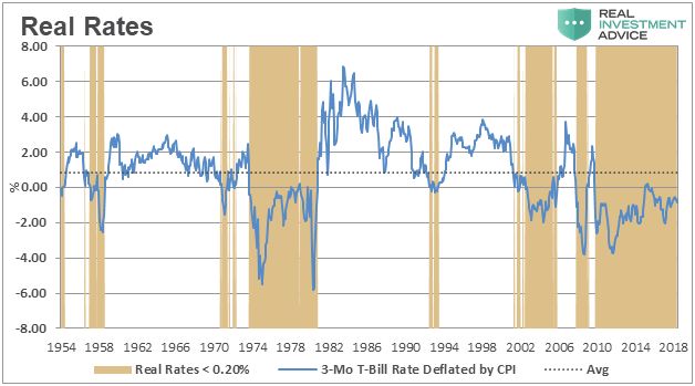
This chart is courtesy Real Investment Advice.com and borrowed from a recent article: ‘Wicksell’s Elegant Model’. The brown areas in the chart highlight the periods when ‘real rates’ were and are negative. Gold tends to perform best during those periods.
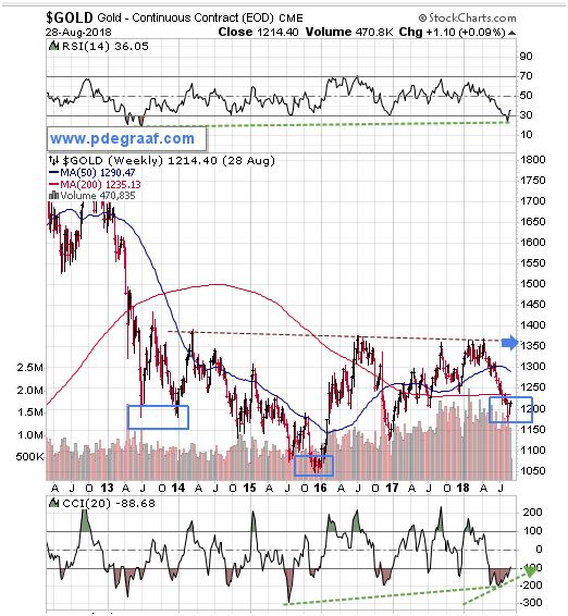
Featured is the weekly gold chart courtesy Stockcharts.com. The pattern indicates the likelihood of a developing ‘inverted head and shoulders’ formation. Watch for a turnaround here to carve out the right shoulder. A breakout at the blue arrow will confirm the pattern, with a target at $1650.
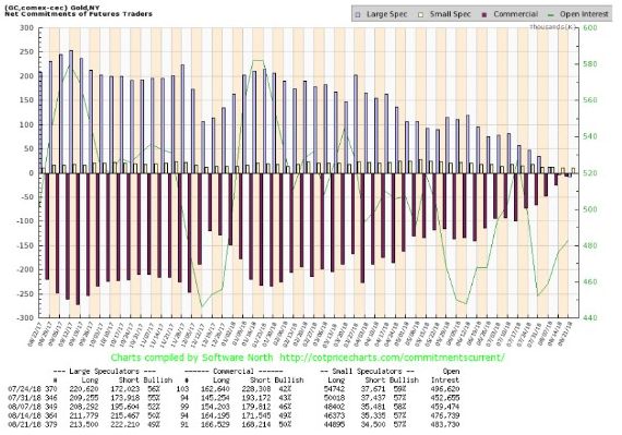
This chart courtesy COT@softwarenorth.com shows the ‘net short’ position of commercial gold dealers has evaporated for the first time in years – perhaps for the first time ever. As a percentage of open interest the number is very bullish at 0.4%.
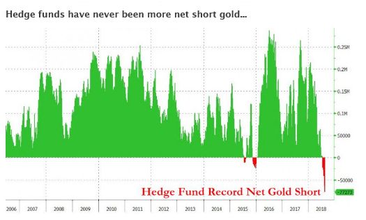
This chart courtesy Zerohedge.com shows hedge funds have NEVER been more ‘net short’ gold. Hedge funds are often referred to as the 'dumb money'. The last time these funds were somewhat short (compared to today), was in December 2015 - see chart). That was when gold moved from $1050 to $1375. Is history about to repeat?
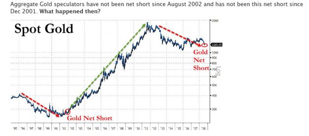
This chart is courtesy Bloomberg.com shows a situation today that compares to a set-up in 2002. Gold back then rose from $275 to $1925.
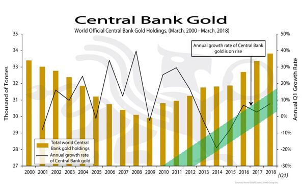
This chart courtesy BGMBullion.com shows a steady increase in the amount of gold that is being acquired by Central Banks, since the end of the last financial crisis. Since Central banks are hoarding gold, we can assume that these bankers anticipate a future role for gold in the world’s financial system.
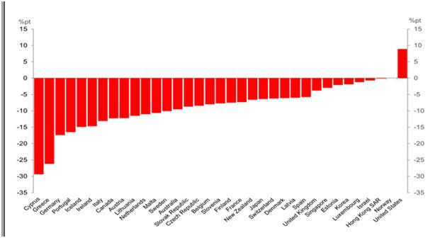
This chart dated April 2018, and courtesy IMF and Deutschebank shows several dozen countries and the expected % Change in Government Debt-to-GDP Ratios for “Advanced” Economies. Most of the countries listed are expected to reduce this ratio, but the USA is shown here as likely to increase its debt to GDP ratio by 9%. This increase in the level of debt will cause the US dollar to depreciate. Investors are likely to seek gold and silver for protection.
While this article is focused primarily focused on gold, we recall that historically, during a gold bull market, silver usually moves up even faster than gold.
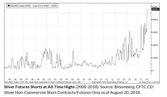
This chart courtesy Sprott.com and sources listed shows hedge funds have shorted silver at an all-time high number. When too many passengers in a boat are seated on one side, there is a danger of the boat tipping over. Watch what happens to the price of silver when these short positions are covered.
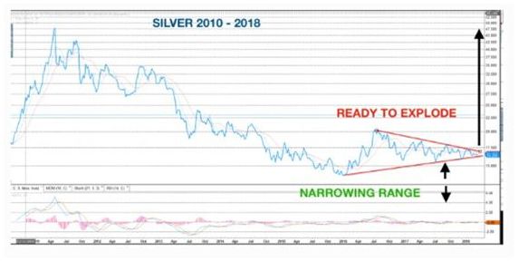
This chart courtesy Egon von Greyerz at Goldswitzerland.com shows a bullish pattern is developing in silver. Silver is the only commodity that has not yet reached the value that prevailed in February 1980. An upside breakout here will send silver advancing towards that 48.50 level, and possibly beyond.
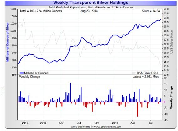
This chart courtesy goldchartsrus.com shows the number of ounces backing SLV and other silver ETFs and trusts has increased while the price of silver declined. This is a bullish divergence; leading to the conclusion that silver is due for a rise, to match the uptrend in this chart.
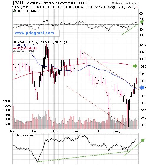
Featured is the Palladium chart. Palladium often leads the precious metals complex. The upside breakout at the blue arrow is setting a positive example for gold and silver and is confirmed by the supporting indicators. This breakout sets up an initial target at the green arrow.
Disclaimer: Investing involves risk taking. Please do your own due diligence. Peter Degraaf is NOT responsible for your trading decisions.
Peter Degraaf is a stocks and commodities investor with ...
more


Thanks Peter. Your article is a twelfth reason for me to be bullish.