
Craig Hemke’s Surprising Revelation In The Palladium Market
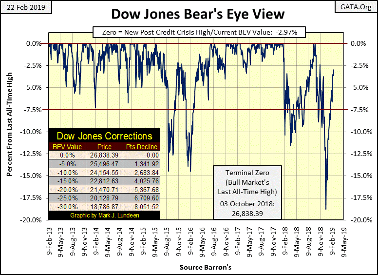
At week’s close the Dow Jones was within 3% of making a new all-time high in the Bear’s Eye View (BEV) chart below. Still, the stock market lacks the excitement most investors seek. But such excitement usually signals the end of a bull market, not its beginning. So, seeing the Dow Jones crawling up week after week in tiny baby steps is actually very bullish.
Currently I’m not in the stock market. At present I prefer my market risks in the precious metals market. But if you’re in the stock market the current technical situation is pretty much risk free, if not exciting. Since early January daily volatility in the stock market, as measured by the Dow Jones, has become very favorable to the bulls.
Of course as we saw how after October 3rd’s last all-time high in the Dow Jones, it wasn’t hard for Mr. Bear to change the landscape on Wall Street from bullish to bearish. So keep an eye out for those days of extreme volatility, the dreaded Dow Jones 2% days in the weeks and months to come.
Keep in mind this is a market that has been going up since August 1982. That’s a long time. The day is going to come when most retail investors, pension beneficiaries and holders of whole life insurance policies are going to come face to face with the reality that Wall Street can have multi-year big bear markets too. The 1890's were bad years for the bulls, as were the 1930's. From 1966 to 1982 the Dow Jones attempted to break above 1000, and stay above 1000 five times, and failed.
If in August 1982, as the Dow Jones began its current monster advance, had you predicted the Dow Jones would rise above 26K in 2018, no one would have taken you seriously. Yet at the close of this week once again, the Dow Jones finds itself above 26K to no one’s surprise.
But the history of the stock market is one that is full of surprises, mostly unpleasant ones. So I’m going to assume 2019, even with all its early promise of capital gains, isn’t going to be a year where one can profit from buying and holding on to a position in the stock market for the long term. Given any excuse to sell and go away - I’d take it and lock up what profits I have. But until we once again see the Dow Jones moving 2% or more from day to day, I think the bulls are okay.
Here’s the Dow Jones in daily bars. Compare the daily volatility in the Dow Jones prior to, then after October 3rd’s last all-time high. The table lists the Dow’s days of extreme volatility, and anytime the Dow Jones moves more than 2% from a previous day’s closing price, it’s a news-making event. Since January 4, the stock market hasn’t been making any news, but it has been going up.
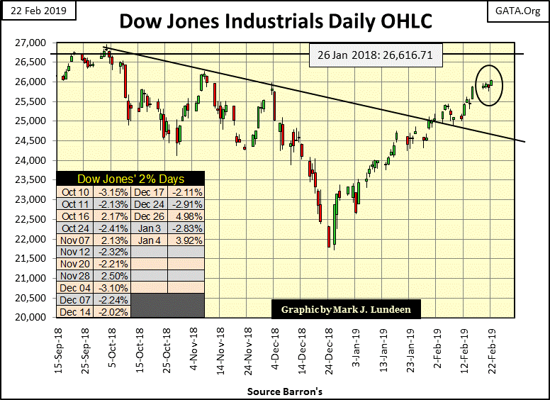
I circled last week in the chart above. Does that look like the Dow Jones going up to you? That’s the exact type of market action that keeps most retail investors out of a market advance as it’s totally lacking any excitement. If that is so, and being so is strongly bullish, why aren’t I bullish on the stock market? Well, as a spectator I am, for only the short term; only as long as the “policy makers” can control market volatility and keep manhandling stock-market valuations higher.
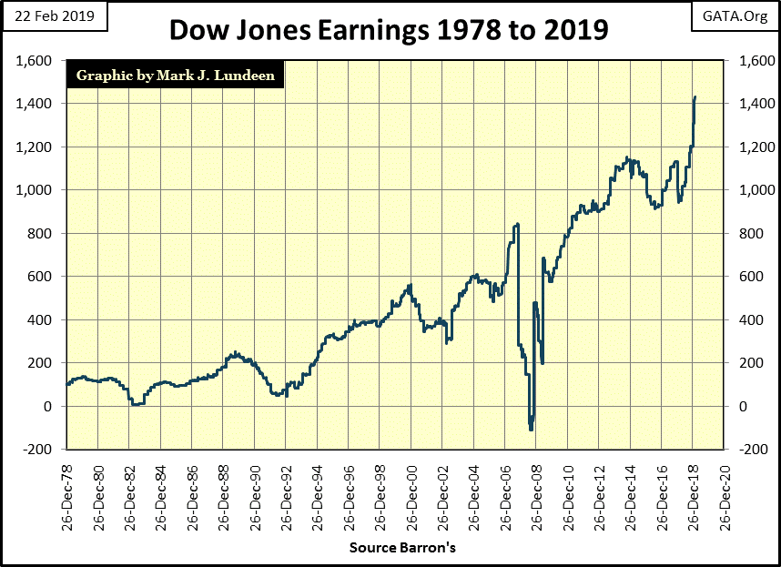
Take a moment to study the earnings for the Dow Jones below. What qualified as earnings in 1978 was totally different than today in 2019. Every time the financial market has a problem, they change the accounting rules. You might say that’s what makes our current “free markets” regulated markets.
This was especially so during the sub-prime mortgage crisis of 2007-09. In October 2007 earnings for the Dow Jones were over $800. Fourteen months later they collapsed to below -$100. Something similar happened during the Great Crash of 1929-32; a total wipe-out in earnings for the Dow Jones. But back then the earnings for the Dow Jones didn’t recover until January 1949; almost two decades later.
Not so for the post credit crisis recovery in earnings for the Dow Jones, where it took only two years for the Dow Jones to recoup its earnings, and has continued going up since. Look at the spike in earnings since late 2018. The Dow Jones sees an 18% correction in December 2018, the deepest price correction since March 2009, and out of nowhere the Dow Jones sees a $400 increase in its earnings – how did that happen?
Note that I no longer follow the financial media as they have a credibility problem with me. So, maybe this big advance in earnings has some basis in fact that I’m totally unaware of. But I’m just looking at this chart for Dow Jones’ earnings in total disbelief.
Even what the market’s reaction to trends in earnings for the Dow Jones has changed since Alan Greenspan and CNBC began focusing on earnings. In the early 1990's they began looking at earning trends as a leading indicator for stock market valuations. I don’t know if they do it anymore, but years ago CNBC called it “earnings central”, where big blue-chip stocks would report their earnings.
They would begin a week before the actual reporting, and have a timer on their video counting down the days, hours and minutes before the earnings for this or that high-tech company would be reported. And then on the report, the earnings would always be a penny above Wall Street’s analysis predictions; it was always a penny above, which would trigger a huge move in the price of the stock, double digit percentages sometimes during the high-tech bubble top in 1999.
It was wonderful entertainment, but it was just a staged production that has now been running on Wall Street for decades now; that trends in earnings are leading indicators for market valuations.
I’ve been through every issue of Barron’s since April 1921, and only a few fiduciaries interviewed by Barron’s over those many decades talked about stock earnings until the 1990's. Charles Dow, the creator of the Dow Jones Indexes, could have told you why in the 1890's: trends in market valuations are a leading indicator for the economy, aka earnings. But not anymore.
That’s not to say trends in valuations and earnings don’t sometimes rise and fall together. Sometimes they do. But at the turns in the market, when bulls would do well to become bears, or when bears would do well to become bulls, timing market exits and entry points via earnings can be disastrous.
Below is a chart for the Dow Jones and its earnings, data from the dusty old pages of contemporary issues of Barron’s. Put yourself in the place of an investor from October 1929 to July 1933, who foolishly used earnings to time market exit and entry points.
The Great Depression market crash (Blue Plot) began on rising earnings (Red Plot), and earnings continued increasing until July 1930 as the Dow Jones found itself down by 40%. For the next two years, the Dow Jones valuation and earnings trended down together, until July 1932, when the Dow Jones began its best year in history, where it advanced by 163% in the next twelve months. During this amazing advance its earnings were either declining or negative. As earnings became positive in July 1933, the best year in Dow Jones history was over.
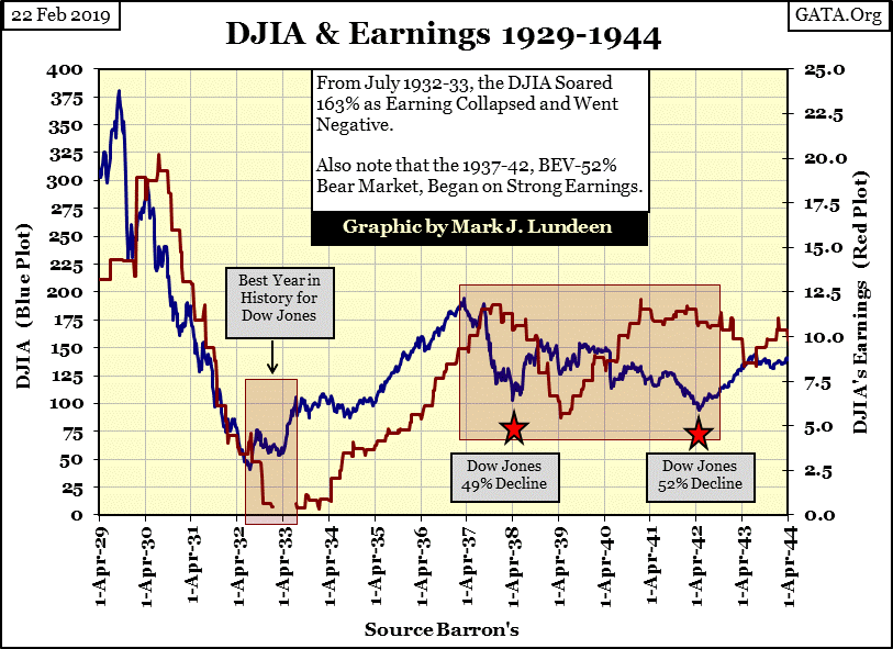
Dow Jones earnings from July 1933 to March 1937 appreciated with Dow Jones valuations, and then once again earnings continued trending up as the Dow Jones entered its 1937-38 49% Bear Market. I’m not going to go into detail as the American economy entered into WWII, but the data plotted above proves the dubious value of using earnings to time market entry and exit points for these fifteen years of market history.
It didn’t change after the war. However, as I’ve said before, there were times when trends in earnings and valuations for the Dow Jones have agreed. But typically when investors needed to get out earnings would have kept them in, and when investors needed to get in, earnings would have kept them out. Small wonder professional money managers before the Greenspan era paid small attention to earnings before Alan Greenspan and CNBC made them the focus of market analysis.
I love the following chart; the Dow Jones (Blue Plot) and its earnings (Red Plot) from 1968 to 1984. Give yourself a million dollars in the market on January 1, 1968, and for the next sixteen years sell 100% of your position on every decline in earnings, and invest 100% of your remaining capital on every increase in earnings. I personally haven’t done this. But I just looked at the disasters that would have result from doing so.
I don’t imagine much would be left of the million dollars by the time the stock market began its current amazing bull market in August 1982 – which began on collapsing Dow Jones earnings.

I haven’t looked at mortgage rates for a while, so here they are in the chart below. Like bond yields, mortgage rates bottomed a few years ago, and have been trending up since. However, since last November when they peaked at 4.95%, we’ve seen a small correction, with mortgage rates declining to 4.35 at the close of this week.
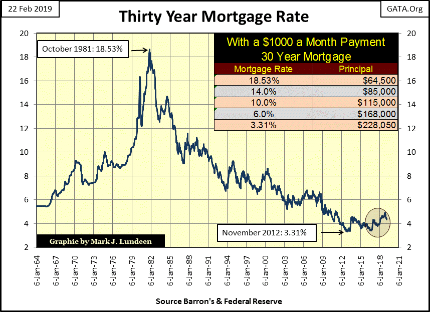
As you can see in the table in the chart above, the mortgage market is highly leveraged. What a $1000 a month mortgage payment will support depends greatly on what rate the mortgage market offers “homeowners.” I don’t care to predict when, but when mortgage rates rise above 5% I expect the financial markets will begin feeling ever increasing deflationary pressure.
That’s not an insight from the genius deep within me. I’m just looking at the chart above. Why did real estate see a monster bull market from 1981 to 2012? Mortgage rates declined from 18.53% down to 3.31%. And we’ll see an equally significant bear market in real estate as these mortgage rates begin to climb.
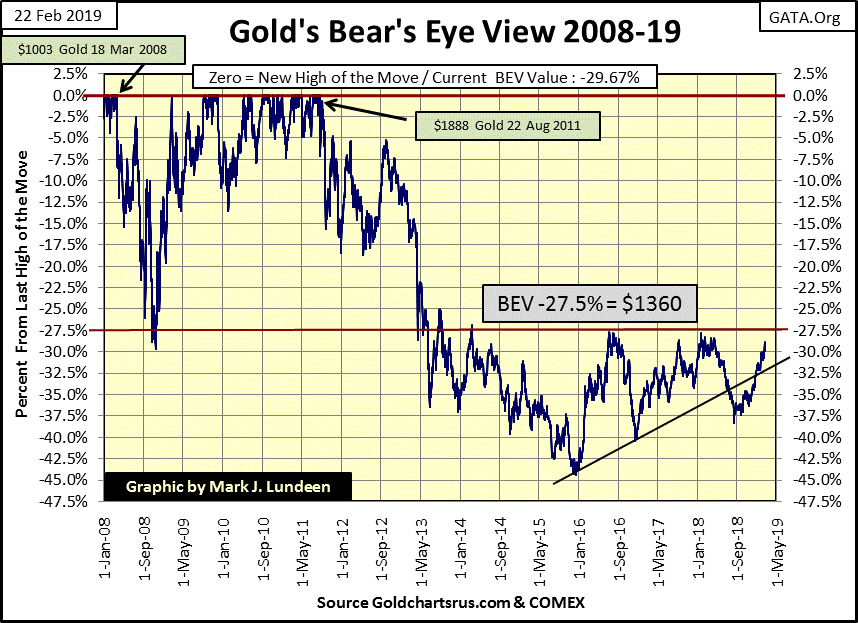
Not since last April has gold found itself above its -30% BEV line in the chart below, then today for the first time in almost a year we see gold with a -29% BEV handle. Like the stock market, sometimes the market action in gold is boring, but as seen below gold has been advancing for the past six months. Maybe not as much as you and I would like to see, but its price trend is pointed the right way to justify my bullishness.
One of these days stock-market investors who today are studying trends in stock earnings are going to look at a chart of gold and wish they had purchased gold and silver at these very boring and very low prices.
Greg Hunter’s USAWatchdog.com has a very interesting interview with Craig Hemke this week.
The entire interview is worth your time, but the one item that caught my attention was Mr. Hemke’s comparison of COMEX open interest to actual metal stored in COMEX approved vaults. As I have the data, I created a table for this very interesting, and timely topic.

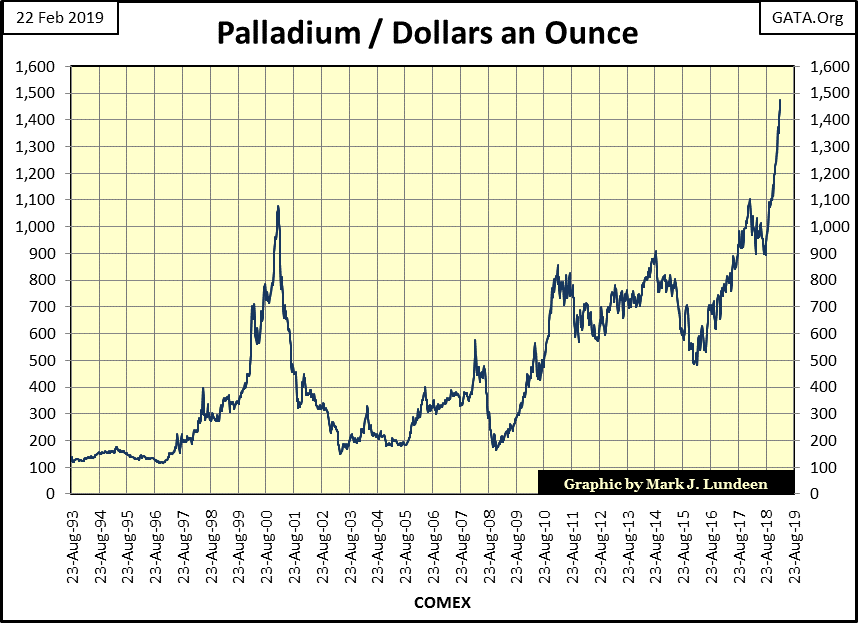
Look at the palladium market. There are 28,157 open contracts currently trading. That’s 2,815,700 ounces of palladium the shorts have promised to deliver, and the longs have promised to take delivery. However, in the entire COMEX system there is currently only 42,583 ounces of palladium in storage.
What’s this all about? I expect the sixty-six ounces of paper palladium now trading for every actual ounce of physical palladium in storage, ounces of promised metal by banks who don’t mine and so can’t deliver, and speculator longs who aren’t interested in taking delivery of palladium because they have no use for it, is to prevent palladium from soaring to something substantially above the current $1472 it closed at this week.
I just noticed this; palladium is now the most expensive of the precious metals, over a $100 an ounce more than gold. And how much would it be if like gold, palladium had only gold’s 6 ounces of paper metal trading for every ounce in storage instead of its current 66? I expect it would be multiples of its current price. Oh, but we can’t have that now can we?
What a chart! Look at palladium’s advance since last August. Like mine, most precious metals market commentary focuses on gold and silver asking when the manipulation scheme is going to fail. Maybe the answer to that question isn’t to be found in analyzing gold and silver, but the palladium market.
I think I’ll begin covering the above table and palladium price chart below on a weekly basis, thank you Craig Hemke.
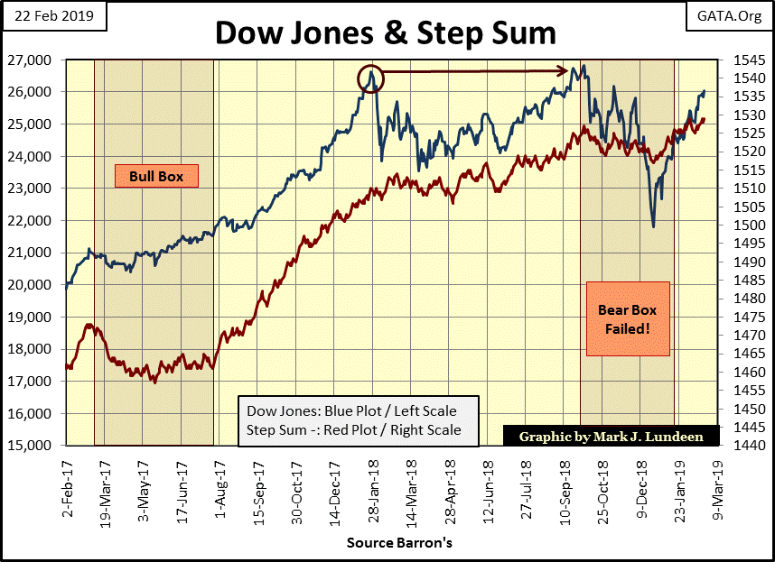
Last but not least is gold and the Dow Jones’ step sum charts below; nothing much new to talk about for either one. Gold and its step sum have been advancing nicely since last summer. Hopefully these trends will continue for the next few years as they did from October 2008 to August 2011.
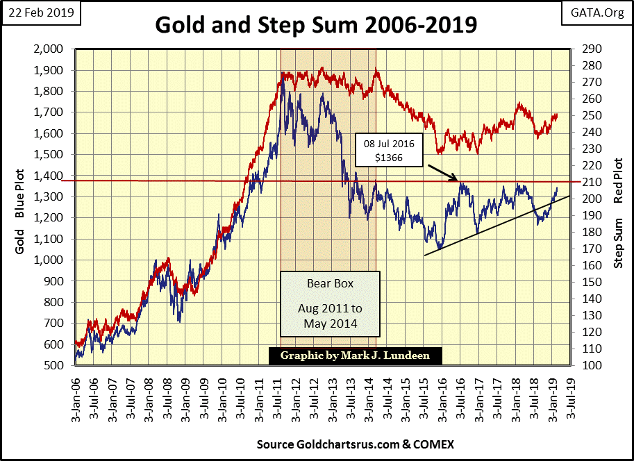
The Dow Jones too sees its price and step sum trends advancing below. But personally I don’t anticipate these rising trends for the Dow Jones continuing for the next few years. Market management by the “policy makers” is becoming increasingly difficult. The freedom of action Alan Greenspan enjoyed during his tenure as Fed Chairman has long since gone away. Central banking just isn’t fun anymore.
One thing for sure; when the stock and bond markets once again begin to melt down, and bond yields and interest rates begin their climb towards double digits, it will be a good day for gold and silver.
But when will that be? I haven’t a clue, but looking at palladium once a week may prove very interesting as 2019 advances towards 2020.
In gold’s step sum table below I note daily volatility has increased to 0.45%. Hopefully the multitudes of 0.43% seen below are a bottom, and a thing of the past. Other than that not much has changed for gold since last week.
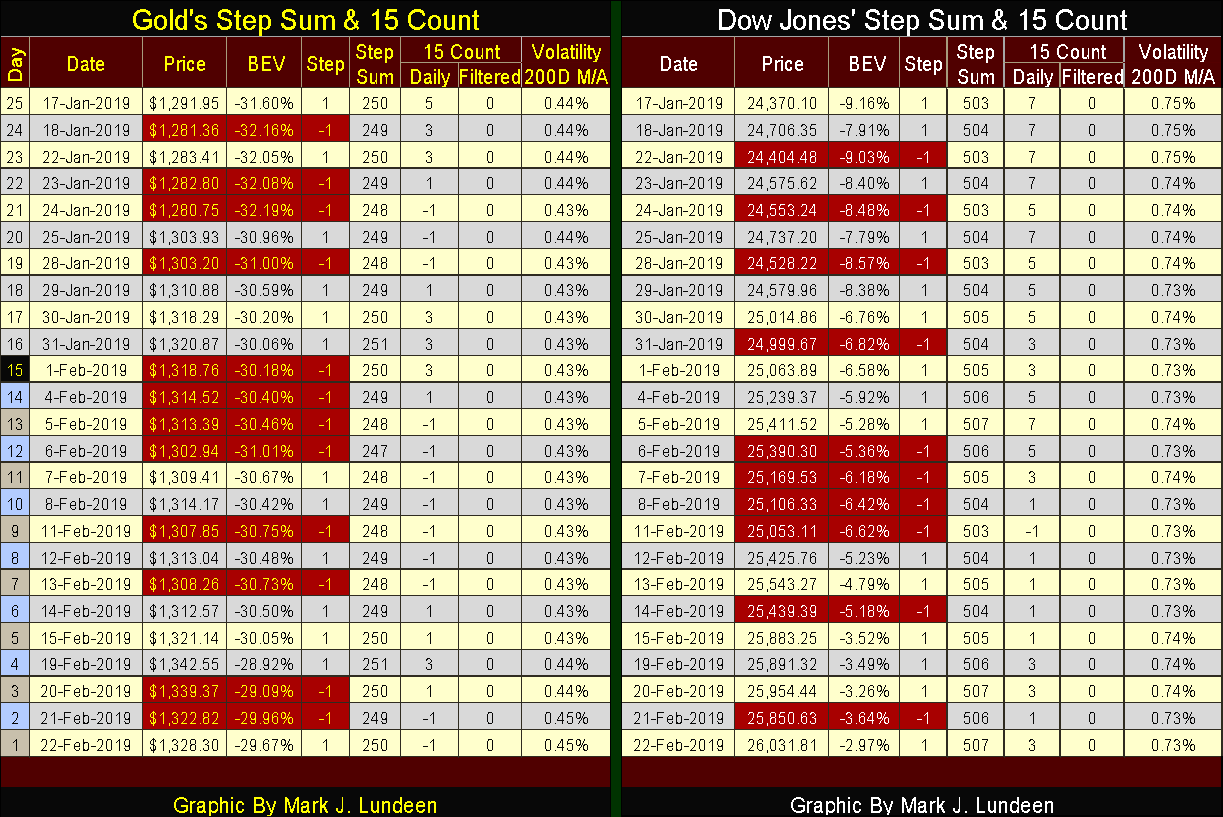
The same can be said for the Dow Jones’ step sum table, but like last week the Dow Jones technical remain stronger than gold’s; which is why it’s no surprise since January 17th the Dow Jones has advanced by 6.82% while gold has only advanced by 2.81%.
Disclaimer: If ever a website needed a Disclaimer, this is it. Indeed, your very presence at any page within this Domain which is www.deMeadville.com has already bound you in the ...
more

