
An In-Depth Look At Gold
Gold plays a dual role as a commodity and as a monetary metal which makes it important to keep a close eye on. During the early stages of a commodity bull market Gold will generally lead the whole complex higher. When the troops see the General leading they will feel more emboldened to have their turn at a bull market. We’ve seen this scenario playing out since the Spring of this year where most of the important commodities have bottomed out and are beginning their new respective bull markets. Gold actually bottomed in late December of 2015 while commodities continued in their bear markets into the Spring of 2020.
As a monetary metal, some investors like to use Gold as a safe way to store wealth or as a hedge against inflation. Other investors like to have Gold in their portfolio in case the stock markets crash and the economy goes into a deep tailspin and never recovers again. One thing we do know is that Gold will always have a monetary value and not go to zero which is possible with an individual stock.
In this in-depth look at Gold, we’ll look at it from the daily to quarterly charts, in bar and line charts, and ratio combo charts which will paint the history for gold starting from the 1970s to the present. When you finish reading this post you should have a strong understanding of where Gold has been and where it is likely to go based on the Chartology. There are no absolutes when it comes to the markets, but as we know history never repeats exactly the same but can rhyme to a certain degree.
Let’s start with a daily chart for Gold and then work our way out to the longer term charts and try to put all the pieces of the puzzle together to form a working scenario we can use to help guide us going forward. Without a game plan or working scenario one is left to the emotional destruction, from a psychological perspective, that ruins most investors that don’t have a true understanding of how markets work.
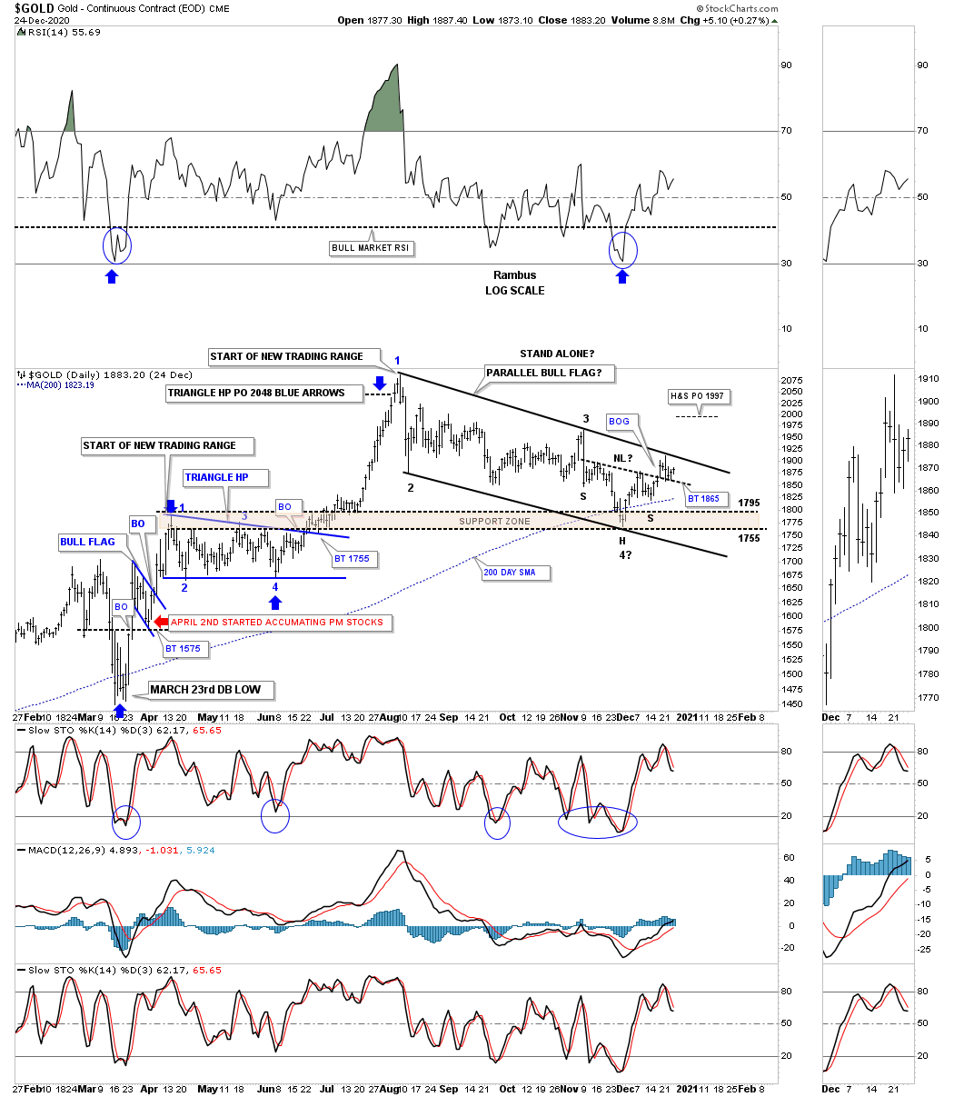
This first daily chart for Gold begins with the 2020 crash low that occurred on March 23rd of this year. In order to end a downtrend, there is generally some type of reversal pattern that may seem obscured initially but may stick out like a sore thumb after some time has elapsed. Gold formed a small double bottom at the March 23rd low which reversed that hard move down. Once Gold traded above the double bottom trendline that was the first sign that Gold may be getting ready for a move to the upside. On April 2nd Gold backtested the double bottom trendline from above which put the new bottom in play as long as the backtest held support. As you can see Gold built that small blue bull flag as the backtest which worked like a halfway pattern. After the breakout from the top rail of the blue flag, Gold impulsed higher until it ran out of gas and needed to consolidate its gains by forming the blue triangle halfway pattern which was truly a halfway pattern as shown by the blue arrows.
After completing the blue 2-month triangle HP the second impulse move of the new bull market reached it price objective up around the 2090 area where it was time to consolidate those gains starting at the August 7th high. From that August 7th high to the present, investors with no game plan or a way to visualize the price action either from an Elliot Wave, Cycles or in our case Chartology, are left totally in the dark with only their emotions to guide them. I know for some of our new members this is the first time you have ever understood what it means to live through a consolidation phase in real-time which are meant to shake you off the bull.
There was no way to know what type of consolidation pattern would form off the August 7th high only that the odds were high that we would see some type of consolidation pattern build-out in time and price. I’ve mentioned many times to you that there are easy consolidation patterns such as a triangle or a bullish rising wedge or rising flag which don’t have a lower low. Then there are harder consolidation patterns that can be much harder to deal with such as a bull flag which sounds easy but you have to hold on when the stock is making lower highs and lower lows which can be hard on your emotions. It’s a great consolidation pattern when it is finished but can be hell for many investors that don’t understand what is taking place.
For those that are new to Chartology, you have just lived through one of the tougher consolidation patterns to deal with which is still not complete yet but getting closer. The reason the August bull flag is getting close to completing is that we are seeing a H&S bottom forming at the 4th reversal point. If the H&S bottom plays out it has a price objective up to the 1987 area which is way above the top rail of the August bull flag. Now we wait and see what the price action has to say about our bullish scenario.
One last point I would like to make before we move on. The potential August bull flag can either be a stand-alone consolidation pattern, meaning this IS the consolidation pattern that will lead the next impulse move higher into new high territory. The other possibility that most PM investors don’t see is that the August bull flag could very well be part of a much bigger consolation pattern that we’ll explore later on.
(Click on image to enlarge)
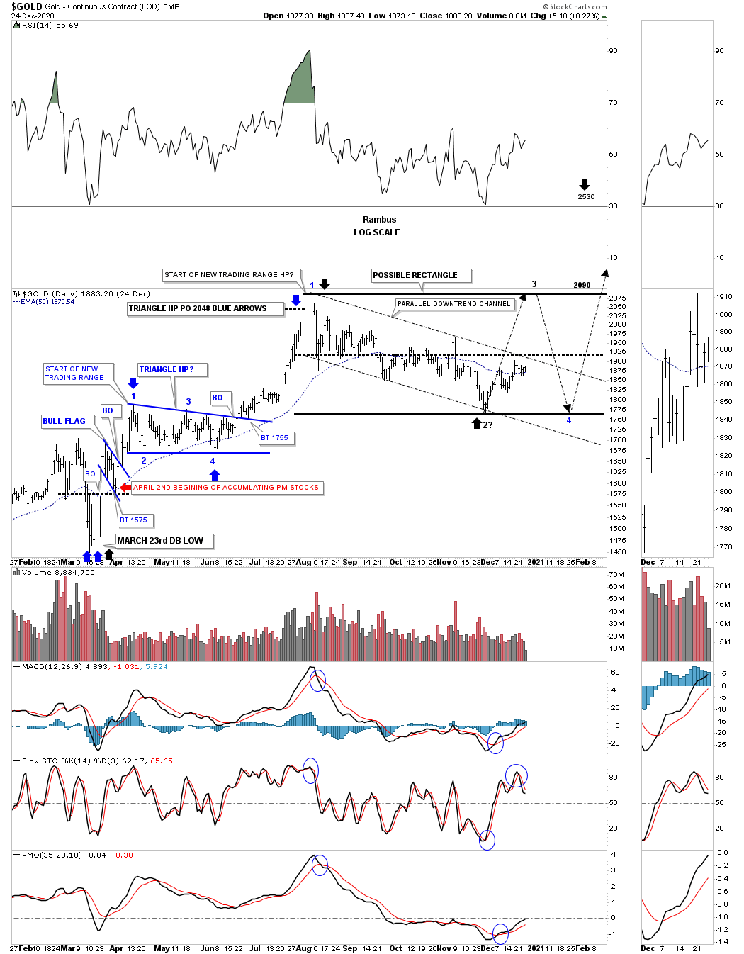
This next daily chart is exactly like the one above but shows how a possible bigger consolidation pattern may form which would be perfectly normal given the advance Gold has had since its longer term lows made back in 2018. I have been suggesting for some time now that I would not be surprised to see a bigger consolidation pattern form with the August flag being reversal points #1 and #2 with the current rally moving up to the previous all-time highs and then at least one more decline toward the bottom of our current trading range. See the blue April – May triangle to get a sense of what is possible off the 2nd reversal point. If indeed the August high is the first reversal point in a much bigger trading range or consolidation pattern that we see now, would strongly suggest a very bullish setup with the black rectangle being a halfway pattern in its own right which would have a price objective up to the 2530 area as shown by the black arrows. Again we’ll look at this possibility on some longer term charts. The red arrows show the backtest to the double bottom trendline where we began to accumulate some of our PM stocks.
(Click on image to enlarge)
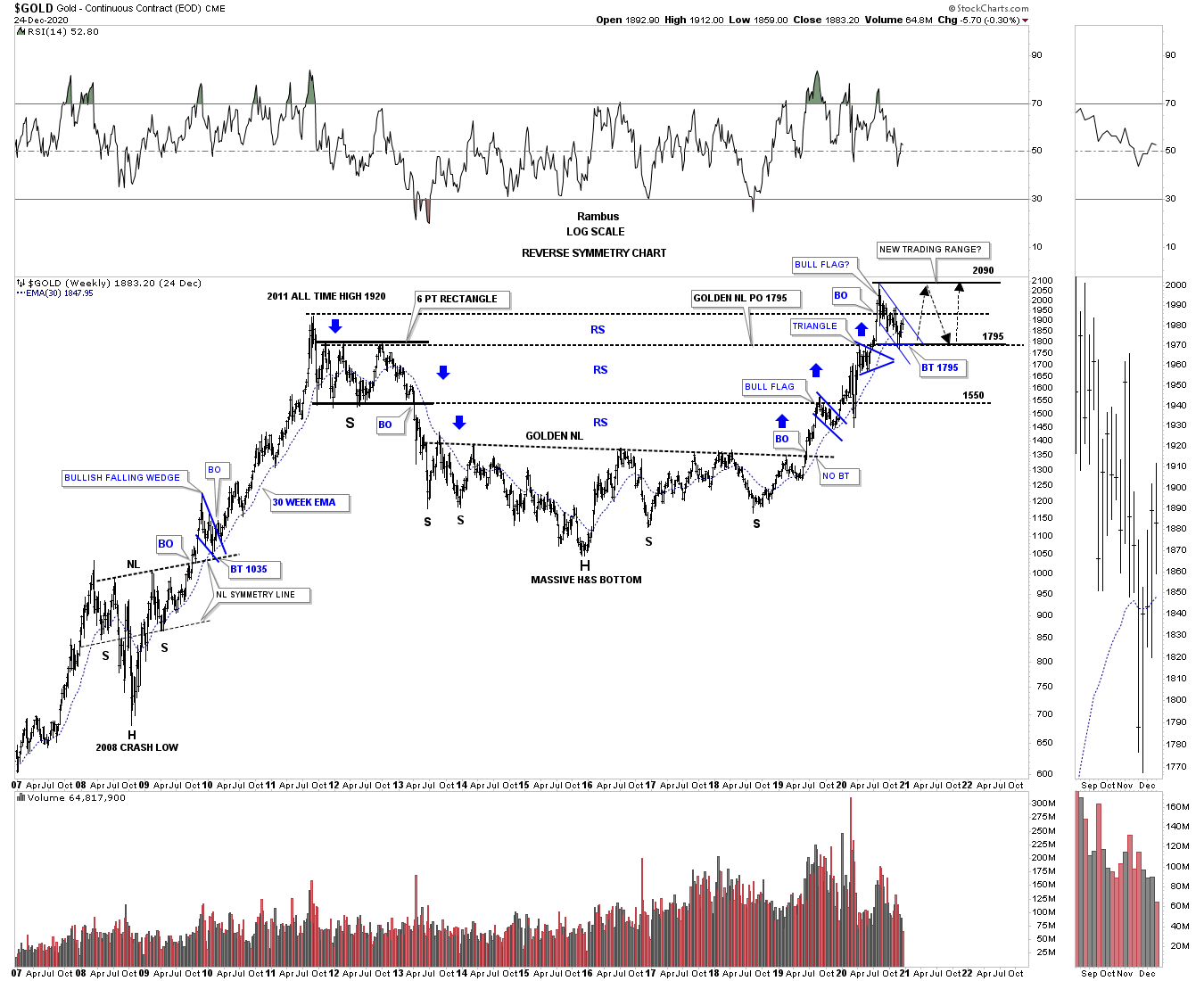
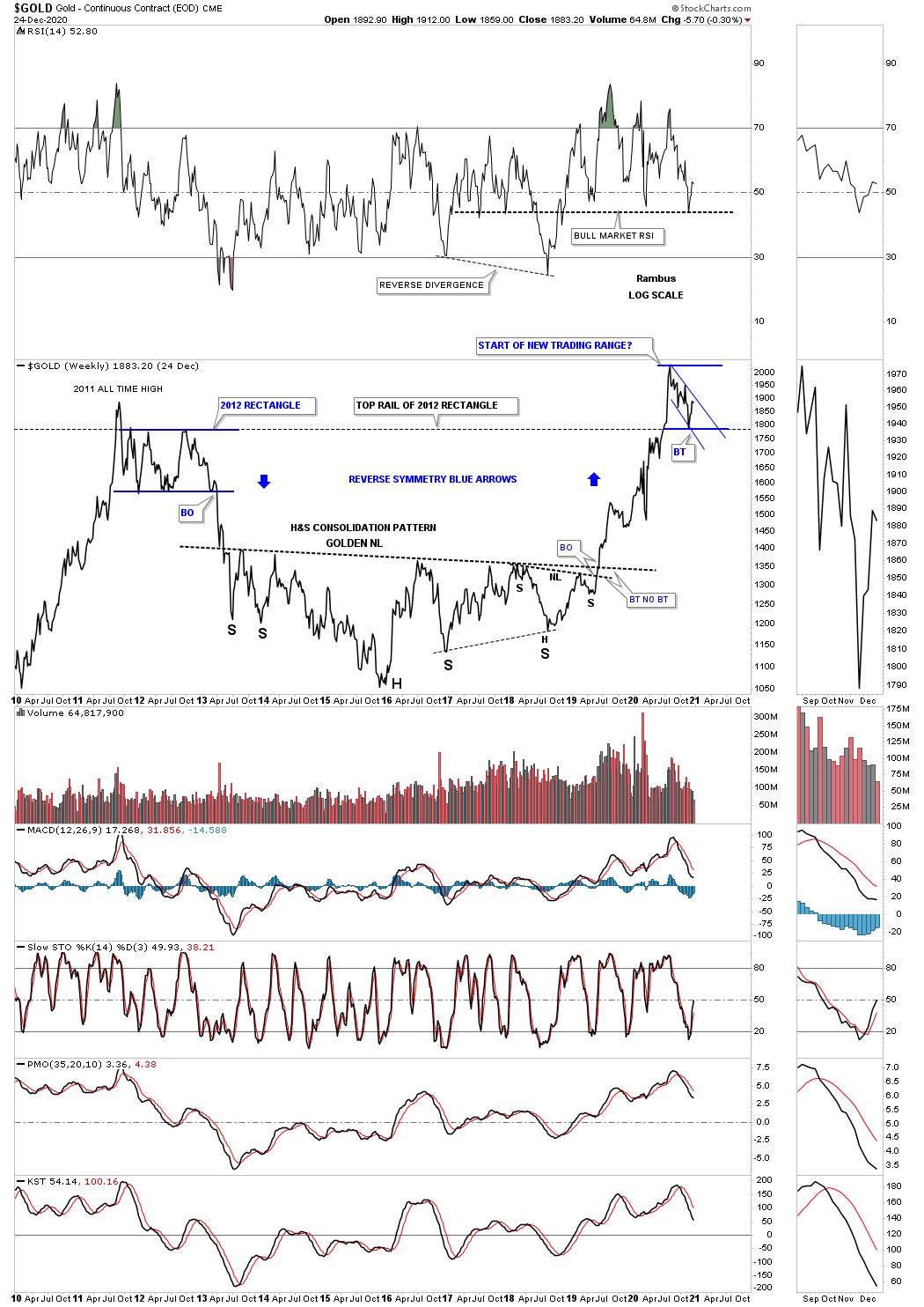
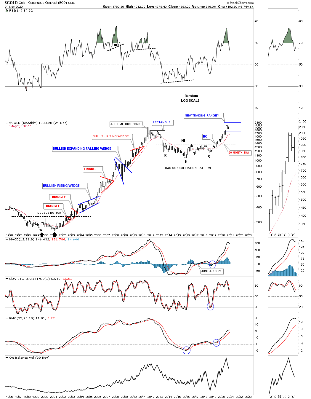
Now let's step back a little further in time and look at the very bullish setup Gold has been in ever since the breakout from that massive H&S base on this weekly reverse symmetry chart. It has been a picture-perfect bull market since the breakout from the large H&S bottom with one consolidation pattern forming on top of the previous one. This is exactly what a bull market is supposed to look like. Now the issue becomes how big of a consolidation phase does gold need to build up enough energy to launch its next impulse move into new all-time high ground? You can see how the bull flag we just looked at on the daily charts above fits into the bigger picture. Again, if the small blue flag is going to be a stand-alone pattern then the next impulse move higher is already underway. The true test will come when the price action reaches the old high around the 2090 area. If Gold fails around that area then the much bigger trading range will come into focus which will not be the end of the world by any stretch of the imagination. A possible large trading range that gold is forming will offer us a golden opportunity to trade the reversal points which in a big pattern could lead to some big games.
Two things to note. First, that massive H&S consolidation pattern had a price objective up to the 1795 area which was hit. The second thing is how the top rail of the 2012 rectangle consolidation pattern has done exactly what we were looking for which is support on a backtest from above.
Most of you know I’m a big believer in Reverse Symmetry, how a stock goes down, especially in a hard and fast move, many times it will reverse back up over the same area. Note the 2012 rectangle which had 6 reversal points that drove most PM investors mad especially when the price action broke to the downside. Many at that time called it manipulation but we saw it for what it was, a 6 point consolidation pattern in a new bear market. Is reverse symmetry suggesting a possible clone to some degree of the 2012 rectangle?
(Click on image to enlarge)
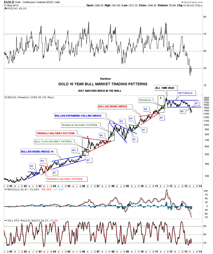
This next weekly chart is one I called, Just Another Brick in the Wall, during the bull market years. When I hear people talk about how gold is manipulated I have to let it go in one ear and out the other because you are not going to change their mind no matter how much evidence you show them. When I look at all the beautiful Chartology that Gold created during its bull-market years I’m in awe. This chart shows you all the classic chart patterns a bull market like Gold can form. Manipulators can’t form chart patterns like these only millions of investors that see the price action for what it is.
Note the impulse move when each and every consolidation pattern completed its work. I’ve often showed you many examples of what a pattern, that slopes up in the direction of the major trend that tells you the trend is very strong. As you can see Gold produced 2 bullish rising wedges each with a perfect breakout and backtest. If you look closely at each impulse move up you will see a small green triangle that formed in the middle of that impulse move as as halfway pattern. The thin black rectangles are exactly the same height and measures 3 of the impulse move price objectives. The reason the blue rectangle that formed just below the all-time high is a consolidation pattern is because it formed just below the all-time high which needed an even number of reversal points. If we would have seen an odd number of reversal points then we would have seen a reversal pattern that would have taken out the high at 1920. You take what the market gives you to work with.
(Click on image to enlarge)
Whenever you look at a line chart it can oftentimes take out some of the noise a bar chart can make. Below is a 10-year weekly line chart for Gold which shows some interesting Chartology. First, you can see the August correction in gold pulled back to the top of the 2012 rectangle where the price action is working on the possible bull flag that could end up being part of a bigger consolidation pattern. During the formation of the right shoulder of that massive H&S consolidation pattern you can see a smaller H&S pattern forming the last reversal point before the neckline was finally broken. Again we looked at a smaller H&S bottom forming at the last reversal point on the daily charts above which are strongly suggesting that the August trading range is going to give way.
There was an interesting development on the RSI when Gold was building out its right shoulder. Most of the time we look for a negative divergence which shows up when a stock is making a higher high while the RSI is making a lower high. This weekly chart shows a reverse divergence which is made when the RSI and gold both formed their initial low. As you can see the RSI went on to make a lower low but gold made a higher low. This chart also shows you how the RSI can work toward your favor if you know you are in a bull market. Most of the times the RSI will trade around RSI 40 or so during a normal correction.
(Click on image to enlarge)
Let’s look at some monthly charts for Gold as they can oftentimes give you a slightly better understanding of the Chartology. This first monthly chart shows you a great example of how resistance reverses its role to support once broken to the upside. The red arrows show you the top of each consolidation pattern during the bull market years. The black arrows show you how the top of each consolidation pattern held support when backtested from above. You are seeing one of the most basic rules from a Chartology perspective. You can see a similar setup in regards to the massive H&S bottom where the red arrows show you the neckline. Once the neckline was broken to the upside the black arrows shows how gold attempted to backtest the neckline looking for support which came up a bit short of a complete backtest but the basic principle is there.
(Click on image to enlarge)
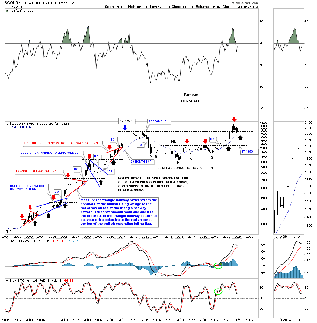
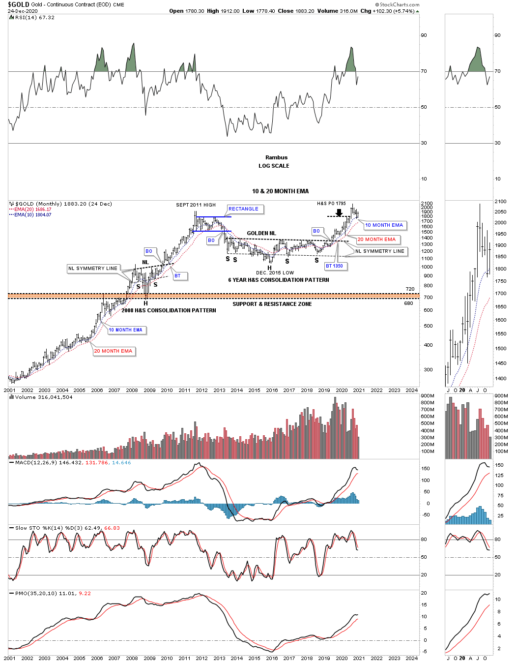
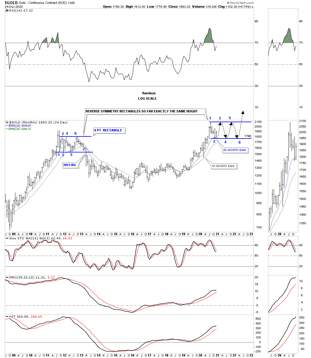
This next long term chart for gold is just a simple monthly look at just the bigger consolidation patterns and how the 10 and 20-month ema work as support during the bull market years. During the bull market years, the only time the 10 and 20-month ema’s were broken was during the 2008 crash and again just before the blue rectangle gave way in 2013 which really launched the bear market. The last 2 months of trading shows how the blue 10-month ema has been holding support. Back in March of this year, the red 20-month ema did its job of holding support.
Next, let's look at the very symmetrical H&S consolidation pattern that formed at the 2008 crash low. It is very symmetrical as shown by the neckline symmetry line which is taken from the neckline and added to the left shoulder low which oftentimes will show you the low for the right shoulder which was the case. Now let's look at the massive H&S consolidation pattern which is also very symmetrical as shown by the neckline symmetry line.
(Click on image to enlarge)
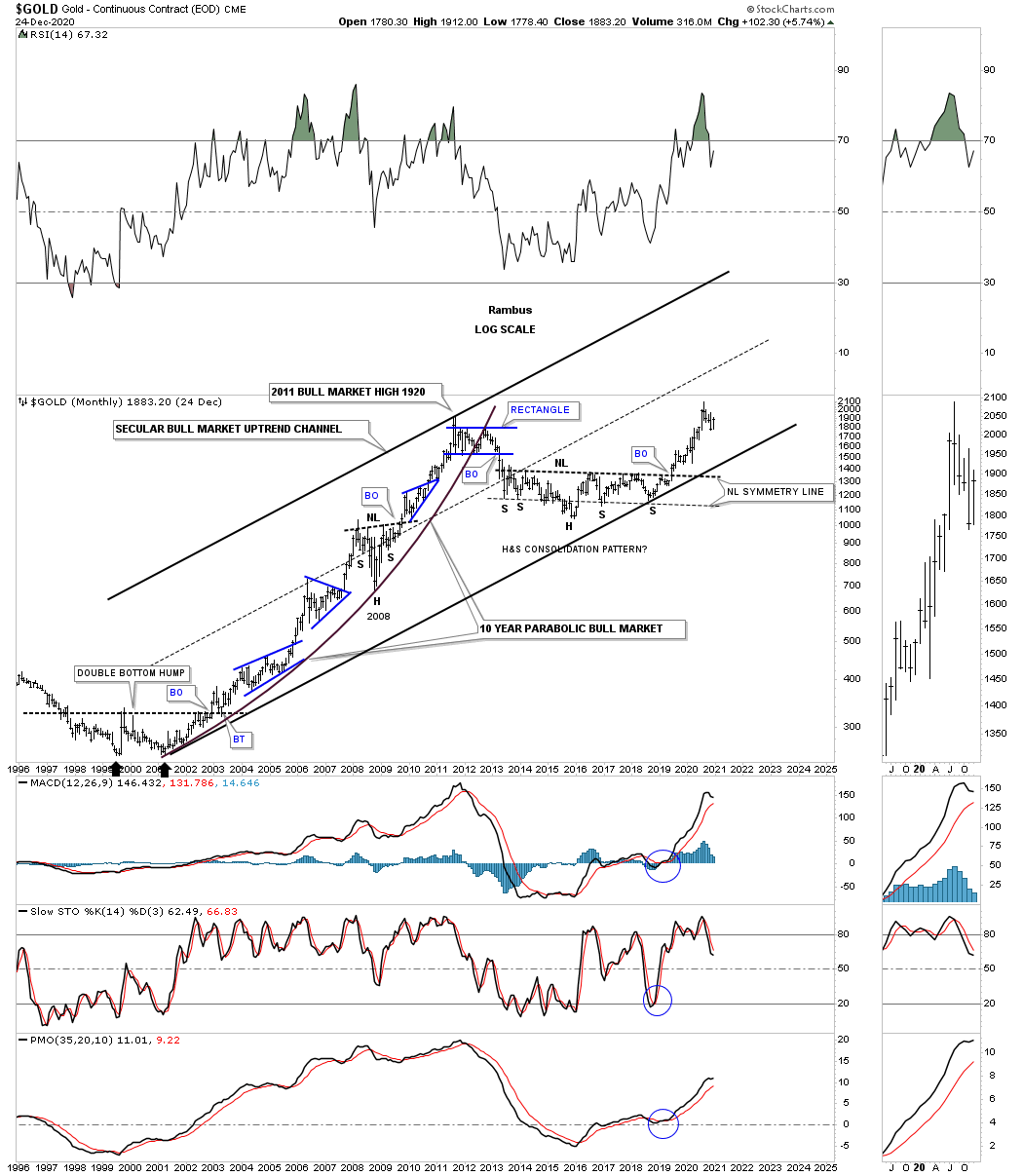
We’ve often discussed how Gold is in a long term secular bull market similar to what the US stock markets are showing us. This long term monthly chart shows the first leg up in Gold’s secular bull market that ended at the September 2011 high. You can see on this log scale chart that Gold’s bull market produced a parabolic rally which shows extremely strong price action. Our current massive H&S consolation pattern is showing the possible halfway point in the secular bull market that began back in 2000.
(Click on image to enlarge)
This next long term monthly chart for gold is just an uncluttered look at Gold’s 2000 bull market that started with the large double bottom in 2000 and the massive H&S consolidation pattern which is leading Gold higher in the 2nd half of its secular bull market. You can also see the possible new trading range forming at the recent high.
(Click on image to enlarge)
Gold’s possible reverse symmetry rectangles with the 10 and 20-month ema for support.
(Click on image to enlarge)
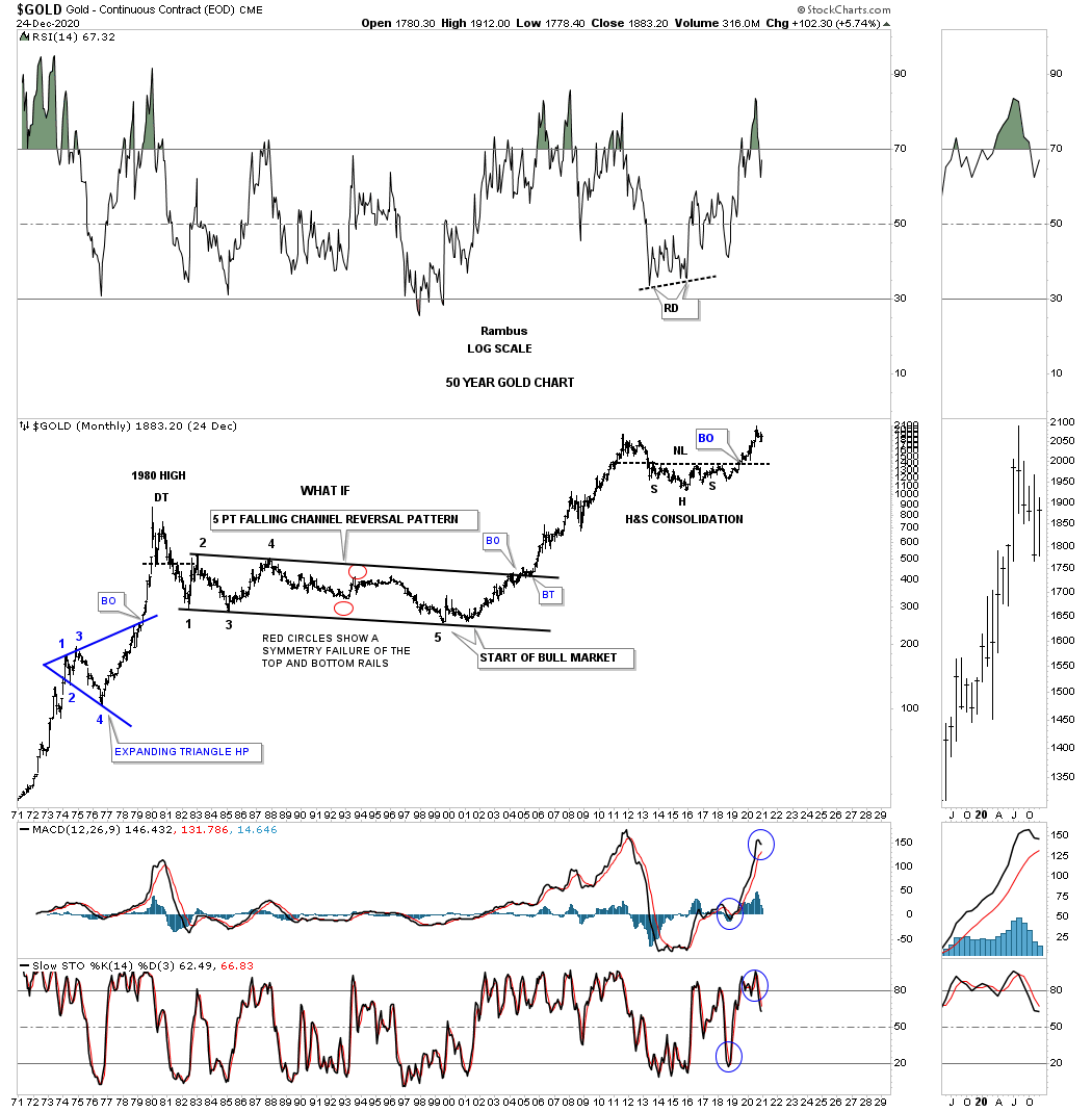
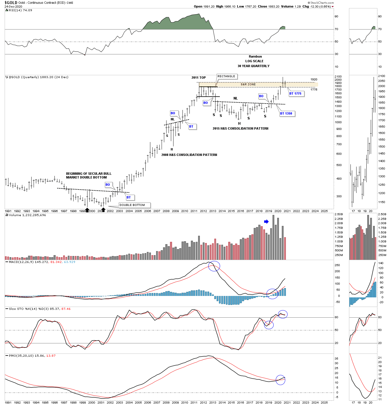
These last few charts are very long term which are needed to put our current price action in perspective. This first chart begins with the blue expanding triangle that formed as a halfway pattern in Gold’s parabolic run to its 1980 high which formed a double top reversal pattern to end that secular bull market. Gold then went on to form that massive 5 point falling channel reversal pattern that ended that bear market. This chart also shows you how clearly that massive H&S consolidation stands out like a sore thumb now.
(Click on image to enlarge)
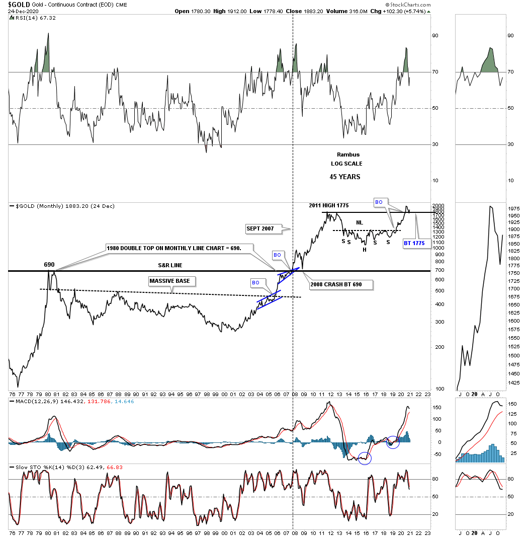
Next is a long term monthly line chart which shows you a slightly different perspective off the 1980 double top high. I mentioned earlier that one of the most basic concepts for Chartology is how a resistance line will reverse its role to support once broken to the upside. Note the heavy black horizontal S&R line that runs through the chart. We’ve looked at many charts in the past which shows us when we see a smaller consolidation pattern forming just below an important resistance line it will give the stock the energy it needs to finally take out overhead resistance, see the blue bullish rising wedge. Now note where the 2008 crash found support, exactly where you would expect to see it. The last point I would like to make on this chart is the current price action. As you can see Gold has broken out to new all time highs and is now in backtest mode to the 2011 high.
(Click on image to enlarge)
Now lets look at a long term quarterly line chart which takes out almost all of the noise a bar chart can make. Keep in mind a Quarterly line chart just uses the quarterly close in which to connect the previous quarterly close. Note that during the bull market years Gold almost never made a quarterly low and if it did it was very small except of the 2008 crash low. This chart also shows you some beautiful reverse symmetry after the breakout from the massive H&S consolidation pattern. The RSI at the top of the chart shows you how long gold can stay overbought during a bull market. The black rectangles are exactly the same size which shows there is a lot of room from the RSI perspective that Gold could rise before getting extremely overbought. Note the negative divergence that formed at the 2011 high vs the RSI. The last point I would like to make is how the recent breakout above the 2011 high could see a backtest to the all time high horizontal trendline which would show all the work is now done.
(Click on image to enlarge)
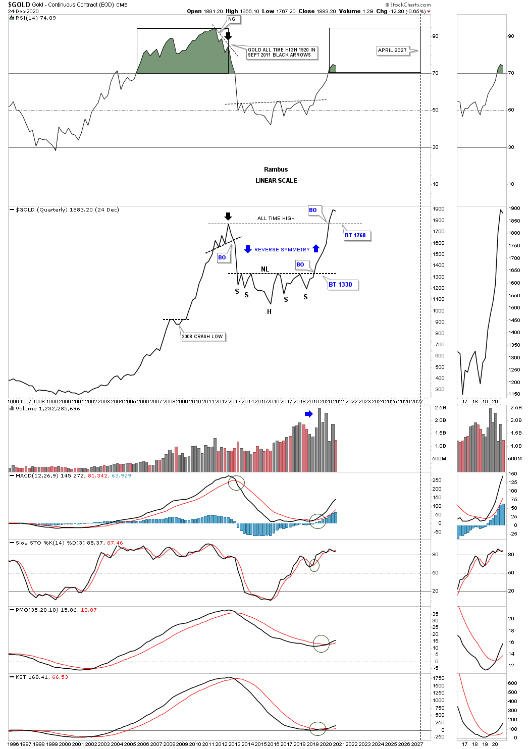
Below is the exact same chart as the line chart above but this is a bar chart with all the trendlines still in place. This bar chart shows the backtest has completed hitting the 2011 high S&R line on the money. We now have 2 full quarters of gold trading above its 2011 high.
(Click on image to enlarge)
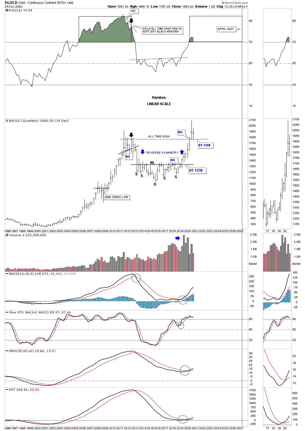
This last chart for tonight is a Quarterly bar chart which shows some simple but beautiful Chartology.
All these charts above should give you a pretty good understanding of Gold from the short term to the long term Quarterly charts. If one is only focused on the short term charts they miss the big picture which plays an important part from the long term perspective. Understanding the big picture you can then drill down to the shorter timeframes to fine-tune the charts. All the best…Rambus
(Click on image to enlarge)
Disclosure: None. If you'd like more information about the additional free trading education mentioned in ...
more

