
Yield Curve Slope Correlations
When looking at bond yields, one should keep in mind that the entire yield curve is a mathematical object. A venerable research approach is to attempt to use time series econometrics to either isolated tenors or slopes. This approach leads to misleading degrees of freedom in bond yield dynamics.
In this article, I will do the simplest step towards modelling the yield curve -- looking at the relationships between selected slopes. We see that slopes move together, which pins down how disjointed various parts of the curve can get. Digging further would require access to a fitted curve.
Short End
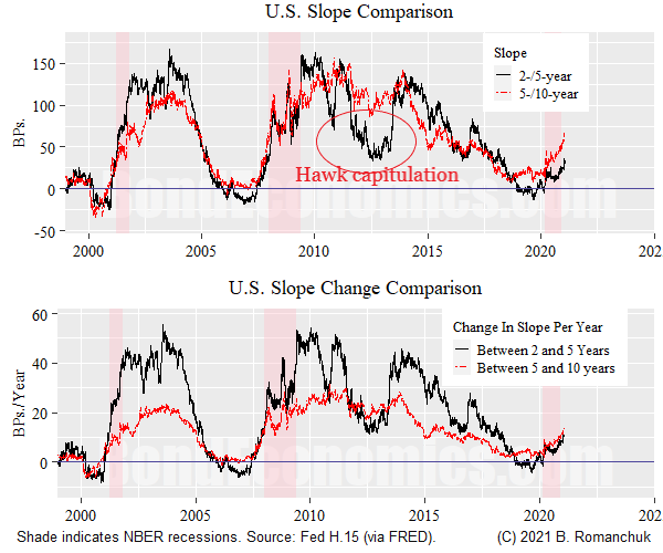
We will first look at the front end of the yield curve (beyond the money market maturities). The top panel shows the 2-/5-year and 5-/10-year U.S. Treasury slopes. Summed together, they form the 2-/10-year slope, which is one of the most commonly looked at slopes. We see that the slopes are highly correlated, with the two slopes often being roughly equal.
The main deviation in the post-1999 period is around 2012 when the hawks finally capitulated on their belief that the Fed would rapidly normalize rates. The 2-/5-year slope was suppressed, while the 5-/10-year slope was at relatively "normal" levels for an expansion. (The current curve is perhaps moving towards this configuration.)
The bottom panel shows the average change in the slope per year of maturity. E.g., if the value of the series at a time point is 20, that means that the slope changes by 20 basis points per year. (For the 2-/5-year slope, that implies a slope of 60 basis points, for the 5-/10-year it implies a slope of 100 basis points.) The change in slope between the 2- and 5-year maturity is normally much greater -- yield changes are gradual.
The lower magnitude of yield changes is not surprising when we consider what par coupon yields represent. (Link to primer on par and zero curves.) The zero curve can be viewed as the average of the instantaneous forward curve, and since the instantaneous forward curve is smooth in practice, the zero curve gets smoothed out as maturities lengthen. The par coupon curve is even smoother since the coupons are discounted at the zero rate of shorter maturities.
Why Lop Off Money Market Maturities?
I did not look at maturities below 2 years since they can be quite volatile, being buffeted by various technical effects. The rate of changes of slopes can get quite high when the central bank is on the move. For example, the "gradualist" pace of rate hikes by the Fed implies a 200 basis point move in the instantaneous forward curve, which averages out to a slope of 100 basis points for a 1-year par coupon versus cash.
Interest rate forecasts can be more intricate in these maturities. For example, the curve could price no rate hikes for one year, then hikes starting thereafter. This means that the slope changes between 0-1 years and 1-2 years can decouple. Further along the curve, the instantaneous forward curve normally does not veer back and forth, and so slope changes are more correlated.
Long End

The figure chart above repeats the analysis for the long end of the curve -- looking at the 5-/10-year and the 10-30-year segments. The top panel shows that the levels are once again nearly equal throughout the history. This implies that the slope changes are much smaller at the long end.
Another way of looking at this is to note that if one knows what the 5-/10-year slope is, one can guess what the 10-/30-year slope is. By implication, if we can pin down the front of the curve up until the 10-year pivot point, one can extrapolate out to the 30-year.
One technical issue that shows up in the ultra-long segment of the curve is that the 30-year often looks expensive to the 20-year: that is, there is often a hump in the curve, with the 20-year at the peak. This can be put down to technicals: per unit of duration, the 30-year has more convexity than the 20-year. A bond portfolio positively convex is equivalent to it being long volatility (e.g., a straddle), which has value. This convexity effect normally only becomes noticeable for par coupons as maturities extend beyond 20 years.
Why the Regularity?
The slope relationships shown earlier are consistent with what I would describe as sensible-looking instantaneous forward curves.
What makes a forward curve "sensible"? I would describe such a forward curve as follows. (Obviously, the maturities used here are rough approximations.)
- The money market curves follow market participants' average forecasts for the path of the policy rate, with a small and stable term premium. (Rarely, technical factors can interfere with this, but so long as default risks are viewed as small, the disruption for maturities beyond a few months are small.)
- Instantaneous forward curves settle into a "steady state" level in the 5-/10-year maturity region. This steady-state average is equal to the 5-year/5-year forward.
- The instantaneous forward curve is continuous and has to interpolate between the money market maturities and that "steady state" level.
The net effect is the 2-/5-year and 5-/10-year slopes end up being roughly equal. This equality is enforced by relative value investors who trade the 2-5-10 butterfly: if the slopes get out of line, the butterfly looks expensive or cheap.
My view is that butterfly trading relationships are often looked at in terms of comparison to historical norms. Any attempt to deviated from those norms are punished. This is perhaps inefficient behavior, but behavioral inertia is hard to beat. It is entirely possible to imagine that other butterfly relationships would be seen as "normal," which would affect the relative speed of adjustment of the instantaneous forward curve.
Tie to Rate Expectations
The above description of "sensible" yield curves explains how rate expectations are tied to bond market valuation.
- Although many people claim to be skeptical about rate expectations, nobody in their right minds thinks short-term rate futures should not trade near forecast values.
- The "steady state" level of rates is related to where one thinks the steady state (nominal) policy rate is. The market could be wrong about this (as the secular bond bull market implies), but that is a rate expectations-driven measure of value.
Note that this means that yields are not being driven by supply and demand, or risk premia tearing around at random.
The main exception I see is the potential for ultra-longs to get extremely rich due to liability-matching investors being forced into long bonds. The United Kingdom was the poster child for this effect. The private sector cannot plausibly issue credit risk-free bonds of that maturity, so the central government is a monopoly supplier of ultra-long duration. Therefore, if one hand of the government (regulators) force investors to buy ultra-longs that are not supplied the other hand (debt management office), bond pricing will necessarily get stupid. As can be seen, the U.S. Treasury market has not seen this effect.
Concluding Remarks
We cannot model yield curve tenors as stand-alone time series; we need to enforce sensible relationships along the curve. This has the side effect that we can predict yields at maturities based on a projected yields at other points.
Disclaimer: This article contains general discussions of economic and financial market trends for a general audience. These are not investment recommendations tailored to the particular needs of an ...
more

