
Short-Term Flows Strengthen USD Dominance
Quick Take
Markets have temporarily stripped out the gloomy macro outlook of decelerating growth and low inflation as G10 yield curves demonstrate, to instead revert back to positive microflows. It may last hours or days, but what’s clear is that there is still a major divergence between the macro risk profile, one that still keeps the pendulum on the caution side, while the short-term is more optimistic as US official continue to sound rather upbeat about an eventual US-China trade deal.
The USD dominance is undeniable, and even if the trend looks over-stretched, the price action seen does not provide any evidence that the bullish USD tide is receding. Flows keep favoring downward pressure in GBP/USD, AUD/USD, upside strength in USD/JPY, USD/CAD while Yen crosses should continue to have a hard time until the microflows re-align with the macro ‘weak risk-off’.
Narrative In Financial Markets
- The US Dollar hits the best levels in 2019 in what’s been a stellar rally, with the onset just days after the FOMC sent a clear signal over a prolonged pause in rates. The counter-intuitive move as a time when the Fed won’t be as restrictive in policies speaks volumes about the lack of FX alternatives. It’s an ugly context out there, and the USD is still the fav of the G10 FX pack.
- It’s still up in the air whether or not a fresh US government shutdown will come into effect on Friday, which is the deadline before the continuing resolution funding expires. There is a lot of uncertainty following the breakdown of border security funding talks to build a wall.
- White House Advisor Conway sounds upbeat by saying that it looks like US-China are getting closer to a trade deal. Axios also reported that a Trump-Xi meeting could take place in Trump’s Florida resort by mid-March, reigniting a positive outlook in a trade resolution. High-level talks get underway on February 14. The key actors involved in the conversations will be China Vice Premier Liu He, US Trade Representative Lighthizer and Treasury Secretary Mnuchin.
- The Brexit deadline is on March 29th and the lack of progress is very concerning as the clock keeps ticking down. There have been no breakthroughs on the Irish border while an offer to discuss the Labour opposition proposal for the UK to stay in the Customs Union looks like is going to be ruled out outright. A UK government spokesman said a meaningful vote on Brexit won’t be this week. The options are narrowing down to a no-deal Brexit or a delayed Brexit.
- The UK exhibits a poor slew of economic indicators, comprised of a weak Q4 GDP of +0.2%, a contraction in December’s GDP reading at -0.4% while industrial and manufacturing production both fell by a significant margin of 0.5% and 0.7% respectively. GBP was the weakest in FX.
- Reports from Bloomberg vindicate, even if we needed further proof, that this year’s China Luna New Year holiday spending saw the slowest increase (8.5%) since 2011. If one then looks at the bull flattening yield curve dynamics across the globe, we are clearly in the midst of a stagnation period, with low growth and little to no inflation to boast of.
Potential Drivers — Economic Calendar
The calendar is light, with only Australian data to contend alongside US NFIB small business index and US jobs openings, all low-tier events that will hardly have an impact on price. In terms of speakers, we get German Buba President Weidmann and BoE Governor Carney as the line-up for today.
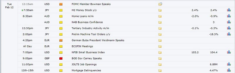
Source: Forexfactory
RORO Model: Risk-On Risk-Off Conditions
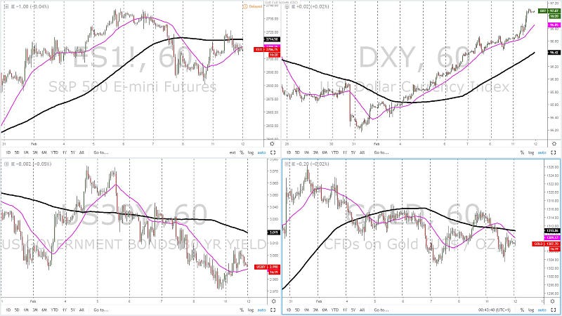
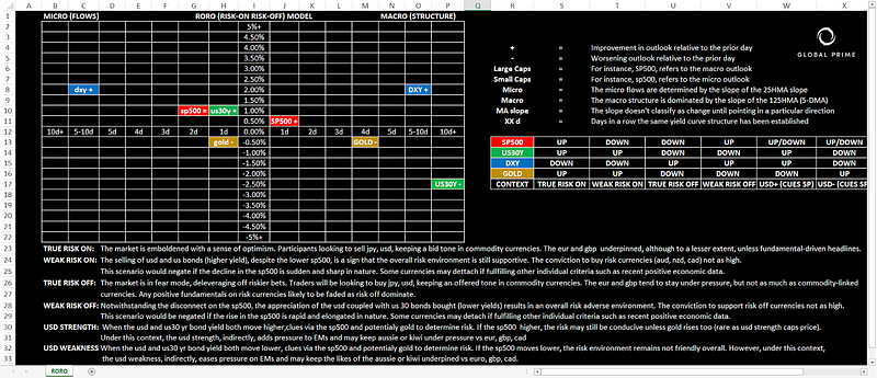
The positive re-adjustment in the S&P 500 has resulted in short-term flows taking the 25-HMA slope pointing upwards again. Additionally, a flatter 125-HMA (5-DMA) slope is also a positive development for the risk outlook. Similarly, renewed demand has been found in the US 30-year bond yield (supply imbalances in US bonds), which has now allowed the US long-dated yields to experience the first positive short-term flows as per the upward slope of the 25-HMA sine Feb 5th. Unlike in equities, there is still significant room to crawl back up to turn this market macro positive, as the 125-HMA (5-DMA) still points at downward tendencies as the overall rhythm. Meanwhile, the USD continues to trade at the beat of its own drum, accelerating the gains to reach the highest levels in 2019 as both micro and macro flows are in complete synchronicity to keep powering the trend. Further proof that ‘risk on’ conditions are improving, Gold has come back down, re-coupling its negative correlation with the DXY, in a move that can also be interpreted as decreasing demand for safe-havens. Overall, the short-term microflows have transitioned into an environment characterized by USD strength with cues to be obtained via equities to determine the susceptibility of the market to risk. From a macro standpoint, the 5-DMA upward slope in the DXY, the downward one in the US 30-y yield and the flattish positioning in the S&P 500 leaves us with an environment that is still neutral to slightly risk-off inclined.
Yield Curve: Outlook For Growth, Inflation & Policies
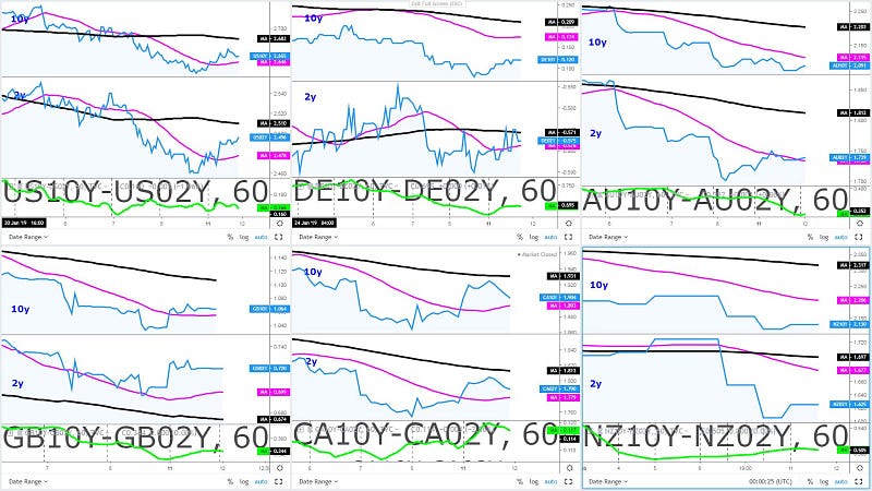
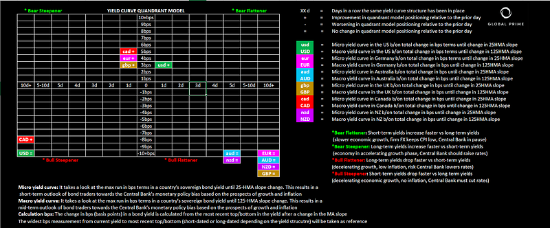
In the short-term, we find improvements in the yield structures of the US, Europe, and the UK. The Canadian economy is the outlier in terms of recent progress in the curve even if the downward pressure in Oil prices may act as a cap. On the contrary, while there has been a pop up in both yields, the aggressive decline in the Oceanic yields (AUD, NZD) keep the short-term outlook (bull flatteners) unchanged. The macro outlook still remains a sea of red with bull flatteners all around, with the exception of the US and the Canadian economies, whose structure fall under bull steepeners. What this macro outlook equates to is a clear sign that the market is firm in its belief of decelerating growth and inflation.
Chart Insights: Technicals & Intermarket Analysis
EUR/USD: Lands At Key Weekly Support After Week-Long Selling
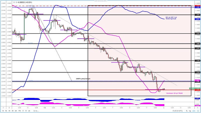
The consistency and conviction in buying the US Dollar across the board has been unlike anything seen since 2016, as gains extend for an 8th consecutive day. The latest sell-off gunning through daily horizontal support (100% proj target as well) has now landed at a strong weekly support area (red line). The printing of the POC at this precise level strengthens the notion that strong clusters of bids sit on this area as one would expect. Looking at the behaviour of price, it looks as though the economic miseries in Europe vs a relatively stable outlook in the US have been playing a greater role as depicted ever since the change of slope in the 25-HMA of the magenta line (German 10-yr bond yield), which has been tracking the price of EUR/USD very tightly.
Despite landing in a weekly area of support, the lack of any rebound off 1.1275 is very worrisome, even if the divergence against the German vs US yield spread is huge. However, one needs to find evidence via price action and not just blindly enter trades because a major divergence with a highly correlated asset exist as the market may be paying attention to a different narrative. Technicals have proven to be king to capitalize on this rally but one feels, such an elongated run is at a significant mature state, especially at such a huge weekly horizontal support + yield spread divergence + slope of German 10y yield is starting to pick up pace to the upside, suggesting that a case for a bounce can be made.
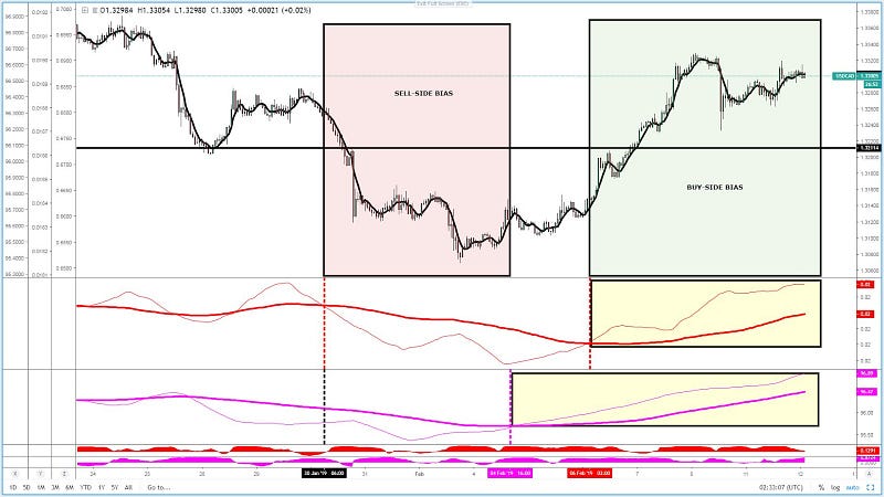
GBP/USD: No Reason Not To Remain A Seller
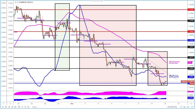
By following the short-term flows based on the slope of the inverted DXY and the UK-US yield spread would have kept one on the right side of this trend for a significant period of time. The market has rapidly evolved, amid the lack of Brexit headlines, into a more predictable affair with the DXY/YS. At this stage, even as the pair lands on a key support area, the clear market rhythm is to keep selling on strength with no indications that the short-term flows via the 25-HMA slopes may be reverting. The downward trendline off Feb 8th high acts as a visual representation of the latest order flows. Any retest back into this line with sync slopes represents an attractive sell proposition.
USD/JPY: Re-Anchoring Of DXY/US30Y = Range Breakout
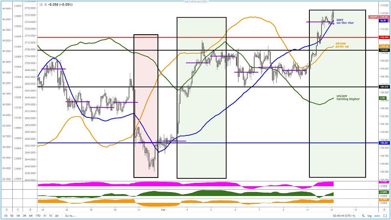
The resolution away from the 5-day long range box came as short-term microflows got re-alienated in favor of the US Dollar as depicted by the green box in the chart above. The rise was initially propelled by the positive flows via the DXY and equities, only to gain further momentum the moment the US 30-year bond yield and the rest of the US yield curve for this matter gathered steam. In the chart, one can clearly observe that the acceleration gathered steam as the slope of the DXY/US30Y re-anchored upwards. These are the times for one to exploit directional moves in the USD/JPY. I’ve marked in the chart other times when the slope of the 25-HMA was in sync. It’s a very repeatable pattern that occurs over and over unless the SP500 has an ‘off the cuff’ contrarian move. As the slopes of the correlated instruments stand, this market remains a buy on dips.
AUD/USD: DXY + Yield Spread Indicate Sell On Strength
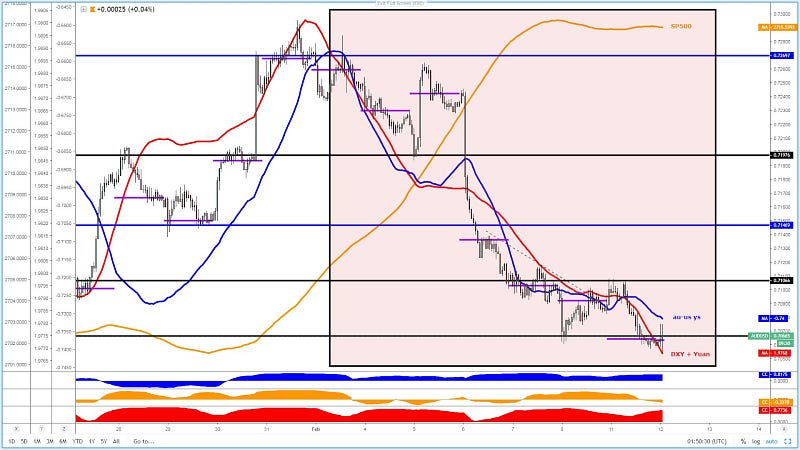
What we’ve learned trading the Aussie since the RBA blink is that the pair has grown its dependence on the Australian — US yield spread (blue line) as the market pays more attention to the monetary divergence between the Fed and the RBA. The correlation coefficient in blue confirms this prognosis. Similarly, the pair remains tightly correlated to the DXY + Yuan performance, in red as the correlation coefficient also demonstrates in the last window below. The one instrument the market is clearly placing on the backburner, for the time being, is the relationship between equities and the Aussie. So, under this study of the narratives driving the Aussie, it’s fair to assume that as long as the microflows via the 25-HMA remain negative as it’s the case via the downward slope, this is a market that should mainly be approached from a sell on rallies perspective to capitalize on the larger moves. I’ve highlighted in a red box the negative backdrop in microflows and how maintaining a sell-side bias would have yielded far better results than trying to pick a bottom. Aim to sync correlated instrument slopes.
USD/CAD: Buy On Weakness As Oil/DXY Stand
The path of least resistance for the pair should be higher if one takes as reference the slope of its two most correlated instruments (DXY + Oil). The DXY in magenta leaves no room for doubt. Even if the 25-HMA slope in Oil (thin red line) was to turn south, there is still a significant macro divergence in favor of the USD/CAD as the 125-HMA (5-DMA) demonstrates (thicker red line). The fact that the pair trades higher than its pre-blockbuster Canadian jobs report is a clear testament that even if an episode of selling pressure may occur due to economic data, the flows are in favor of the bulls here.
Important Footnotes
- Risk model: The fact that financial markets have become so intertwined and dynamic makes it essential to stay constantly in tune with market conditions and adapt to new environments. This prop model will assist you to gauge the context that you are trading so that you can significantly reduce the downside risks. To understand the principles applied in the assessment of this model, refer to the tutorial How to Unpack Risk Sentiment Profiles
- Cycles: Markets evolve in cycles followed by a period of distribution and/or accumulation. The weekly cycles are highlighted in red, blue refers to the daily, while the black lines represent the hourly cycles. To understand the principles applied in the assessment of cycles, refer to the tutorial How To Read Market Structures In Forex
- POC: It refers to the point of control. It represents the areas of most interest by trading volume and should act as walls of bids/offers that may result in price reversals. The volume profile analysis tracks trading activity over a specified time period at specified price levels. The study reveals the constant evolution of the market auction process. If you wish to find out more about the importance of the POC, refer to the tutorial How to Read Volume Profile Structures
- Tick Volume: Price updates activity provides great insights into the actual buy or sell-side commitment to be engaged into a specific directional movement. Studies validate that price updates (tick volume) are highly correlated to actual traded volume, with the correlation being very high, when looking at hourly data. If you wish to find out more about the importance tick volume, refer to the tutorial on Why Is Tick Volume Important To Monitor?
- Horizontal Support/Resistance: Unlike levels of dynamic support or resistance or more subjective measurements such as Fibonacci retracements, pivot points, trendlines, or other forms of reactive areas, the horizontal lines of support and resistance are universal concepts used by the majority of market participants. It, therefore, makes the areas the most widely followed and relevant to monitor. The Ultimate Guide To Identify Areas Of High Interest In Any Market
- Trendlines: Besides the horizontal lines, trendlines are helpful as a visual representation of the trend. The trendlines are drawn respecting a series of rules that determine the validation of a new cycle being created. Therefore, these trendline drawn in the chart hinge to a certain interpretation of market structures.
- Correlations: Each forex pair has a series of highly correlated assets to assess valuations. This type of study is called inter-market analysis and it involves scoping out anomalies in the ever-evolving global interconnectivity between equities, bonds, currencies, and commodities. If you would like to understand more about this concept, refer to the tutorial How Divergence In Correlated Assets Can Help You Add An Edge.
- Fundamentals: It’s important to highlight that the daily market outlook provided in this report is subject to the impact of the fundamental news. Any unexpected news may cause the price to behave erratically in the short term.
- Projection Targets: The usefulness of the 100% projection resides in the symmetry and harmonic relationships of market cycles. By drawing a 100% projection, you can anticipate the area in the chart where some type of pause and potential reversals in price is likely to occur, due to 1. The side in control of the cycle takes profits 2. Counter-trend positions are added by contrarian players 3. These are price points where limit orders are set by market-makers. You can find out more by reading the tutorial on The Magical 100% Fibonacci Projection
Wonder what’s the yield curve in a bond? It’s really critical to understand what the market is pricing in terms of Central Bank policies going forward. Learn the basics in more


