Market Crash Reversal Patterns “Experiment” With History
S&P 500 Index versus “Inverted” 30 Year Yield “monthly” Chart
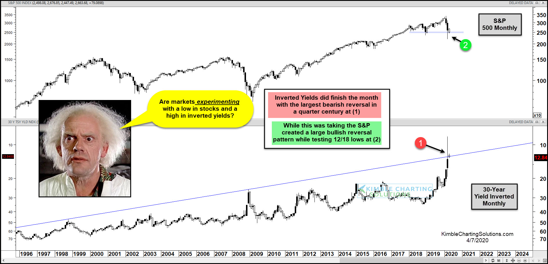
Stocks and treasury bond yields had a wild (and scary) month of March as the financial markets crashed to new lows.
In today’s chart, we highlight this by looking at the long-term “monthly” chart of the S&P 500 Index versus an “inverted” 30 Year US Treasury Bond Yield.
Note that inverting charts offer a different perspective and reduce bias. For more on this, read my “Market Masters” article from 2015.
Today’s chart highlights huge reversal patterns for both stocks and bond yields.
The inverted chart of the 30-Year yield shows the largest “monthly” reversal pattern in a quarter-century occurred in March at (1). At the same time, the S&P 500 put in a large bullish reversal pattern while testing the December 2019 lows at (2).
(Click on image to enlarge)