
Gold Prices Extend Gains As Treasury Yields Decline
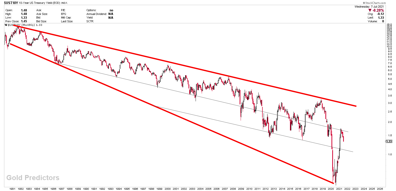
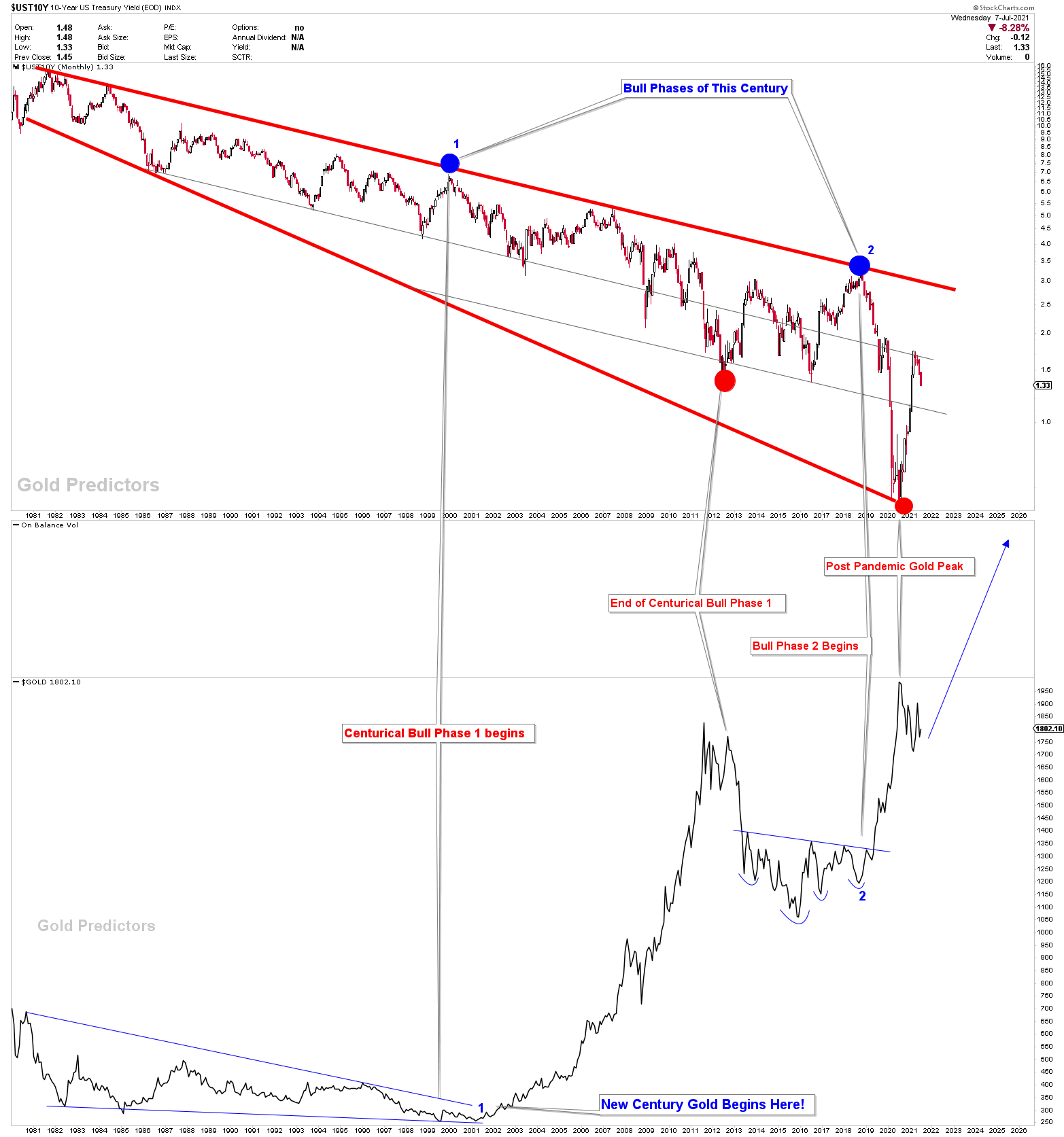
The 10-year Treasury yield has fallen sharply after hitting the strong channel resistance. The monthly chart of 10-year Treasury yield shows some significant resistance, however daily charts produced a bull flag which was damaged after recent drop. The Fed has increased purchases of long-term paper. The US Treasury slowed its issuance of long-term paper, which created a shortage. The bond markets are no longer concerned about inflation and are bidding up the price of bonds. Equity investors are growing wary about elevated risk in the stock market and, expecting a Fed taper. They are investing in bonds as a safe haven if there is a stock market crash. These factors are the possible reasons at the back of the drop in 10-years Treasury yields.
.png)
Interpretation of 10-year Treasury Yield
The monthly chart of 10-year Treasury yields shows the clear big picture.
(Click on image to enlarge)
The Fed's balance sheet is increasing dramatically, but there was a significant increase in the balance sheet for the week ending June 16th ($111.9 billion).
(Click on image to enlarge)
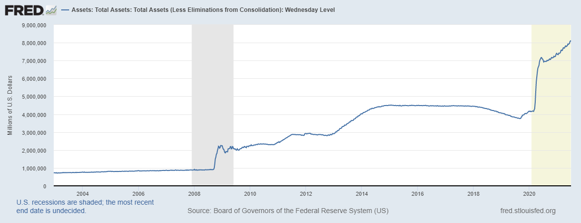
Source: Fred
For the past six months, the consumer price index (CPI) has increased by 5.9% on an annualized basis. While the CPI increase may reflect temporary price spikes due to supply chain disruptions, average hourly wage rates increased at an annualized rate of 4.3% over the same time period. This data indicates longer-term inflationary pressures.
(Click on image to enlarge)
_637613469964898054.png)
Source: Fred
Effect of Treasury Yield on US Dollar Index
The interest rate at which a government can borrow money is known as the sovereign bond yield. Bonds are interest-sensitive securities that the general public can buy and lend to governments, municipalities, and corporations. Central bank policies drive short-term interest rates, whereas bond yields are more affected by market sentiment. In relation to their yield, bond prices move in the opposite direction. For instance, as the price rises, the yields fall.
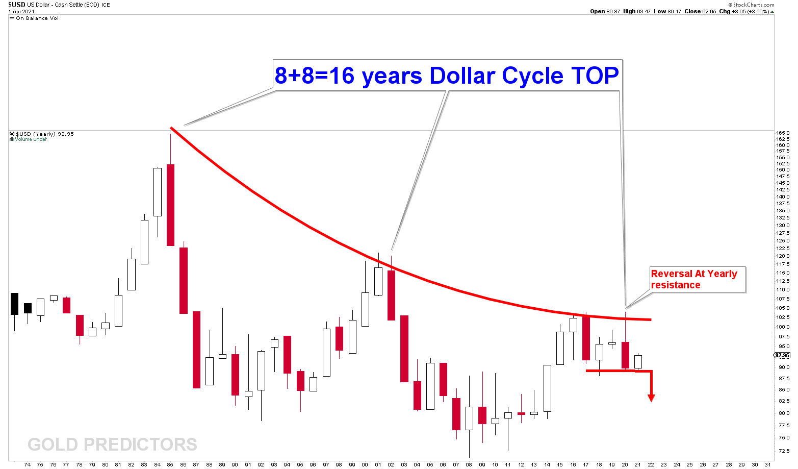
US Dollar Yearly Outlook
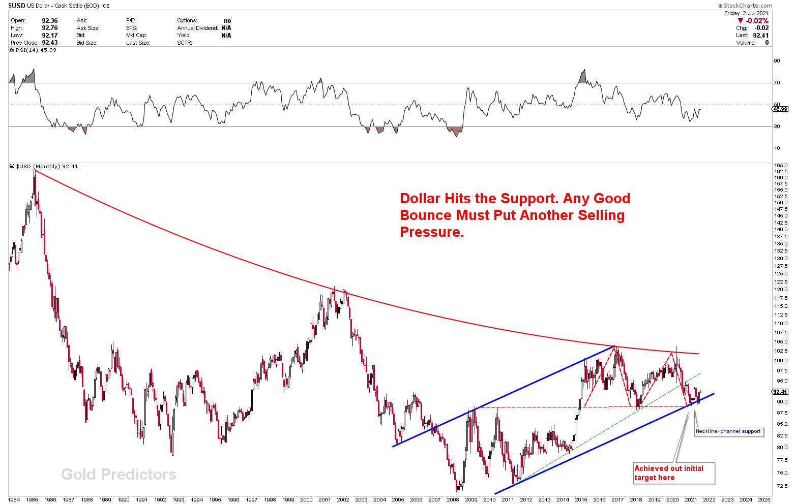
Treasury yields have an impact on the country's currency markets. The yearly US dollar index charts show that during its 16-year cycle top, the US dollar hits the most important long-term resistance at value of 102-103 in the falling curve. A quick reversal in the US dollar from the massive resistance indicates that selling pressure is building. From the technical yearly chart, we've been selling US dollars since the Covid-19 pandemic began in 2020.
(Click on image to enlarge)
US Dollar Index Monthly Outlook
The chart below presents the Total Nonfarm which indicates an increase of 850,000 jobs in June as compared to the month of May. However, there was a 6.7 million job shortfall as compared to the pre-virus peak of Feb 2020. Many companies are struggling to fill the positions as virus safety concerns arise. Since the decrease in the total weekly hours by 3.6% increased the average hour/employee, it helps to improve some of the shortfall. GDP is expected to exceed $T19.3 in Q3 2021, indicating higher productivity. However, the bond market is happy with the June employment report as the 10-year Treasury yields dropped sharply. This recent drop indicates US dollar weakness.
(Click on image to enlarge)
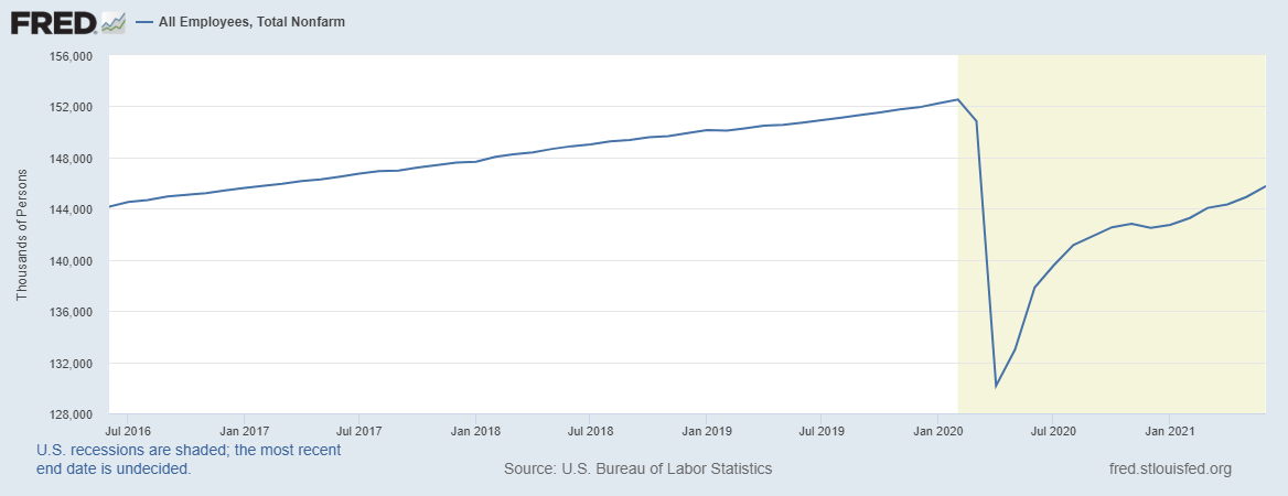
Source: Fred
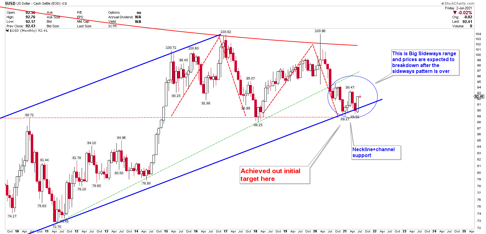
The relevance of the trading zone is demonstrated by the monthly chart of the US dollar index. The chart was created a few months ago and can be read here. The chart is performing perfectly. When the US dollar index was trading at 89-90 levels, we indicated absolutely that the US dollar index might pump at these levels. The US dollar has climbed from 89 to 92.50 in a matter of days, exactly as per our predictions. But this pump is US dollar has nothing to change the bearish view of the chart.
A declining curve from the high in 1985 to the peak in 2020 is used to produce the long-term monthly chart. We've shown how the US dollar's value would plummet by the start of the Covid-19 crisis in February 2020. The price has dropped significantly from a peak of 102 to a low of 89. The development of a bearish M structure was aided by the fall in the US dollar index. This structure has a strong bearish tendency and is a bearish pattern if the value of 89 is lost. The primary target of 89 was expected to be placed at the lower angle of blue channel support. Necklines in M-type patterns meet the horizontal support at the same point. Since it is mixed up with other types of support, this is referred to as a major support juncture. We believe that in a few months, this juncture will be broken, and the US dollar will fall. Pumping at this level can be done for a little longer. The US Dollar index has been stuck in a sideways range of 89-93 as a consequence of this significant region of support.
(Click on image to enlarge)
The monthly chart is zoomed out to observe the details. A red circle is marked which indicates that prices can be in a sideways range and once the range is over, the US dollar index must break downside.
(Click on image to enlarge)
US Dollar Correlated Markets
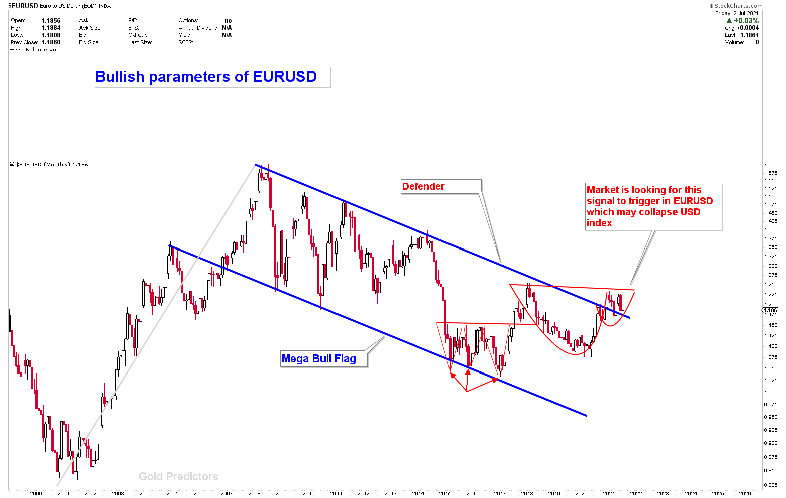
The fact that the USD dollar index is inversely proportional to the EURUSD is due to correlation phenomena in currencies. Since the US dollar index has developed very bearish charts, EURUSD has developed a very bullish chart. The chart below depicts the bullish structure of the EURUSD. The pair is expected to rise once the US dollar index falls. The instrument has formed a mega bull flag, which has been broken for quite some time. For a long time, price has been testing this flag. It's worth noting that if the US dollar index loss 89, the EURUSD is likely to break 2018-19 highs, signaling yet another bullish signal for the currency pair.
A triple bottom at the bottom angle of the flag supports the bullish flag patterns of EURUSD, indicating that the instrument is under bullish compression. Another CUP development, followed by a handle right after the flag breakout, suggests that the pair's next move will be higher.
(Click on image to enlarge)
Effect of 10-years Treasury yield on Gold Market
There is a strong relationship between gold and Treasuries since they are both regarded safe-haven investments. Bond prices have a positive connection with gold, whereas yields have a negative link. The bond price falls when the yield rises, and vice versa. Although investors who store gold miss out on investing possibilities, there is a negative relation between gold and yields. Since gold has no yield, capital flows out of the yellow metal and into bonds as bond rates rise, leading the gold price to decline.
The monthly chart below presents the correlation between gold prices and 10-years Treasury yields. The following chart shows that gold prices began their first bull phase in 2000 and ended in 2011, followed by a 4-5 years’ pullback. In 2019, the second bull phase was confirmed, which we had been discussing with members for quite some time. The primary bull phase resistance was $2,100, which was hit in 2020 by a post-pandemic peak. This resistance of $2,100 can be observed by yearly charts. According to the fundamentals and technical, the pullback from $2,100 to $1,680 is quite normal, and gold is expected to resume its strong rally. It's worth noting that the bull phase 1 begins with the breaking of a triangle, while the bull phase 2 begins with the breaking of a strong inverted head and shoulders. Both patterns were extremely strong, indicating a significant upward movement in gold prices. The chart below clearly shows that gold forms a strong bottom when Treasury yields reach the falling wedge trend line. Since the bull phase 2 bottom was reached in 2019, the Treasury yield peak could begin to fall at any time, offering another strong indication for gold to rise.
(Click on image to enlarge)
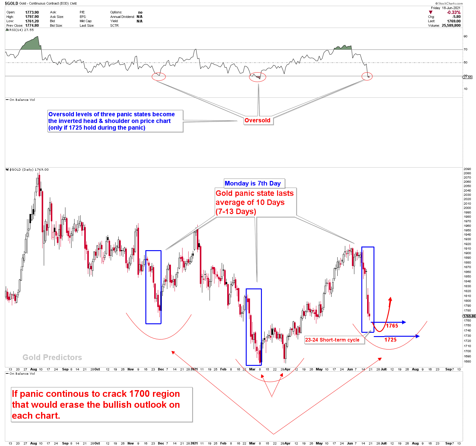
The chart below was used to present the gold short-term outlook to members. We have been looking 1765 for a long time. Only one weekly close below 1765 occurred in the final minutes of Friday, when prices fell from 1769 to 1760 to end the week. We've identified members that this is a possible bear trap with 90% of probability. Finally, gold prices have continued to rise from the 1750 level. If gold breaks 1931, it will confirm the inverted head and shoulder pattern, indicating that new highs are on the way.
(Click on image to enlarge)
Conclusion
On very short term charts, the 10-year Treasury yields have dropped sharply and have broken through support. Treasury yields are intimately connected to the US dollar and gold. Lower Treasury yield produced another indication for US dollar weakness. On yearly, monthly, and weekly charts, the US dollar has produced strong bearish patterns, and the US dollar is likely to break down soon. The highly correlated instrument EURUSD can be used to observe the weakness of the US dollar index. The EURUSD has a strong bullish outlook, since the US dollar index has a strong bearish outlook. Falling yields and a weakening US dollar are both signs for gold bulls. Gold's short, medium, and long-term outlooks are all bullish, and prices are on their way to new all-time highs.
Disclaimer: Articles/Short-term & Long-term Trading signals/Newsletters distributed by GoldPredictors.com has no regard to the specific investment objectives, financial situation or the ...
more

