
Gold: Logic Vs. Emotions, True Vs. Temporary
How gold behaved yesterday, everyone knows. How it rallied before today’s opening bell, you probably already see as well. But can we assign this to some reasonable cause or rather just emotionality? Let’s look at the charts first.
Yesterday was one of “those” days and today’s pre-market trading ones one of those mornings. “Those” sessions that we all know take place every now and then, but we secretly wish they didn’t. Like one of those things that “happen to other people” but never to us. You don’t like it, and I don’t like it. “Those” days test our knowledge (what’s normal and what’s not?) and – most of all – patience. Something happened, markets reacted, and just when it was likely that after several more days (a few weeks at best) the junior miners would slide profoundly to new yearly lows, it started to seem much less likely. The keyword here, however, is “seem”, and in today’s analysis, I’ll show you why
That “something” yesterday that most likely triggered the rally in gold was the surprisingly positive employment numbers that resulted in temporary changes in the real yields (more on that later today; and yes, this does make the current situation look even more like 2013 …). And that “something” that likely triggered another rally was likely the exceptionally bad… employment numbers (different numbers, though, as yesterday’s report was about initial jobless claims and today’s report was the nonfarm payrolls for April. There were fewer jobless claims, but fewer jobs as well. It shouldn’t have been the case that gold rallied on both pieces of news, but it’s what we saw. Overall, yesterday’s and today’s rally seems to have much more to do with emotionality and, well, randomness than it does with cold logic (by the way, if you haven’t read Fooled by Randomness by Nassim Taleb, I highly recommend it).
And a great way to deal with emotionality and randomness is through charts, as far as the markets are concerned (and, well, through Stoic philosophy in general, but that’s a matter going well beyond the scope of this analysis). When looking at charts, we can apply tools designed to detect emotional peaks and breakthroughs that markets endure.
After all, it’s not important that a line or slope was broken by itself – it’s important because of what it all represents and how people interpret it. Times change, but the fact that people feel fear and greed doesn’t change, which is why even distant patterns and similarities to what we see on different occasions can be useful.
All right, all right, all right, it’s all nicely said, but when will I be making lots of money on this trade?
Likely a week – or so – longer than what seemed to be the most plausible scenario before yesterday’s session. I’m quite sure most people will agree that waiting an extra week for a truly massive price move doesn’t sound that bad after all, especially given that we’re already sitting on profits from the previous positions – everyone following my analyses to the letter profited from the last long trade in the miners, and many people profited handsomely by exiting the previous short position (GDX) on Feb. 26, 2021 and (GDXJ) on Mar. 4, 2021 – extremely close to the yearly bottom (at least so far).
While the market’s moves don’t depend on me, analyzing the market thoroughly, diligently and carefully, and then reporting my findings to you (and keeping you updated), does. Therefore, during yesterday’s session, I sent the intraday Alert to my subscribers, in which I discussed the situation. Not much changed on the market since I posted/sent it, so today’s analysis is going to be an extension of what I wrote then.
Let’s jump right into charts, starting with the USD Index.
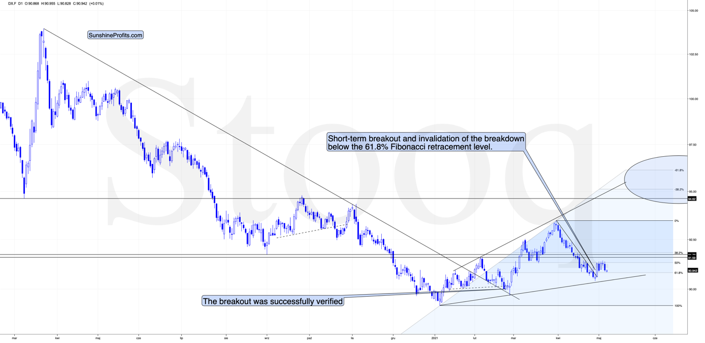
In yesterday’s regular analysis, I wrote the following about the above chart:
Yes, the USD Index soared on Friday, Apr. 30, and based on that it invalidated the breakdown below the 61.8% Fibonacci retracement level. It also broke above its declining resistance line, but it’s been trading sideways since that time. The rally didn’t continue, which likely makes traders question its validity.
What is really happening here is that the USD Index has been verifying the breakout – and it managed to do so. Consequently, the situation is bullish for the next several weeks (even if we see a very short-term move to somewhere around the recent lows).
This, in turn, means that gold is likely to fall in the following weeks (not necessarily in terms of days, though).
As traders had previously been unsure if the strength in the USD Index was indeed the beginning of a new trend, they just got a “confirmation” that the USD Index is not done with declining. In my view, that’s an incorrect interpretation of what’s happening, and while the traders might be right about this for the next several hours or days, they are likely very wrong about the overall direction of the trend over the course of the following months. This means precious metals and mining stocks have likely overreacted yesterday, and this will be reversed once the USD Index proves that last Friday’s rally was not accidental. A rally to new monthly highs might be enough proof.
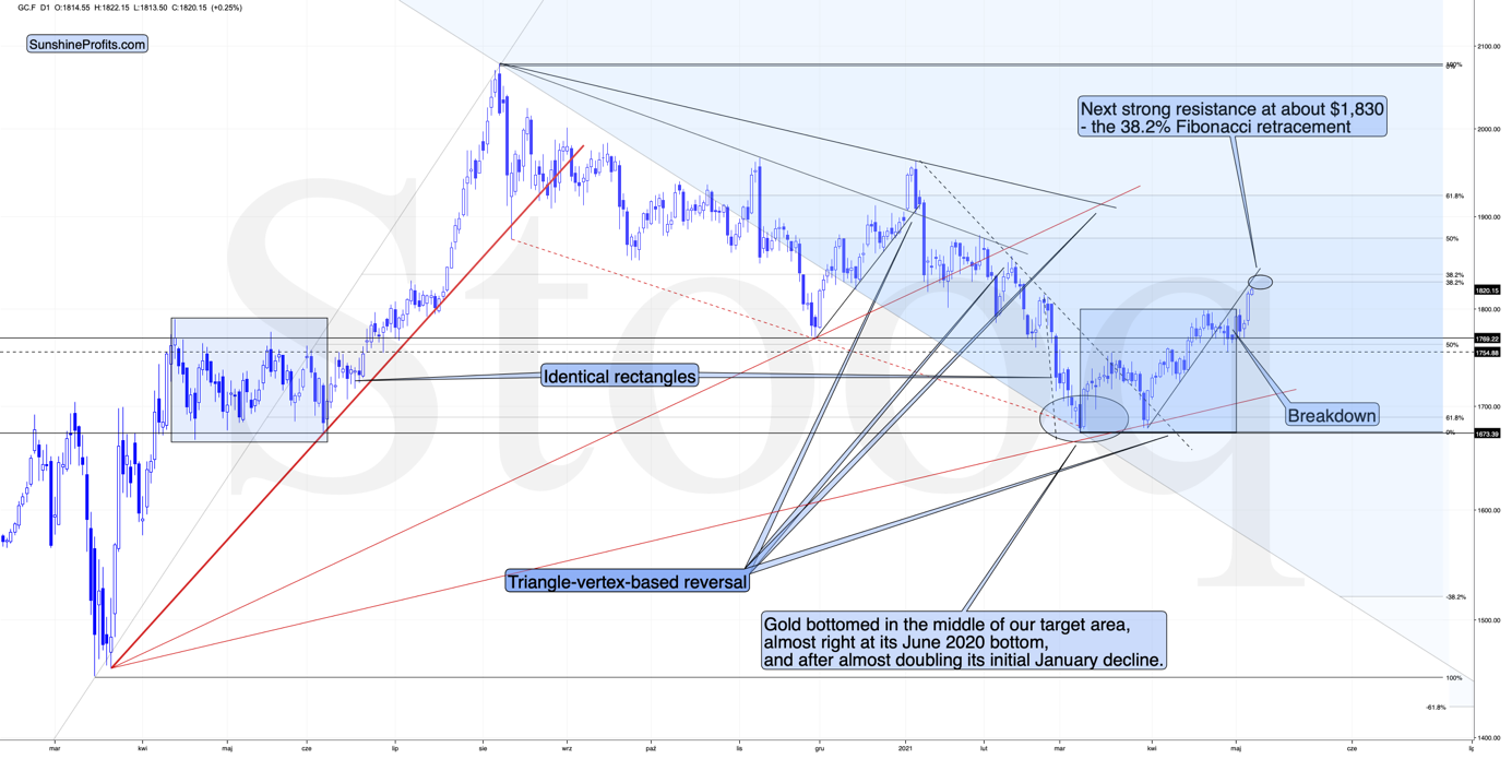
In the near term, the USD Index could once again test the very recent lows and perhaps reach the rising medium-term support line – at about 90.4 – 90.5. In response, gold might even rally to $1,830 or so, which I already wrote yesterday.
[Edit: I wrote the above in advance, and I’m adding this paragraph at 9 AM EST – the USD Index just reached the above-mentioned target area, so the bottom might be in at this time or it might be extremely close.]
Quoting my yesterday’s thoughts on that matter:
How high could gold rally in the very near term? Perhaps by another $15, to about $1,830 as that’s where we have the 38.2% Fibonacci retracement level based on the August 2020 – March 2021 decline. However, even if gold does rally there (which is far from being certain – the top might form as early as today), it doesn’t seem likely to me that GDXJ would soar substantially. Please note that miners tend to be particularly weak relative to gold right at or before the top and GDXJ is already underperforming.
Also, a quick rally to this level would imply a move back to the previously broken support line – it could work as resistance right now.
Gold moved beyond the blue rectangle that I marked on the above chart (a copy of the 2020 consolidation) but it is not required for the two shoulders of a head-and-shoulders pattern to be 100% identical, so it didn’t invalidate the possibility of this pattern being formed in the following weeks.
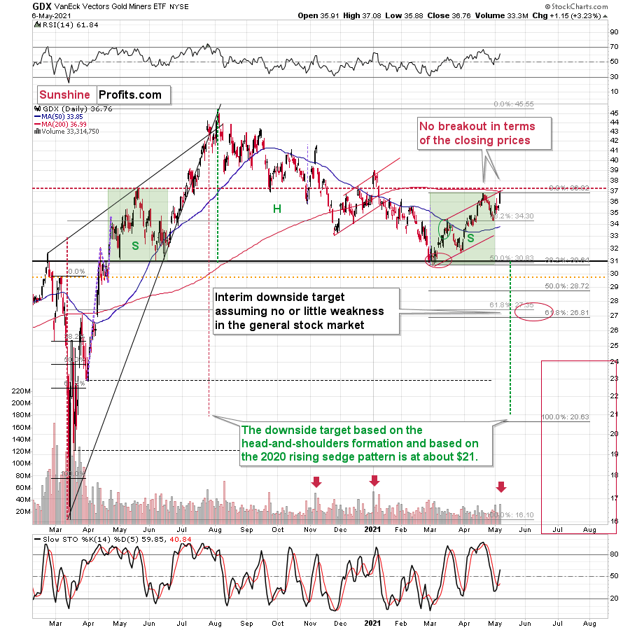
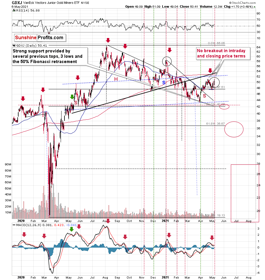
Mining stocks have indeed underperformed yesterday. The GDX ETF moved to new intraday highs, but it closed the day below the highest closing price of April. The GDXJ ETF was unable to rally to new intraday highs – it underperformed once again. In fact, looking at the GDXJ ETF chart reveals that yesterday’s session wasn’t really that important in terms of price changes… As long as one is sticking to the selection of assets that I’m featuring in the analyses.
Still, yesterday’s session provides us with some interesting clues. The most interesting thing is the spike in volume that we’ve seen in both ETFs. It’s particularly notable in the case of the GDXJ ETF.
On both charts, it’s clear the spikes in volume during daily rallies are something that marks the end of the rally, not its beginning. On the GDXJ ETF chart, we see an additional layer of detail. Namely, the way the volume spikes are positioned relative to each other and how it all compares to the late-2020 and early-2021 performance.
In early November 2020, we saw a spike in volume which marked a local top. Then the early-December spike marked the start of a rally. Then after– more or less – an equal amount of time, we saw another spike in volume, which once again marked a local top – that was the early-2021 high.
Now, we saw a spike in volume in late February 2021 (local top), then in late March (start of the rally), and now – in early May, after a more or less equal amount of time – we can see another spike in volume. Consequently, it seems quite likely that what we see right now is similar to what we saw at the beginning of the year. The difference is that if miners decline from here, then the slide is likely to be much bigger as a move to new yearly lows would confirm the broad head-and-shoulders pattern in the miners.
Another obvious clue is that miners – unlike gold – didn’t soar to new highs, so one might say that they continue to underperform gold, which is bearish, especially when combined with outperforming silver.
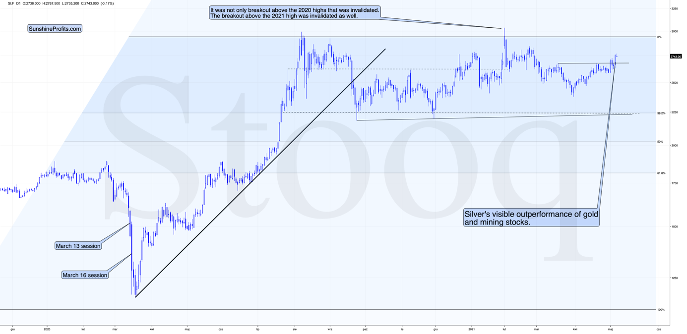
And that’s exactly what silver is doing right now – it’s outperforming gold on a short-term basis. This is what has been preceding major tops for many years, and it seems that the same fate awaits the precious metals market shortly.
Having said that, let’s take a look at the markets from a more fundamental angle.
Taper Your Expectations
After the Bank of Canada (BOC) decided to scale back its asset purchases on Apr. 21, the Bank of England (BOE) announced on May 6th that it will reduce its bond purchases from £4.40 billion per week to £3.40 billion per week beginning some time in between May and August.
Please see below:
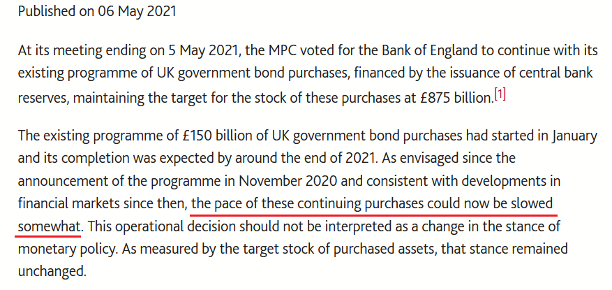
Source: BOE
And why is this so important?
Well, with the BOE following in the BOC’s footsteps, the U.S. Federal Reserve (FED) is likely next in line. To explain, while the PMs enjoyed another strong rally on May 6th, their recent climb actually makes some fundamental sense: with inflation expectations surging and the U.S. 10-Year Treasury yield failing to participate, the U.S. 10-Year real yield has declined by 12 basis points since Apr. 30. However, with the U.S. 10-Year Treasury yield demonstrating an even wider divergence from the U.S. 10-Year breakeven inflation rate than before the taper tantrum in 2013, once the dam eventually breaks, the former’s flood will likely drown the PMs in the process. (You likely remember very well how fast gold plunged in 2013.)
Please see below:
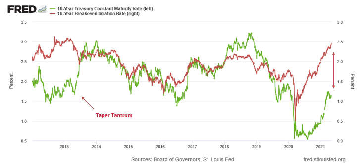
To explain, the green line above tracks the U.S. 10-Year Treasury yield, while the red line above tracks the U.S. 10-Year breakeven inflation rate. If you analyze the left side of the chart, you can see that when the material gap finally filled in 2013, the U.S. 10-Year Treasury yield’s surge was fast and furious. Likewise, if you analyze the right side of the chart, you can see that the gap between the two is even larger now. As a result, with material divergences often reversing in a violent fashion, the next surge will likely be no different.
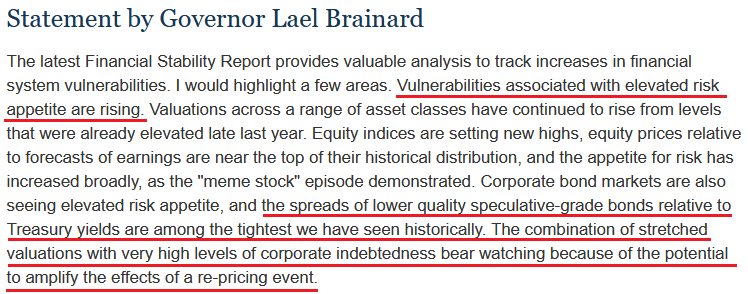
To that point, the FED released its semi-annual Financial Stability Report on May 6. An excerpt from the report read:
“High asset prices in part reflect the continued low level of Treasury yields. However, valuations for some assets are elevated relative to historical norms even when using measures that account for Treasury yields. In this setting, asset prices may be vulnerable to significant declines should risk appetite fall.”
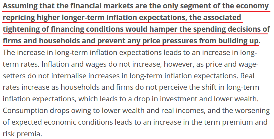
On top of that, FED Governor Lael Brainard had this to say about the current state of affairs:
Source: U.S. FED
For context, a “re-pricing event” means that if the U.S. 10-Year Treasury yield reconnects with the U.S. 10-Year breakeven inflation rate above, we should prepare for an explosion.
If that wasn’t enough, Boston FED President Eric Rosengren told an audience at the Boston College Carroll School of Management on May 5th that the housing market remains on high alert. For context, the FED currently buys “at least” $40 billion worth of agency mortgage-backed securities (MBS) per month.
Please see below:
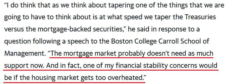
Source: Bloomberg
The bottom line?
With euphoric valuations and surging inflation on a collision course of destruction, even FED officials are sounding the alarm. And with the PMs’ recent rally underpinned by falling real yields and investors’ joyful exuberance, sentiment will sour rather quickly once the FED is forced to reduce liquidity. Case in point: following historical recessions since 1970, the U.S. 10-Year Treasury yield often rallies sharply, consolidates, and then continues its trek higher.
Please see below:
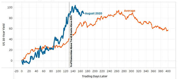 Source: Arbor Data Science
To explain, the orange line above tracks the average performance of the U.S. 10-Year Treasury yield during global recoveries since 1970, while the blue line above tracks the performance of the U.S. 10-Year Treasury yield since August 2020. If you analyze the middle of the chart, you can see that the U.S. 10-Year Treasury yield is likely exiting its consolidation phase and is poised to resume its uptrend.
Likewise, while the PMs have exuded confidence alongside a largely absent USD Index, history implies that another sharp move higher is approaching fast.
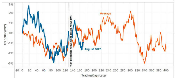
Source: Arbor Data Science
To explain, the orange line above tracks the average performance of the USD Index during global recoveries since 1970, while the blue line above tracks the performance of the USD Index since August 2020. If you analyze the middle of the chart, you can see that the greenback’s bounce off of the bottom nearly mirrors the average analogue. Moreover, while fits and starts were present along the way, the USD Index is approaching a period that culminates with further strength.
And why is this the case?
Well, because, like most things in life, you can’t have your cake and eat it too. With investors pricing in a future of record GDP growth, perpetual asset purchases by the FED, and zero percent interest rates, the goldilocks environment has never occurred in history. For context, when economic growth is strong, increased demand for debt – as businesses increase their capital investments and expand alongside the growing economy – allows lenders to charge higher interest rates. Conversely, when economic growth is weak, decreased demand for debt – as businesses hunker down and preserve capital – forces lenders to offer lower interest rates.
Thus, with a strong economy supposedly around the corner, the U.S. 10-Year Treasury yield and the USD Index should rise in unison (because higher interest rates increase the fundamental value of the U.S. dollar). However, with “elevated risk appetite” (as Brainard puts it) threatening to swallow the financial system, FED officials are wary about reducing liquidity, rising interest rates, and popping the stock market bubble.
Remember though: history has shown that no matter how hard they try, the house of cards always comes crashing down. Case in point: Lords of Finance: The Bankers Who Broke the World dissects the stock market crash of 1929 and The Great Depression.
And if you read the excerpt from the book below, notice a familiar policy?
“The quartet of central bankers did in fact succeed in keeping the world economy going but they were only able to do so by holding U.S. interest rates down and by keeping Germany afloat on borrowed money. It was a system that was bound to come to a crashing end. Indeed, it held the seeds of its own destruction. Eventually, the policy of keeping U.S. interest rates low to shore up the international exchanges precipitated a bubble in the U.S. stock market. By 1927, the Fed was thus torn between two conflicting objectives: to keep propping up Europe or to control speculation on Wall Street. It tried to do both and achieved neither.”
The bottom line?
With inflationary pressures akin to propping up Germany in the late 1920s, the FED is torn between rocking Wall Street – which occurred on May 4th when U.S. Treasury Secretary Janet Yellen hinted that interest rates should rise – and allowing inflationary pressures to persist in hopes that they’ll calm down on their own. However, with cost-push inflation born by speculation in the commodities market, a summertime surprise will likely force the FED’s hand.
As evidence of the European Central Bank’s (ECB) ‘hope-and-pray’ strategy, the ECB published a report on May 6th essentially outlining a myriad of reasons why it should not raise interest rates. And while the policy stance is bearish for the EUR/USD, and therefore, bullish for the USD Index, the reasoning is another example of why once the dam breaks, the flood will be fast and furious.
Please see below:
Source: ECB
Translation?
As long as inflation expectations are confined to the financial markets and not mirrored by households and businesses, then inflation is synthetic, and raising interest rates will do more harm than good to the economy. However, with the argument flawed on so many levels, history implies that failing to taper creates even more problems down the road.
Case in point: the Institute for Supply Management (ISM) released its services PMI on May 5th. Quoting an excerpt from the report, I wrote on May 6th:
“The Prices Index figure of 76.8 percent is 2.8 percentage points higher than the March reading of 74 percent, indicating that prices increased in April, and at a faster rate. This is the index's highest reading since it reached 77.4 percent in July 2008 ….All 18 services industries reported an increase in prices paid during the month of April.”
And highlighting the significance, notice the strong correlation between the ISM Prices Index and the core Personal Consumption Expenditures (PCE) Index? For context, the core PCE Index is similar to the core Consumer Price Index (CPI). However, the former measures the prices that consumers and nonprofits pay for goods and services and excludes more than just the effects of food and energy.
Please see below:
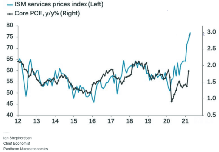
To explain, the light blue line above tracks the year-over-year (YoY) percentage change in the ISM Prices Index, while the dark blue line above tracks the YoY percentage change in the core PCE Index. If you analyze the right side of the chart, you can see that reconnecting with the light blue line implies a core PCE Index reading of roughly 3% (using the scale on the right side of the chart). For context, the last time the core PCE Index hit 3% was January 1992. Thus, while the PMs continue to enjoy the speculative ride higher, once the FED realizes that reducing liquidity is not only the best, but the only course of action, the positivity will likely be short-lived.
In conclusion, plunging real yields have lit a fire under the PMs, but the rubber band can only stretch so far before it snaps. With inflation bubbling beneath the surface and central banks already diverging in their responses, it’s only a matter of time before long-term yields move meaningfully higher. To that point, with the U.S. 10-Year Treasury yield demonstrating its largest-ever divergence from the U.S. 10-Year breakeven inflation rate, history implies that the reconnection won’t be met with applause by the PMs. Thus, the medium-term outlook remains profoundly bearish, and the PMs often shine their brightest just before the sunsets.
Disclaimer: All essays, research and information found on the Website represent the analyses and opinions of Mr. Radomski and Sunshine Profits' associates only. As such, it may prove wrong ...
more


You also mentioned GDX will top at 34 but didn’t it 37.50, HUI. At 300 and crashes, it’s over 301 with a MACD bull cross over. Just saying