Better Ways To Sort Out What The U.S. Treasury Yield Curve Is Saying
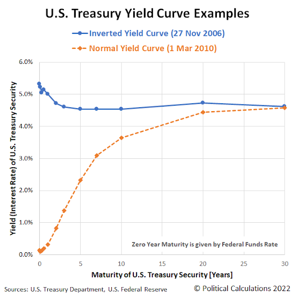
Part of the U.S. Treasury yield curve inverted and all we got was lousy analysis!
That's actually something of an understatement. There has been an explosion of reporting about the inversion of the U.S. treasury yield curve in recent weeks. If you read any of it, you likely found it leaves a lot to be desired. Here's a random selection of recent headlines:
- What The Inverted Yield Curve Means For The Economy
- The Inverted Yield Curve, A Warning, Not An Alarm Bell
- What Does an Inverted Yield Curve Mean for Stocks?
- An Inverted Yield Curve Doesn’t Always Predict a Recession. Why This Time Is Different.
- The Yield Curve May Not Be a Reliable Bellwether for Recession
It's not any better if you read what academic economists have been writing either, much of which has the intellectual consistency of muddled hash. In fact, if all that analysis were laid out end to end, the last thing you'd ever reach from reviewing it all is a conclusion. You'd think achieving some sort of clarity would be both desirable and a priority because the inversion of the Treasury yield curve is believed to portend recession in the future for the economy.
Part of the problem is that the U.S. Treasury yield curve has more than one part to it than can become inverted. A lot of people will focus on some select parts of it, without taking what's going on in the rest of it into account.
That realization lies behind some more interesting analysis by MetricT at r/dataisbeautiful that offers a path to reach the kind of conclusions you'd want to reach whenever the treasury yield curve becomes inverted. Here's that original analysis from 28 March 2022, which has been updated with charts showing yield curve data through 15 April 2022 (in addition to some other minor tweaks):
Mean Yield Spread across all US Treasury Maturities as a (slightly) better recession gauge than the 10y/2y and 10y/3m yield curve spreads
The US Treasury yield curve spread (most commonly the 10 yr/2 yr and 10 yr/3mo spreads) are popular gauges of incoming recession. But those measures aren't perfect. In particular:
- There is a noticable false positive from Sep 1966 - Feb 1967 where the 10 yr/3 mo yield curve inverted but no recession followed.
- A "is it or isn't it?" event in 1998 where the yield curve almost inverted before returning to normal. This caused a lot of consternation at the time until it was subsequently shown to be another false positive.
- Another "is it or isn't it?" event in 2019 where the yield curve inverted, but pundits wondered if it "inverted enough" to trigger a recession. Narrator: It did...
I've been looking at ways to improve the traditional yield curve measures. A few months ago I posted R code to graph the percent of all yield curve spreads that are inverted, which made it much more obvious that a recession was the likely outcome in 2019.
So the idea occured to me: There are (at present) 55 different yield curve combinations. What would the average of all yield curve combinations look like? That should give us a better measure of how distorted the yield curve is than looking at a single pair of spreads.
As it turns out, the average does perform a bit more accurately than the 10y/2y and 10y/3m yield curves. In particular, it fails to invert in 1998, meaning our "is it or isn't it?" has a much clearer "no" answer. And it did invert during the similar "is it or isn't it?" event in 2019 and correctly predict a recession. So it sends a clearer signal than the better known 10y/2y and 10y/3m curves.
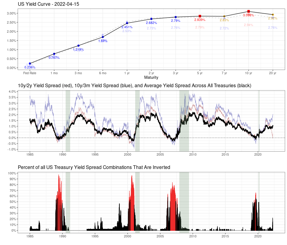
Graph 1:
Top: The US Treasury yield curve as of April 15 2022. A healthy yield curve should be upward sloping. Notice the obvious bear flattening between 3 yr <-> 10 yr Treasuries. There are already inversions between several longer-duration Treasuries (inverted points highlighted in red). There is currently a technical inversion in the 30yr/20yr curve due to a preference for 30 year Treasuries due to the relative newness of 20 yr Treasuries.
Middle: The usual 10y/2y and 10y/3m spread alongside the average yield spread for all maturity combinations. Notice that while the 10y/2y is rapidly nosediving (and getting a lot of press in doing so), the average is still relatively stable, though that may or may not last much longer. So keep an eye on things, but don't overreact just because the 10y/2y curve inverts.
Bottom: Shows the percent of all Treasury combinations that are inverted. It's graphed as a percent because the total number of maturities has changed over time (for instance, the Fed introduced 7 yr Treasuries in 2009), so graphing the percent allows you to do an apples-to-apples comparison. The color scheme is simply "blue if the average yield curve spread is < 0, red if it's > 0".
Graph 2:
Graphs the Federal Funds Rate since 1985 and highlights times when the average yield curve is inverted. As you can see, Fed tightening has come to a screeching halt almost immediately once the average YC is inverted, and quickly starts heading downward. It suggests the Fed is going to have great difficulty raising the Fed rate, as they probably only have a few months before the average inverts.
I'll clean the code up and eventually post it on my Github repo, though it will probably take a few days.
There are two bits of good news. First, MetricT's code is available! Second, through 15 April 2022, the average of all yield curve combinations hasn't changed the low probability of recession signal of MetricT's original analysis from 28 March 2022.
We're not the only ones who recognize there's a lot lacking in current day analysis of the treasury yield curve. For additional discussion, we'll recommend adding Scott Grannis' exploration of better measures of the yield curve to your reading list as well.
Disclosure: None.


